
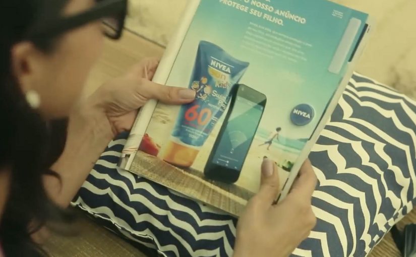
NIVEA: Protection Ad

Last year NIVEA transformed a regular print ad into a portable solar charger for smartphones. Now in its latest ad, NIVEA has made the right side detachable, so people on the beaches of Brazil can use it as a trackable bracelet.

Parents who want to keep an eye on their children can rip off the bracelet, attach it to a child’s arm, and then download the companion app. In the app, they can add each child’s name and set the maximum distance each child can wander. If a child goes too far, the app sends a loud alert.

From print to proximity

The clever part is that it is not just a “detachable freebie”. The bracelet is described as embedding Bluetooth proximity tech, so the printed unit becomes a functional signal that a phone can detect and monitor.

In FMCG innovation, utility-based media works best when the object removes a real anxiety in the exact moment the product is used. Utility-based media here means an ad unit that doubles as a small tool people use right away.

The real question is whether the utility you build into the media unit is reliable enough to earn trust when the anxiety spikes.

Why the idea lands on the beach

NIVEA’s product promise is protection, but protection on a beach is not only about skin. It is also about the panic of losing sight of a child in a crowded, noisy, high-movement environment. The bracelet reframes the brand benefit from a claim to a service. This works because it shifts “protection” from a claim about skin into a service parents can experience in minutes.

Extractable takeaway: If you want a print placement to behave like product, compress the mechanism into four verbs that anyone can repeat. Tear it out. Put it on. Set a safe radius. Get alerted. That simplicity is what turns a print placement into something people talk about, and something press can repeat without over-explaining.

Business intent

This is a campaign designed to win preference in a category full of parity. It makes NIVEA Sun Kids feel like an innovator in a place where it matters, and it creates a reason to choose the brand that is not only SPF.

The work later received major awards recognition, including winning the Mobile Lions Grand Prix at Cannes Lions.

Steal the protection-to-service pattern

  • Turn media into a usable object. If it solves a real problem, people keep it and share it.
  • Map the utility to the brand promise. The best “useful ads” make the benefit feel literal.
  • Make setup frictionless. Clear instructions and a fast pairing experience are the difference between buzz and abandonment.
  • Design for the real environment. Beach. Noise. Distance. Movement. The alert has to work in the messy world.

A few fast answers before you act

What is NIVEA’s Protection Ad?

It is a print ad that includes a tear-out bracelet for children, paired with a mobile app that alerts parents if a child moves beyond a preset distance on the beach.

How does the bracelet connect to the phone?

Coverage describes the bracelet as using Bluetooth proximity technology. The phone detects the bracelet, and the app uses distance thresholds to trigger alerts.

Why does this count as strong “useful advertising”?

Because the ad delivers a real service in-context. It does not only talk about protection, it provides an extra layer of it during a real beach day.

What is the biggest risk with safety-themed tech campaigns?

Trust and reliability. If pairing fails, alerts misfire, or the experience feels unclear, the concept turns from reassurance into frustration.

What should you measure if you build something similar?

Redemption and pairing success rate, app installs driven by the ad unit, repeat usage during real outings, and brand preference uplift versus a control region or period.
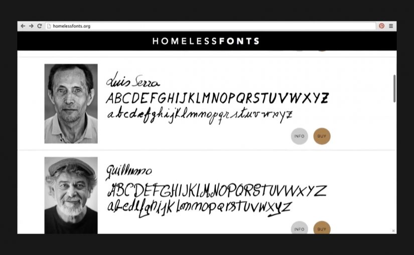
Homeless Fonts: Fonts from Cardboard Signs

When you walk by a homeless person holding a cardboard sign, you usually see an anonymous face struggling to survive. Homeless Fonts flips that moment. It turns the most visible part of street life. The handwriting. Into something people and brands can actually pay for.

From street sign to typeface

The Cyranos McCann teamed up with the Arrels Foundation in Barcelona to launch HomelessFonts.org. The site features fonts built from the real handwriting of local homeless people, available for purchase by marketers who want something more human than a default type library.

Here, a “font” is a downloadable typeface file that designers can license and use across ads, packaging, and digital interfaces, just like any other professional typeface.

In urban European cities, design-led micro-commerce can convert overlooked skills into dignified income streams.

Where the money goes

The money raised from the website is intended to support accommodation, food, social programs, and health care for people experiencing homelessness. For more information visit www.HomelessFonts.org.

Why this lands

It works because it asks brands to buy a useful asset instead of “donating to a cause.” You are not funding an abstract promise. You are paying for a tool that visibly changes the tone of your message, and the purchase itself carries a story your audience can recognize instantly.

Extractable takeaway: If you want purpose marketing to stick, attach the donation mechanic to a practical, reusable brand input (a font, a template, a dataset, a sound pack) so the act of funding also improves the work.

What it’s really trying to change

The real question is whether brands will pay for contribution instead of performative concern.

This is a stronger model than pure cause messaging because it gives people commercial value, not just visibility.

Beyond fundraising, the campaign reframes homeless people from passive recipients to contributors with identity and craft. The typefaces carry names and personality, and that shifts the conversation from pity to participation.

What to steal from Homeless Fonts

  • Sell a tool, not a feeling. Build the fundraising mechanic around something buyers genuinely need.
  • Make the proof visible. The output (handwriting) is instantly recognizable, which makes the story easy to retell.
  • Design for everyday reuse. The more places the asset can live (print, digital, packaging), the more sustainable the model becomes.
  • Keep the transaction simple. Clear product. Clear price. Clear destination for proceeds.

A few fast answers before you act

What is Homeless Fonts?

It’s a collection of purchasable fonts created from the handwriting of homeless people in Barcelona, sold via HomelessFonts.org.

Who created it?

The project was launched by the Arrels Foundation in partnership with Cyranos McCann.

How do brands actually use the fonts?

Like any licensed typeface. Designers can apply them in headlines, posters, packaging, social content, landing pages, and campaign visuals to add a distinctly human texture.

What does buying a font change versus asking for donations?

It turns support into a market exchange for a useful asset. That reduces “charity fatigue” and gives brands a concrete output that carries the story forward every time it’s used.

Where is the money intended to go?

The campaign describes proceeds being used for accommodation, food, social programs, and health care supporting people experiencing homelessness.

Nar Mobile: The Donor Cable

Azerbaijan is often described as having an unusually high incidence of children born with thalassemia, a hereditary blood disorder found across Mediterranean and nearby regions. The illness can require extensive blood transfusions for babies, and hospitals can struggle with shortages of donated blood.

So Y&R Moscow partnered with Azerbaijan cellular network Nar Mobile to re-imagine blood donation for a more digital daily life. Together they created a special wearable bracelet. A donor cable is a wearable charging cable that lets smartphone owners easily donate battery power to another person, and uses that act as a prompt to donate blood.

A wearable that makes donation tangible

The Donor Cable is a charging cable designed as a bracelet. When someone’s phone is dying, you can connect phone to phone and transfer power. The campaign then bridges that familiar “help” moment to a bigger one. Donate blood.

A donor cable is a physical connector that enables one person’s phone battery to recharge another device. The campaign uses that simple transfer as a metaphor for medical donation.

In mobile-first markets, translating “helping” into a familiar phone habit can lower friction for real-world donation behaviour.

Why this lands

This works because it does not start with guilt or abstract altruism. It starts with a small, instantly useful act between two people, then reframes that feeling of helping as the reason to do the harder, higher-impact thing. The bracelet format also keeps the reminder on you without requiring ongoing media.

Extractable takeaway: If you need behaviour change, start with a low-friction action that already feels rewarding, then create a clear bridge and an immediate next step to complete the “real” action while motivation is still warm.

What the numbers are trying to prove

The stronger strategic move here is the bridge from everyday phone help to real blood donation, not the bracelet itself.

The real question is whether the campaign makes the jump from symbolic transfer to actual donation immediate enough to convert intent into action.

Campaign coverage described the donor cables as an instant hit and reported an increase in blood donation of 335%. Treat that percentage as reported performance unless you have a primary measurement source to cite.

What behaviour-change teams should steal

  • Make the metaphor usable. A real action beats a slogan.
  • Put the reminder on the object. Wearable prompts outlast a media flight.
  • Collapse distance to conversion. Pair the story with an easy path to donate.
  • Keep the rule explainable. If it takes a paragraph to understand, it won’t spread.

A few fast answers before you act

What is the Donor Cable?

A wearable charging cable that lets one person transfer battery power to another phone. It is used as a behavioural prompt to encourage blood donation.

Why connect phone charging to blood donation?

The idea uses a clear analogy. A small, immediate “donation” of power makes the bigger act of donating blood feel more approachable, and more top-of-mind.

How does the bracelet change behaviour beyond awareness?

It creates a repeatable micro-action people can perform in public, then links that positive social moment to a concrete next step. Donate blood.

Is the 335% figure a verified metric?

It is presented in campaign coverage as a reported result. If you want it stated as verified, you would need a primary measurement source.

What’s the main risk if you copy this pattern?

If the bridge from the small action to the real action is not immediate, the analogy stays clever but does not convert. The donation step must be easy to find and easy to complete.