
Coca-Cola Happiness Machine #ReasonsToBelieve

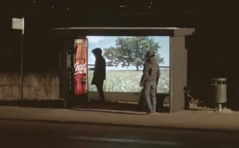
Coca-Cola is at it again, this time unleashing happiness in Sweden. A special Coke machine sits at a bus stop to spread some summer happiness in the middle of the cold and dark Nordic winter. The results…

Why the bus stop is the perfect stage

A bus stop is pure waiting time. That makes it a natural canvas for surprise, generosity, and shared reactions. When the environment is grey and cold, the contrast of “summer happiness” lands even harder, because it flips the mood of the moment instantly.

Extractable takeaway: Waiting time is a pre-built attention state. Pair it with a simple, generous interruption and you get a shared reaction people want to retell.

What this activation proves in one simple move

You do not need a complex mechanic to create a strong brand experience. Here, “mechanic” simply means the one interaction rule that triggers the surprise. Put the idea in the right place, at the right time, and make the reward feel unmistakably human. Because the moment is public and immediate, people experience it together, and that is why it spreads on its own.

In European cities, transit touchpoints like bus stops are one of the few places where strangers reliably share the same small moment of time.

The real question is whether your idea turns that routine pause into a shared reaction people will retell.

This kind of work wins when simplicity and placement do the heavy lifting, not explanation.

Stealable patterns from a bus-stop surprise

  • Borrow “waiting time” as attention. Start where people are already paused and open to distraction.
  • Design for contrast. Put warmth and play into a cold, routine context so the shift is instantly legible.
  • Keep the rule simple. A single, human-feeling reward beats a complicated interaction people have to learn.

Click here to see other Coca-Cola Happiness campaigns from around the world.


A few fast answers before you act

What is the Coca-Cola Happiness Machine concept?

It is a series of experiential campaigns where a Coca-Cola machine behaves unexpectedly, giving people a surprise that feels generous and shareable in public.

Why does placing it at a bus stop work so well?

Because waiting amplifies attention. People are already paused, watching, and open to distraction. The setting turns a small surprise into a social moment.

What makes “happiness” activations feel authentic instead of gimmicky?

The reward has to be simple, immediate, and emotionally clear. If the moment reads as kindness or delight first, the branding can stay light and still win.

What is the main design lesson here?

Engineer contrast. Put warmth where people expect cold. Put play where people expect routine. That is how a short interaction becomes a memorable story.
Zach King: The Vine Magician

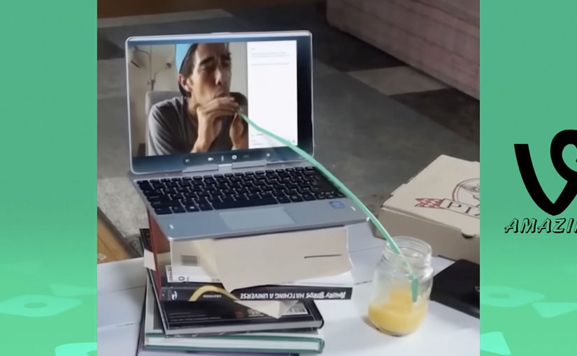
Filmmaker Zach King uses video editing to create six-second Vine clips that give the viewer the illusion of real magic. The charm is that the “trick” feels physical. Someone walks through a door that should not exist. Objects swap places mid-motion. Reality behaves like it has a hidden shortcut.

Here is a Vine compilation of some of Zach’s most mind-bending videos.

How the “magic” works

The mechanism is not supernatural, it is editorial craft. Most of these illusions rely on precise cut points, clean match movement, and staging that hides the seam. Here, the seam is the hidden join between two shots that the edit tries to conceal. A hand passes in front of the lens. A body turns. A prop blocks the frame for a split second. Then the edit swaps the world underneath. Because the hidden cut preserves the sense of continuous physical movement, the illusion feels real instead of purely digital.

In short-form social video, attention is measured in seconds, so the craft has to read instantly without explanation.

Why it lands

It works because the viewer gets a complete story in a tiny runtime. Each clip has a setup, a turn, and a payoff that you can replay immediately. The loop is the distribution mechanic. You rewatch to understand, you share to test whether others can spot the seam.

Extractable takeaway: When your format is ultra-short, stop thinking in “content minutes” and start thinking in “repeat value”. Build a moment that rewards a second view, because the second view is where sharing usually happens.

What this teaches about creative constraints

Six seconds is not a limitation, it is a design brief. You cannot waste frames on context, so the idea has to be visual and the reveal has to be unmissable. That forces discipline. One illusion, one beat, one clean exit.

The real question is how to turn a six-second constraint into a visual idea people want to replay and share.

What to steal from Vine-era illusion design

  • Use motion as cover. If something moves across the frame, it can hide a transition.
  • Design the loop. End on a pose or frame that makes the replay feel natural.
  • Keep the rule simple. The best clips can be explained in one sentence, even if the execution is hard.
  • Make the seam the curiosity. Viewers enjoy not knowing, as long as the payoff is satisfying.

A few fast answers before you act

What is a “Vine magic” video in this context?

A six-second clip that feels like real-world magic, but is achieved through precise editing, staging, and hidden transitions.

Why do these clips get replayed so often?

Because the viewer wants to spot the seam. Rewatching is part of the fun, and that behavior increases sharing.

What is the core creative structure behind most of these illusions?

A fast visual setup, a single impossible change, then a clean frame that lands the joke or surprise.

What should brands learn from this format?

Design for repeat value. A short clip that people replay and forward can outperform longer content that gets watched once.

How do you adapt this without copying the style?

Pick one visual transformation that expresses your message, then execute it with a clean transition that viewers instinctively want to replay.

Ikea Social Catalogue

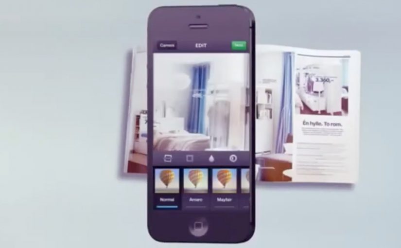
IKEA has been innovating every year with their classic paper catalog. In Norway they decide to take this classic paper catalog and make a social media version of it. With zero budget, they ask their 130,000 Facebook and Instagram fans to post the page of their favourite product on Instagram and add the hashtag #ikeakatalogen, for the chance of winning that product.

How the Social Catalogue works

The mechanic is intentionally lightweight. Here, “mechanic” means the single action IKEA asks for. One public photo of a catalogue page plus one hashtag. IKEA asks fans to pick their favourite item from the catalogue, photograph the page, and post it publicly so the product becomes discoverable through personal networks. Over time, more and more items get documented and shared by real people, effectively recreating the catalogue as a social feed.

In retail and consumer brands with large owned distribution like catalogues, the cheapest growth loops come from turning existing browsing moments into public signals.

The real question is whether your owned channel can become a prompt people want to publicly share, instead of a one-way broadcast they only consume.

Why print is the trigger, not the limitation

Most brands treat print as a one-way broadcast. Here, print is the starting gun. The physical catalogue becomes the prompt that drives people online, and the content that fuels sharing is already in consumers’ hands. Print is not the limitation. It is the trigger when you design the handoff into social indexing.

Extractable takeaway: If you can turn an owned, offline touchpoint into a simple public posting behaviour, you get both social proof and a self-building product index without paying for equivalent distribution.

The growth loop is built into social behaviour

The “social” part is not a slogan. It is distribution mechanics. The hashtag makes individual posts browsable beyond the poster’s own network, so every new post increases discoverability for the next one. When someone posts their chosen page, their network sees it. That drives curiosity, repeats the behaviour, and compounds reach without buying equivalent media.

What to steal

  • Use an owned asset as the trigger. The catalogue is already shipped. The campaign rides that distribution.
  • Make participation effortless. One photo and one hashtag, then you are in.
  • Let the audience do the indexing. Fans effectively organise and surface products through what they choose to share.
  • Reward desire, not trivia. The prize is the exact thing the person already wants.

A few fast answers before you act

What is the IKEA Social Catalogue?

A campaign that turns the printed IKEA catalogue into a social feed by asking people to photograph and share their favourite pages with #ikeakatalogen for a chance to win the featured product.

What is the core behaviour it uses?

People naturally share things they want. The campaign turns that impulse into distribution and product discovery.

What does the hashtag do in this mechanic?

It collects individual posts into one browsable stream, so products stay discoverable beyond the original poster’s friends and followers.

Why is this effective for retail?

Because it turns product browsing into social proof, and social proof into incremental reach, without asking people to learn a new behaviour.

What is the simplest version to replicate?

Pick one existing owned channel, define one shareable action, and reward the exact item the person publicly chooses.