
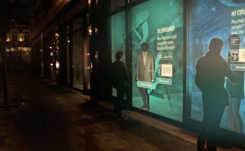
The Adaptive Storefront: BLE Retail Display

Shop windows, billboards, bus stops, and car showrooms do not have to be passive experiences. In the video below, a prototype interactive digital display adapts to whoever stands in front of it.

The display identifies shoppers using Bluetooth Low Energy (BLE) and reacts to personal data stored on the shopper’s mobile device, such as shopping habits and preferences. Shoppers can swipe through personalised content, place items in a virtual shopping cart, and purchase straight from the display.

When glass turns into a shoppable interface

This “adaptive storefront” concept takes a familiar retail surface and makes it behave like a storefront UI. Here, “adaptive storefront” means the window can recognise a nearby device via BLE and change what it shows based on data available on that device. Not a poster. Not a looped video. A live interface that changes per person and lets you complete an action while you are still in that high-intent moment of attention.

How the prototype behaves in front of a shopper

  • Detect. BLE proximity is used to recognise that a specific shopper is present.
  • Adapt. The display adjusts what it shows based on data available on the shopper’s phone.
  • Let the shopper drive. Swiping changes what is on screen, rather than forcing a fixed sequence.
  • Close the loop. Items can be added to a cart and purchased directly from the display.

In physical retail environments, the storefront is the first high-attention interface a brand controls before a shopper reaches the shelf.

Why it lands

Because the display can recognise a nearby device and accept input on the surface, it compresses discovery, consideration, and purchase into one interaction. The value is not the novelty of a “smart window”. It is the reduction of steps between interest and action, while the shopper’s intent is still fresh. The real question is whether you can do that with clear permission and control, not silent personalisation.

Extractable takeaway: A surface becomes valuable when it combines context with immediate action. Personalisation only earns its keep when it removes friction and helps a shopper decide faster, not when it merely looks clever.

What it is really trying to unlock for brands

Behind the demo is a clear ambition. Turn high-footfall surfaces into conversion surfaces. If the experience is permissioned and useful, it can bridge the gap between physical browsing and digital checkout without forcing a shopper to open an app, search, and start over.

That also hints at a measurement upgrade. A storefront that can be interacted with can be instrumented. What people swipe. What they ignore. What they add. Where they drop. That is a very different feedback loop than counting impressions.

Practical takeaways for adaptive storefronts

  • Start with one job-to-be-done. For example, “help me shortlist”, “show me what is in stock”, or “let me buy in two taps”.
  • Make control obvious. If swiping is the interaction, design the UI so people understand it in one second.
  • Keep data minimal and on-device. Use only what is needed to improve relevance, and avoid making the experience feel intrusive.
  • Design for the environment. Glare, distance, dwell time, and group behaviour change everything compared to mobile UX.
  • Plan the opt-in moment. The experience works best when the shopper understands why the screen adapts and what they get in return.

A few fast answers before you act

What is an “adaptive storefront” in plain terms?

It is a storefront display that changes what it shows based on who is standing in front of it, and lets the shopper interact and buy directly on the surface.

Why use BLE for this type of experience?

BLE enables low-power proximity detection, so a display can recognise a nearby device and trigger the right experience without requiring scanning a code each time.

What data is needed to personalise the display?

Only enough to improve relevance. For example, stated preferences, browsing history, or saved items, ideally kept on the shopper’s phone and shared with clear permission.

What makes this feel useful instead of creepy?

Permission, transparency, and value. The shopper should understand what is happening, control it, and get something meaningfully better than a generic screen.

What should you measure in a pilot?

Opt-in rate, interaction rate, add-to-cart rate, conversion rate, and whether the experience reduces time-to-decision without increasing drop-off.

Absolut: Unique Access via WhatsApp

In October, Klik (a chocolate snack) was billed here as the first brand to use WhatsApp to increase brand engagement amongst its teen audience.

Now a month later, ABSOLUT Vodka in Argentina uses WhatsApp as well, this time to invite people to an exclusive launch party. To build awareness and engagement in Buenos Aires, Absolut creates “Sven the doorman”. Interested people have to contact Sven via WhatsApp and convince him to grant access. Since he is not easy to convince, people get creative fast.

Sven is the mechanic

The mechanism is conversational gating. Conversational gating means access is unlocked only through a back-and-forth chat, not a form or link. A single contact on WhatsApp becomes a bouncer, and the brand turns the usual “enter to win” pattern into a negotiation. You are not filling a form. You are performing for a personality, in the channel where you already talk to friends.

In mobile-first urban markets, messaging apps like WhatsApp are a natural place for brands to run direct, high-attention interactions without building a separate destination.

Why this format spreads

It packages exclusivity into a simple game loop. The real question is whether you want people to feel like they earned access, or like they completed a funnel step. Ask. Get rejected. Try again. Escalate creativity. That loop is inherently shareable because it produces artifacts people can screenshot, forward, and remix. This format is a better bet when you want depth of participation and talk value, not maximum reach. Reported campaign write-ups describe hundreds of participants and a flood of user-made messages, which is exactly what you want when the goal is buzz rather than reach alone.

Extractable takeaway: If you want engagement that feels earned, design a human-scale gate with a clear personality and a strict rule. Then let people “pay” with creativity, not clicks.

What to steal for your own messaging plays

  • Make scarcity real. The smaller the prize pool, the more believable the doorman becomes.
  • Turn the brand into a character. Sven is not a hotline. He is a role people can play against.
  • Reward effort, not volume. You want fewer, better attempts, not spammy persistence.
  • Design the rejection lines. The “no” is half the entertainment. Script it so it invites a better next try.
  • Build for screenshots. Assume the conversation will leave WhatsApp. Make it legible outside the app.

A few fast answers before you act

What is the core idea behind “Sven the doorman”?

A brand persona acts as a gatekeeper on WhatsApp. People must persuade him to unlock access to an exclusive event, which converts invitations into a creative challenge.

Why use WhatsApp instead of a landing page?

Because it removes friction. The interaction starts inside an everyday messaging habit, and the conversational format makes participation feel personal rather than transactional.

What makes this approach risky?

It can backfire if the “doorman” feels unfair, creepy, or inconsistent. The rules must be clear, and the tone must fit the audience.

What is the simplest version a brand can run today?

Use one WhatsApp contact, one character, and one strict rule to unlock a limited reward. Keep the conversation short, and make the “no” entertaining enough that people want to try again.

How do you keep the “doorman” from becoming spammy or exhausting?

Set a tight interaction window, cap repeated attempts, and use rejection lines that steer people toward better next tries instead of inviting endless back-and-forth.

Honda CR-V: An Impossible Made Possible

When “no CGI” becomes the flex

Optical illusions and jaw-clenching stunts (Volvo Trucks) instead of computer animation are becoming the norm.

Honda’s latest European commercial for the CR-V 1.6 i-DTEC Diesel keeps that trend going. It uses well-placed props and carefully drawn imagery to trick you into seeing the impossible. Describing it in detail gives too much away, so it is better to watch the optical illusions directly.

The mechanic: perspective tricks that stay readable on camera

The spot plays with perspective, scale, and line-of-sight to make everyday spaces behave in ways they should not. The car seems to float, shrink, or move through geometry that your brain struggles to reconcile, precisely because the scene is constructed to be “correct” from the camera’s viewpoint. That matters because a camera-perfect illusion feels physically plausible, so viewers give the stunt more credit than they would give obvious digital trickery.

In European automotive marketing, practical illusion work is a fast way to signal engineering credibility while still delivering spectacle. By practical illusion work here, I mean physical sets, props, and camera-controlled perspective rather than digital effects.

Why it lands

It rewards attention. You cannot half-watch it, because your brain keeps trying to solve the image. That creates replay value, and replay value is a quiet superpower for car advertising, where most spots blur into the same driving shots and the same claims.

Extractable takeaway: If your message is “this performs beyond what you expect,” use a visual system that makes viewers test their own assumptions, then let the craft do the convincing.

The real question is whether the illusion makes the car feel more impressive, not just the ad more clever.

Honda gets that balance right here because the illusion sharpens the product story instead of distracting from it.

What to borrow from illusion-led car storytelling

  • Make one camera angle the truth. Illusions work when the viewing position is controlled and the payoff is immediate.
  • Use mystery as a feature. A little confusion buys you replays, and replays buy you recall.
  • Keep the brand role simple. The product should move through the illusion, not compete with it.
  • Protect the reveal. If explanation kills the effect, build your copy to point, not to decode.

A few fast answers before you act

What is “An Impossible Made Possible” for Honda CR-V?

It is a European TV spot for the CR-V 1.6 i-DTEC Diesel that uses practical optical illusions, props, and perspective tricks to make the car appear to do impossible things.

What is the core creative mechanic?

Forced perspective and camera-aligned set construction. The scene is built so the illusion reads as “real” from the viewer’s point of view.

Why avoid heavy CGI in this kind of execution?

Practical illusions feel earned. Viewers sense there is a real setup behind the shot, which increases credibility and replay value.

What makes illusion-led ads more memorable?

They trigger a “solve it” response. People replay to understand what they saw, and that repetition drives recall.

What is the most transferable lesson for brands?

Use craft to create viewer doubt, then resolve it with a clean product moment. Confusion first. Clarity second.