Star Wars is a marketing phenomenon every brand wants to be part of. Disney signed up seven brands for what it described as an expansive promotional campaign. The brands included Covergirl, Max Factor, Duracell, FCA US, General Mills, HP, Subway and Verizon, each developing custom work for Star Wars: The Force Awakens.
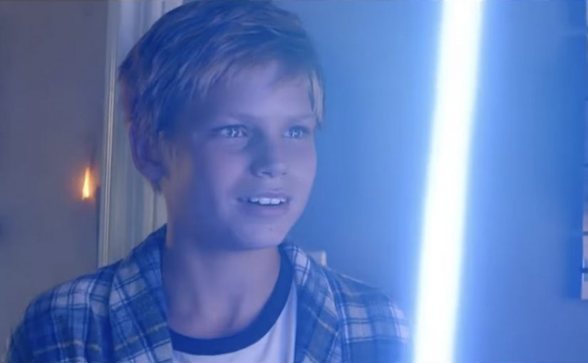
Since Star Wars is the biggest and most talked about event of 2015, this makes a fitting last post of the year for Ramble. Here is a Duracell Star Wars TV ad that is described as having already generated over 15 million views on YouTube.
How the partner machine works
The mechanism is straightforward. A tentpole film recruits a small set of major brands, then those brands translate the movie into retail moments, household rituals, and repeatable creative formats that can run for weeks. A “tentpole” film is the flagship release that carries the biggest marketing push.
In global blockbuster launches, promotional partner programs scale a single release into many consumer touchpoints before opening weekend.
The real question is whether your brand has a native job in the franchise moment, or whether you are just renting attention.
Why the Duracell idea fits the moment
Duracell chooses a natural bridge. Star Wars lives in toys, imagination, and living-room play. Batteries are the invisible enabler of that play, which is why the brand does not need to borrow the story world awkwardly. It simply powers it. This is the right kind of franchise tie-in.
Extractable takeaway: When you attach to a cultural franchise, pick the most “native” role you can own in the experience, then dramatise that role in a scene people recognise from real life.
What to steal from this kind of film tie-in
- Start from a product truth. The partnership works when the brand’s role is unavoidable, not decorative.
- Anchor in a ritual. Christmas morning is a ready-made attention moment that does the distribution work for you.
- Use the franchise as a texture. The brand still needs its own reason to exist inside the story.
- Keep the message simple. One benefit, one scene, one emotional beat is enough in a seasonal spot.
A few fast answers before you act
What is this Duracell Star Wars spot doing in one sentence?
It uses Star Wars as a backdrop to make a simple point. Duracell powers the toys and imagination that fuel Christmas-morning play.
Why do big films recruit promotional partners?
Partners add reach, retail presence, and repeated reminders across categories, extending awareness beyond trailers and cinema media.
What makes a franchise tie-in feel authentic?
The brand has a clear, credible job in the experience, and the creative shows that job rather than forcing a logo into the story.
What is the main risk with “everyone wants in” moments?
Generic sameness. If the brand role is not distinct, the work becomes interchangeable and the franchise overshadows the message.
What should you measure beyond views?
Brand recall linked to the benefit, retail lift in the seasonal window, and whether the partnership creates a repeatable platform for future campaigns.