James Ready: Billboard coupon savings

James Ready: Billboard coupon savings

James Ready beer and Leo Burnett Toronto are back with another campaign built around the same consumer truth. People want to afford more beer.

To help, James Ready introduced “billboard coupons,” a way to save money on life necessities like food, dry cleaning, and grooming. The idea is simple. If you save money elsewhere, you have more money left for beer.

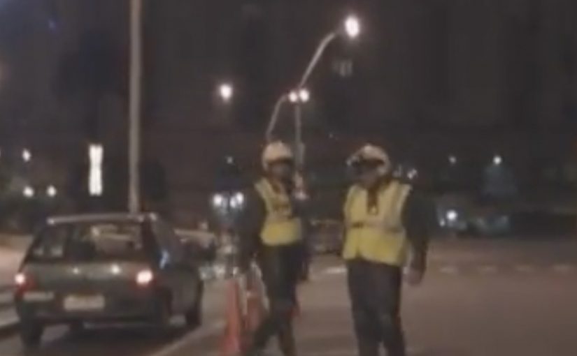
By partnering with local retailers, the program lets people take a picture of a billboard and show the photo at the corresponding retailer to receive savings on selected products and services.

A billboard that behaves like a coupon book

This flips the billboard role. Instead of being pure awareness, it becomes a utility object you can “carry” with you via a phone photo. That change matters because it extends the life of the message beyond the moment you drive past it.

Extractable takeaway: The best OOH-led promotions create a portable proof-of-value, meaning a saved artifact the customer can show later to claim the benefit. If the audience can store it in their camera roll, the media becomes a tool, not just a reminder.

The mechanism: proof without printing

Traditionally, coupon programs rely on physical handouts or codes people forget. This uses a behaviour people already do without thinking. Photograph something. The photo becomes the redemption token.

The real question is whether your promotion can turn a photo into proof without adding steps.

The retailer partnership layer is what turns it from gimmick to program. It gives the billboard a reason to exist in specific neighbourhoods and creates a story local businesses can also talk about.

In promotion-heavy categories, photo-as-proof mechanics scale because they turn an everyday phone habit into redemption.

Why it works for a beer brand

James Ready positions itself around everyday value and a slightly cheeky, practical tone. Saving on dry cleaning and food is not glamorous, but that is the point. It makes the brand feel like it is on the consumer’s side.

There is also a subtle psychological move here. The “more beer money” framing makes saving feel like a win, not a sacrifice.

Mechanics to copy from billboard coupons

  • Use a universal behaviour as the trigger. Photos, texts, taps. Avoid anything that needs training.
  • Make redemption low-friction. “Show the photo” is simpler than entering codes or printing.
  • Partner for legitimacy. Retail partners turn a brand stunt into a usable savings program.
  • Design for memory. A billboard must communicate the entire mechanic in seconds.
  • Keep the value proposition honest. Small, real savings beat big, unbelievable promises.

A few fast answers before you act

What are “billboard coupons” in this James Ready campaign?

They are offers displayed on billboards that people photograph on their phones and then redeem by showing the photo at participating local retailers.

Why use photos instead of QR codes or SMS?

Because it reduces friction and works with basic phones and habits. Taking a photo is fast, familiar, and the image becomes a simple proof token.

What makes this more than a one-off stunt?

The retailer partnership network. When multiple local businesses honour the offers, the campaign becomes an ongoing utility rather than a single execution.

What is the biggest risk operationally?

Inconsistent redemption. If staff are not trained or offers are unclear, customers feel embarrassed and the brand takes the blame. Execution discipline matters.

How could a brand adapt this pattern today?

Keep the “portable proof” principle, but use a clearer redemption mechanism where appropriate. A scannable image or an in-wallet pass can preserve simplicity while improving tracking.

Erdinger: Drinking and Driving, the 0% Twist

Erdinger: Drinking and Driving, the 0% Twist

A car rolls through the city. A police stop follows. The officers lean in, looking for the usual “roadside donation” and the driver plays along, calmly offering a beer.

Then comes the punchline. The beer is positioned as 0% alcohol, so the “gotcha” is not that the driver outsmarts the law, it is that the product truth flips the entire situation into a clean reveal.

The prank is the plot, the product truth is the twist

This is staged like a short documentary. A mockumentary, meaning it borrows the signals of documentary realism to make a scripted idea feel “found” instead of “made.” The setting is described as a downtown South American city where traffic stops double as bribe fishing.

In consumer marketing, the fastest path to shareable attention is often a single product truth turned into a public situation people can retell.

How it works: build tension, then release it safely

The mechanism is simple and replicable:

  • High-stakes setup: alcohol control and a police stop.
  • Social friction: the uncomfortable “what will they do” moment.
  • Unexpected compliance: the product is positioned as 0%, so the driver is not “escaping,” he is “within the rules.”
  • Clean release: viewers get to laugh without carrying guilt, because the punchline is anchored in the product claim, not reckless behavior.

In regulated categories and global consumer marketing, this kind of “responsible twist” lets you stage tension without training the audience to celebrate harm.

The real question is whether your product truth can carry the punchline without turning the audience into accomplices.

Why it spreads: it gives viewers a story, not a slogan

People do not forward “great taste” claims. They forward a scene they can summarize in one line. “These guys offer beer at a breath test, and it is fine because it is 0%.” That is the whole viral unit. It also lands because the audience recognizes the broader trope of roadside authority and awkward power, then the brand resolves it with a disarming, responsible reframing.

Extractable takeaway: Build the retell first, then design the twist so it resolves on a defensible truth that gives the audience a guilt-free reason to share.

What the brand is really selling

The visible message is “0% alcohol.” The deeper intent is permission. This is the right move because it makes responsibility the payoff, not a disclaimer.

It positions the beer as a choice that fits social moments where you want the ritual, not the alcohol.

That matters because “non-alcoholic” is not only a functional attribute. It is a situational benefit: it lets the product show up in contexts where a normal beer is a bad idea.

Steal the 0% twist structure

  • Start from a product truth that can survive scrutiny, not a vague brand value.
  • Choose a situation with instant stakes so the first five seconds do the work.
  • Design a moral “safe landing” where the audience can enjoy the twist without endorsing harm.
  • Make the retell obvious by ensuring the story fits in one sentence.

A few fast answers before you act

Is this encouraging drunk driving?

No. The joke is engineered to resolve on “0% alcohol,” so the brand can claim compliance rather than celebrate recklessness.

What is the core creative mechanic here?

It converts a product attribute into a plot device. The “0%” is not a line at the end, it is the hinge that changes what the scene means.

Why does the documentary style matter?

Mock-documentary cues create believability quickly. Viewers process it as “something that happened,” which increases watch-through and sharing.

What makes the idea portable to other categories?

The structure is generic: tension, social friction, twist, relief. Any brand with a defensible “safety” or “permission” truth can map onto that arc.

What is the biggest risk when copying this approach?

If the “safe landing” is weak, the audience reads it as promoting harmful behavior. The twist must clearly reframe the situation as responsible, not as a workaround.

Bud Light: Clothing Drive

Bud Light: Clothing Drive

A simple gag, executed cleanly

A Bud Light ad credited to DDB USA plays as a pure setup-and-payoff joke. It does not over-explain itself. It just commits to the visual premise and lets timing do the work.

How the “clothing drive” trick works

The spot relies on controlled misdirection. Here, controlled misdirection means giving viewers just enough information to make the wrong prediction before the reveal corrects it. It establishes a familiar situation, encourages the viewer to predict what happens next, then flips that expectation with one sharp visual turn. The humor lands because the logic is coherent after the fact, even if you did not see it coming.

In mass-reach FMCG advertising, tight visual gags are a dependable way to earn attention without asking for extra cognitive effort.

The real question is whether the viewer gets the joke in a single beat and remembers the brand at the same time. For broad-reach comedy, restraint is the right call: one clean reversal beats extra explanation.

Why it lands

The joke is readable on mute, which makes it travel. The premise is also self-contained, so viewers can share it without needing context or explanation. When a brand already owns “easy-going fun,” this kind of execution reinforces that identity without resorting to slogans.

Extractable takeaway: If you want broad shareability, build a gag that is visually legible, hinges on one clear reversal, and resolves fast enough that people will replay it immediately.

Steal the visual-gag discipline

  • Make the setup ordinary. Normal scenes make the twist feel bigger.
  • Let the camera be the narrator. Clean framing and timing beat extra dialogue.
  • Optimize for mute viewing. If the joke works without audio, it works in feeds.
  • End on the cleanest frame. The final beat should be the one people remember and reshare.

A few fast answers before you act

What is Bud Light’s “Clothing Drive” ad?

It is a short comedic spot built around a “clothing drive” visual premise, using misdirection and a quick reveal to land the punchline.

What is the core creative mechanic?

Expectation management. A familiar setup invites a predictable outcome, then one visual reversal delivers the joke.

Why does mute readability matter here?

It makes the ad work in feeds, social clips, and distracted viewing environments where audio may be off but the visual payoff still has to land instantly.

Why are visual gags effective for beer brands?

They match the social, low-friction viewing context. Bars, parties, and feeds reward jokes that land quickly without explanation.

What’s the most transferable lesson for marketers?

Design the payoff so it is instantly understandable, even with no sound, and keep the entire arc short enough to trigger an immediate replay.