Three student concepts that show their thinking in one move
This year Miami Ad School has produced a run of strong conceptual projects from current students. Here are three that stand out because each one has a clear mechanic and a crisp “why this brand” fit. Here, the mechanic means the one user action and system response that make the concept work.
What makes these concepts travel
Each idea takes a familiar behavior. Choosing food, correcting spelling, inviting friends. Then it adds a single interaction rule that turns the behavior into a branded moment. It is not “advertising about a thing”. It is an experience that demonstrates the thing.
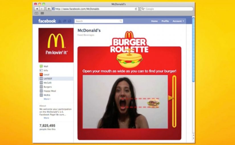
McDonald’s Burger Roulette App
This student concept is designed as a Facebook app that helps you find the “perfect” McDonald’s burger for your mouth. The premise is playful decision support. You answer a few prompts, the system narrows your choice, and the brand becomes the helpful guide instead of a menu you skim and forget.
UNICEF Donate A Word
This student concept proposes a new way to donate for child education by using the spelling feature inside Google Chrome. When a misspelled word is flagged, the prompt becomes a donation trigger, turning a small everyday friction into a small everyday contribution.
In portfolio-driven creative education, concepts like these matter because they show whether a student can turn brand strategy into a usable interaction, not just a line of copy.
Heineken Invite
This student concept uses a social-media-connected bottle opener that invites friends over for a beer. The social mechanic is competitive. Whoever has the most friends attending earns a free case of Heineken, turning “opening a beer” into an invitation ritual and a reason to gather.
Why it lands
All three ideas share the same advantage. They make the brand useful inside a moment people already have, rather than interrupting people to talk about the brand. The mechanic is the message, and the interaction is simple enough that you can explain it in one sentence without killing the effect. That works because a visible rule lets people grasp the idea instantly and connect the payoff to the brand.
Extractable takeaway: Build concepts around one native behavior and one immediate response. If the “rule” is explainable in a sentence and demonstrable in a clip, the idea will be remembered, and repeated.
The real question is whether the interaction makes the brand promise visible without extra explanation. The strongest student concepts are the ones where the interaction itself carries the branding work.
What brand builders can take from these student concepts
- One behavior, one rule. Keep the mechanic tight. Complexity kills concept believability.
- Make the brand the enabler. The best student concepts position the brand as the thing that makes the moment better, not the logo that arrives at the end.
- Design for quick demonstration. If you cannot show it in 10 seconds, it will not spread beyond the pitch.
- Payoff matters. Personal recommendation, effortless giving, or a social reward. The user needs a reason to do the action.
A few fast answers before you act
What is the common pattern across these three concepts?
Each turns a familiar action into a branded interaction rule with an immediate payoff, making the experience feel like proof rather than promotion.
Why are student concepts often framed around apps or gadgets?
Because interfaces make mechanics visible. You can show input, response, and reward quickly, which makes the idea easy to understand and easy to share.
What makes a concept like “Donate a Word” compelling?
It piggybacks on an existing habit and converts a tiny, repeated behavior into a tiny, repeated donation moment, which feels effortless and scalable.
What is the main risk when brands try to build ideas like this for real?
Friction. If the mechanic is not instant and obvious, people will not complete it in the real world, even if it looks great in a concept film.
What’s the single best takeaway for marketers reviewing student work?
Look for concepts where the mechanic expresses the brand promise without extra explanation. If the interaction itself makes the point, the idea is strong.