Bar Aurora & Boteco Ferraz: $73,000 Bar Tab

At Bar Aurora and Boteco Ferraz, the bar tab can land like a punch. A normal night out suddenly totals $73,000.

The number is deliberately absurd. Instead of “just” charging for drinks, the receipt is designed to confront patrons with the kinds of costs that a drunk-driving crash can trigger, described as an itemized ledger of consequences rather than a generic warning.

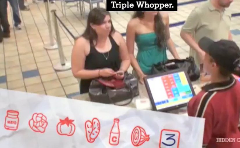
Ogilvy Brasil (São Paulo) ties the message to the moment that matters most. Right after the drinking. Right before the decision to drive.

A receipt that speaks at the exact decision point

The mechanism is simple and brutal. Take a familiar ritual, the bar tab, and turn it into a personalized “cost statement” that patrons cannot ignore because it arrives inside a context they trust and understand. It works because the receipt arrives as a trusted artifact at the exact moment the choice is being made.

That timing does most of the work. The message is not competing with the rest of the day’s noise. It shows up when someone is already weighing options like “I’m fine” versus “I should take a taxi.”

In public-interest and brand-led behavior-change work, point-of-decision interventions outperform broad awareness because they collide with behavior, not intentions.

Here, a point-of-decision intervention is a prompt delivered at the moment someone is deciding what to do next.

The real question is whether you can make the consequence feel immediate enough to change the drive-or-taxi decision.

Why the anger matters more than the poster

People get annoyed because the interruption feels personal. That emotion spike is useful. It snaps the brain out of autopilot, forces a re-check, and reframes the “big deal” as a concrete, financial, immediate-looking problem.

Extractable takeaway: If the risky behavior feels like a small, private choice, make the consequence feel like a concrete, personal ledger entry that appears at the decision point. Reduce abstract harm into a format the audience already treats as “real.”

Done well, this does not need moralizing language. The receipt format does the persuasion quietly. It turns “don’t do this” into “here is what this can cost you, in a language you already understand.”

What the bar gets out of it

This is cause work that also behaves like brand building. It positions the venue as the place that looks after customers beyond the last drink, and it gives staff a socially acceptable reason to start a safer-ride conversation without sounding preachy.

It also travels. The idea is easy to retell, easy to film, and built for word-of-mouth because the “$73,000” moment is inherently shareable.

Patterns to reuse from the $73,000 tab

  • Move the consequence into the present tense. Don’t explain risk. Render it.
  • Use a trusted artifact. Receipts, tickets, confirmations, packaging, dashboards. Anything the audience already believes.
  • Interrupt without humiliating. Aim for friction and reflection, not public shaming.
  • Design for the handoff. The moment should naturally lead to a safer alternative (taxi, ride-share, designated driver) without needing a speech.

A few fast answers before you act

What is the “$73,000 Bar Tab” idea?

It is an anti drink-driving activation where patrons receive a dramatically inflated bar tab that reframes a “small” choice as a high-cost outcome, using the receipt format to make the warning feel concrete.

Why use a bar tab instead of a standard awareness ad?

A bar tab arrives at the point of decision, when a person is actively choosing what to do next. That timing creates immediate relevance and forces the brain out of autopilot in a way a poster rarely can.

What is the key mechanism that makes it persuasive?

Format plus timing. The message is delivered inside a familiar, trusted artifact, at the exact moment the audience is weighing whether they are “okay to drive.”

How can brands adapt this pattern without backlash?

Keep the intervention private, keep the tone factual, and pair it with an obvious safer alternative. The goal is reflection and route change, not punishment.

What should the moment lead to immediately?

Build in an easy handoff to the safer choice, so the “pause” turns into action, like taking a taxi, using ride-share, or calling a designated driver.

Burger King: Whopperface

Proof marketing at the counter, not in a tagline

In fast-food marketing, “fresh” claims are easy to say and hard to believe. Proof marketing means giving customers evidence at the point of purchase, not just a promise. Burger King’s Whopperface is a clean example of turning a claim into visible proof inside the restaurant.

One cashier, one hidden cam, one printer. That is all Ogilvy Brasil needed to prove that Burger King sandwiches are made to order.

When a customer ordered a Whopper, they took a picture without anyone noticing. Then the customer got their freshly made sandwich with their face on it. Burger King proved that each sandwich is unique and made to order for each customer.

How Whopperface created “made to order” evidence

The mechanism is simple. Capture identity at the moment of order, then attach it to the product that comes out of the kitchen.

The hidden camera took the photo. The printer produced the personalized output. The handoff at the counter delivered the proof. The customer did not just hear “we make it fresh”. They received a physical, personalized marker that could only exist if the sandwich was made for them in that moment. Because the print is generated after the order, it converts timing into evidence, which short-circuits the usual “was this pre-made?” doubt.

Why it lands psychologically

In quick-service restaurants, the counter is the trust bottleneck for freshness. People trust what they can verify. Whopperface works because it lets the customer verify “made to order” with a marker tied to their identity.

Extractable takeaway: When skepticism is the barrier, attach a unique, customer-linked artifact to the output so the claim becomes self-evident at the moment of truth.

A customized face print is not a vague reassurance. It is a unique token. It signals individual attention and removes doubt about whether the item was pre-made. It also triggers a social instinct: if you receive something with your identity on it, you are more likely to show it, talk about it, and remember it.

The business intent behind the stunt

The intent was to rebuild credibility around freshness and ordering, using retail experience as the media channel.

The real question is whether your brand can turn its most fragile claim into something customers can verify in the moment.

Instead of spending budget repeating a claim, Burger King invested in a moment that created both belief and shareable content. The proof lived in the customer’s hands, and the story traveled naturally from there.

If trust is the issue, spend on proof at the counter before you spend on more media.

Proof patterns to borrow from Whopperface

  • Turn claims into artifacts. If you want belief, create something physical that acts as evidence.
  • Place proof at the point of truth. The point of truth is the exact moment and place the customer decides whether to believe you.
  • Use personalization as verification. Identity markers make “made for you” tangible.
  • Keep the system minimal. Simple setups scale. One camera, one printer, one process.

A few fast answers before you act

What was Burger King’s Whopperface?

A retail stunt where customers received their freshly made sandwich with their face printed on it, proving the order was unique and made specifically for them.

What was the core mechanism?

A hidden camera captured the customer at order time, and a printer produced a personalized output that was attached to the fresh sandwich at handoff.

Why does this prove “made to order” better than a claim?

Because it creates a unique, verifiable artifact that can only exist if the sandwich was produced for that specific customer in that specific moment.

What business goal did it support?

Increasing trust in freshness and differentiation by turning the restaurant experience into proof and shareable content.

What is the main takeaway for other brands?

If trust is the barrier, design a simple proof mechanism that customers can see, hold, and share.

Dream Job Brasil: Massage Therapist

A “dream job” ad that sells the fantasy

This film plays like a cheeky career pitch. It takes a role most people file under “practical” and frames it as wildly aspirational, using humor and a little provocation to make the point stick.

The mechanism: flip reality into wish-fulfillment

The creative move is simple. Here, wish-fulfillment means turning an ordinary role into an exaggerated fantasy of status and reward. Instead of listing benefits or talking about training, it dramatizes the emotional payoff of the job by pushing a familiar workplace dynamic to an exaggerated extreme.

This works because it turns a functional job claim into an instantly felt reward.

In mass-market recruitment advertising, a single, culturally legible exaggeration can make a role feel desirable faster than a rational list of pay, stability, or prospects.

Why this lands as a shareable job ad

It compresses the pitch into one punchline. You do not need context, brand knowledge, or even language fluency to get the joke, which is why this format travels well beyond its media buy. The real question is whether the audience can feel the upside of the role before they have time to analyse it. This is the right strategy when a job category needs desire more than explanation.

Extractable takeaway: If you want a recruitment message to spread, lead with an instantly readable scenario that dramatizes the emotional upside. Then let the brand be the quiet enabler, not the lecturer.

What to steal from this recruitment setup

  • Sell the feeling, not the spec. Especially for “everyday” roles, aspiration is often emotional, not informational.
  • Commit to one clear gag. One idea people can retell beats five benefits they will forget.
  • Make it understandable on mute. The best sharable spots still work through visuals and pacing alone.
  • Keep the brand role clean. The ad should feel like a story first, and a message second.

A few fast answers before you act

What is this film trying to achieve?

It makes a job-search brand’s promise tangible by portraying a role as a “dream job” through an exaggerated, comedic scenario.

Why use humor instead of a rational pitch?

Because humor is a memory shortcut. It creates instant comprehension, higher share intent, and faster recall than a feature list.

What is the core creative technique here?

Role and expectation reversal. The ad takes a familiar situation, flips power and desire, then rides that contrast for impact.

When does this approach work best?

It works best when the audience already understands the job category and the brand needs attention and consideration more than explanation.

Why does this format travel beyond its media buy?

Because the joke is readable at a glance. When the emotional upside is obvious without much setup, the idea becomes easy to remember, share, and retell.