A road trip, chosen by your favorite song
Tell Jeep your favorite song and their app will tell you where to drive. Jeep Spain and Leo Burnett Iberia come up with an online campaign called “Drive Your Track”.
At www.driveyourtrack.com users are asked to upload their favorite song to discover where their music could take them.
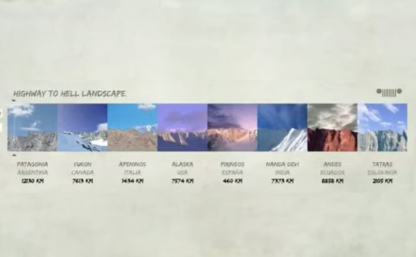
How Drive Your Track works
The mechanic is simple and slightly magical. The site reads the shapes of the uploaded track’s sound waves, then matches those shapes to landscape imagery that “looks like” the waveform. With an extra click, users can also discover the route to reach the destination.
In automotive brand building, turning an abstract promise like “freedom” into a playful self-portrait tool helps make exploration feel personally earned. Here, that means the user’s own taste shapes the result, so the experience feels like a reflection rather than a recommendation.
Why it lands
It replaces the usual car-site decision tree with a personal input that people already care about. Their music taste. That shifts the interaction from “find a feature” to “discover a place”, and it gives people a reason to share because the output feels like a quirky reflection of them, not an ad.
Extractable takeaway: If you want people to explore a brand experience, start from an input they feel ownership over, then return an output that looks unique enough to share without needing an incentive.
What Jeep is really buying
This is a soft test-drive nudge disguised as entertainment. The real question is how to make a brand promise about freedom feel personal before anyone even thinks about a vehicle spec sheet. The campaign gets people to imagine themselves on a specific drive with a specific soundtrack, then offers a route so the fantasy can become a plan. Even if the destination is symbolic, the journey cue is real, and that is the brand territory Jeep wants to occupy.
What to steal from Drive Your Track
- Make the first step emotional, not technical. “Upload a song” beats “choose terrain type”.
- Turn data into a story artifact. Waveforms become landscapes, so the output is visual and memorable.
- Give a clear next action. A route option converts discovery into intent.
- Design for identity sharing. If the result feels personal, distribution comes naturally.
A few fast answers before you act
What is Jeep’s “Drive Your Track”?
It is an interactive campaign where users upload a favorite song and the experience matches the track’s waveform shapes to landscapes, then offers a route to reach the suggested destination.
What is the core mechanic?
Waveform visualization and pattern matching. Your song’s sound-wave shapes are used to generate a landscape-style destination suggestion.
Why does music work as the input?
Music is identity. When the input feels personal, people stay longer, care more about the output, and are more likely to share it.
What makes this more than a novelty?
The route step. It turns a playful recommendation into a concrete next action that can lead toward an actual drive.
What is the transferable lesson for other brands?
Start with a user-owned input, return a shareable artifact, then offer one clear step that turns curiosity into intent.