NIVEA Creme: Second Skin Project

A mother puts on a headset and a skin-like suit. Her son does the same, thousands of kilometres away. The promise is simple. If they cannot be together for Christmas, technology will let them feel a hug anyway.

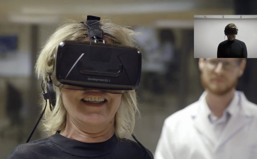
That is the set-up in NIVEA Creme’s “Second Skin Project” with Leo Burnett Madrid. The film introduces Laura in Madrid and her son Pablo, who is away volunteering in Paraguay. They are invited to test a “Second Skin” garment that is presented as a high-tech fabric designed to simulate human skin and transmit the sensation of touch at distance, paired with virtual reality headsets.

The story then pivots. What looks like a tech demo is used to make a point about touch, not technology. The most persuasive moment is not the suit. It is the human reunion that follows, designed to underline NIVEA Creme’s belief that nothing beats skin-to-skin contact.

The “Second Skin” mechanism that pulls you in

The film borrows credibility from advanced-sounding materials and VR. That framing creates anticipation, because the viewer wants to know whether the experiment can actually work. The suit and headset are the narrative engine that earns attention for long enough to land the real message.

In global consumer brands where heritage products compete with endless alternatives, emotional proof often carries more weight than functional claims.

The real question is whether the tech is the story, or whether it is just a credible pretext for the brand to own the value of touch.

The twist that protects the brand meaning

There is a risk with tech-led emotion. The technology can become the hero and the brand becomes a sponsor. This script avoids that by using the tech as a decoy. The reveal shifts the spotlight back to the product truth. A hug is still the best “gift” and NIVEA Creme wants to be associated with that intimacy.

Extractable takeaway: When you borrow a shiny mechanism to earn attention, make the emotional payoff explicitly restate what the brand believes, or the gadget takes the credit.

How to use “purpose + tech” without losing the human truth

  • Use technology as the hook, not the conclusion. Let it earn attention, then pay it off with a human truth.
  • Make the brand stance explicit. Here the stance is clear. Technology can be amazing, but touch matters more.
  • Cast real stakes. Distance, holidays, and family history make the outcome feel earned.
  • Keep the product role emotional, not technical. NIVEA Creme is not “the innovation”. It is the comfort cue that frames the story.

A few fast answers before you act

What is the NIVEA Creme Second Skin Project?

It is a Christmas-season film and experiment setup where a mother and son test a VR-led “Second Skin” suit that is presented as transmitting the feeling of touch at distance, then the story reveals the value of real human contact.

Why does the campaign use VR and a “second skin” suit?

Because it creates a believable question the audience wants answered. Can technology replicate a hug? That curiosity holds attention long enough for the campaign’s real point to land.

What is the core message NIVEA Creme is trying to own?

That skin-to-skin contact matters. The work uses technology to highlight that, even in a world of advanced tools, nothing replaces human touch.

What makes this more than a generic emotional video?

The narrative structure. It starts as a tech experiment, then pivots into a human reunion. That contrast makes the conclusion feel stronger than a straight sentimental story.

What is the biggest risk with “tech-as-story” campaigns?

Audience misattribution. People remember the gadget and forget the brand meaning. The fix is to ensure the emotional payoff clearly belongs to the brand stance, not the device.

Instagram Powered Thread Screen by Forever 21

The F21 Thread Screen is a 2,000 pound machine that uses 6,400 mechanical spools of thread to display Instagrams hashtagged with #F21ThreadScreen. Melding fashion and technology, the Thread Screen is truly beautiful and unique. Hashtag an Instagram of you and your friends and see yourselves in a way unlike anything you’ve seen before…

Why this installation is so compelling

The idea is simple. Post with a hashtag. But the output is unexpected. Instead of a screen showing pixels, you get a physical, mechanical interpretation that feels handcrafted, even though it is powered by a heavy machine.

Extractable takeaway: When a familiar action produces a materially different output, people stop, watch, and share the surprise.

Because the installation turns a normal Instagram post into a moving, thread-based image, the same content earns attention as an in-store spectacle.

  • Digital input, physical output. A social post becomes a tangible display.
  • Participation is effortless. The only requirement is a hashtag, which fits existing behavior.
  • It creates a new kind of “share”. People share twice. First on Instagram. Then again when the installation shows them back in a surprising format.

In retail environments, where foot traffic is finite and attention is fragmented, turning social participation into a physical moment can convert passers-by into participants.

How to reuse the Thread Screen pattern

The real question is how you take a familiar social mechanic and make the payoff feel materially different in the real world.

Retail and fashion brands should not just “display social” in-store. They should translate participation into a physical moment people want to watch and capture.

  • Change the medium of the reward. Keep the action familiar (a hashtag), but make the output unexpected enough to feel handcrafted.
  • Design for dwell time. Here, dwell time means the extra time people stay near the installation to see themselves appear and change.
  • Build in the second share. Give people a reason to post again, because the physical result looks nothing like a normal screen.

A few fast answers before you act

What is the Forever 21 Thread Screen?

It is a large-scale mechanical installation that uses thousands of thread spools to display Instagram posts tagged with #F21ThreadScreen as a physical, moving thread-based image.

How does a visitor participate?

They post an Instagram photo with the hashtag #F21ThreadScreen, which the installation then pulls into the display.

Why is this effective for retail and fashion brands?

It turns social participation into an in-store spectacle, giving people a reason to engage, watch, and share again from the physical experience.

What is the key takeaway?

Do not just “display social”. Transform it. The more unexpected the medium, the more memorable the experience becomes.

Peruvian League Against Cancer: Shadow WiFi

You are on a beach, the sun is out, and your phone wants a signal. Then you notice a large blue structure casting a patch of shade. Step into that shade, and you get free WiFi. Step out into the sun, and the WiFi disappears.

Instead of simply warning people about UV rays, the Peruvian League Against Cancer and Happiness Brussels create “Shadow WiFi”. A directional antenna delivers WiFi only to the shadow area of the structure. A sensor tracks the sun’s movement and rotates the antenna, so as the shadow shifts through the day, the WiFi access shifts with it, and people follow.

The mechanism is the message

The mechanic does not just communicate “stay in the shade”. It enforces it gently. The reward is instantly understood. Connectivity. The rule is equally clear. Shade equals access. Sun equals nothing. The result is prevention education delivered through interactivity, not through guilt. This is the right kind of nudge because it rewards the safer choice instead of lecturing people into it.

The real question is whether you can make the protective choice feel more useful than the risky one in the moment.

In public health behavior-change campaigns, trading immediate utility for safer choices is often more effective than warnings alone.

Why it lands

It targets the real friction. On a beach, the problem is not awareness. It is motivation and habit in the moment. Shadow WiFi turns shade into a social and practical hotspot, so safer behavior feels like the default choice rather than a sacrifice.

Extractable takeaway: If you want people to adopt a protective habit, attach it to a reward they already seek in that environment, and make the “safe zone” tangible, not theoretical.

Guerrilla activation moves worth copying

  • Pay people in utility, not slogans. Free WiFi is a real benefit that beats reminders and posters.
  • Make the rule physical. When the benefit is literally bounded by shade, the behavior is self-explaining.
  • Design for movement. The rotating antenna turns a static installation into a living experience that keeps working all day.
  • Teach inside the experience. Use the login or landing step to deliver prevention guidance while intent is high.

A few fast answers before you act

What is Shadow WiFi in one sentence?

A beach WiFi network that only works in the shade, encouraging people to avoid direct sun exposure while learning about skin cancer prevention.

Why does restricting WiFi to shade change behavior?

Because it makes the safer choice immediately rewarding. People move for a benefit they already want, and the health message rides along.

What is the key technical trick?

A directional antenna limits the WiFi coverage to the shadow zone, and a sun-tracking sensor adjusts the antenna as the shadow moves.

How do you translate this idea without using WiFi?

Keep the same pattern. Put a desired utility behind a clear, physical boundary that represents the safer behavior, so the experience teaches the rule without needing explanation.

What can make this fail?

If the WiFi is unreliable or the shaded area is too small, the utility collapses and the activation becomes a novelty object instead of a habit shaper.