Smart Apps: Audi Start-Stop and Reborn Apps

Here are two mobile apps that recently caught my eye…

Audi Start-Stop App

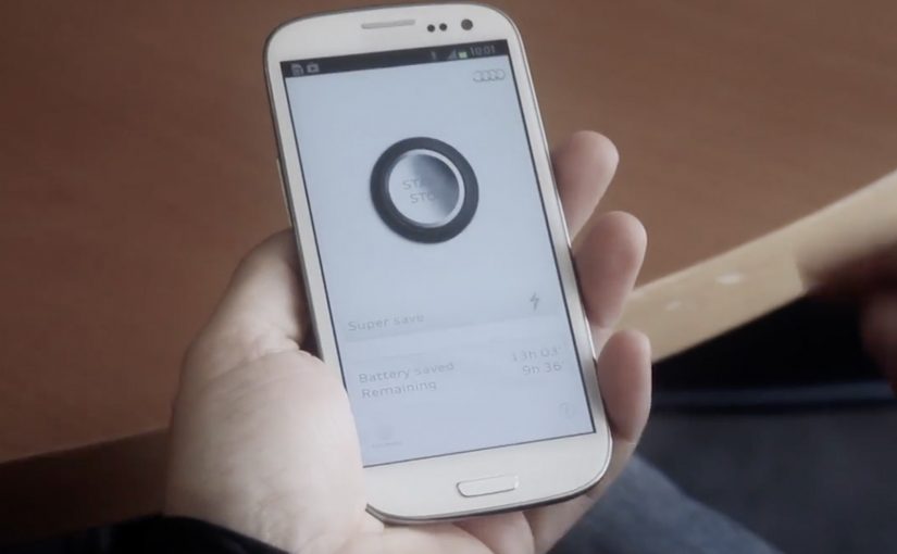
The Audi start-stop system turns off the engine when the car stops at a traffic light and turns it on again when the car starts. Using the same principle, Audi along with DDB Spain creates an Android app that detects which applications have been open longest without being used and sends an alert to the user to close them. Thus saving battery and making the phone a more efficient tool.

Reborn Apps

Many events create their own smartphone apps. But when the event is over, the apps lose their usefulness and are then hardly used. To give these apps a second life, Duval Guillaume gets various Belgium organisations to push out an update which turns their event apps into a registration medium for organ donation.

In European mobile marketing, the strongest brand apps behave like practical utilities first and brand messages second.

The real question is whether your app earns its place by doing one useful thing so well that people choose it again tomorrow.

Brand apps should be judged on repeat usefulness, not on campaign polish.

Why these app ideas work

Both concepts start with a familiar trigger and then make the next best action nearly frictionless, which is why the prompt feels helpful instead of noisy.

Extractable takeaway: Both apps translate a familiar real-world idea into a simple mobile behavior change. One nudges you to close what you are not using. The other repurposes what you already have installed.

  • They solve a real friction. Battery drain and app clutter are everyday pains. Low donor registration is a societal pain.
  • They use a clear trigger. “Unused for long” becomes the reason to act. “Event is over” becomes the reason to update.
  • They keep the action lightweight. A close action or a signup action can happen in seconds.

Two different intents, one shared pattern

The Audi app is a utility story. It borrows a car feature metaphor to make an Android housekeeping task feel purposeful. The Reborn idea is a “mobile for good” story. By “mobile for good,” I mean using everyday mobile touchpoints to drive a public-interest action, not just brand engagement. It turns leftover event attention into a meaningful registration moment, without asking people to download something new.

Patterns to borrow for brand apps

  • Start from a known behavior. People already ignore background apps. People already keep old event apps installed.
  • Make the trigger obvious. If users cannot explain why the app pinged them, they ignore it next time.
  • Design for the next best action. One tap to close. One short flow to register.
  • Let the brand sit behind the benefit. If the utility feels real, the brand halo follows naturally.

A few fast answers before you act

What is the Audi Start-Stop App?

It is an Android utility idea that identifies apps left open for a long time without being used and alerts you to close them, borrowing the metaphor of Audi’s start-stop engine system.

What problem does it try to solve?

It targets battery and resource drain caused by apps that stay running in the background after you stop actively using them.

What are Reborn Apps?

It is an idea that asks event app publishers to push an update after the event ends, transforming those unused apps into a simple organ donation registration tool.

Why is the “update instead of download” approach smart?

It removes acquisition friction. The app is already on the phone, so the campaign can focus on conversion rather than installs.

What is the common lesson across both examples?

Make the desired behavior the easiest behavior. Use a clear trigger, keep the action simple, and let usefulness do the persuasion.

Febelfin: Amazing Mind Reader Reveals His Gift

Febelfin, the Belgian federation for the financial sector, launched a campaign urging people in Belgium to be vigilant about what they make available online. To drive the message home, they recruited Dave, an extremely gifted “clairvoyant” who appears to read strangers with uncanny accuracy.

Dave showcases his talent to a random sample of people. Just when they start to believe in his gift, the magic behind the magic is revealed.

The trick that makes the “mind reading” believable

The mechanism is a classic reveal structure. First, you watch a performer deliver personal details that feel impossible to know. Then you discover the method: the information is assembled from what people have already left exposed online, and fed to the performer in real time. The stunt lands because it starts as wonder and ends as discomfort.

In consumer cybersecurity awareness campaigns, showing how easily public traces can be stitched into a personal profile is often more persuasive than abstract warnings.

Why it lands

This works because it makes the risk feel immediate and personal. The audience is not asked to imagine a faceless threat. They watch real people realize that a stranger can infer and retrieve sensitive details from what is already searchable, shareable, and often forgotten.

Extractable takeaway: If you turn an invisible risk into a visible demonstration that feels “too accurate to be safe”, you shift behavior faster. People do not remember the warning line. They remember the moment they felt exposed.

The intent behind the stunt

The campaign is not really about a performer. It is about reframing online sharing as a security decision. The real question is how to make careless public sharing feel risky enough that people actually change their settings and habits.

By revealing the method, the story pivots from “psychic” to “preventable”, and the viewer is left with a clear implication: tighten what you publish, and you reduce what can be weaponized.

What privacy-awareness teams can borrow

  • Lead with a believable scenario: start in a world viewers accept, then escalate into the lesson.
  • Make the reveal educational: do not only shock. Show the method so people understand what to change.
  • Use real reactions as proof: authentic discomfort is more convincing than any statistic.
  • Keep the message singular: one risk, one demonstration, one behavior change.
  • End with control: the viewer should feel “I can prevent this” rather than “this is inevitable”.

A few fast answers before you act

What is Febelfin’s “Amazing Mind Reader” video?

It is a hidden-camera awareness film where a “clairvoyant” appears to know intimate details about strangers, then reveals that the information was gathered from what they have available online.

What is the campaign trying to teach?

That personal data leakage is often self-inflicted through oversharing, weak privacy settings, and public profiles. The “magic” is the internet.

Why use a mind reader premise?

Because it creates instant attention and a clean reveal. The viewer first experiences surprise, then realizes the risk is real and avoidable.

Is this about online banking only?

It is framed by the financial sector, but the lesson applies broadly: anything public or easily discoverable can be combined into a usable profile by bad actors.

What is the biggest risk in copying this format?

If the reveal feels manipulative or too invasive, the audience can reject the message. The best executions shock first, then immediately teach and restore a sense of control.

TNT: A Dramatic Surprise on an Ice-Cold Day

In the quiet town of Dordrecht, a familiar red button sits waiting. When innocent passers-by dare to push it, pure TNT drama unfolds, with a slightly new twist: close participation from the public.

In April last year TNT launched their digital channel in Belgium with a big red push button in a quiet Flemish square.

Now, to launch their movie channel in the Netherlands, they created a new dramatic piece of the now-famous red button, this time pulling bystanders closer into the action.

The mechanic that makes the button irresistible

The mechanism is a simple dare plus instant escalation. A single, universal instruction invites a tiny act of curiosity. The moment someone commits, the environment “answers” with a choreographed sequence that feels bigger than the setting. The new twist is the proximity: the public is not only watching the drama, the public is forced to navigate it.

By “close participation”, the stunt means the action breaks the invisible line between performer and audience, so bystanders become part of the scene rather than spectators at a safe distance.

In channel launches and entertainment branding, public stunts that turn bystanders into participants are a shortcut to earned attention.

Why it lands

This works because it transforms a brand promise into a physical consequence. “We know drama” is not a slogan you politely agree with. It becomes something you experience in real time, in a place that looked ordinary seconds earlier. The tension comes from the button. The payoff comes from the world changing around the person who pushed it. That works because one visible action creates instant narrative clarity: everyone can see the cause, the consequence, and the brand promise in one beat. The real question is whether the escalation makes TNT’s promise legible in seconds, not whether people will press the button. This is a strong launch format because the button is only the trigger, while the readable escalation is what sells the channel.

Extractable takeaway: If you can convert a brand line into a simple action and an immediate, escalating response, you create a story people retell accurately. That accuracy is what makes the idea travel.

Design moves worth borrowing

  • One action, one trigger: make the entry point obvious and almost impossible to resist.
  • Escalation with clarity: raise the intensity quickly, but keep the through-line readable for anyone who arrives mid-scene.
  • Let the environment do the branding: the best stunts feel like the place itself has changed, not like a pop-up was installed.
  • Design for the crowd: build moments that work for the person in it and for everyone filming from the edges.
  • Keep the “twist” singular: here it is proximity. One twist is enough when the production is big.

A few fast answers before you act

What is “A Dramatic Surprise on an Ice-Cold Day”?

It is a TNT red button sequel staged in Dordrecht, where pushing the button triggers a choreographed chain of dramatic events that pulls bystanders into the action.

What’s different versus the earlier “quiet square” button?

The key twist is the closeness of participation: the drama happens nearer to the public, and the public is more directly swept into the scene.

Why does a single button work so well?

Because it creates instant viewer control. One obvious action produces an immediate consequence, which makes the story easy to understand and easy to share.

What’s the core marketing job this format does?

It turns a positioning line into a lived moment, then uses the crowd’s reactions and recordings as distribution.

What’s the biggest execution risk?

If the escalation feels confusing or unsafe, the narrative flips. The format depends on clear choreography and the audience feeling surprised, not threatened.