KitKat: Human Vending Machine

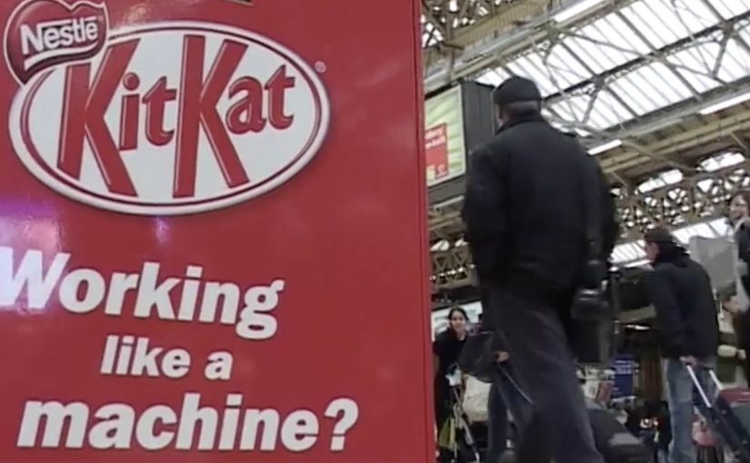
We all know how it feels to need a break from the routine of working like a machine. That is why KitKat brought a quirky trend from Japan over to the UK by installing a human vending machine in London’s busy Victoria Station.

Commuters were given a chance to buy a KitKat for 20p, but from a machine with a real difference. A real person operated it from inside, turning a quick purchase into a small moment of surprise and a quick chat. The money was described as going to charity.

A vending machine that replaces automation with a person

The mechanic is straightforward. It looks like a standard vending machine on the concourse. You put money in. You make a selection. Then a real “vendor” inside the unit hands you the bar, human-to-human, at vending-machine speed.

In high-traffic commuter environments, ambient activations (quick, in-the-flow brand interactions placed in public space) work best when the interaction is instant, the reward is obvious, and bystanders can understand the joke in one glance.

Why it lands

This works because it turns the very thing people are tired of, being treated like a machine, into the punchline. The vending format signals efficiency and routine. The human reveal breaks that expectation and delivers the “Have a break” idea as an experience, not a line of copy.

Extractable takeaway: If your brand promise is about relief, do not only describe relief. Stage a short, public interruption of routine where the consumer feels the promise in real time.

What the activation is really doing for the brand

The real question is whether you can make the “Have a break” promise felt without turning the commute into a bottleneck.

This is a strong format when the idea is obvious from a distance and the handoff stays genuinely fast.

At face value, it is a cheap bar and a good deed. Underneath, it is a behavioural prompt in a place where people are stressed, rushed, and receptive to a small uplift. The “human machine” also creates instant social proof. Every interaction becomes a tiny piece of live theatre that recruits the next person in line.

How to borrow the human-vending-machine pattern

  • Make the concept self-explanatory. The best stunts do not need instructions. The crowd teaches the crowd.
  • Build one clean reveal. A single unexpected moment beats multiple clever steps.
  • Design for the queue. Waiting becomes part of the experience and amplifies visibility.
  • Anchor the stunt to the brand line. The “break” is the product, and the bar is the proof.
  • Give people a reason to feel good. A charity tie-in can reduce cynicism and increase participation.

A few fast answers before you act

What is the “human vending machine” idea in one line?

A vending machine that dispenses KitKat bars, but the dispensing is done by a person inside the unit, turning a routine purchase into a surprise interaction.

Why does this work specifically in a commuter station?

Stations concentrate stress, repetition, and time pressure. A fast, playful interruption is more valuable there than a slow, explanatory brand experience.

What makes it feel like a KitKat idea rather than a random stunt?

The experience embodies the brand’s break positioning. It converts “take a break” from a slogan into a short, tangible moment.

What is the main execution risk?

Throughput. If the interaction slows down and the queue becomes frustrating, the stunt flips from “break” to “delay” and the mood collapses.

What should you measure beyond footfall?

Queue conversion rate (people who stop and join vs those who pass by), average interaction time, sentiment in on-site reactions, and whether the activation shifts purchase behaviour during the commute window.

UNICEF Tap Project: Dirty Water Machine

What if someone bottled the water that millions in developing countries drink every day and offered it on the streets of New York?

For just a buck, during World Water Week (March 22-29), New Yorkers in the Union Square Park area are invited to “enjoy” the benefits of Dirty Water. It comes in a range of choices like Malaria, Cholera, or Typhoid Dirty Water, and is described as having 900 million consumers.

Dirty Water is not an actual product, but a real problem for millions of children around the world.

A vending machine that sells disgust

The mechanism is a classic reversal: a familiar vending machine is repurposed to dispense bottles labeled with water-borne diseases. The point is not to get anyone to drink it. The point is to make the problem visceral and immediate for people who normally never have to think about it. By keeping the interaction familiar, the reversal lands because it turns moral distance into a physical reaction in seconds.

In global cause marketing, turning an abstract statistic into a physical choice can move more people from awareness to action than another informational poster ever will.

The real question is whether you can turn a distant, abstract problem into a personal encounter that makes action feel unavoidable.

Why “nobody drinks it” is the message

New Yorkers are startled to see options like Yellow Fever or Hepatitis Dirty Water. They look at the machine in disgust. And that disgust is the creative payload, meaning the emotional reaction the campaign is designed to deliver, because it mirrors the reality that millions of families do not have the option to refuse unsafe water.

Extractable takeaway: When the barrier is “I cannot feel this problem,” engineer a harmless encounter that triggers the right emotion on contact, then attach one immediate action that turns that emotion into help.

The donation promise that makes the $1 meaningful

The idea of “selling” dirty water is framed as being inspired by UNICEF’s promise that every dollar donated provides safe drinking water to 40 children for a day. Even if the bottle is never purchased as a “product”, the transaction becomes a small, concrete unit of impact.

How the campaign stays active beyond the street

This Dirty Water initiative is positioned as ongoing, with continued donation options online at tapproject.org or via text message. Text TAP or AGUA to UNICEF (864233) to make a $5 donation.

Steal the Dirty Water pattern

  • Use reversal with familiar UX. Put the message inside an everyday interaction so the emotional hit lands before the rational debate starts.
  • Make the abstract a physical choice. Let people “choose” the problem in front of them, then offer one simple action to refuse it for someone else.
  • Price the action as a unit. Frame the donation as a small, concrete purchase so the person feels immediate impact, not vague virtue.

A few fast answers before you act

What is the “Dirty Water” vending machine in one line?

A public vending machine that dispenses “dirty water” bottles labeled with diseases to shock passers-by into donating for clean water.

Why price it at $1?

Because $1 is a friction-light ask that feels like a purchase, not a pledge, and it maps to a clear “unit” of impact in the campaign story.

What is the main creative trick that makes it work?

Reversal: it sells something no one wants, so the emotional response is disgust, and that response reframes clean water as a privilege rather than a given.

What should brands learn from this without copying the cause?

If the problem is invisible, make it physically encounterable, and tie the encounter to one simple action that feels immediately meaningful.

What is the lowest-risk way to adapt this pattern?

Keep the reversal honest and harmless, avoid sensational claims, and make the action as clear as the emotion: one step, one outcome, no hidden complexity.

Chang Soda: Fizzy Billboard

A giant Chang Soda bottle towers over a busy Bangkok shopping area. At the right moment, the cap “pops” and a burst of white balloons shoots out like carbonation escaping from a freshly opened drink.

Seeking new ways to create an impact in today’s sea of daily ad bombardment while taking into account shrinking budgets is quite a challenge. Chang’s Fizzy Billboard did just that, described as a reminder of how effective a great billboard idea can be when it turns a product truth, a single attribute the product can credibly own, into a public spectacle.

This is an outdoor activation that uses a physical effect, balloons released from the bottle, to dramatize “fizz” in a way that can be understood in a single glance.

The mechanism that makes it memorable

The creative leap is not the billboard. It is the “fizz”. Balloons are cheap, visible from far away, and they behave like bubbles in motion. Because of that, the claim becomes tangible even for people who only catch the moment in passing.

In FMCG categories where products are hard to differentiate at shelf, a single unmistakable physical metaphor in public space can outperform a week of polite messaging.

Why it lands as a shareable street moment

The payoff is time-based. People hear that “something happens” and they wait. When the burst comes, it reads instantly and creates a crowd reaction that becomes part of the communication. The effect also photographs well, which helps the idea travel beyond the street.

Extractable takeaway: If you want OOH to earn sharing, build a visible cause-and-effect that people can describe in one sentence, then make the payoff repeatable enough to be worth waiting for.

What the brand is really buying

This is a salience play. The goal is to make “Chang equals fizzy” stick through a short, repeatable spectacle, and to borrow the credibility of a real-world stunt rather than relying on a purely filmed illusion. The real question is whether you can turn one attribute into a repeatable moment people will stop for and retell. If you have to choose, back one literal, repeatable effect instead of spreading budget across polite static placements.

Steal-worthy rules for spectacle OOH

  • Make one product truth physical. Choose the one attribute you want remembered and build the effect around it.
  • Design for distance. If it does not read from across the street, it will not earn attention.
  • Use a predictable moment. A scheduled payoff creates anticipation and word of mouth.
  • Keep the metaphor literal. People should get it before they think about it.

A few fast answers before you act

What is Chang’s “Fizzy Billboard”?

An outdoor activation for Chang Soda where a giant bottle billboard appears to “pop” and release balloons like fizz, turning carbonation into a public spectacle.

Why use balloons for a soda message?

Balloons are inexpensive, highly visible, and they move like bubbles. That makes “fizzy” readable in one second from a distance.

What makes this kind of billboard more effective than a standard print-only OOH?

It creates a moment, not just an image. A time-based spectacle earns attention, crowd reaction, and secondary sharing that static posters rarely trigger.

What business outcome is this designed to influence?

Brand salience and attribute ownership. It aims to make the brand strongly associated with “fizz” versus competitors.

What is the biggest execution risk with spectacle billboards?

If the payoff is unclear or inconsistent, people feel tricked. The effect must be obvious, repeatable, and easy to explain in one sentence.