The North Face: Red Flags in China

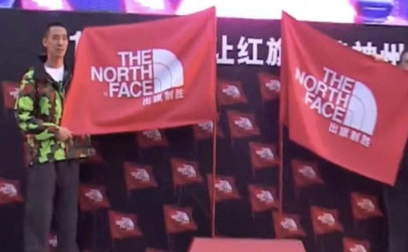
The North Face in China turns a simple outdoor ritual into a phone-powered race. You “plant” a virtual red flag to claim a location. You get the bragging rights of being first. Then you try to out-plant everyone else.

A modern take on the oldest explorer move in the book

Planting a flag is a universally understood symbol. It’s the shorthand for “I was here first.” This campaign borrows that instinct and digitizes it, so the only equipment you need is a mobile phone.

The mechanic: claim a place, then defend your status

At the heart of the idea is a competitive map. Participants place virtual red flags on locations they discover, and the campaign keeps score so “firsts” become collectible. It’s a light-touch way to make exploration feel like a game you can win, not just a virtue you should aspire to.

In fast-growing outdoor markets where many people are still taking their first steps into hiking culture, this kind of social competition is an effective on-ramp.

Why it lands: it converts curiosity into a scoreboard

Outdoor positioning often sounds lofty. “Explore more.” “Get outside.” The problem is that those ideas are hard to act on today, especially in cities where “nature” is not a default habit.

Extractable takeaway: If you want behavior change, give people a visible “progress signal” they can earn quickly. A simple status marker (first, top 10, streak, champion) turns vague aspiration into a repeatable loop.

Red flags work because they’re instantly legible. You don’t need instructions to understand what it means to claim something, and you don’t need a long explanation to feel the urge to beat someone else to the next spot.

The real question is how do you turn exploration from a brand line into a repeatable action people want to perform?

The business intent: make “Never Stop Exploring” measurable

This is a smart brand move because it makes “Never Stop Exploring” visible as behavior instead of leaving it as a slogan.

Case-study write-ups describe this as an integrated push that blends mobile participation with on-ground visibility and retail activation. The core goal is to move the brand from “admired” to “acted on”, by making exploration something people can start immediately, then repeat.

What brand teams can steal from Red Flags

  • Use a symbol people already understand: flags, stamps, passports, badges. Familiar metaphors reduce friction.
  • Turn progress into a public artifact: a claimed location or visible marker is more motivating than a private point total.
  • Design for repeat loops: one action should naturally suggest the next one.
  • Make competition optional but obvious: the scoreboard should be there for people who want it, without blocking casual participation.
  • Reward “first steps”: the earliest wins matter most when you’re trying to create a new habit.

A few fast answers before you act

What is the Red Flags idea in one sentence?

The Red Flags idea is a mobile competition where people plant virtual red flags to claim places and earn status for being first, encouraging more exploration through a simple scoreboard.

Why does “claiming a location” work so well?

Claiming a location works because it makes exploration feel personal and scarce. Once a place is “yours”, you feel ownership, and ownership increases repeat behavior.

Is this gamification or location-based marketing?

Red Flags is both gamification and location-based marketing. The location is the proof of action, and the game layer, claims, status, and competition, supplies motivation and repeatability.

What’s the main risk in copying this mechanic?

The main risk in copying this mechanic is overcomplicating it. If placing the first marker takes too long or requires too many steps, you lose the impulse that makes the idea work.

What’s a modern equivalent if you don’t want maps?

A modern equivalent without maps is any “claimable” unit: completing a route, checking in at partner venues, finishing a micro-challenge, or earning a time-bound “first” in a shared feed.

Share Happy Ice Cream Machine

You approach an ice cream machine that refuses to work for a solo person. It only dispenses when two people participate together. The reward is simple. Free ice cream. The behaviour it creates is even simpler. Ask someone nearby to join you.

The idea. Turn a freebie into a shared ritual

Most giveaway machines are built for speed. Press, receive, leave. Share flips the script. The machine makes cooperation the trigger, so the brand message is performed in public rather than stated on a poster.

Why this mechanic works

It removes awkwardness. People have a reason to talk to strangers, and the machine becomes the icebreaker. The shared reward also creates a shared story, which is why these activations often travel well on social. Here, the mechanic is simply the rule people must follow to unlock the reward.

Extractable takeaway: When the reward depends on two people, the brand turns participation itself into proof of the idea.

Buy interaction, not just sampling

In crowded retail and event environments, the hard part is not handing out samples, but giving strangers a reason to interact in public.

The real question is not whether a free ice cream can attract attention. It is whether the brand can turn that attention into a memorable social behaviour.

Share gets that right, because the interaction is the media, not just the reward.

Steal this from the teamwork mechanic

  • Make the rule obvious before people arrive. People should understand from a distance that this only works together.
  • Keep the action physical and quick. The longer the interaction takes, the more the social energy drops.
  • Make the reward immediate. Fast payoff is what turns a small interaction into a satisfying public moment.
  • Judge success by interactions, not just giveaways. The stronger metric is how many micro-connections the brand creates between people.

A few fast answers before you act

What is the Happy Ice Cream Machine?

It is a vending-machine-style activation that dispenses free ice cream only when people participate together, so the reward is tied to cooperation.

Why require two people?

Because it forces a social moment. The brand message becomes a behaviour. Sharing is not a slogan. It is the unlock mechanism.

What makes this kind of activation spread?

It is easy to understand on video. Two strangers team up, the machine responds, and the payoff is instant. That simplicity travels.

Where does this work best?

It works best in places with natural foot traffic and a low barrier to joining in, such as retail zones, festivals, campuses, and public events.

What should you measure?

Participation pairs per hour, average dwell time, repeat attempts, and the share rate of user-generated clips during the activation window.

Volkswagen Polo GTI: Fast Lane

Fast Lane: turning routine into a shortcut you choose

Volkswagen is soon going to launch its new Polo GTI. To create awareness and generate buzz, it built a “Fast Lane” in subways, malls and elevators around Germany. In this campaign, “Fast Lane” means a playful, faster-feeling alternative route placed beside the normal one, dedicated to everyone who likes to go beyond the regular, who is curious for new stuff, and who enjoys speeding it all up a little.

How it works: add a faster option that feels like play

The mechanism is simple. Place an obvious “normal” route next to an unexpected alternative that is quicker and more fun. Then let people self-select into it. The viewer controls the switch by choosing the fast lane, and that choice becomes the story.

In German urban commuting environments, small design changes in high-footfall spaces can shift behaviour quickly because routine is strong and the contrast is instantly visible.

The real question is whether you can turn “fast” from a spec into a shortcut people choose in public.

Fast Lane 1: The Slide

Long staircase. Next to it a slide. Which way would you go?

Fast Lane 2: The Shopping Carts

Some carts are pimped with a skateboard. Up for some extra shopping fun?

Fast Lane 3: The Elevator

A sound system turns the ride into a rocket take-off. Welcome on-board.

Why it lands: speed becomes a feeling, not a spec

The campaign does not explain performance. It lets people experience a mindset. Faster. Lighter. A little rebellious. Because the “fast” option is obvious and self-selected, it feels earned, which makes the idea stick without needing specs. Each execution creates a moment where the “fast” choice feels like a reward, not just efficiency.

Extractable takeaway: If you want people to believe a feature, design a situation where they can choose it and feel it, not just read about it.

The business intent: borrow everyday behaviour as proof

For a GTI launch, “fast” can easily become generic language. This is stronger than repeating performance adjectives. Fast Lane makes it concrete. It attaches the idea of speed to real-world micro-decisions, and turns the resulting participation into shareable proof that travels beyond the physical placements.

What to steal if you want to turn a feature into a behaviour

  • Build the contrast into the environment. Normal route next to the fun shortcut.
  • Make the faster choice self-evident. People should understand it in one glance.
  • Let viewer control do the persuasion. Choosing it is more convincing than being told.
  • Create a story per location. Each execution is a complete, watchable moment on its own.

A few fast answers before you act

What is Volkswagen’s “Fast Lane” for the Polo GTI?

A set of playful public-space installations (slide, skate carts, rocket-sound elevator) that let people choose a “faster” option, designed to build buzz for the Polo GTI.

What is the core mechanism?

Put a normal route next to an unexpected shortcut that is quicker and more fun. People self-select, and the choice becomes the story.

Why does this work better than talking about performance specs?

It turns “fast” into a felt experience. Participation makes the feature believable without needing explanation.

What business intent does it serve?

It makes the GTI’s positioning concrete and talkable, then relies on the resulting participation moments to travel beyond the physical placements.

What is the most transferable takeaway?

If you want people to believe a feature, design a situation where they can choose it and feel it, not just read about it.