Obermutten: A Little Village Goes Global

Obermutten: A Little Village Goes Global

Obermutten is a little mountain village in the Canton of Graubünden, Switzerland. It has around seventy eight residents and is known to virtually no one except a few hikers passing through now and then.

Now, millions of people around the world have reportedly either read about or heard of Obermutten, after Jung von Matt/Limmat created a simple Facebook campaign for Graubünden Tourism that put this small village on the world map. Media reports have reportedly appeared across many countries, including mentions on mainstream TV news in South Korea.

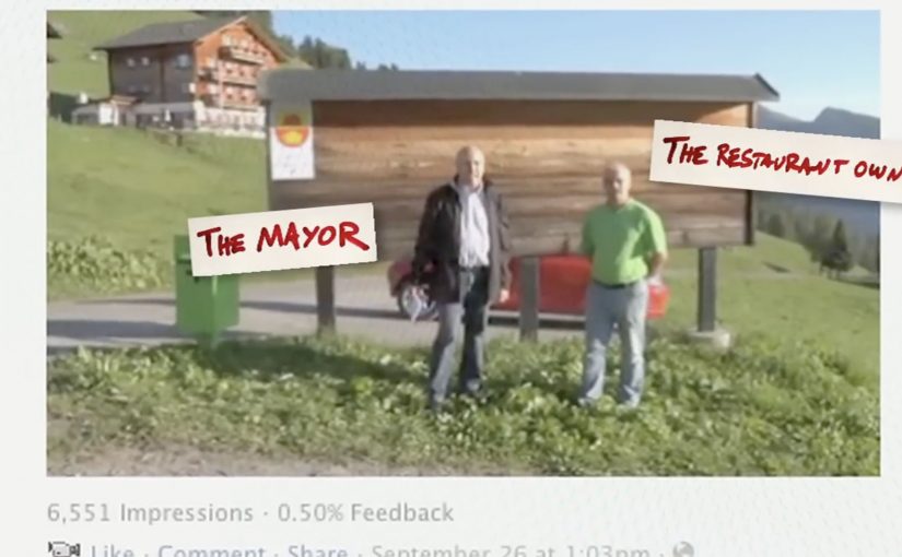
How? It began with a newly created village Facebook page where the local mayor made a remarkable promise via video: click “Like,” and your profile picture will be posted on the commune’s official notice board. In no time, the board was completely covered with fans. To deal with the flood of likes, they reportedly started hanging profile pictures on barn walls in the village. The community has reportedly grown to over 14,000 fans.

A promise that turns a “Like” into a physical souvenir

The mechanism is a simple exchange with a visible payoff. A tiny action online triggers a tangible reward offline. Your profile picture is printed and displayed publicly, which makes the relationship feel real, not symbolic. Each new photo also becomes proof for the next person considering whether to join.

In destination marketing for small places, visible social proof, meaning a growing wall of real faces that proves the promise is being kept, and low-friction participation can outperform paid reach when the reward is concrete and inherently shareable.

The real question is how a tiny place turns a one-click action into public belonging people want to share.

Why it lands

This works because it replaces abstract engagement with a human gesture. You are not “following a page.” You are being welcomed by a real village and given a public spot on a real wall. That emotional upgrade is what converts a novelty into a story, and a story into press and sharing. This is a smarter tourism idea than a bigger media buy because the participation itself becomes the attraction.

Extractable takeaway: When you turn a digital action into a physical, publicly visible reward, participation becomes contagious. People join to see themselves included, and the growing display becomes the marketing.

What destination marketers should steal from Obermutten

  • Make the reward tangible: if the payoff can be photographed, it spreads without asking.
  • Keep the promise binary: one action, one guaranteed outcome, no fine print in the core idea.
  • Design for accumulation: the “wall filling up” is the compounding asset that makes the story stronger over time.
  • Use a human voice: a mayor speaking is more believable than a brand slogan.
  • Let the proof do the persuasion: the growing number of displayed faces sells the idea better than any ad copy.

A few fast answers before you act

What did Obermutten do on Facebook?

They invited people to like the village Facebook page, with the promise that each fan’s profile picture would be printed and posted on the village’s official notice board, and later on barn walls as the number grew.

Why did this become global news?

The idea is easy to explain and easy to visualize. A tiny village publicly “welcoming” thousands of strangers creates an inherently newsworthy contrast, and it produces strong images for media coverage.

What is the core mechanic marketers can reuse?

Convert a low-friction digital action into a tangible, visible reward that accumulates over time. The accumulation becomes both proof and content.

Is this a tourism campaign or a social media campaign?

Both. It uses a social platform to generate participation, then translates that participation into offline visibility that functions like a tourism invitation and a PR engine.

What is the biggest risk with this approach?

If the reward is not genuinely delivered, the story collapses. The format depends on the promise being kept consistently, and on the physical display being maintained with care.

Renault Clio: The Silent Song Contest

Renault Clio: The Silent Song Contest

People are known to let loose and sing like crazy in their cars. For the launch of the new Renault Clio, Belgian agency Boondoggle turned that familiar behaviour into a Facebook game.

A series of online videos were posted on Facebook featuring different Clio drivers singing, with one twist. The sound was removed. To participate, players had to lip-read and guess the correct song as quickly as possible. The player with the most correct guesses at the end of the promotion won the Clio.

A game built from a behaviour people already recognise

The mechanic works because the setup is instantly relatable. Everyone has seen someone singing in a car, or has done it themselves. Muting the audio transforms that everyday scene into a puzzle, and Facebook becomes the scoreboard.

In automotive launch campaigns, lightweight interactive games can keep attention longer than a standard film because they invite repeated attempts rather than one passive view.

Why it lands

It hits a sweet spot between simple and sticky. The barrier to entry is low. You watch a clip and take a guess. Yet the experience rewards skill and speed, which makes it competitive. The silence is also a smart creative constraint. It forces focus, and it makes the guessing moment feel earned.

Extractable takeaway: If you want repeat engagement, take a common behaviour, remove one expected element, and turn the gap into a game people can get better at.

What Renault is really trying to get from Facebook here

The prize is a Clio, but the real objective is frequency. A contest format encourages people to come back for new clips, compare scores, and share with friends to test who can guess faster. That creates repeated brand exposure without needing repeated media spend.

The real question is whether your launch needs one memorable view or a repeatable reason for people to come back and compete.

What to copy from the Silent Song Contest

  • Start from a human truth. Real behaviour makes the concept self-explanatory.
  • Use a constraint as the hook. Muted audio is not a limitation. It is the game engine.
  • Design for replay. Multiple clips and a cumulative score drive repeat visits.
  • Keep the action atomic. Watch, guess, score. No multi-step friction.
  • Reward skill, not luck. Competitive mechanics feel fairer than random draws.

A few fast answers before you act

What is the Silent Song Contest in one sentence?

A Facebook game for the Renault Clio where players watch muted videos of drivers singing, lip-read to guess the song quickly, and compete on total correct answers to win the car.

Why does removing sound make the idea stronger?

Removing sound turns a normal singing clip into a puzzle. The missing audio forces attention and makes the guess feel earned and shareable.

What makes this work on Facebook specifically?

This works on Facebook because the clips are easy to watch, comment on, and share, and the contest format benefits from people returning as new videos appear.

What is the biggest execution risk?

If clips are too hard, people quit. If too easy, they get bored. Difficulty needs to be tuned so most people feel progress over time.

What should you measure beyond video views?

Repeat participation rate, average guesses per user, completion rate across the series, share rate, and whether the campaign shifts launch awareness and consideration.

SNS Bank: I Want Interest on My Current Account

SNS Bank: I Want Interest on My Current Account

SNS Bank promotes a simple product shift. Paying interest on a normal current account. Instead of leading with rates and fine print, the work frames it as something worth protesting for.

People “join” the protest using their Facebook or Twitter account. Their profile picture then becomes the campaign’s moving unit, connected into live rich media placements running on Dutch publisher inventory such as msn.nl and telegraaf.nl. Here, the moving unit is the participant’s profile picture reused as the visible building block of the protest crowd.

How the protest mechanic is built

The mechanism is straightforward. Sign up with a social account, capture the profile image, then re-render that image as part of a marching crowd inside dynamic banners. The same identity asset travels from social sign-up, to landing experience, to high-impact display formats, including what is described as a homepage takeover on telegraaf.nl.

In European retail banking, feature-led propositions like “interest on current accounts” often need a memorable way for customers to visibly participate to cut through price parity and low attention.

Why it lands

It takes a boring benefit and gives it a human visual. A rate becomes a crowd. That shift matters because it makes the offer feel socially validated and easy to explain. It also turns ordinary display inventory into a live proof point, because the banners visibly update with real people rather than generic stock photography. This is the right strategic move because the campaign makes participation itself the proof of relevance.

Extractable takeaway: When your proposition is a small financial feature, convert it into a visible social object. One reusable profile image can power sign-up, storytelling, and proof across every paid placement.

What SNS Bank is really trying to achieve

The business intent is to make “interest on a current account” feel like a category change, not a marginal tweak. The protest framing gives SNS Bank permission to be louder than the feature itself, and it creates a participation funnel that can be measured from social sign-up to on-site conversion.

The real question is how to make a marginal banking feature feel like a public movement rather than a line item in a comparison table.

What to steal from this protest-led banking launch

  • Turn the benefit into a visual system. If the offer is intangible, give it a repeating picture that accumulates and grows.
  • Use one identity artifact everywhere. A single profile image can unify sign-up, landing experience, and ad formats into one story.
  • Make paid media feel live. Dynamic creative that visibly changes reads as proof, not just persuasion.
  • Respect permission and platform rules. If you are pulling profile images, ensure consent is explicit and the experience stays compliant.

A few fast answers before you act

What is the core mechanic of this campaign?

People join via Facebook or Twitter, and their profile image is then reused as the creative building block inside a marching protest rendered across rich media banners.

Why use display banners for something that starts in social?

Because banners can function as visible proof at scale. The audience sees real faces moving through the ad units, which makes the proposition feel active rather than purely claimed.

What is the main advantage of the “protest” framing?

It makes a dry feature feel like a cause. That reframing increases memorability and gives people a simple story to repeat.

What is the biggest risk in copying this approach?

Using social identity assets without clear consent creates trust and compliance issues. If the sign-up step is not explicit, the same mechanic can backfire fast.

When does this kind of mechanic work best?

It works best when the product feature is real but visually weak. The participation layer gives the feature a public shape without changing the underlying offer.