Formula E: Leap of Faith

Formula E: Leap of Faith

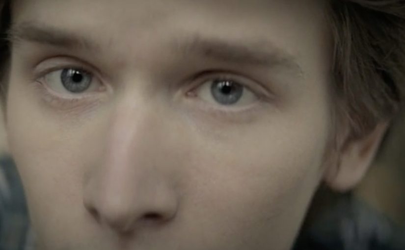
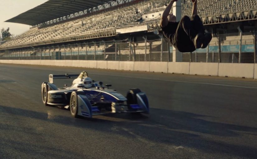
A race car comes up fast from behind. Damien Walters cannot see it. He commits anyway, throwing a backflip that clears the car at speed, landing as if it is routine.

Watch the perfectly synchronised leap below.

One trick, built on timing discipline

The mechanic is simple to describe and hard to execute. A blind backflip over a moving Formula E car. What makes it work is timing control. The driver holds a consistent approach speed, and the stunt is triggered off a repeatable timing reference so the flip happens at the exact moment the car reaches the take-off zone.

In sports branded content, the cleanest way to earn attention is to stage a single, unmissable proof where human skill and the sport’s technology meet in the same frame.

Why it lands

This is a spectacle with a clear question and a clear answer. Can he do it. Then, there it is. The real question is whether the stunt can make precision feel visible rather than merely claimed. The “blind” constraint adds tension because it removes the most obvious safety cue, and the viewer instinctively runs the risk calculation while watching. The payoff is the feeling of precision, not chaos. It reads less like danger for danger’s sake and more like controlled performance.

Extractable takeaway: If your story is “this is high-performance and precise,” build a moment where the viewer can see precision as a binary outcome, and keep the framing uncluttered enough that nobody misses the proof.

What Formula E gets out of it

The stunt borrows the language of elite motorsport. Speed, control, engineering, nerve. It also gives Formula E an easily shareable “you have to see this” asset that travels beyond core racing fans, while still feeling native to the category.

What to steal from the stunt

  • Make the promise visible. Translate “precision” into a single, legible pass or fail moment.
  • Add one constraint that increases tension. Blind, one-take, fixed distance, single attempt. Keep it understandable.
  • Keep the shot honest. The simpler the framing, the more the audience trusts what they are seeing.
  • Design for replay. If the moment is short and clean, people will rewatch and repost without needing context.

A few fast answers before you act

What is “Leap of Faith” in one sentence?

A branded stunt film where Damien Walters performs a blind backflip over a speeding Formula E car with tight timing synchronisation.

What makes the stunt feel different from a normal trick shot?

The car approaches from behind, so the timing has to be pre-controlled rather than visually adjusted, which raises tension and makes precision the headline.

Why does this format work for a sports brand?

It communicates the sport’s core attributes, speed and control, in a compact proof that is understandable even to non-fans.

What is the main creative risk?

If the production feels over-edited or overly cinematic, audiences question authenticity and the share impulse drops.

When should you use a “single proof moment” idea like this?

When your brand story is performance-based and you can express it as one unmistakable action that holds attention in the first three seconds.

AIDES: A Life

AIDES: A Life

AIDES is described as a leading association in the fight against HIV/AIDS in France and Europe, with a long-running focus on both rights and prevention.

One of its prevention messages is delivered through a short film by TBWA\Paris called “A Life.”

A life story told in reverse

The film is structured as a life narrated backwards. It starts with old age and rewinds through the expected milestones. Family, love, travel, the sense of a full life. Then the rewind lands on a single moment in youth where HIV enters the story, and the future we just witnessed is revealed as the life that will not happen.

In public-health communications, prevention messages compete with fatigue and stigma, so narrative devices have to create attention without sounding like a lecture.

Why the reversal hits harder than a warning

The real question is how to make a familiar prevention warning feel personal enough to interrupt complacency.

Instead of describing risk, the spot makes the consequence legible as absence. It turns prevention from “avoid a bad outcome” into “protect the life you think you are going to have.” The backwards structure keeps the viewer engaged because it feels like a human story first, and only becomes a prevention message at the moment the timeline snaps into focus.

Extractable takeaway: If your message is easy to ignore in abstract form, anchor it in a relatable future, then reveal the single preventable turning point that removes that future.

What the campaign is trying to change

The intent is not awareness of HIV as a concept. It is behavior. That is the stronger strategic move, because the film is built to influence a decision, not just to restate a known risk. Use protection, and treat the decision as something that safeguards years, not minutes. The creative also avoids positioning people living with HIV as “other.” It focuses on a moment anyone can recognize. A choice made early that reshapes everything later.

What to steal for prevention and behavior-change work

  • Start with a human narrative. Let the viewer lean in before you reveal the message.
  • Make the consequence concrete. Show what disappears, not just what might happen.
  • Link the call-to-action to identity. “Protect your life” often motivates more than “avoid a disease.”
  • Use one clear turning point. A single, memorable moment is easier to recall than a list of risks.

A few fast answers before you act

What is the core creative device in “A Life”?

A backwards life narration that rewinds from old age to youth, then reveals the preventable moment where HIV changes the future that was just described.

What behavior is the film trying to encourage?

Prevention, especially the consistent use of protection, by reframing it as protecting your future rather than reacting to fear.

Why does telling the story in reverse work?

It sustains attention and makes the twist meaningful. The viewer first invests in a life they recognize, then understands what is at stake when that life is taken away.

What should a marketer avoid when using a similar approach?

Over-explaining the moral. The power comes from the reveal. If you add heavy-handed copy, you reduce the emotional clarity the structure creates.

When is this structure a good fit?

When a prevention message is well-known but routinely ignored, and you need a fresh device that turns a familiar warning into a personal, memorable stake.

Dentsu London and BERG: Making Future Magic

Dentsu London and BERG: Making Future Magic

Dentsu London has made two films with BERG as part of an ongoing collaboration to bring their “Making Future Magic” strategy to life. Both films treat the growing number and variety of media surfaces as a canvas.

Here, “media surfaces” means everyday objects and touchpoints that can carry useful information without behaving like traditional screens or ads.

Incidental Media sketches a near future where media surfaces are everywhere, but used to be playful, informative, and better at connecting you to friends and family.

The Journey shifts the same thinking into travel, focusing on opportunities in stations and on trains.

What the “media surfaces” idea actually proposes

The mechanic is a design-fiction approach. Instead of inventing new hardware, the films show existing surfaces behaving differently. Receipts, windows, clocks, tickets, and public displays become quieter, more contextual, and more useful. Small pieces of information appear where they help, then fade back into the background.

In urban, mobile-first consumer environments, the most effective ambient media tends to be context-aware, lightweight, and respectful of attention.

Why it lands

It feels plausible because it is built from things we already recognize. The films do not pitch a sci-fi leap. They demonstrate a series of small shifts in how content could live on everyday surfaces, and that makes the future feel “next door” rather than distant.

Extractable takeaway: If you want people to believe a future-facing strategy, show it as a set of concrete, everyday interactions on familiar surfaces. Keep the behaviors small, specific, and repeatable.

What Dentsu London is really doing with this work

This is strategy communication as an artifact. The films give teams and clients a shared mental model for what “Making Future Magic” could mean in practice, and they do it in a format that is easy to circulate, discuss, and reuse in planning conversations.

The real question is how you make a future-facing strategy tangible enough that teams and clients can picture it, discuss it, and reuse it.

This is a stronger way to communicate future experience thinking than leaving it as abstract language in a deck.

How to make future concepts feel usable

  • Show, then explain. Start with a believable vignette before you introduce principles.
  • Use familiar surfaces. Credibility rises when the canvas is already part of everyday life.
  • Prioritize quiet utility. Ambient media works best when it helps without demanding constant input.
  • Design for context shifts. Travel, waiting, and transition moments are rich canvases for information that matters.

A few fast answers before you act

What is “Incidental Media” in one sentence?

A near-future sketch where everyday surfaces carry small, useful pieces of media that are playful and contextual rather than loud and interruptive.

What does “The Journey” focus on?

Travel contexts like stations and trains, showing how ambient, contextual media could reduce friction and improve the experience of moving through transport systems.

Why use concept films instead of a written strategy deck?

Because films make the future tangible. They align teams faster by letting everyone see the same interactions, not just read abstractions.

Why does this future feel believable instead of sci-fi?

Because the films build from ordinary surfaces and small behavior shifts. That makes the idea feel adjacent to current life rather than dependent on a radical technology jump.

What is the main risk in copying this approach?

Staying too high-level. If the vignettes are not specific enough to feel real, the work becomes mood, not a usable model for decisions.