Volkswagen: Rock in Rio Drumset

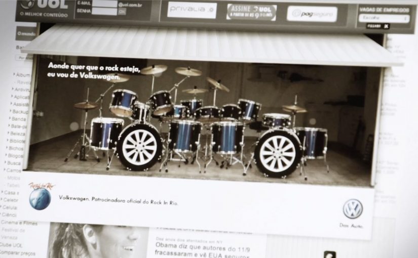
A banner ad you can actually “play”

To celebrate Rock in Rio, Volkswagen built a banner execution that uses your webcam as the input device. Instead of asking you to watch, it invites you to perform, like a tiny drum solo inside a media placement.

How the mechanism earns attention

The core mechanic is simple: webcam permission turns a standard banner into an interactive surface, where your movement becomes the “controller” for the drum kit. That shifts the experience from passive exposure to active participation in a few seconds. Because the unit reacts to a single, instantly legible gesture, it earns attention before the viewer has time to move on.

In brand-led entertainment marketing, the smallest possible interaction can turn a paid unit into something people choose to engage with.

Why it lands in a festival context

Rock in Rio is already about energy, performance, and communal hype. A drum kit inside a banner borrows that emotional language and makes it personal. You are not being shown “festival vibes”. You are generating them, even if it’s just for a moment at your desk.

Extractable takeaway: When a paid unit lets people create a recognizable mini-performance in one step, the creative feels like entertainment, not media.

The payoff is not the complexity. It’s the contrast: banners normally ask for a click, this one asks for a gesture. That little shift makes the format feel fresh again.

The real question is whether your paid placement gives people something to do, not just something to click.

This is the right kind of interactivity for display: opt-in, one-step, and instantly legible.

Takeaways for webcam-controlled banners

  • Use one input. A single action users already understand (movement, tap, swipe) beats multi-step instructions.
  • Make the first five seconds obvious. If the user can’t “get it” instantly, they drop. Here, the drum metaphor does the teaching.
  • Match the interaction to the moment. Music festival content should feel performative. The interaction mirrors the cultural context.
  • Keep the reward emotional. The win is “I played it”, not “I learned a feature list”.

A few fast answers before you act

What is a webcam-controlled banner ad?

It’s a display ad unit that asks for webcam access and uses the camera feed as a live input, usually via motion detection, to let the viewer interact with the creative.

Why use a webcam in a banner at all?

Because it turns a standard media placement into an experience. That can increase attention and memorability when the interaction is instantly understandable.

What makes this Rock in Rio execution work?

The interaction fits the occasion. A drum kit is a native “festival” object, and the gesture-based control makes the format feel playful instead of intrusive.

What’s the main risk with webcam-based ads?

Friction and trust. If the value isn’t obvious, users will refuse permissions or bounce. The creative must communicate intent and payoff immediately.

What’s the simplest modern takeaway?

Give the audience a one-step action that creates a visible result. If the interaction is clear and rewarding, the format becomes the message.

Parrot AR.Drone: The Flying Banner

The Parrot AR.Drone is a quadrotor you can control with an iPhone or iPad. Instead of explaining that in copy, Beacon Communications Tokyo built an interactive web banner that lets people experience the idea.

The banner displays a QR code. Scan it and your phone becomes the controller for a virtual AR.Drone that appears inside the banner. You pilot it around the screen using your smartphone, effectively turning the ad into a small playable product demo.

Why this banner stands out

Most banners talk about what a product can do. This one makes the product behaviour the message. If the AR.Drone is “controlled by your phone,” the ad is controlled by your phone. That direct mapping makes the idea instantly believable. For interface-led products, this is the right pattern: let people try the interface, not read about it.

Extractable takeaway: If your product is an interface, let the audience use that interface inside the ad unit, even in a simplified form.

The mechanic: QR to second screen control

The QR code is not decoration. It is the bridge that turns a passive placement into a two-device experience. Here, “second-screen control” means the desktop shows the scene while the phone acts as the controller. The banner stays on the desktop screen. Control moves to the phone. That split makes the interaction feel closer to the real product, and it also creates a small sense of “this is special” because the ad is no longer self-contained.

In consumer electronics launches, the most persuasive interactive advertising is a playable demo that mirrors the product experience in seconds.

The real question is whether the viewer can feel the core control loop before they decide to care.

How it creates attention without shouting

As described in industry coverage, users could fly the drone around the page and even “blast” parts of the site to reveal the full-screen message. That gives the interaction a purpose and a payoff. It is not just movement. It is progression.

Beacon also reported unusually strong click-through performance compared to typical expectations for the placement. In this case, that makes sense. People do not click because they were interrupted. They click because they were already playing.

Second-screen demo moves to copy

  • Replicate the product, do not describe it. A short, real interaction beats a long explanation.
  • Use one clear bridge between devices. QR works here because it is immediate and simple.
  • Design an obvious payoff. A reveal, a score, a result. Give the interaction a reason.
  • Keep the controls teachable. If people cannot learn it in seconds, the banner loses them.
  • Make it readable for spectators. Movement on the main screen helps others understand what is happening fast.

A few fast answers before you act

What is “The Flying Banner” for Parrot AR.Drone?

It is an interactive web banner where scanning a QR code turns your smartphone into a controller for a virtual AR.Drone that you can pilot inside the banner.

Why is this a stronger demo than a normal video ad?

Because it lets people feel the core promise. Phone-controlled flight, through direct interaction, not description.

What role does the QR code play in the experience?

It is the handoff mechanism from desktop to phone. The desktop shows the “world.” The phone becomes the controller, matching how the real product is used.

What is the biggest risk with multi-device banner ideas?

Drop-off. If the connection step is slow, confusing, or unreliable, most users abandon before they experience the payoff.

How would you modernize this mechanic today?

Keep the principle of second-screen control, but reduce friction. Use a fast connect flow and ensure the experience is still satisfying even if someone chooses not to connect a phone.

Opel Movano: File Mover banner

To promote the Opel Movano van range, McCannLowe created a banner that is both useful and innovative. Working like file transfer services such as YouSendIt or WeTransfer, the banner lets users upload up to 2GB of data “into the rear of the van” and send it to someone across the web.

The recipient then gets an email to download the file and learn about the Opel Movano. Simple, practical, and spot-on for the target audience. This is the right kind of B2B creativity because it turns “capacity” into something you can use.

In B2B and SME logistics markets, utility-based advertising wins when the ad itself performs a real job for the viewer. Here, “utility-based advertising” means the ad unit delivers a small, real service before it asks for attention.

When the ad behaves like a service

The smart move is that the interaction mirrors the product story. The Movano is built to carry stuff. So the banner becomes a carrying service for digital “stuff.” That alignment makes the message feel proved, not claimed. The real question is whether your creative can earn attention by doing a job your audience already needs done.

Extractable takeaway: If your product promise is functional, build a functional ad. A banner that does a real task can earn attention without needing a hard sell.

The mechanism: upload, send, deliver

The mechanic is easy to explain and easy to repeat. Choose a file. Upload it into the banner unit. Send it to a contact. The brand payload arrives as part of the delivery moment, which is when the recipient is most attentive. Here, “brand payload” is the branded context and message that rides along with the delivery. Because the brand arrives at the exact moment the task succeeds, the mechanism turns utility into positive brand proof.

In B2B commercial vehicle marketing, utility-first creative tends to work best when it removes friction inside an existing workflow.

Why this is a strong commercial vehicle play

Commercial vehicle advertising often struggles because capabilities blur together. This execution dramatizes “capacity” in a way people can feel immediately, and it does it in the same environment where business users already move files and coordinate work.

Service-first takeaways for B2B banners

  • Make the benefit experiential. If the product carries, let the ad carry.
  • Keep the flow obvious. One task, one outcome, no learning curve.
  • Use the recipient moment. Delivery creates a second touchpoint that feels useful, not intrusive.
  • Match the utility to the audience. File sending is naturally relevant for business users.
  • Keep branding inside the service. The brand should feel like the enabler, not the interruption.

A few fast answers before you act

What is the Opel Movano “File Mover” banner?

It is an interactive banner that works like a file transfer tool. Users upload a file into the banner, send it, and the recipient receives an email to download the file along with Opel Movano information.

Why is “utility” such a strong creative strategy in B2B?

Because it earns attention through usefulness. A business audience is more likely to engage when the ad helps them do something real, even briefly.

What makes this different from a standard lead-gen banner?

The value exchange is immediate. The user gets a working service, and the brand message is attached to the service delivery rather than gated behind a form.

What’s the biggest execution risk in a “service banner”?

Reliability and trust. If uploads fail, emails do not arrive, or the experience feels unsafe, users abandon quickly and the brand takes the blame.

How could a brand update this idea today?

Keep the same principle. Offer a real micro-service inside the ad unit. Then design the handoff so it is fast, secure, and clearly permission-based.