Prigat: Smile Stations

Publicis Israel and e-dologic are back with a new campaign for Prigat, a leading company in the Israeli fruit juice market.

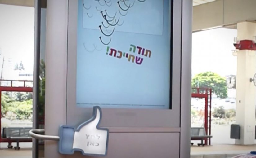
This time they use innovative digital billboards called “Smile Stations” to send real-time messages at various train stations. The aim is to get passers-by to smile, and “like” the moment.

The mechanic: turn a Facebook message into a station moment

It starts on the Prigat Facebook Page. People send messages that are pushed to screens at train stations. Commuters walking by can approach the screen and press a physical “Like” button.

That button press triggers a simple payoff. The billboard captures the moment, then broadcasts the video back to the person who sent the message. Users who generate the most smiles win a prize.

In busy public transit environments, interactive out-of-home works best when the action is obvious, the feedback is immediate, and the reward is shareable.

Why it lands: it makes public emotion measurable

Most out-of-home asks for attention. Smile Stations asks for a reaction, then turns that reaction into proof you can send back to the originator.

Extractable takeaway: If you want participation at scale, close the loop. Let a remote user trigger a real-world moment, let a passer-by respond with one physical action, then send that response back as a personal artifact the originator can keep and share.

Reported figures put this at over 10,000 messages sent to station screens, with thousands of people responding by hitting the Like button.

What the brand gets from this

The real question is whether a public display can turn a remote social prompt into a personal moment worth sharing.

This is stronger than passive digital out-of-home because the physical Like button reduces effort and the returned video turns a fleeting reaction into a personal memory both sides can own.

The campaign does not just generate impressions. It creates a two-sided interaction where both parties feel like they caused something to happen. That is a stronger memory structure than “I saw an ad”, especially in a context as repetitive as commuting.

What to steal for your own social-plus-out-of-home activation

  • Design a one-step physical interaction: one big button beats a complicated interface in public space.
  • Make the response visible: the passer-by should understand instantly that their action “counts”.
  • Return a personal artifact: sending the video back is what turns participation into sharing.
  • Gamify without friction: “most smiles wins” is a clean mechanic with no explanation overhead.
  • Pick locations with dwell time: stations work because people pause, look up, and wait.

A few fast answers before you act

What is a “Smile Station”?

It is an interactive digital billboard at a train station that displays user-submitted messages and invites passers-by to respond by smiling and pressing a physical Like button.

What makes this different from a normal digital billboard?

It is two-way. Remote users trigger messages, commuters respond physically, and the response is captured and sent back as video, creating a closed feedback loop.

Why include a physical Like button?

Because it removes friction. A single, tangible action is faster and more intuitive than asking people to pull out a phone, scan, or type.

How do you measure success for an activation like this?

Message volume, unique senders, Like-button presses, response rate per message, video shares by originators, and dwell time around the screen locations.

What is the main execution risk?

Latency and unclear feedback. If the system feels slow or people are unsure what their button press did, participation drops quickly in a commuter setting.
Volkswagen Polo GTI: Fast Lane

Fast Lane: turning routine into a shortcut you choose

Volkswagen is soon going to launch its new Polo GTI. To create awareness and generate buzz, it built a “Fast Lane” in subways, malls and elevators around Germany. In this campaign, “Fast Lane” means a playful, faster-feeling alternative route placed beside the normal one, dedicated to everyone who likes to go beyond the regular, who is curious for new stuff, and who enjoys speeding it all up a little.

How it works: add a faster option that feels like play

The mechanism is simple. Place an obvious “normal” route next to an unexpected alternative that is quicker and more fun. Then let people self-select into it. The viewer controls the switch by choosing the fast lane, and that choice becomes the story.

In German urban commuting environments, small design changes in high-footfall spaces can shift behaviour quickly because routine is strong and the contrast is instantly visible.

The real question is whether you can turn “fast” from a spec into a shortcut people choose in public.

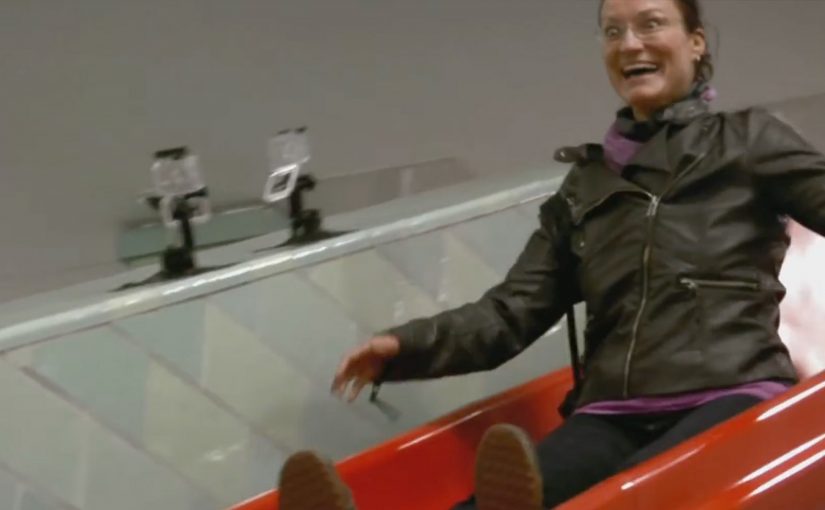
Fast Lane 1: The Slide

Long staircase. Next to it a slide. Which way would you go?

Fast Lane 2: The Shopping Carts

Some carts are pimped with a skateboard. Up for some extra shopping fun?

Fast Lane 3: The Elevator

A sound system turns the ride into a rocket take-off. Welcome on-board.

Why it lands: speed becomes a feeling, not a spec

The campaign does not explain performance. It lets people experience a mindset. Faster. Lighter. A little rebellious. Because the “fast” option is obvious and self-selected, it feels earned, which makes the idea stick without needing specs. Each execution creates a moment where the “fast” choice feels like a reward, not just efficiency.

Extractable takeaway: If you want people to believe a feature, design a situation where they can choose it and feel it, not just read about it.

The business intent: borrow everyday behaviour as proof

For a GTI launch, “fast” can easily become generic language. This is stronger than repeating performance adjectives. Fast Lane makes it concrete. It attaches the idea of speed to real-world micro-decisions, and turns the resulting participation into shareable proof that travels beyond the physical placements.

What to steal if you want to turn a feature into a behaviour

  • Build the contrast into the environment. Normal route next to the fun shortcut.
  • Make the faster choice self-evident. People should understand it in one glance.
  • Let viewer control do the persuasion. Choosing it is more convincing than being told.
  • Create a story per location. Each execution is a complete, watchable moment on its own.

A few fast answers before you act

What is Volkswagen’s “Fast Lane” for the Polo GTI?

A set of playful public-space installations (slide, skate carts, rocket-sound elevator) that let people choose a “faster” option, designed to build buzz for the Polo GTI.

What is the core mechanism?

Put a normal route next to an unexpected shortcut that is quicker and more fun. People self-select, and the choice becomes the story.

Why does this work better than talking about performance specs?

It turns “fast” into a felt experience. Participation makes the feature believable without needing explanation.

What business intent does it serve?

It makes the GTI’s positioning concrete and talkable, then relies on the resulting participation moments to travel beyond the physical placements.

What is the most transferable takeaway?

If you want people to believe a feature, design a situation where they can choose it and feel it, not just read about it.

Cadbury Creme Egg: Egg-Splatting Bus Stands

Turning bus-stop boredom into a reason to play

Only available from New Year’s Day to Easter Day, the Cadbury Creme Egg is one of the best selling confections in the U.S., Canada, and the United Kingdom.

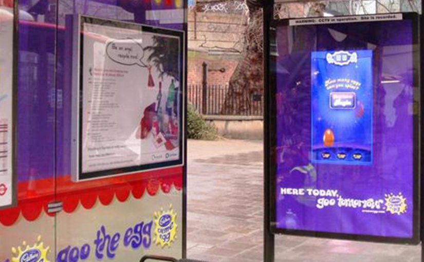
In a bid to boost Creme Egg sales in the lead-up to Easter, Cadbury’s has come up with some really unique bus shelter ideas in the UK.

Waiting for a bus is boring. Now though, you can fill this time by playing Cadbury’s first ever interactive outdoor game called Splat the Egg.

How the idea works: time, place, and a simple interaction loop

The mechanism is classic context hijack. By “context hijack”, I mean using the place’s existing purpose and dwell time as the trigger for a simple action. You take a moment with unavoidable waiting, add a clear instruction, and reward participation with a small burst of fun. The shelter becomes the interface, and the product becomes the “game object”. Because the action is legible and the payoff is immediate, people can join in without needing a long explanation.

In European FMCG launches with seasonal availability, interactive out-of-home can act as both reminder and recruiting surface, converting passive footfall into active brand experience.

Why it lands: it gives the viewer control over the medium

It works because it reframes waiting as choice. Instead of being stuck, you get something to do. And once one person starts, the social proof pulls in the next. A bus stop is already a small crowd. The game turns it into a moment people watch and talk about. The real question is whether your out-of-home placement gives people something to do, not just something to read. Interactive out-of-home should earn attention by turning waiting into play, not by piling on more claims.

Extractable takeaway: If your medium comes with unavoidable dwell time, build a two-second, self-explanatory action that rewards participation and makes spectators part of the experience.

The business intent: make seasonal scarcity feel like an event

Creme Egg’s limited availability is built for anticipation. This activation makes that anticipation physical. It pushes mental availability ahead of Easter and ties the product to a playful ritual rather than just a purchase.

A neat extension for people who cannot try it in person

Is this the future of advertising. Every lamp post and bus shelter calling out to be stroked, touched or hit?

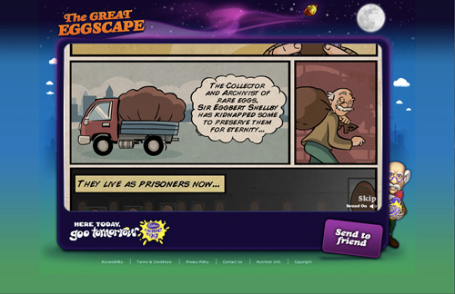
For those who won’t have the chance to experience the real thing. You can have a go at the online version at www.cremeegg.co.uk/greateggscape/.

The Great Eggscape

What to steal for interactive out-of-home without overbuilding it

  • Exploit dwell time. Bus stops, queues, and waiting areas are built-in attention pockets.
  • Keep the interaction legible in two seconds. If it takes explanation, it will not scale in the street.
  • Design for spectators as well as players. The crowd is part of the distribution.
  • Connect the physical to an accessible fallback. An online version extends reach beyond the locations.

A few fast answers before you act

What is Cadbury’s “Splat the Egg” bus shelter idea?

An interactive out-of-home activation that turns a bus shelter into a playable game, letting people waiting for a bus engage with a Creme Egg-themed experience.

Why choose bus shelters for an interactive campaign?

Because they come with natural dwell time. People are already waiting, so the activation converts idle minutes into engagement without asking for extra effort.

What is the core mechanism?

Context hijack plus a simple interaction loop. A clear instruction turns a waiting moment into a quick burst of fun, and the shelter becomes the interface.

What is the business goal behind this activation?

To build anticipation for a seasonal product and tie scarcity to a playful ritual that increases mental availability ahead of Easter.

What is the most transferable takeaway?

Build simple viewer control into the medium at moments of forced waiting, and design for spectators as well as participants so the crowd becomes distribution.