Gladiator: USB Can

A “USB” that is really packaging as a key

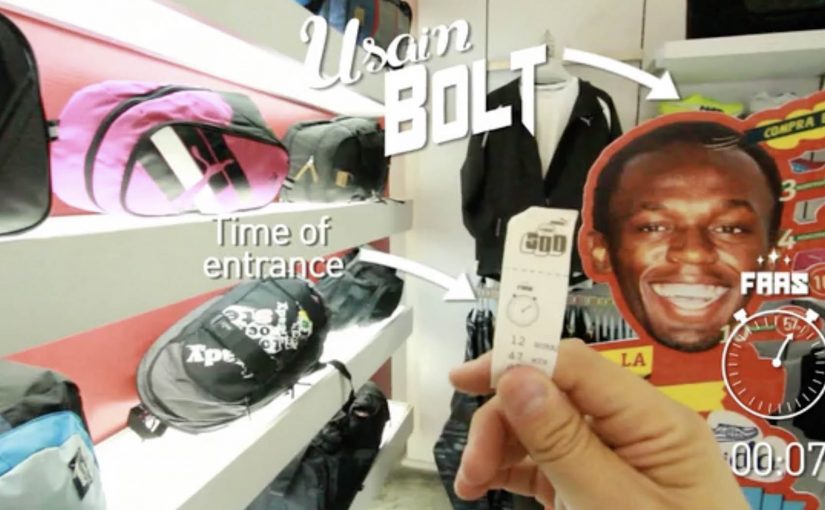
Mexican energy drink Gladiator created a “USB Can” which is not exactly a USB, but it features a packaging innovation that gives users storage when they need it.

Users who want to use the USB Can are directed to a website where they connect with Facebook and scan their can to upload files from their computer. Those uploaded files can then be unlocked on another computer by scanning the same USB Can.

The mechanic: one physical object, reused as authentication

The core move is simple. The can becomes the key. You do not carry a drive. You carry the proof that you own the can, and that proof unlocks your files. It is a packaging-as-authentication mechanic that turns a throwaway object into a repeatable login ritual.

By that, I mean the pack itself functions as the proof needed to unlock the digital benefit.

In FMCG promotions, utility mechanics work best when the physical object is the credential and the digital benefit is immediate.

The real question is whether a disposable pack can earn repeat use by acting like a credential instead of just carrying a logo.

Why it lands

It creates an easy story people can retell. “This can unlocks your files.” The idea also fits the energy drink mindset because it borrows tech culture cues without needing to become a real hardware product. You get the surprise of a “USB” promise, then the reveal that it is a smart access system rather than storage inside the can. Because the can itself becomes the credential, this is smarter than a standard promo-code promotion: it is easier to remember, explain, and reuse.

Extractable takeaway: When you want packaging to be more than a label, give it a repeatable job. Make the pack the key that unlocks a benefit people can use more than once.

What packaging-led utility brands can borrow

  • Make the object the credential. A physical key reduces friction and increases memorability.
  • Keep the ritual quick. Scan, unlock, done. If it takes too long, it stops feeling like a perk.
  • Use a benefit people can demo. “Unlock files on another computer” is easy to explain and easy to show.
  • Let the gimmick resolve into utility. The “USB” hook earns attention. The access mechanic earns credibility.

A few fast answers before you act

What is Gladiator’s “USB Can”?

It is a packaging-led activation where the can is scanned to unlock an online file upload and retrieval flow, so the can behaves like a reusable access key rather than a literal USB drive.

What is the core creative mechanic?

Packaging as authentication. The same physical can is scanned again to unlock access to the files later.

Why does this work better than a normal promo code?

Because the object is the code. It is harder to ignore, easier to remember, and it turns the pack into a functional part of the experience.

What is the transferable principle for other brands?

Give packaging an action people can repeat. If the pack becomes a key, token, or trigger, it can extend the campaign beyond first purchase.

What is the main risk of this kind of execution?

If scanning or login is unreliable, the “magic” collapses. The tech flow has to be faster than the novelty.

PUMA: The World’s Fastest Purchase

PUMA Faas 500 are positioned as “fast” running shoes, so PUMA Mexico turned that promise into a store rule. The faster you complete the purchase, the bigger your discount.

It is retail gamification with a stopwatch. You take a time-stamped ticket when you enter, then hit the finish at checkout. Your elapsed time maps directly to a percentage off.

Speed, translated into a receipt

The mechanic is intentionally physical. A start button and a finish button. Two timestamps. A discount ladder, meaning predefined discount tiers tied to elapsed time. It converts a product claim into a behavior challenge shoppers can understand in one glance.

In store-based brand marketing, this kind of “simple rule. visible payoff” design is what turns a promotion into something people talk about and demonstrate. This is the right kind of promotion when the product promise is simple and the store can keep the timing fair.

In physical retail environments where staff can control flow and timing, a timed discount rule turns positioning into something customers can prove on the spot.

Why it works: tension, then relief at the till

Most discounts are passive. This one is earned under mild, playful pressure, which changes how the saving feels. Because the discount is calculated from your elapsed time, the saving feels earned rather than handed out. You are not just getting money off. You are winning.

Extractable takeaway: If you can translate a brand claim into a simple rule with a visible measurement, customers will internalize it faster and retell it more convincingly.

The case framing also borrows credibility from sport. The faster you move, the more you deserve, which fits the “fast” positioning without needing extra explanation.

What the brand is really buying

The real question is whether your operation can make the customer’s speed, not the queue, decide the discount.

Yes, it can drive conversion in the moment. More importantly, it makes “fast” measurable. The shoe is no longer described as fast. The shopping experience is fast, and the brand gets to own that feeling.

It is also a neat piece of shopper marketing craft: the discount is the reward, but the real output is attention inside the store and social retell outside it.

Borrowable moves for a speed-to-discount promo

  • Turn the product truth into a rule, not a tagline.
  • Make the measurement visible, tickets, timers, receipts, anything tangible.
  • Use a stepped reward, so “almost” still feels like something.
  • Keep the setup frictionless, one instruction. two actions. instant payoff.

A few fast answers before you act

What is the core mechanic here?

A timed in-store challenge. Entry timestamp plus checkout timestamp determines a discount tier.

Why is this stronger than a standard percent-off promotion?

Because shoppers earn the saving through behavior. That creates participation, attention, and a story, not just a transaction.

What kind of products fit this model best?

Anything with a defensible “speed” or “efficiency” claim, plus a purchase journey that can be completed quickly inside a controlled environment.

What is the biggest operational risk?

Queue dynamics. If checkout bottlenecks decide the discount, the game feels unfair. The store needs enough throughput so the customer’s speed is what matters.

How do you measure success beyond sales?

Participation rate, average completion time, discount distribution, and organic sharing that shows people proving their time and reward.

Scribe: World of Paper

A paper universe that starts with a notebook

Cru de Ladies and BBDO México created this film to promote the notebook brand Scribe. It is described as being produced in just two weeks, and it leans hard into a single idea. Everything becomes paper.

How the “world of paper” effect sells the brand

The spot turns an everyday object into a generative tool. A notebook is not just something you write in. It is the source of a whole environment that folds, cuts, stacks, and rebuilds itself as if the real world is being sketched into existence. The craft is the argument. If paper can become anything, then this brand’s paper is worth paying attention to.

In consumer categories where the product looks ordinary at a glance, a single memorable metaphor can do more valuation work than a list of claims.

Why it lands

The film creates a simple emotional loop. Wonder first, then recognition. Viewers get the pleasure of seeing ordinary materials behave in extraordinary ways, and that pleasure transfers back onto the product category. Because the concept is visually coherent from start to finish, the brand feels like the author of the world, not a logo dropped on top of it.

Extractable takeaway: When your product is materially simple, build a coherent visual metaphor that makes the material feel limitless, then let craft carry the persuasion.

The business intent hidden inside the craft

This is not a “features” ad. It is a value-perception ad. The job is to upgrade how people talk about notebooks. From commodity. To identity and possibility. Once that shift happens, premium pricing and preference become easier to defend.

The real question is how to make an ordinary notebook feel like a source of possibility rather than a paper commodity.

What to steal from Scribe’s paper-world logic

  • Choose one world-rule and commit. One governing logic should shape every scene. A single consistent metaphor beats a collage of disconnected tricks.
  • Make the product the source of the transformation. The notebook creates the world, so the brand earns authorship.
  • Let technique serve meaning. Effects land when each one reinforces the same promise, not when they compete for attention.
  • Keep the narrative readable without words. If the story plays on mute, it travels further and ages better.

A few fast answers before you act

What is Scribe’s “World of Paper”?

It is a brand film that imagines everyday life as a paper-crafted universe that unfolds from a Scribe notebook, using craft and visual transformation to make the category feel magical and premium.

What is the core creative mechanic?

A single world-rule drives the piece. One governing logic applies to every scene: everything is paper, and the notebook is positioned as the source that generates and reshapes the environment.

Why does a craft-led film work for a simple product?

Because it upgrades perception. The viewer’s delight and attention attach to the material, which makes the brand feel more valuable without needing feature claims.

What should marketers copy from this approach?

Commit to one coherent metaphor, make the product the engine of the story, and keep the narrative readable on mute.

What is the most common way this kind of film fails?

When the effects become the point and the product becomes a prop. If the product is not the source of the transformation, the brand does not earn the meaning.