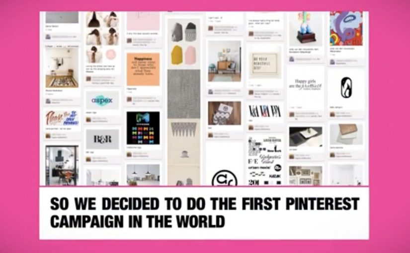
Pinterest is one of the most talked about and fastest growing social networks of 2012. What makes this social site different from the others is its pinboard-styled social photo sharing feature that allows users to create and manage theme-based image collections.
Since it is still very new, a lot of major brands do not know what to make of it. However, a couple have already found creative ways to exploit the potential of the new social media destination.
Why the native loop matters
In early-stage social platforms, the first campaigns that win tend to be the ones that treat the platform’s native behavior, pinning, collecting, repinning, as the mechanic, not as an afterthought. The native loop, the repeatable cycle of pinning, repinning, and collecting, is what makes participation feel like curation instead of work.
In global consumer brands and agencies, early pilots work best when the platform’s native loop is the unit of design, not a channel to paste old formats into.
The real question is whether your idea makes the platform’s default action rewarding before you add any media spend.
Brands should ship only what is native-first, and skip anything that needs heavy explanation to feel like it belongs.
Four early Pinterest plays worth studying
Women’s Inspiration Day by Kotex
In Israel, Kotex reportedly identified 50 inspiring women and looked at what they were pinning on Pinterest, then sent them virtual gifts. If they re-pinned the gift, Kotex would send a real gift by mail. Smoyz, the agency behind the effort, claims nearly 100% of the women posted something about their gift, not only on Pinterest, but on Facebook, Twitter and Instagram.
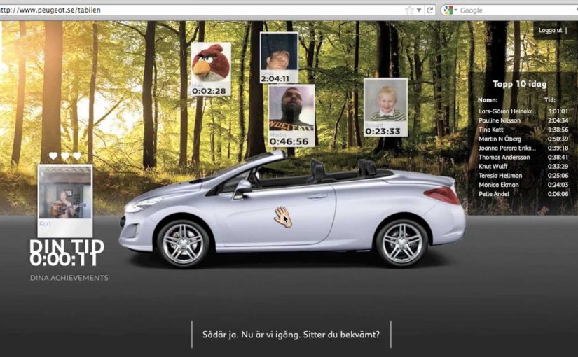
Puzzle by Peugeot Panama
Peugeot Panama ran a contest that awarded fans who completed their Pinterest puzzle. The brand’s Pinterest presence featured images of cars running over two or more boards. In each case, a board was missing. To get the missing pieces, fans had to go to Peugeot Panama’s website to find and complete the full image set.
Color Me Inspired by Guess
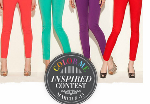
Guess challenged its fans to create boards based on four spring colors: Noir Teal, Hot House Orange, Red Hot Overdue and New Plum Light. Participants were asked to title their boards as “Guess My Color Inspiration” and pin at least five images, each tagged with #GUESScolor, in them. Four winners were then chosen by fashion bloggers Kristina Bazan of Kayture, Michelle Koesnadi of Glisters and Blisters, Jennifer Rand of Belle De Couture and Samantha Hutchinson of Could I Have That.
Pinterest Lottery by British Midland International
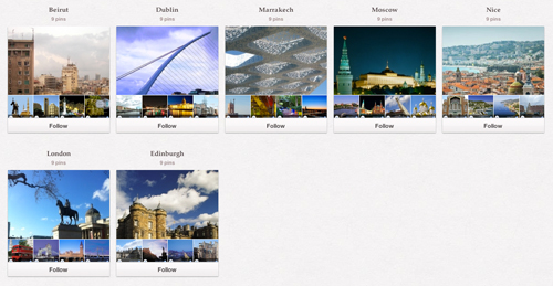
British airline “bmi” launched a game of chance to engage its fans. With “Pinterest Lottery”, bmi encouraged fans to re-pin up to six images of its travel destinations Beirut, Dublin, Marrakech, Moscow, Nice, London and Edinburgh. At the end of each week, the company chose a number at random, and users who had re-pinned the image with that number qualified for a chance to win a free return flight.
What these early campaigns get right
These ideas differ in execution, but they all turn Pinterest behavior into a simple loop you can complete and share.
Extractable takeaway: When a platform is new, design around the action people repeat, then let the reward validate the behavior, not the other way around.
- They make “repin” the action, not the decoration. The platform behavior is the participation mechanic.
- They reward curation. People are not asked to broadcast. They are asked to build a board that reflects taste.
- They turn visuals into utility. Gifts, missing puzzle pieces, color palettes, destination boards. Each idea uses images as a system, not as wallpaper.
Rules for your first Pinterest test
- Start with one native behavior. Make it do the heavy lifting, then build the incentive around it.
- Design for identity, not reach. Boards are self-expression. Campaigns that respect that feel less like ads.
- Keep the rules explainable. If the mechanic cannot be retold in one sentence, participation drops.
A few fast answers before you act
What made Pinterest feel different from other networks in 2012?
Its core object was a curated pinboard. People collected and organized images by theme, which made self-expression look like curation rather than status updates.
What is the common pattern across these early brand campaigns?
They use Pinterest’s native loop. Pin, repin, collect, complete, as the interaction, then attach a reward or outcome to it.
Why did Kotex’s approach travel well?
Because the output was personal and “worth pinning”. The gift reflected what someone had already revealed about themselves through their boards.
Why do puzzle and lottery mechanics fit Pinterest?
Because Pinterest already feels like collecting. Turning boards into completion tasks or numbered sets makes the platform behavior feel like a game, not a campaign.
What is the biggest risk when brands jump onto a new platform too early?
Forcing old formats into new behaviors. If the campaign does not feel native to how people already use the platform, it gets ignored or mocked.