Görtz: Virtual Shoe Fitting

Görtz: Virtual Shoe Fitting

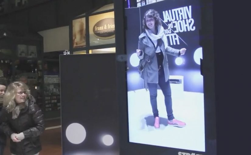
In September last year I had written about a Nike Sneaker Customization concept from Miami Ad School. Since then, ad agency kempertrautmann, along with German shoe retailer Görtz, creates the same virtual shoe store at Hamburg Central Station and transforms a digital billboard into a point of sale for shoes.

A station billboard that behaves like a shop window

Using Microsoft Kinect gesture controls, the shopper’s feet are scanned and reproduced on the screen. A selection of shoes is then presented to try on and compare virtually. A social component lets shoppers share a snapshot of themselves with the shoes on Facebook. Those who decide to buy receive a QR code that leads to a mobile checkout, with next-day delivery.

Virtual shoe fitting is an interactive retail experience that overlays a chosen shoe style onto a live on-screen view of your feet, so you can judge look and proportion before purchasing.

In European retail environments where commuters split time between offline browsing and mobile checkout, the strongest executions connect fast “try” moments to a low-friction purchase path.

Why it lands: it compresses the path from curiosity to checkout

The idea removes the biggest barrier in out-of-home retail, which is the gap between “that looks interesting” and “I can actually get it”. The Kinect scan creates a personal moment, the virtual try-on creates confidence, and the QR code turns intent into an immediate transaction rather than a promise to remember later. That matters because each step reduces the drop-off that usually happens between public interest and private purchase.

Extractable takeaway: If you want digital out-of-home to sell, not just impress, design the experience so the last step is not “find us later”. Make the last step “buy now”, with the minimum possible handoff friction.

What the campaign is really proving

The real question is whether a public screen can do enough selling work in the moment to replace the need for a later retail visit.

It is less about tech novelty and more about role change. The billboard stops being a broadcast surface and starts behaving like a staffed shop assistant. It recognizes you, helps you evaluate options, and hands you a clear next step to purchase.

This works best when the technology serves the buying decision, not when it becomes the point of the experience.

What this retail screen gets right

  • Personalize instantly: a scan, a fit, a quick moment that feels made for the passer-by.
  • Keep choices bounded: a curated range beats a full catalog when people are in a hurry.
  • Build a shareable artifact: snapshots extend the experience beyond the station.
  • Make the handoff obvious: QR-to-checkout should feel like the natural next click, not a separate journey.
  • Promise something operationally real: next-day delivery turns “stunt” into “service”.

A few fast answers before you act

What is the core idea?

A digital billboard in a train station becomes a virtual shoe store. Shoppers try on shoes using gesture control, then complete purchase on mobile via a QR code.

Why use Kinect in a public space?

Because it enables hands-free interaction and creates a personal “fit” moment without requiring an app download or typing in a rushed environment.

What makes this different from a normal QR poster?

The poster does not only link out. It provides evaluation first. The virtual try-on is the persuasion layer, and the QR code is the conversion layer.

What is the biggest execution risk?

Latency and calibration. If the scan feels inaccurate or the overlay looks wrong, the experience loses trust and the checkout step will not happen.

What should you measure?

Interaction starts, completed try-ons, QR scans, checkout completion rate, and next-day delivery satisfaction. Those metrics show whether the billboard is acting as a true point of sale.

eMart: Sunny Sale Shadow QR Codes

eMart: Sunny Sale Shadow QR Codes

Korea continues to set the standard in creative QR code campaigns. In June last year, Homeplus in South Korea used QR codes to create a virtual store in a subway station.

Now eMart, South Korea’s largest retailer, creates shadow QR codes across the city that only become visible when the sun is at the correct angle in the sky, between midday and 1pm. Consumers who scan the QR code during this period are redirected to the eMart online store, where they receive $12 coupons for products that are delivered to their homes.

Turning time into the trigger

The mechanism is a physical installation designed to cast a QR pattern as a shadow only during a narrow daily window. The code is effectively “off” for most of the day, then “on” at lunch. That forces a repeatable habit moment and makes the scan feel like a discovery rather than a prompt.

In dense, mobile-first retail markets, lunch hour is a high-frequency window where a time-boxed incentive can convert attention into immediate action.

The real question is whether you can make the trigger itself time-locked and unmistakable, so people self-schedule the behavior instead of waiting for another reminder.

A time-locked trigger is a stronger activation pattern than an always-on QR poster because the constraint becomes the story.

Why the shadow constraint works

The campaign does not just offer a discount. It creates scarcity you can see. If you miss the light, you miss the code. That turns a routine coupon into a small challenge, and it gives people a reason to talk about the “how” as much as the “what”.

Extractable takeaway: If you want to spike behavior in a specific time slot, make the call-to-action itself time-bound, not just the offer. When the trigger disappears outside the window, the audience learns the rhythm faster than they would from reminders alone.

The sundial-style QR codes, meaning the code is only scannable when sunlight hits at the right angle, were installed at 36 locations across Seoul and served more than 12,000 coupons. eMart membership increased by 58% and lunch hour sales went up by 25%.

Retail activation takeaways: time-locked QR

  • Make the rule instantly legible. “Only works at lunch” is easy to understand and easy to retell.
  • Use a constraint that creates urgency without pressure. The sun provides the timer. The brand does not need to shout.
  • Connect the scan to a clear payoff. Coupon plus delivery is a complete loop, not a teaser.
  • Design for repeat visits. A daily window encourages people to come back tomorrow, not just once.

A few fast answers before you act

What is the Sunny Sale “shadow QR code” idea?

A 3D installation casts a scannable QR code as a shadow only during a specific time window, so shoppers can unlock a coupon by scanning at the right moment.

Why limit the code to midday?

It concentrates attention into lunch hour, creates visible scarcity, and trains a daily habit around a predictable retail moment.

What makes this better than a normal QR poster?

The time-based constraint is the hook. The QR code is not always available, so scanning feels like discovery and the story becomes shareable.

How do you pick the right time window?

Choose a moment that already has repeatable footfall and intent, then make the window tight enough to feel special but wide enough that normal shoppers can realistically catch it.

What can go wrong with time-locked activations?

If the reward is weak or redemption is clunky, the constraint becomes frustration. The tighter the window, the more important the payoff and UX become.

Parrot AR.Drone: The Flying Banner

Parrot AR.Drone: The Flying Banner

The Parrot AR.Drone is a quadrotor you can control with an iPhone or iPad. Instead of explaining that in copy, Beacon Communications Tokyo built an interactive web banner that lets people experience the idea.

The banner displays a QR code. Scan it and your phone becomes the controller for a virtual AR.Drone that appears inside the banner. You pilot it around the screen using your smartphone, effectively turning the ad into a small playable product demo.

Why this banner stands out

Most banners talk about what a product can do. This one makes the product behaviour the message. If the AR.Drone is “controlled by your phone,” the ad is controlled by your phone. That direct mapping makes the idea instantly believable. For interface-led products, this is the right pattern: let people try the interface, not read about it.

Extractable takeaway: If your product is an interface, let the audience use that interface inside the ad unit, even in a simplified form.

The mechanic: QR to second screen control

The QR code is not decoration. It is the bridge that turns a passive placement into a two-device experience. Here, “second-screen control” means the desktop shows the scene while the phone acts as the controller. The banner stays on the desktop screen. Control moves to the phone. That split makes the interaction feel closer to the real product, and it also creates a small sense of “this is special” because the ad is no longer self-contained.

In consumer electronics launches, the most persuasive interactive advertising is a playable demo that mirrors the product experience in seconds.

The real question is whether the viewer can feel the core control loop before they decide to care.

How it creates attention without shouting

As described in industry coverage, users could fly the drone around the page and even “blast” parts of the site to reveal the full-screen message. That gives the interaction a purpose and a payoff. It is not just movement. It is progression.

Beacon also reported unusually strong click-through performance compared to typical expectations for the placement. In this case, that makes sense. People do not click because they were interrupted. They click because they were already playing.

Second-screen demo moves to copy

  • Replicate the product, do not describe it. A short, real interaction beats a long explanation.
  • Use one clear bridge between devices. QR works here because it is immediate and simple.
  • Design an obvious payoff. A reveal, a score, a result. Give the interaction a reason.
  • Keep the controls teachable. If people cannot learn it in seconds, the banner loses them.
  • Make it readable for spectators. Movement on the main screen helps others understand what is happening fast.

A few fast answers before you act

What is “The Flying Banner” for Parrot AR.Drone?

It is an interactive web banner where scanning a QR code turns your smartphone into a controller for a virtual AR.Drone that you can pilot inside the banner.

Why is this a stronger demo than a normal video ad?

Because it lets people feel the core promise. Phone-controlled flight, through direct interaction, not description.

What role does the QR code play in the experience?

It is the handoff mechanism from desktop to phone. The desktop shows the “world.” The phone becomes the controller, matching how the real product is used.

What is the biggest risk with multi-device banner ideas?

Drop-off. If the connection step is slow, confusing, or unreliable, most users abandon before they experience the payoff.

How would you modernize this mechanic today?

Keep the principle of second-screen control, but reduce friction. Use a fast connect flow and ensure the experience is still satisfying even if someone chooses not to connect a phone.