NIVEA: Solar Ad Charger

NIVEA: Solar Ad Charger

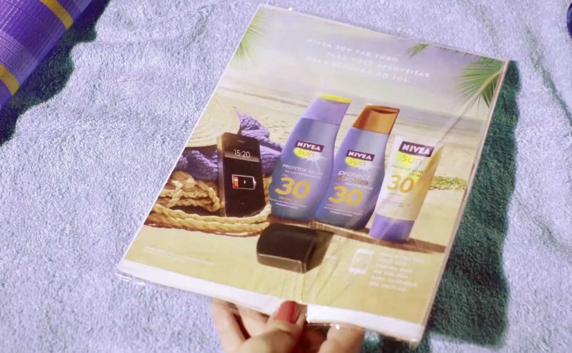
You are on the beach, your battery is dying, and the solution is sitting inside a magazine. NIVEA Sun and Draftfcb Brazil built a print ad insert with real solar panels and a USB port, so beachgoers could plug in and charge while staying in the sun.

The mechanism is the message. The ad is not “about” a product benefit. It behaves like one. Put it in sunlight, connect your phone, and it becomes a small piece of beach kit.

In consumer brand marketing, the most memorable activations turn a media placement into a useful object that fits a real moment of need.

The real question is whether you can make the medium do the job your copy normally tries to do.

This kind of utility-first work is worth copying because it earns attention by solving something small, fast, and real.

Everything in the context ties together cleanly. Sun. Beach. Sunscreen. Mobile phone. Solar charger. The usefulness makes the brand feel present without asking for attention, because the attention arrives naturally once the ad starts solving a problem.

When “print” becomes a product

This is a simple but important shift. The ad is no longer a container for persuasion. It is a container for utility. That makes the experience inherently shareable, because the story people retell is not “I saw an ad”. It is “I charged my phone with a magazine”.

Why this idea lands on a Brazilian beach

Beach time is long, bright, and social. It also creates a predictable friction point. Phones run out of battery, and leaving the spot to find power breaks the day. A solar-powered insert fits the environment and the behaviour, so the concept feels obvious in hindsight.

Extractable takeaway: When the environment already supplies the input, design the interaction so the payoff arrives with almost no explanation.

How to reuse the Solar Ad Charger pattern

  • Start with a real constraint. Battery anxiety is a better brief than “increase awareness”.
  • Let the medium carry the meaning. Solar charging in sunlight communicates the sun story instantly.
  • Make the interaction self-explanatory. A USB port is a universal instruction set.
  • Design for the “tellable moment”. A tellable moment is an interaction someone can retell in one sentence, without explaining the ad first.

A few fast answers before you act

What is the NIVEA Solar Ad Charger?

It is a magazine ad insert created for NIVEA Sun in Brazil that includes thin solar panels and a USB port, allowing readers to charge a phone using sunlight.

Why does this count as interactive advertising?

Because the viewer has to use it. The interaction is physical and immediate. Place it in sun, connect a cable, and the ad performs a function rather than only communicating a claim.

What makes the idea feel so “on brand”?

The utility is inseparable from the product context. Sunscreen is used in the sun. The charger also only works in the sun. The message and the mechanic are the same thing.

What is the main lesson for FMCG launches?

If you can turn a placement into a small, relevant tool, you shift from attention-seeking to value-giving. That typically increases recall, sharing, and positive brand association without needing complex explanation.

What is the most common pitfall with utility ads?

Overengineering. If it requires special setup, fragile components, or unclear instructions, people will not try it. Simple inputs and fast payoff matter more than novelty.

Hellmann’s: Recipe Receipt to Recipe Cart

Hellmann’s: Recipe Receipt to Recipe Cart

Last year Hellmann’s in Brazil came up with a novel way to encourage consumers to use their mayonnaise for more than just sandwiches. The brand teamed up with supermarket chain St Marche to install special software in 100 of its cash registers. When Hellmann’s is scanned, the system matches the rest of the basket to a recipe, then prints it directly on the receipt at checkout. In the first month of the three-month experiment, sales reportedly increased by 44%.

Now, for their new campaign, shopping carts at Pão de Açúcar in São Paulo are mounted with NFC-enabled touchscreen devices. As consumers move through aisles, the touchscreen detects nearby shelf zones and suggests a relevant recipe that uses Hellmann’s. If a recipe is liked, customers can interact with the display to locate ingredients in-store, or share the recipe with friends via email. The activation reportedly involved 45,000 customers, and sales rose by almost 70%.

Two in-store recipe engines, two different moments

The first mechanic works at the end of the trip. It uses the checkout scan as the trigger, then turns the receipt into a personalized cooking prompt based on what you already bought. The second mechanic works during the trip. It uses aisle-level detection to suggest ideas while shoppers are still deciding what to put in the basket, then helps them navigate to the ingredients needed to complete the recipe.

In FMCG shopper marketing, the strongest in-store activations change behavior at the exact point where choices are made.

The real question is whether you can turn a passive product scan into a contextual meal decision while the shopper still has momentum.

When the goal is basket expansion, the in-aisle version is the pattern worth prioritizing because it intervenes before the choice is locked.

Why it lands

Both ideas attack the same barrier. People know mayonnaise, but they default to a narrow usage script. By “usage script” I mean the default, almost automatic way shoppers think a product is used. These executions widen the script with immediate utility, not persuasion. They do not ask shoppers to “remember later.” They hand them a meal idea in the moment, using their own basket and their current aisle as the context. This works because the suggestion arrives at the moment of intent, so the shopper can act immediately instead of relying on memory.

Extractable takeaway: If you want to grow usage occasions, embed the suggestion inside an existing retail behavior. The basket scan, the aisle browse, the store navigation. Then deliver a next-best action that is specific, contextual, and instantly doable.

What to steal for your own retail activations

  • Anchor to a hard trigger. Checkout and aisle location are reliable moments. Build the experience around signals that already exist.
  • Make relevance visible. Recipes work because the shopper can see why this suggestion fits. It uses what they are holding, or what is right in front of them.
  • Keep the interaction short. In-store attention is scarce. One clear suggestion beats ten options and a browsing experience.
  • Close the loop with navigation. A recipe is only valuable if the shopper can find the missing ingredients quickly.
  • Design for shareable utility. Email sharing is not a gimmick here. It turns a private meal problem into a social handoff.

A few fast answers before you act

What is the difference between Recipe Receipt and Recipe Cart?

Recipe Receipt triggers at checkout and prints a recipe based on the basket. Recipe Cart triggers in-aisle and suggests recipes based on where the shopper is, while helping locate ingredients in-store.

Why does this work better than a normal coupon or promotion?

Because it delivers practical utility tied to the shopper’s context. It expands how people use the product by giving a specific meal idea, not just a price incentive.

What data does a concept like this actually need?

Only basket contents at checkout, or aisle location for the cart experience, plus a curated recipe database that can match ingredients to suggestions.

What is the biggest execution risk?

Low relevance. If the suggested recipes feel generic or mismatched to what shoppers are buying and seeing, the experience becomes noise and loses trust fast.

What is the simplest version to pilot first?

Pilot one trigger and one matching rule set, then measure whether shoppers actually add missing ingredients. Start with whichever moment you can instrument cleanly, checkout or aisle.

Video Campaigns: When the Player Is Message

Video Campaigns: When the Player Is Message

Two videos that did not just play, they proved the point

Video innovation rarely comes from “better footage”. It comes from changing how the viewer experiences the message. These two campaigns are clean examples of that approach.

In the last week or so I came across two campaigns that used video to innovatively deliver their message.

Volkswagen Hidden Frame – using the YouTube play bar as the story

The Volkswagen Side Assist feature helps drivers avoid accidents by showing other vehicles when they are in the side mirror’s blind spot.

To drive home the message, AlmapBBDO developed a film that used YouTube’s play bar to show the difference the VW Side Assist made in people’s lives.

No Means No – a player that interrupts denial

Amnesty Norway, in an attempt to change the Norwegian law on sexual assault and rape, developed a film that used a custom video player to pop up the key message.

The campaign was a success and the law was about to change as a direct consequence of the campaign.

Why interface-led video lands harder

Both ideas shift the viewer from passive watching to active noticing. By “interface-led” I mean the player UI, like the progress bar, overlays, or controls, doing storytelling work, not just housing the film.

Extractable takeaway: If the interface carries part of the argument, the viewer is forced to notice the point during playback, which reduces message loss.

The real question is whether your player can carry the argument when attention collapses.

Volkswagen used a familiar interface to make a safety benefit visible in the moment. Amnesty used an interface interruption to force the key message to be seen, not skipped. In both cases, the “player” stopped being furniture and became the persuasion device.

In global consumer brands and publisher-style marketing teams, interface constraints often determine what gets noticed and what gets ignored.

What these campaigns were really trying to achieve

The business intent was not “engagement” as a vanity metric. It was message delivery with minimal loss.

Volkswagen aimed to make an invisible feature feel tangible and memorable. Amnesty aimed to change perception and behavior at the cultural level, and the player design reinforced that urgency by refusing to be background noise.

Player-hacking patterns to copy

Here, “player-hacking” means designing the video controls and UI as part of the message, not just the wrapper.

  • Use the interface as evidence. When the message is hard to show, let the UI demonstrate it.
  • Design for the skip reflex. If your message is often ignored, build an experience that makes ignoring harder.
  • Keep viewer control intentional. Interactivity works when it serves comprehension, not novelty.
  • Make the “point” happen inside the viewing moment. Do not rely on a voiceover claim when the experience can prove it.

A few fast answers before you act

What is an “interface-led” video campaign?

An interface-led video campaign is one where the player experience, like the progress bar, overlays, or controls, is part of the storytelling, not just the container.

How did Volkswagen Hidden Frame use YouTube differently?

It used YouTube’s play bar as a narrative device to demonstrate the value of Side Assist, making the benefit feel visible rather than described.

What did Amnesty Norway’s No Means No change about the player?

It used a custom video player that surfaced the key message via a popup, ensuring the point was encountered during playback.

Why do these ideas work better than a standard film in some cases?

Because they reduce message loss. The viewer is guided to notice the point through the viewing mechanics, not just the content.

What is the practical takeaway for brands?

If your message is often missed, redesign the viewing experience so the message is structurally harder to ignore and easier to understand.