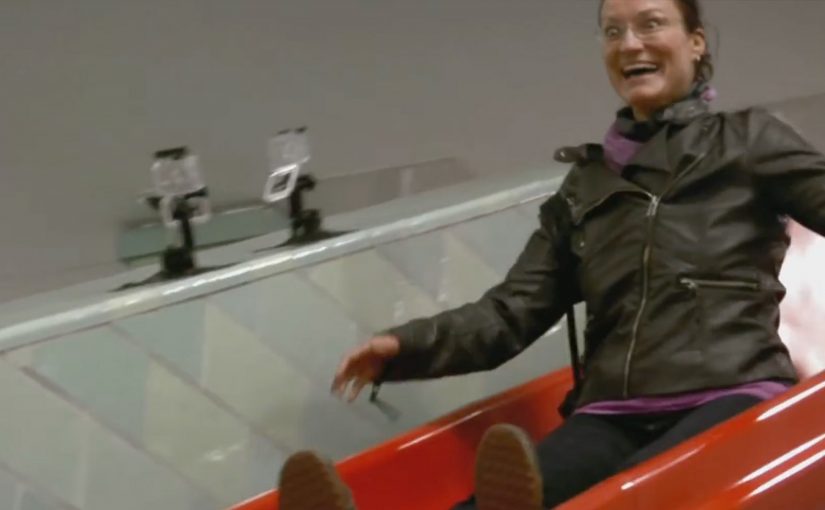
A shopping cart appears where it should not be. It is spotted racing through neighbourhood streets, then turning up abandoned in unlikely corners of Rome. People start talking because the “protagonist” is absurdly familiar. The cart is the symbol of value, and now it is behaving like it has a mind of its own.
Saatchi & Saatchi Milan built this mystery for Carrefour Italia to support the rollout of 106 new Carrefour Markets in Lazio, grounded in the brand’s “Positive every day” positioning. The creative idea is simple. Value for money is an appeal people struggle to resist. So the carts become the carriers of that temptation.
The activation is designed as a two-phase integrated campaign. Here, “integrated” means the same narrative runs in parallel across multiple channels, so each touchpoint adds another “sighting” or a step of explanation. First, it seeds sightings and curiosity across multiple channels at the same time. Then it resolves the story by revealing where all those carts are heading.
A teaser built like a local urban legend
The first phase plays like breaking news. A live-feeling street presence. Transit placements. News-style content. Online video. Each touchpoint adds another “sighting” so the mystery grows without needing complex explanation.
The choice of protagonist matters. A shopping cart is instantly readable, and it already carries the promise of savings. When you animate that object, you turn a pricing message into a narrative people retell.
Solving the mystery without breaking the spell
The second phase keeps the same media system but shifts the objective. It moves from “have you seen it” to “here is where it is going.” The reveal connects the runaway-cart story to the new Carrefour Market openings, so the attention converts into a clear destination and a clear reason.
In large-scale retail launches, integrated campaigns work best when one story can travel from street to screen to store without changing its meaning.
Why this lands for a retailer
This is value communication that does not feel like a leaflet. It uses curiosity, pattern recognition, and a small dose of humour to make people look twice. The pricing promise stays present, but it arrives through a chase, not a claim. The real question is whether your rollout story makes value feel like a discovery instead of a discount. For multi-location openings, a repeatable curiosity loop is a stronger starting point than a price-led announcement.
Extractable takeaway: If value is your promise, stage it as a simple, repeatable story people can retell, then make the store opening the payoff.
What to steal for your next multi-location rollout
- Choose a protagonist that already means something. Everyday objects can carry brand meaning faster than mascots.
- Design a two-step rhythm. Tease first, then resolve. Mystery creates attention. Resolution creates direction.
- Let every channel play a specific role. Street for credibility. Transit for frequency. Online for amplification. Press for legitimacy.
- Make the reveal point somewhere real. The story must end at the store door, not inside the ad unit.
A few fast answers before you act
What is “The Mystery of the Escaping Shopping Carts”?
It is an integrated Carrefour Italia campaign where shopping carts are staged as “escaping” across Rome to build curiosity, then the story resolves by linking the carts to new Carrefour Market openings in Lazio.
Why use shopping carts as the protagonists?
Shopping carts are universal retail symbols and naturally connected to value for money. Turning them into characters makes the savings message feel like a story rather than a promotion.
What does “integrated” mean in this campaign?
It means multiple media channels run in parallel and reinforce the same narrative. Each channel adds sightings, social proof, or explanation, so the mystery grows consistently across the city.
Why does a teaser-and-reveal structure work for retail openings?
Because it builds attention before asking for action. The teaser creates talk and curiosity. The reveal converts that attention into a clear destination, which fits the goal of driving visits to new locations.
What is the main risk with mystery-led retail campaigns?
If the reveal is weak or delayed, people feel tricked. The payoff has to be satisfying, and it must clearly connect the story to a real store or offer.


