Samsung Smart Window

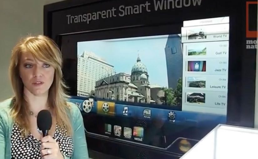
At CES 2012, Samsung unveils a “transparent” window screen concept called Samsung Smart Window. The effect feels instantly familiar. It brings the Minority Report interface fantasy straight into the real world.

Here, “transparent” means a see-through display surface that overlays digital content on what is behind the glass.

The real question is when a screen stops reading as a device and starts reading as part of the building.

The point. A window that is also a screen

Samsung Smart Window frames the display as a surface you can look through and look at. A transparent screen that turns the idea of a “window” into an interface.

Treat Smart Window less as a product promise and more as a signal that “display as surface” is becoming a default interaction pattern.

The mechanism. Turning glass into UI

By framing the display as something you can look through and look at, Samsung collapses “screen” and “window” into one surface. That lets digital layers sit on top of the physical view, not beside it.

In consumer electronics showrooms and built environments, transparent displays matter when you want information to live on the surface people already face, not on a separate device.

Why this works. The screen disappears

The concept works because the window metaphor makes interaction feel like manipulating the room. When the display behaves like glass, the UI feels less like using a device and more like reading the world with an added layer.

Extractable takeaway: If you want a futuristic interface to feel plausible, attach it to an object people already understand and touch, then let the digital layer borrow that object’s meaning.

What Samsung signals next

Samsung positions the Smart Window as moving toward mass production, with availability expected soon. The message is simple. This is not just a lab demo. It is a direction Samsung wants the market to expect.

Practical takeaways for transparent UI

  • Anchor the metaphor. Start with a physical object people already trust (window, mirror, dashboard), then let the interface inherit that mental model.
  • Overlay, do not relocate. Put information on top of the real-world view so the viewer does not mentally switch contexts.
  • Design for glance. Treat the surface like architecture. Prioritize legibility and minimal steps.

A few fast answers before you act

What is Samsung Smart Window?

A transparent display concept unveiled by Samsung at CES, positioned as a window-like screen.

What does it evoke culturally?

A Minority Report style interface experience, where the screen feels like a transparent surface in the real world.

Where is it introduced?

At CES, the consumer technology trade show.

What is the key value of the concept?

It makes the display feel less like a device and more like an architectural surface.

What is the stated next step?

Movement toward mass production and near-term availability.

Toyota Scion “Microsoft Surface Experience”

You walk up to a Microsoft Surface table at a Scion auto show stand and pick up one of the collectible cards. You place it on the table and the surface immediately reacts. Photos, video content, regional sales information, and localized events appear around the card. You flip the card over and it triggers a musical element. Beats, bass, or vocals. When all eight cards are on the table at the same time, the full song plays and the table turns into a simple, social remix station.

Auto shows as a lab for new interfaces

At the 2011 International Motor Show in Frankfurt, the pattern is easy to spot first-hand. The brands that win attention make exploration physical and obvious.

The activation. Scion meets Microsoft Surface

If you visit upcoming auto shows late this year or in 2012, you can run into the Scion Surface Experience, built on Microsoft Surface tables. Toyota’s agency Juxt Interactive designs the experience to let visitors explore Scion’s product, racing, and cultural affiliations in an unexpected way.

How it works. Eight cards, two sides

The interaction is built around a deck of eight collectible cards:

  • Place a card on the Surface and the table reveals photos, video content, regional sales information, and localized events.
  • Flip the card over and it triggers one element of a song, such as beats, bass, or vocals.
  • Place all eight cards on the Surface at once and the full song plays.

Once the full track is unlocked, guests can remix the song in their own way. It reinforces the self-expression that sits at the core of the Scion brand story.

In auto show environments, where multiple brands compete for brief attention in the same hall, interfaces that make participation obvious outperform passive display messaging.

The take-home loop. Physical tokens for digital content

The cards do not end when the stand visit ends. Guests can take their cards home and use them to download digital content connected to the auto show experience. The business intent is clear: use play to pull visitors into deeper product content, then extend recall beyond the booth with a take-home trigger.

Why this works. Exploration first, messaging second

This is a clean example of experiential design where the interface creates the interest. The collectible cards make the first step easy, the Surface makes the response immediate, and the “complete the set” mechanic rewards curiosity. The “complete the set” mechanic means each added card reveals more value, so the interaction naturally pulls people toward finishing the sequence together. Because each added card changes the output immediately, the table turns product exploration into a visible group activity, which keeps people engaged longer than a passive stand screen.

Extractable takeaway: When you want people to explore branded content, give them a physical trigger, an immediate digital response, and a group reward for going deeper.

The real question is how to turn product exploration into something people want to start, continue, and share with the people beside them.

What to steal from this interface-led booth

  • Make the first move physical. Use a tangible trigger that is obvious, low-friction, and instantly responsive.
  • Turn content into discovery. Let people unlock information through curiosity, not a forced linear demo.
  • Design for small groups. Build in a reason to collaborate, compare, and “complete the set” together.
  • Extend the moment beyond the booth. Give visitors a take-home token that continues the experience after the event.

A few fast answers before you act

What is the Toyota Scion Microsoft Surface Experience?

An auto show installation that uses Microsoft Surface tables and eight collectible cards to explore Scion content and trigger a music remix experience.

What happens when a card is placed on the table?

The Surface reveals photos, video content, regional sales information, and localized events tied to the stand experience.

What happens when the card is flipped?

It triggers a part of a song, such as beats, bass, or vocals.

Why are there eight cards?

Placing all eight cards on the Surface at the same time unlocks the full song, and turns the table into a simple remix station.

What is the lasting value beyond the booth moment?

Visitors can take the cards home and use them to download digital content related to the auto show experience.

Volkswagen Beetle: Juiced Up

A billboard looks normal until you point your phone at it. Then the Beetle “juices up” into a 3D scene that spills out of the frame, turning a static poster into something you can explore.

That is the twist behind Volkswagen’s Beetle “Juiced Up” launch, created with Red Urban. Traditional out-of-home placements like billboards and bus shelters double as augmented reality markers. Download the custom app, scan the printed ad, and a 3D experience unlocks on your screen.

An AR marker is a printed visual pattern that a camera can recognize. When the app detects it, it anchors digital 3D content to the real-world poster so the animation appears to sit on top of the physical ad.

The best out-of-home work turns “I noticed it” into “I did something with it”, without asking people to learn a new behaviour.

Why AR markers work so well in out-of-home

Out-of-home already has the two things AR needs. Scale and repetition. People pass the same placements multiple times, which makes it easier for curiosity to build. Once someone scans, the experience feels like a hidden layer you only get if you engage. In global consumer brands running large-scale launches, out-of-home works best when it functions as a repeated trigger, not a one-time impression. A revamp is hard to communicate through copy alone. A 3D reveal makes the “newness” feel more tangible, even if the viewer only plays for a few seconds.

Extractable takeaway: Treat the physical placement as the interface. Make the first scan feel like the poster is “unlocking”, and keep the payoff immediate so the viewer control feels effortless.

What this launch is really optimizing for

This is not just about feature education. It is about reframing the Beetle’s personality and making the redesign feel more assertive and contemporary. The real question is whether your out-of-home is only a reminder, or a trigger that rewards interactivity. The app is a proof device, meaning it proves “this is different” by behaving differently than a normal poster campaign. This approach is worth doing only when the interaction reinforces the product story, not when it is novelty for its own sake.

What to steal for your next OOH-led activation

  • Make the trigger obvious. A single prompt, scan here, is enough. Let the payoff do the persuasion.
  • Anchor the interaction to the medium. If it is out-of-home, the phone should feel like a lens on the poster, not a separate experience.
  • Keep the first moment fast. If the 3D reveal does not land immediately, the novelty collapses.
  • Design for “I have to show you”. The best activations create a demo impulse that spreads in person.

A few fast answers before you act

What is “Volkswagen Beetle: Juiced Up”?

It is an out-of-home launch activation where Volkswagen posters and billboards act as AR markers. A dedicated mobile app unlocks a 3D Beetle experience when viewers scan the ads.

Why use AR markers instead of a standard QR code?

Markers make the poster itself the interface. That keeps the experience visually seamless, and it helps the 3D content feel physically attached to the real ad.

What is the main benefit of this approach for a product revamp?

It makes “newness” experiential. A 3D reveal can communicate attitude and redesign energy faster than a feature list.

What is the biggest practical risk with AR OOH?

Friction. If the app install and scan flow is slow, most people will not complete it. The reward has to justify the effort quickly.

What is the simplest way to improve completion rates?

Reduce steps and increase immediate payoff. Clear instruction at the poster, fast recognition, and an instant 3D moment that feels worth showing to someone else.