Volkswagen virtual Golf Cabriolet app

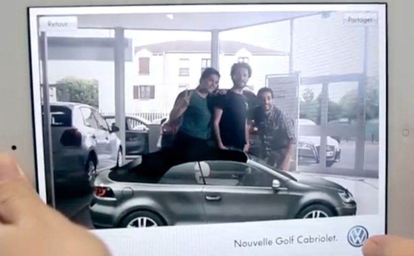
The Golf Cabriolet is back after 9 years of absence, since production was stopped in 2002. Volkswagen together with Paris based agency ‘Agency.V.’ have come up with the worlds first augmented reality car showroom app for the iPad2, iPhone and Android. Here, augmented reality means using the phone or tablet screen as a lightweight showroom for a virtual version of the car.

The app lets you explore the vehicle and play with it’s features like opening the soft-top roof, rotating the car, checking the vehicle’s details, changing the body colour or the style of the rims. You can even take a picture of yourself with the virtual car and share each step of this experience through your social networks.

Why this is a useful AR showroom idea

This is a clean, practical use of augmented reality. It gives people a way to “handle” the car without needing a dealership visit. The experience stays focused on the things people actually want to try first. The roof open and close. The rotation. The color and rim changes. Because the app turns the screen into a hands-on showroom, the product feels easier to explore and share.

Extractable takeaway: AR product demos work best when they compress first-touch exploration into a few obvious actions people already want to try.

In car marketing, that shifts the first product interaction from the dealership to the viewer’s own screen.

What Volkswagen is really demonstrating here

The business intent is not to recreate the full dealership experience. It is to move the first high-interest product interaction into a portable format people can control, personalize, and share.

The real question is whether that kind of lightweight showroom removes enough friction to make early product interest feel immediate and worth passing on.

What to take from this if you are building AR product demos

  1. Prototype “touch” moments first. Opening, rotating, and quick configuration are the behaviors people expect before they care about specs.
  2. Keep the interaction set small and obvious. A few high-intent controls beat a feature dump in early-stage AR.
  3. Make sharing a natural outcome of exploration. A photo-with-the-product moment is a low-friction distribution mechanic.
  4. Use AR to remove the dealership barrier. The value is access and play, not realism for its own sake.

A few fast answers before you act

What is the Volkswagen virtual Golf Cabriolet app?

An augmented reality car showroom app for iPad2, iPhone and Android that lets people explore and customize the Golf Cabriolet.

What can you do inside the app?

Open the soft-top roof, rotate the car, check details, change body colour, change rim styles, and take a photo with the virtual car to share socially.

Who created it with Volkswagen?

Paris based agency ‘Agency.V.’.

Why is this a useful AR showroom idea?

It brings the core product exploration moments onto a personal screen, so people can interact with the car before any dealership visit.

Where could people download it?

From the French iTunes Store for iPhone and iPad 2, and from the Android market for Android devices.

DoubleClick: Fly over France HTML5 banner

You open a banner and, instead of a product shot, you get a hot-air balloon. You pick up speed, drift across a map, and “tour” famous French locations from above, including the Eiffel Tower, Notre-Dame de la Garde in Marseille, and the Château de Versailles.

This demo came out of the DoubleClick HTML5 Banner Challenge, with Biborg Interactive and Alpha Layer showing what happens when a banner is treated like a mini experience instead of a static placement.

The rich media build, meaning a banner unit that runs real-time code in the browser rather than a fixed image, leans on several HTML5 capabilities at once. Geolocation can drop you near your own location at the start. WebGL handles the 3D-like rendering layer in capable browsers. Audio and video tags add atmosphere. Google Maps-style navigation does the heavy lifting for exploration.

HTML5-rich media lets a banner behave like a lightweight web app, while still living inside a standard media buy.

An HTML5 rich media banner is a display unit that runs real-time code in the browser. It can detect location (with permission), render interactive graphics, and respond to user input without plugins.

What makes this feel different from “banner interactivity”

Most interactive banners ask for clicks. This one offers navigation. If your goal is time-in-unit, navigation is the better default than click-to-reveal. The moment you give people directional control, the experience shifts from “ad” to “toy”, and time-in-unit rises naturally because curiosity takes over.

Extractable takeaway: When you turn a banner into something navigable with one obvious control, you trade “interaction” for exploration, and exploration reliably buys you time.

Why the tech stack choice matters

Geolocation is not a gimmick here. It personalizes the first frame by making “your world” the default starting point, if the user opts in. WebGL is not decoration. It signals modernity and smoothness, making the experience feel closer to a game than a widget.

In programmatic display buys, weight and cross-browser reach still win, so the core interaction has to survive even when advanced features fall back.

The business intent behind the challenge demo

This is less about selling France and more about selling a capability. The real question is whether your banner is built to be explored or merely clicked through. It is a proof point for what DoubleClick Studio and HTML5 workflows can support, and it is a portfolio-grade demonstration for the teams who built it.

Steal these patterns for your next HTML5 banner

  • Give viewers one clear control. Navigation beats click-to-reveal when you want time spent.
  • Use “permissioned” personalization. Geolocation works best when it improves the first 3 seconds, not when it tries to be clever later.
  • Design a graceful fallback. If 3D is not available, the core experience should still be enjoyable.
  • Make the value visible without instructions. If someone can understand the interaction from across the room, they will try it.

A few fast answers before you act

What is the DoubleClick HTML5 Banner Challenge demo here?

It is a rich media banner concept that lets users “fly” a hot-air balloon over a map of France and discover landmarks, built to showcase what HTML5 banners can do beyond animation.

Which HTML5 features does the banner use?

It is described as using geolocation (with permission), WebGL for interactive graphics, and native audio and video support, alongside map-based navigation to create a lightweight exploration experience.

Why is geolocation useful in a banner?

Because it can personalize the first moment. Starting near a user’s own location makes the experience feel immediately relevant, as long as it is optional and clearly explained.

What does WebGL add to rich media ads?

WebGL enables GPU-accelerated 2D and 3D graphics in the browser. In advertising units, that can translate into smoother motion, depth effects, and more game-like interaction.

What is the biggest risk with “mini-app” banners?

Weight and compatibility. If the unit is too heavy or too fragile across browsers, you lose reach. The best builds keep a simple core loop and treat advanced effects as optional upgrades.

Mercedes-Benz: Transparent Walls for PRE-SAFE

For the PRE-SAFE® precrash system from Mercedes-Benz, ad agency Jung von Matt in Germany set out to make chaotic traffic intersections safer.

The idea was to let everyone “look around the corner” as if walls were transparent. In this execution, “transparent walls” means projecting a live camera view onto the building edge so the blind spot becomes visible. A camera filmed what was happening out of sight around the corner, and the live images were projected onto an 18/1-format billboard mounted on the building edge for approaching traffic to see.

When out-of-home becomes a live safety interface

This is not an awareness poster. It behaves like infrastructure. The corner. The blind spot. The moment of uncertainty. All become the media placement and the message at the same time.

The real question is whether your safety story behaves like a tool at the decision point, not a slogan people ignore.

How the mechanism creates “transparent walls”

  • Capture. A camera records the street view that drivers cannot see until they commit to the turn.
  • Project. A large-format display on the building corner shows that view in real time.
  • Anticipate. People approaching the intersection get a few extra seconds to recognise a cyclist, car, or hazard.

In urban mobility and automotive safety communications, making risk visible in the moment can change behaviour faster than warning copy.

Why it lands

Safety messages often fail because they arrive as abstract advice. This one arrives as immediate utility. It gives people a concrete, legible advantage at the precise point where bad outcomes happen. Because the live projection turns hidden risk into visible information, the benefit is believed without asking anyone to trust a claim. Safety-led brand work should earn attention through utility, not admonition. The result feels less like advertising and more like “someone fixed a problem.”

Extractable takeaway: The most persuasive safety communication is not a claim. It is a demonstrable reduction of uncertainty, delivered at the exact moment people need it.

What the brand intent looks like underneath

The stunt does double duty. It dramatizes what PRE-SAFE® is for without explaining sensors, thresholds, or system logic. It also signals a brand posture. Mercedes-Benz is not only selling performance. It is selling anticipation.

Steal this pattern: make uncertainty visible

  • Build the message out of the environment. Pick a real-world constraint your audience feels, then solve it visibly.
  • Make the proof self-evident. If people can understand the benefit in one glance, the idea scales.
  • Reduce uncertainty, not fear. Practical clarity outperforms shock in public safety-adjacent work.
  • Choose the right “moment.” Place the intervention where decisions are made, not where people are merely passing through.
  • Design for all road users. Intersections are shared systems. Make the benefit readable for drivers, cyclists, and pedestrians.

A few fast answers before you act

What is “Transparent Walls” in one sentence?

It is a digital out-of-home installation that shows live footage from around a blind corner on a building-edge billboard, so approaching traffic can spot hazards earlier.

How does this connect to PRE-SAFE®?

It demonstrates the value of anticipation. Seeing danger earlier is the human equivalent of what precrash systems aim to deliver technologically.

Why use a live camera feed instead of a scripted film?

Because real-time content makes the utility undeniable. People trust what they can see unfolding right now.

What are the main execution risks?

Latency, visibility in different lighting conditions, weather robustness, and ensuring the display informs rather than distracts drivers.

How would you measure success?

Observed speed adjustments, braking behaviour changes, near-miss reduction at the intersection, dwell/attention metrics, and sentiment around perceived usefulness.