

Febelfin: Amazing Mind Reader Reveals His Gift

Febelfin, the Belgian federation for the financial sector, launched a campaign urging people in Belgium to be vigilant about what they make available online. To drive the message home, they recruited Dave, an extremely gifted “clairvoyant” who appears to read strangers with uncanny accuracy.

Dave showcases his talent to a random sample of people. Just when they start to believe in his gift, the magic behind the magic is revealed.

The trick that makes the “mind reading” believable

The mechanism is a classic reveal structure. First, you watch a performer deliver personal details that feel impossible to know. Then you discover the method: the information is assembled from what people have already left exposed online, and fed to the performer in real time. The stunt lands because it starts as wonder and ends as discomfort.

In consumer cybersecurity awareness campaigns, showing how easily public traces can be stitched into a personal profile is often more persuasive than abstract warnings.

Why it lands

This works because it makes the risk feel immediate and personal. The audience is not asked to imagine a faceless threat. They watch real people realize that a stranger can infer and retrieve sensitive details from what is already searchable, shareable, and often forgotten.

Extractable takeaway: If you turn an invisible risk into a visible demonstration that feels “too accurate to be safe”, you shift behavior faster. People do not remember the warning line. They remember the moment they felt exposed.

The intent behind the stunt

The campaign is not really about a performer. It is about reframing online sharing as a security decision. The real question is how to make careless public sharing feel risky enough that people actually change their settings and habits.

By revealing the method, the story pivots from “psychic” to “preventable”, and the viewer is left with a clear implication: tighten what you publish, and you reduce what can be weaponized.

What privacy-awareness teams can borrow

  • Lead with a believable scenario: start in a world viewers accept, then escalate into the lesson.
  • Make the reveal educational: do not only shock. Show the method so people understand what to change.
  • Use real reactions as proof: authentic discomfort is more convincing than any statistic.
  • Keep the message singular: one risk, one demonstration, one behavior change.
  • End with control: the viewer should feel “I can prevent this” rather than “this is inevitable”.

A few fast answers before you act

What is Febelfin’s “Amazing Mind Reader” video?

It is a hidden-camera awareness film where a “clairvoyant” appears to know intimate details about strangers, then reveals that the information was gathered from what they have available online.

What is the campaign trying to teach?

That personal data leakage is often self-inflicted through oversharing, weak privacy settings, and public profiles. The “magic” is the internet.

Why use a mind reader premise?

Because it creates instant attention and a clean reveal. The viewer first experiences surprise, then realizes the risk is real and avoidable.

Is this about online banking only?

It is framed by the financial sector, but the lesson applies broadly: anything public or easily discoverable can be combined into a usable profile by bad actors.

What is the biggest risk in copying this format?

If the reveal feels manipulative or too invasive, the audience can reject the message. The best executions shock first, then immediately teach and restore a sense of control.
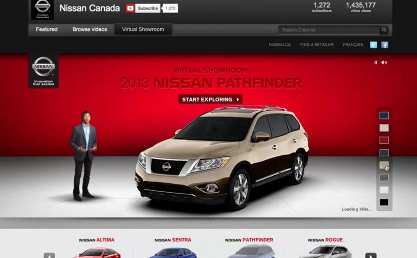
The Nissan Virtual Showroom

There was a time when people would go to the dealership to research cars. But now most research (70%) is done online, with 50% of buyers stating that online information was the most influential part of their research.

So Nissan decided to bring their dealership to the online audience through a custom YouTube Channel experience.

And for people on the go using smartphones for research, they also created a first of its kind custom mobile YouTube Channel, where they replicated the desktop experience for smaller screens.

As a result Nissan is said to have received an extremely positive response, along with a significant increase in people looking for their dealership after researching.

When a channel becomes product UI

What makes this interesting is not that Nissan published more videos. It is that the channel itself is treated like product UI. Here, “product UI” means the navigation and information scent that helps shoppers self-direct to the next best video step. Instead of forcing viewers to hunt through a generic grid, the experience is designed to guide shopper intent from model discovery to feature deep-dives, then onward to the next step in the buying journey.

A “virtual showroom” in this sense is a structured video experience that lets a buyer explore models, features, and trims in a self-directed way, without sales pressure, and without leaving the environment where they are already doing research.

In automotive marketing, the research screen becomes the showroom. So the channel needs to behave like a product experience, not a playlist.

In platform-led categories, the “research screen becomes the showroom” dynamic shows up anywhere buyers start their learning inside someone else’s interface.

The real question is whether you are designing the research journey, or just uploading assets into a grid.

Why it lands with real car-shopping behavior

The psychology is simple. When someone is researching a car, they want control. They want to compare, replay, and go deep only on the features they care about. A channel-built showroom supports that viewer control, and it keeps momentum high because the buyer never has to “leave to learn” and then try to find their way back.

Extractable takeaway: If your customer’s moment of curiosity happens on mobile, mirror the same structured pathways on the small screen so intent is not lost to a new search.

Business intent: turn video curiosity into dealer intent

Nissan is said to have received an extremely positive response, along with a significant increase in people looking for their dealership after researching. Brands should treat high-intent platform surfaces like product UI when the buyer journey starts there. The strategic bet is clear. If you can keep the research experience coherent and confidence-building, you increase the odds that the next action is dealership search, a test drive, or a shortlist decision, rather than another brand’s video.

Stealable patterns for your next “research-first” launch

  • Design the navigation, not just the content. The way viewers move matters as much as the videos themselves.
  • Map content to buyer questions. Make it easy to jump from overview to the exact feature proof someone is hunting for.
  • Keep parity across devices. If your audience researches on mobile, do not treat mobile as a scaled-down afterthought.
  • Build a clean handoff to the next step. The experience should naturally lead into dealer discovery, test drive intent, or model comparison.

A few fast answers before you act

What is a “virtual showroom” on a brand channel?

A virtual showroom is a structured video experience that helps shoppers explore products like they would in-store, with clear pathways from model overview to feature details, without relying on a salesperson or a separate site.

Why build the showroom inside a video platform experience?

Because that is where research attention already lives. Keeping the experience native reduces friction, preserves intent, and lets buyers move from curiosity to confidence without context-switching.

What makes a mobile virtual showroom different from “mobile video”?

It is not just playback on a phone. It is an interface designed for mobile decision-making, where browsing, comparing, and drilling into details still feels coherent on a smaller screen.

How does this drive dealership outcomes without being pushy?

By making the buyer feel informed and in control. When research is easy and confidence increases, dealer search and test drive intent tend to follow naturally as the next step.

What content do you need for this to work?

You need a library that covers the full set of buyer questions. Walk-throughs, feature explainers, comparisons, and proof points that can be consumed in any order depending on what the shopper cares about.

How do you measure whether it worked?

Track signals that reflect progression in the funnel, such as deeper feature engagement, repeat visits, branded search lift, and increases in dealer-locator usage or dealership queries following content exposure.

IKEA Klippbok

IKEA Australia wanted to create a utility that IKEA customers could regularly use to help inspire them in their home. So they created an iPad app called Klippbok (Swedish for “scrapbook”) that gave users access to IKEA products all year round. With easy-to-use design functionality, users were able to mix and match IKEA products and create collages, swatchbooks (material and color sample sets), roomsets (simple room mockups) and more.

Making inspiration feel hands-on, not aspirational

The mechanism is straightforward. You drag IKEA products into a blank canvas, experiment with combinations, and build a visual “plan” you can refine over time. It takes the part people enjoy most in-store, imagining how it could look at home, and makes it repeatable on a device. Because the output is something you can revisit and refine, the interaction is more likely to earn repeat use.

In retail marketing, the strongest “always-on” utilities are the ones that turn browsing into making.

By “always-on utility”, I mean a tool customers can use between campaigns, not a one-off catalogue drop.

Why the scrapbook metaphor is the right UX

Calling it a scrapbook is not just a name. It sets expectations. This is playful, remixable, and personal. That framing lowers the pressure of “designing a room” and replaces it with “trying ideas”, which is a much easier behavior to sustain. This framing choice is the right move when the goal is repeatable inspiration, not a single perfect plan.

Extractable takeaway: If your tool makes “show someone” the natural next step, build sharing into the flow, because that social loop turns a private utility into a brand platform.

Business intent: stay present between store visits

Klippbok’s real job is frequency. Instead of only showing up when a catalogue drops or when someone is already planning a store run, the app gives IKEA a year-round touchpoint that keeps products in consideration while customers are still forming preferences.

The real question is whether your utility gives customers a reason to return when they are not yet in buy mode.

Reported outcomes and craft credits

The app was created by The Monkeys and built by Nomad. In industry reporting around the work, Klippbok is credited with roughly 53,000 downloads across 100+ countries and reaching number two in the Australian iTunes Lifestyle category.

What to steal if you want customers to return regularly

  • Turn your range into a creative system. Let people assemble, not just browse.
  • Design for quick wins. Fast collages beat perfect room planners for repeat usage.
  • Make sharing a native next step. If “show someone” is easy, your users do your distribution.
  • Build for year-round relevance. Inspiration tools age better than campaign landing pages.

A few fast answers before you act

What is Klippbok, in plain terms?

Klippbok is an IKEA iPad app that lets people create mood boards, collages, swatchbooks, and roomsets using IKEA products, so they can plan and experiment with home ideas.

Why does an inspiration app matter for a retailer like IKEA?

Because the purchase journey is rarely one session. If you can keep customers playing with ideas between store visits, you stay in the consideration set longer and influence what ends up on the shopping list.

What is the key mechanism that drives engagement?

Drag-and-drop creation. The user is making something of their own, not consuming content, which increases time spent and makes sharing more likely.

What is the biggest mistake with “catalogue as app” launches?

Copying print into a screen. The app has to behave like a tool, not a PDF, or it will not earn repeat use.

How do you measure whether an inspiration app is working?

Return frequency, creation rate, share rate, and the percentage of users who save or revisit projects. If you can connect it, track downstream indicators like store visits or product adds-to-list after app sessions.