Cheetos Mix-Ups: Cheetahpult Dual-Screen Game

Cheetos Mix-Ups: Cheetahpult Dual-Screen Game

In March I had written about how Google had inspired developers to convert mobile phones and tablets into remote controls for desktop browsers via a simple mobile URL. Now Cheetos, an American brand of cheese-flavored puffed cornmeal snacks, has successfully tapped this technology to engage with viewers as they watch a regular TV commercial on YouTube.

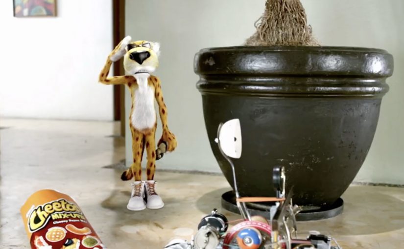
Viewers watching the Cheetos Mix-Ups ad on YouTube get a dual-screen experience. They can fling the new Cheetos Mix-Ups snacks from their phone into a video playing on their desktop. The campaign creates a new way to engage with the ad, and to get to know the product’s new shapes and colors through play.

At this point, the video is reported to have reached 8.5 million views on YouTube. People who played the game are reported to have stayed for an average of 7 minutes and 17 seconds, and flung an average of 56 Cheetos per game.

A YouTube ad that behaves like a game

The trick is simple and surprisingly scalable. Your desktop stays on YouTube, playing the film. Your phone becomes the controller via a lightweight URL experience, so interaction happens in your hand while the “world” of the ad stays on the big screen.

How the dual-screen catapult works

Instead of treating the mobile device as a companion banner, the experience treats it as an input device. You aim, fling, and see the result immediately in the desktop video frame, which turns passive viewing into a loop of action, feedback, and repeat.

In global FMCG launches, second-screen interactivity works best when it turns product attributes into gameplay, and makes “learning the product” feel like time well spent.

Why this lands while people are “just watching YouTube”

It hijacks a familiar behavior. People already watch ads on desktop while their phone is in hand. Cheetahpult converts that split attention into viewer control, and uses physics and repetition to teach what Mix-Ups actually is, in a way a standard product shot cannot. The real question is whether the interaction helps people understand Mix-Ups faster than a normal product shot would. In this case, it does, because the mechanic turns product variety into something people learn by doing.

Extractable takeaway: If your product is hard to describe in one sentence, let people handle it. Build a micro-game where the mechanic is the product benefit, and the reward is comprehension.

What Cheetos is really buying here

This is product education disguised as entertainment. The intent is to turn a new SKU with multiple shapes and flavors into something memorable, then associate that memory with the brand, so the next shelf moment feels familiar.

What Cheetos teaches about interactive video

  • Design for the device people already hold. Dual-screen works when the phone is the controller, not an afterthought.
  • Make the mechanic teach the product. If the game can be reskinned for any brand, it is not specific enough.
  • Keep the loop short and replayable. Fast rounds create “just one more try” behavior, which is where learning happens.
  • Use the main video as the stage. The desktop frame should feel like the real world, and the phone should feel like the tool.

A few fast answers before you act

What is Cheetahpult?

Cheetahpult is a dual-screen YouTube experience that turns a Cheetos Mix-Ups video into a simple physics-style game, with the phone acting as the controller and the desktop video acting as the playfield.

Why does second-screen interaction help an ad?

It converts passive reach into active time. When people interact, they process product details more deeply, and the ad becomes something they did, not just something they saw.

What makes this different from a typical “interactive ad”?

The interaction is not layered on top as buttons. The phone becomes a controller, and the main video becomes the environment, so the ad and the game feel like one system.

When should a brand use this pattern?

When a launch needs fast product education, and when the product has attributes that benefit from repetition, variation, and play, like shapes, combinations, flavors, or configurations.

What should a brand avoid when copying this idea?

Avoid mechanics that are fun but unrelated to the product. If the interaction does not teach something specific about the item being launched, the brand gets playtime but not product understanding.

The Nissan Virtual Showroom

The Nissan Virtual Showroom

There was a time when people would go to the dealership to research cars. But now most research (70%) is done online, with 50% of buyers stating that online information was the most influential part of their research.

So Nissan decided to bring their dealership to the online audience through a custom YouTube Channel experience.

And for people on the go using smartphones for research, they also created a first of its kind custom mobile YouTube Channel, where they replicated the desktop experience for smaller screens.

As a result Nissan is said to have received an extremely positive response, along with a significant increase in people looking for their dealership after researching.

When a channel becomes product UI

What makes this interesting is not that Nissan published more videos. It is that the channel itself is treated like product UI. Here, “product UI” means the navigation and information scent that helps shoppers self-direct to the next best video step. Instead of forcing viewers to hunt through a generic grid, the experience is designed to guide shopper intent from model discovery to feature deep-dives, then onward to the next step in the buying journey.

A “virtual showroom” in this sense is a structured video experience that lets a buyer explore models, features, and trims in a self-directed way, without sales pressure, and without leaving the environment where they are already doing research.

In automotive marketing, the research screen becomes the showroom. So the channel needs to behave like a product experience, not a playlist.

In platform-led categories, the “research screen becomes the showroom” dynamic shows up anywhere buyers start their learning inside someone else’s interface.

The real question is whether you are designing the research journey, or just uploading assets into a grid.

Why it lands with real car-shopping behavior

The psychology is simple. When someone is researching a car, they want control. They want to compare, replay, and go deep only on the features they care about. A channel-built showroom supports that viewer control, and it keeps momentum high because the buyer never has to “leave to learn” and then try to find their way back.

Extractable takeaway: If your customer’s moment of curiosity happens on mobile, mirror the same structured pathways on the small screen so intent is not lost to a new search.

Business intent: turn video curiosity into dealer intent

Nissan is said to have received an extremely positive response, along with a significant increase in people looking for their dealership after researching. Brands should treat high-intent platform surfaces like product UI when the buyer journey starts there. The strategic bet is clear. If you can keep the research experience coherent and confidence-building, you increase the odds that the next action is dealership search, a test drive, or a shortlist decision, rather than another brand’s video.

Stealable patterns for your next “research-first” launch

  • Design the navigation, not just the content. The way viewers move matters as much as the videos themselves.
  • Map content to buyer questions. Make it easy to jump from overview to the exact feature proof someone is hunting for.
  • Keep parity across devices. If your audience researches on mobile, do not treat mobile as a scaled-down afterthought.
  • Build a clean handoff to the next step. The experience should naturally lead into dealer discovery, test drive intent, or model comparison.

A few fast answers before you act

What is a “virtual showroom” on a brand channel?

A virtual showroom is a structured video experience that helps shoppers explore products like they would in-store, with clear pathways from model overview to feature details, without relying on a salesperson or a separate site.

Why build the showroom inside a video platform experience?

Because that is where research attention already lives. Keeping the experience native reduces friction, preserves intent, and lets buyers move from curiosity to confidence without context-switching.

What makes a mobile virtual showroom different from “mobile video”?

It is not just playback on a phone. It is an interface designed for mobile decision-making, where browsing, comparing, and drilling into details still feels coherent on a smaller screen.

How does this drive dealership outcomes without being pushy?

By making the buyer feel informed and in control. When research is easy and confidence increases, dealer search and test drive intent tend to follow naturally as the next step.

What content do you need for this to work?

You need a library that covers the full set of buyer questions. Walk-throughs, feature explainers, comparisons, and proof points that can be consumed in any order depending on what the shopper cares about.

How do you measure whether it worked?

Track signals that reflect progression in the funnel, such as deeper feature engagement, repeat visits, branded search lift, and increases in dealer-locator usage or dealership queries following content exposure.