Toronto Silent Film Fest: Instagram trailers

You open Instagram, land on a feed of black-and-white stills, and start scrolling fast. Suddenly the images “move” like a flipbook. It feels like a tiny silent-movie trailer hiding inside a platform that is supposed to be static photos.

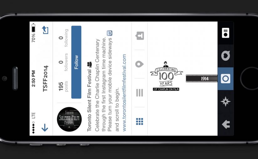
The month before, Fox used Vine to mash up a Wolverine trailer and stir hype. Now the Toronto Silent Film Festival borrows the same instinct, then applies it to Instagram. It promotes the event with what it bills as a first-of-its-kind set of Instagram trailers that only really work on a smartphone.

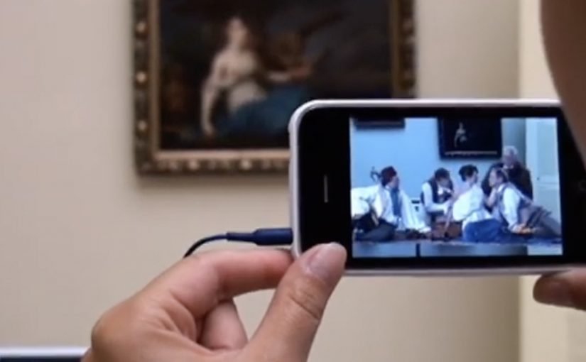
An Instagram trailer, in this format, is a sequence of consecutive still frames posted as individual images. When you scroll rapidly, your thumb becomes the playback control and the feed becomes the projector.

In niche cultural events marketing, the fastest way to earn attention on a small budget is to turn a platform’s native behaviour into the medium.

The trick lands because the mechanic matches the subject. Silent films are built on frame-by-frame illusion. Instagram is built on frame-by-frame browsing. Put the two together and the experience feels clever, not forced.

Why this works better than a normal trailer drop

A standard trailer asks for time and attention up front. This asks for curiosity first. You discover the motion by accident, then you replay it because you want to confirm what you just saw. That discovery loop is the real distribution engine. For a social-first launch, this is a better opener than dropping a normal trailer because it earns replays before it asks for commitment. By “discovery loop” I mean the accidental motion, the immediate replay to confirm it, and the urge to show someone else.

Extractable takeaway: If you can turn a native gesture into a repeatable “did you see that?” moment, you can earn attention and sharing without asking for a click.

What the campaign is really doing

It is less about explaining the festival and more about attracting the right kind of audience. If you enjoy the hack, you are probably the kind of person who will enjoy the program. The format acts like a filter for taste.

The real question is whether your launch gives people a simple action that doubles as playback and sharing.

This work is credited to Cossette, and it later picked up industry recognition for using mobile behaviour as the creative device, which fits the strategy. Make the idea itself feel like a silent-film magic trick.

What to steal for your own social-first launch

  • Exploit a native gesture. Scrolling is a universal habit. Build around it.
  • Make discovery the hook. The best “first play” happens when people think they found something.
  • Match mechanic to meaning. Frame-by-frame browsing is a perfect metaphor for silent-film motion.
  • Keep the explanation optional. If the concept needs a paragraph to understand, it will not spread.

A few fast answers before you act

How do Instagram trailers work in this campaign?

The trailer is split into many still frames and posted as consecutive images. On a phone, you scroll quickly through the feed to simulate motion like a flipbook.

Why does this feel “right” for a silent film festival?

Silent cinema is fundamentally frame-based illusion. This mechanic recreates that feeling using modern thumb-scrolling, so the medium reinforces the message.

What is the main advantage over posting a normal video?

Discovery. People do not just watch. They figure it out, replay it, and show someone else how it works.

What kind of brands or events can use this pattern?

Anything with a strong visual identity and a story that benefits from “reveal”. Especially cultural events, launches, and limited-time programs where curiosity drives consideration.

What is the biggest risk with platform hacks?

If the experience only works in a narrow usage mode, many people will miss it. The mechanic needs to be obvious enough that first-time viewers understand what to do within seconds.

The Nissan Virtual Showroom

There was a time when people would go to the dealership to research cars. But now most research (70%) is done online, with 50% of buyers stating that online information was the most influential part of their research.

So Nissan decided to bring their dealership to the online audience through a custom YouTube Channel experience.

And for people on the go using smartphones for research, they also created a first of its kind custom mobile YouTube Channel, where they replicated the desktop experience for smaller screens.

As a result Nissan is said to have received an extremely positive response, along with a significant increase in people looking for their dealership after researching.

When a channel becomes product UI

What makes this interesting is not that Nissan published more videos. It is that the channel itself is treated like product UI. Here, “product UI” means the navigation and information scent that helps shoppers self-direct to the next best video step. Instead of forcing viewers to hunt through a generic grid, the experience is designed to guide shopper intent from model discovery to feature deep-dives, then onward to the next step in the buying journey.

A “virtual showroom” in this sense is a structured video experience that lets a buyer explore models, features, and trims in a self-directed way, without sales pressure, and without leaving the environment where they are already doing research.

In automotive marketing, the research screen becomes the showroom. So the channel needs to behave like a product experience, not a playlist.

In platform-led categories, the “research screen becomes the showroom” dynamic shows up anywhere buyers start their learning inside someone else’s interface.

The real question is whether you are designing the research journey, or just uploading assets into a grid.

Why it lands with real car-shopping behavior

The psychology is simple. When someone is researching a car, they want control. They want to compare, replay, and go deep only on the features they care about. A channel-built showroom supports that viewer control, and it keeps momentum high because the buyer never has to “leave to learn” and then try to find their way back.

Extractable takeaway: If your customer’s moment of curiosity happens on mobile, mirror the same structured pathways on the small screen so intent is not lost to a new search.

Business intent: turn video curiosity into dealer intent

Nissan is said to have received an extremely positive response, along with a significant increase in people looking for their dealership after researching. Brands should treat high-intent platform surfaces like product UI when the buyer journey starts there. The strategic bet is clear. If you can keep the research experience coherent and confidence-building, you increase the odds that the next action is dealership search, a test drive, or a shortlist decision, rather than another brand’s video.

Stealable patterns for your next “research-first” launch

  • Design the navigation, not just the content. The way viewers move matters as much as the videos themselves.
  • Map content to buyer questions. Make it easy to jump from overview to the exact feature proof someone is hunting for.
  • Keep parity across devices. If your audience researches on mobile, do not treat mobile as a scaled-down afterthought.
  • Build a clean handoff to the next step. The experience should naturally lead into dealer discovery, test drive intent, or model comparison.

A few fast answers before you act

What is a “virtual showroom” on a brand channel?

A virtual showroom is a structured video experience that helps shoppers explore products like they would in-store, with clear pathways from model overview to feature details, without relying on a salesperson or a separate site.

Why build the showroom inside a video platform experience?

Because that is where research attention already lives. Keeping the experience native reduces friction, preserves intent, and lets buyers move from curiosity to confidence without context-switching.

What makes a mobile virtual showroom different from “mobile video”?

It is not just playback on a phone. It is an interface designed for mobile decision-making, where browsing, comparing, and drilling into details still feels coherent on a smaller screen.

How does this drive dealership outcomes without being pushy?

By making the buyer feel informed and in control. When research is easy and confidence increases, dealer search and test drive intent tend to follow naturally as the next step.

What content do you need for this to work?

You need a library that covers the full set of buyer questions. Walk-throughs, feature explainers, comparisons, and proof points that can be consumed in any order depending on what the shopper cares about.

How do you measure whether it worked?

Track signals that reflect progression in the funnel, such as deeper feature engagement, repeat visits, branded search lift, and increases in dealer-locator usage or dealership queries following content exposure.

Sukiennice: Secrets Behind Paintings

The Sukiennice Museum in Krakow is one of the oldest museums in Poland, and it is reopening after a complete renovation. The problem is not the building. The problem is attention. Young people do not automatically find 19th-century Polish art interesting.

Leo Burnett Warsaw gets the challenge to pull this audience back in, and answers it with an integrated campaign anchored by the New Sukiennice augmented reality app.

The mechanic: bring paintings to life with viewer control

The app turns the visit into an interactive layer. Point your phone at selected works and the paintings come alive, revealing their stories through short films and animated moments. Instead of reading a label first, you get pulled into a scene first, then you choose to go deeper. Here, viewer control means visitors choose when to trigger the story and whether to go deeper.

In European museums trying to win younger audiences, lightweight AR can translate static collections into short, shareable stories without rewriting the institution’s identity.

Why it lands: it swaps “art history” for narrative tension

This is not about making the museum more “digital”. It is about making the first minute feel rewarding. Young visitors do not need more information at the start. They need a reason to care. That works because short films give the paintings a hook, and the phone becomes a bridge between a familiar screen habit and an unfamiliar art period.

Extractable takeaway: If the barrier is “this feels irrelevant”, do not lead with education. Lead with story. Give people one fast, emotional moment they can experience, then let curiosity pull them into context and detail.

An integrated campaign that keeps the app from being a lonely download

The real question is how you make a heritage visit feel immediately worth a young person’s time without turning the art into a gimmick.

The app plays the central role, but it does not stand alone. The campaign also uses billboards, social media and e-cards to create buzz and point people toward the experience. The intent is clear. Get young people to show up, then let the AR layer turn “I visited” into “I discovered”.

The buzz generated by the campaign is described as attracting a significant share of Krakow’s population to the museum.

What to steal for your own cultural or heritage activation

  • Start with one irresistible moment: pick a small set of works and make them unforgettable, rather than trying to animate everything.
  • Put the story before the lesson: emotion first, interpretation second.
  • Make it usable on-site: the experience should work in the gallery without long setup or instructions.
  • Design for “showing a friend”: the best museum tech spreads when people can demonstrate it in seconds.
  • Support it with media that explains the payoff: billboards and social should communicate the “why” of the visit, not just the existence of an app.

A few fast answers before you act

What is the New Sukiennice app?

It is an augmented reality museum app designed to bring selected paintings to life and reveal their stories through short film content during a gallery visit.

Why is AR a good fit for 19th-century painting?

Because the barrier is often distance. AR can add narrative entry points and context quickly, helping visitors connect emotionally before they engage intellectually.

What makes this more than a tech demo?

The app is positioned as the core of an integrated campaign. The surrounding billboards, social media and e-cards create the motivation to visit, and the on-site experience delivers the payoff.

What’s the biggest risk with museum AR?

Friction and distraction. If setup is slow, or the experience pulls attention away from the original work instead of back into it, the technology becomes the point and the art loses.

How should a museum measure success here?

Look at youth attendance lift, repeat visits, time spent in targeted rooms, and whether visitors progress from the AR moment into deeper engagement like reading labels, joining tours, or exploring more works.