
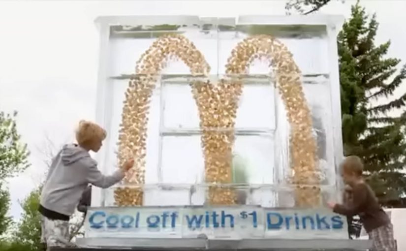
McDonald’s: Dollar Drink Days Ice Sculpture

McDonald’s Canada and Cossette Vancouver brought to life one of the first interactive ice sculptures this summer on behalf of McDonald’s Restaurants in Alberta. The objective was to drive consumer interest in the company’s Dollar Drink Days campaign. Here, “interactive” means people can physically engage with the installation and change it in real time.

Hosted in the town of Sylvan Lake, the stunt saw 8,000 pounds of ice moulded into a seven-foot tall installation containing over 4,000 sparkling loonies, shaped into McDonald’s famous Golden Arches. The ice melted on a summer Saturday, and consumers chipped away at the sculpture to collect their bounty.

To attract high levels of interaction, the sculpture was strategically placed near the Sylvan Lake Pier, an area frequented by young adults and families. The day also featured a DJ, street promotional teams, hula hooping, limbo contests and giveaways.

In quick-service promotions, especially in seasonal, high-footfall leisure locations, the hard part is converting “cheap” into “must-see”.

The real question is how you turn a simple price offer into a moment people choose to chase.

Price promotions are forgettable until you give people a physical action that earns a visible payoff.

Why this activation pulls people in

The reward is visible and the deadline is unavoidable. Because the coins sit inside melting ice, the mechanism turns curiosity into action and keeps people moving from watching to participating.

Extractable takeaway: If you want a price promo to travel, make the payoff visible, put it behind one simple action, and bake in a deadline people can feel.

  • A clear, physical payoff. The value is visible and tangible, and the “win” is earned through participation.
  • Built-in urgency. Melting ice creates a natural time limit, which pushes people to act now rather than “later”.
  • Placement does the heavy lifting. Putting it at a high-traffic summer spot turns curiosity into crowds.

Reusing the melting-deadline mechanic

This is a strong example of turning a price promotion into a real-world spectacle. Instead of telling people “Dollar Drink Days is on”, the brand created a moment people wanted to be part of, and then made participation the mechanism for reward.

  • Make the payoff obvious. Put the value where people can see it before they commit.
  • Use a deadline that enforces itself. A physical countdown beats a marketing one, because it changes what people do right now.
  • Let the location supply the audience. Choose a place that already has the right crowd, then make the moment easy to join.

A few fast answers before you act

What was the Dollar Drink Days ice sculpture?

It was a seven-foot interactive ice installation in Sylvan Lake, Alberta, shaped like the Golden Arches and packed with thousands of loonies for visitors to collect as it melted.

How did people interact with it?

As the sculpture melted during the day, people physically chipped away at the ice to reach the coins inside.

Why stage it near Sylvan Lake Pier?

The location is naturally busy with young adults and families in summer, which increases footfall and keeps participation high.

What is the core pattern worth reusing?

Give people one simple action that unlocks a tangible reward. Add a natural deadline, and stage it where the right crowd already gathers.
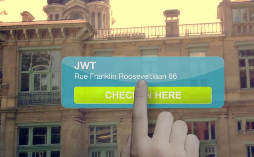
Euro RSCG: Foursquare Mayor Recruitment

Guerrilla recruitment via social channels is gaining popularity among agencies. In this example, Euro RSCG Brussels used Foursquare to seek out digital talent.

The team at Euro RSCG drove around Brussels every day and checked in at leading agencies. After they became the “Mayor” of targeted agencies, they released their recruitment messages.

Foursquare as a recruitment billboard

The mechanism is simple and slightly mischievous. Foursquare rewards repeated check-ins at a venue with the “Mayor” status. Euro RSCG uses that status as the placement, then drops hiring messages where competitors’ people are most likely to notice them. It works because the platform-granted title creates visible relevance at the exact venue where rival talent is already paying attention.

In competitive digital-talent markets, employer branding works best when it shows up inside the daily tools and rituals your target audience already uses.

Why it lands

It is instantly understandable, and it leverages a public platform rule rather than buying attention. The move also signals confidence. “We are willing to compete for talent in plain sight.” Used with restraint, this is a smart recruiting idea because it turns ordinary check-in behaviour into targeted employer visibility. The real question is whether the platform rule makes the message feel natively relevant or just makes the stunt feel intrusive. At the same time, it walks a fine line. If it feels like harassment rather than humour, the tactic can backfire.

Extractable takeaway: If you use a social platform as a recruiting channel, make the entry mechanic native to the platform and keep the message playful, specific, and respectful, or it will read as desperation.

Other examples of agencies using social media to attract talent are:

Recruitment moves worth borrowing

  • Target by context, not by demographics. “Where do the people I want already spend attention?” is often the better question.
  • Use platform rules as media. When the channel itself creates the placement, participation feels less like advertising.
  • Keep the call to action tight. One clear role or value proposition beats generic “we’re hiring.”
  • Anticipate the ethics. If you would not want a competitor doing it to you, adjust tone and frequency.
  • Design for screenshots. If the message is worth sharing, the audience will distribute it for you.

A few fast answers before you act

What is the Euro RSCG Foursquare idea in one sentence?

It is a recruitment tactic where Euro RSCG repeatedly checks in at competitor agency venues on Foursquare, becomes “Mayor,” then posts hiring messages to reach digital talent.

Why does “Mayor” status matter?

Because it is a visible, platform-granted position at a location. That makes the recruitment message feel placed “inside” the venue’s social layer rather than pushed from outside.

What makes this more effective than a standard job post?

It targets people by environment and habit. The message shows up where relevant talent is likely to be, not where job ads usually live.

What is the main risk?

Reputation. If the move feels aggressive, disrespectful, or creepy, it can damage employer brand faster than it attracts candidates.

How do you measure success?

Qualified inbound applications attributed to the tactic, social sharing and sentiment, and whether awareness among the intended talent pool increases without negative backlash.

Bike Guide: Detachable Bike Tour Vehicle

A tour bus that splits into bikes when the city gets interesting

“Bike Guide” is an innovative concept from Seoul based designer Kukil Han. He has conceptualized a convenient two-in-one tour bus, which enables the passengers to detach their bikes at specific checkpoints in order to explore the surroundings.

Bike Guide is a detachable-bike tour vehicle concept where a single bus carries multiple bikes, lets riders peel off at checkpoints to explore independently, then recombines the group at a planned rendezvous.

Two-in-one tour bus here means one vehicle that functions as group transport and also as a mobile dock for individual bicycles.

The mechanic: modular touring with a built-in regroup button

Each individual bike is supposed to be equipped with a GPS, which would also notify the user of when and where to rejoin the group. In this concept, the “regroup button” is the GPS prompt that tells riders exactly when and where to meet the bus again.

A checkpoint in this concept is a planned stop where riders detach bikes, explore a nearby area, then meet the bus again at the next agreed point.

In urban tourism and micro-mobility, the winning experiences blend group convenience with moments of solo freedom, without making regrouping stressful.

The real question is whether you can offer controlled independence without making timing and safety feel like work for the rider.

This pattern works best when the product treats splitting and rejoining as first-class moments, not edge cases.

Why the idea is clever. Even before it becomes real

The promise is simple: you get the efficiency of a guided tour without the feeling of being dragged past everything. You ride when you want to ride. You rejoin when you want the tour to move on. The GPS layer matters because it turns “go explore” into “go explore safely”. It reduces anxiety about getting lost or missing the group, which is the main barrier to letting tourists detach at all.

Extractable takeaway: If you want people to roam, make regrouping predictable. Navigation is less about directions and more about permission.

What to steal if you are designing modular mobility

  • Design the detach and rejoin moments. The “handoff” is the product. Not the vehicle.
  • Make the rule-set obvious. Where do I split. How long do I have. Where do I meet.
  • Use navigation as reassurance. GPS is not a feature. It is permission to roam.
  • Plan for mixed energy levels. Some people want to pedal. Others want to sit. This concept serves both.

A few fast answers before you act

What is the Bike Guide concept?

It is a tour-bus concept that carries detachable bicycles. Passengers can split off at checkpoints to explore by bike, then rejoin the bus later.

What problem does this solve for city tours?

It combines the efficiency of group touring with the freedom of cycling, reducing the common trade-off between “seeing more” and “feeling free”.

How does it keep riders from losing the group?

Each bike is supposed to include GPS guidance and notifications that tell riders when and where to rendezvous, so exploration stays bounded and regrouping stays predictable.

Why is the modular “detach and rejoin” mechanic the real innovation?

Because the handoff is the product moment. It lets different energy levels coexist, while keeping the overall experience coordinated and time-boxed.

What would make this feel safe and usable for tourists?

Clear rules. A visible countdown or meet-time. Simple navigation back to the rendezvous. A fallback if someone misses the group.

What should mobility designers copy from this concept?

Design for controlled independence. Give people freedom inside guardrails, and make regrouping effortless so exploration does not create stress.