
Kalles Kaviar: Egg Timer iPhone App

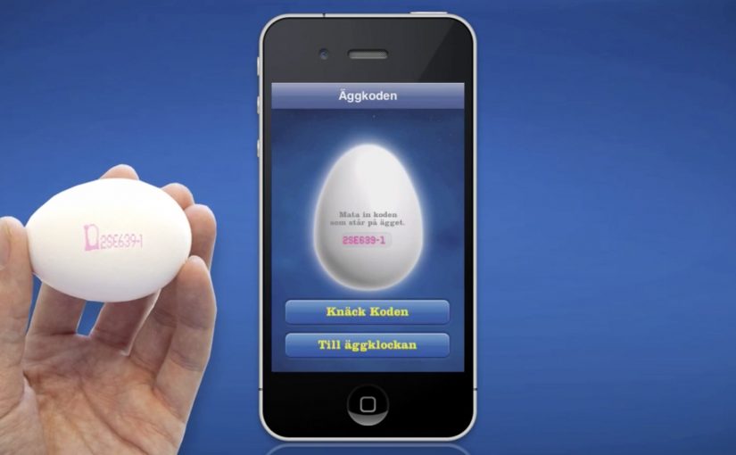
This egg timer iPhone app was created by CP+B for Swedish sandwich spread Kalles Kaviar.

The idea behind the app is to help users boil the perfect egg. It goes further than a simple countdown. It accounts for variables like egg size and how you like it cooked, and it even builds an iTunes playlist where the end of the music means your egg is ready.

The campaign is described as a hit with caviar and egg lovers. It reportedly passed 53,000 unique iPhone downloads and reached number three in Sweden’s iTunes list of the most downloaded free apps.

A breakfast brand that ships something useful

The clever move here is the product logic. Kalles is frequently eaten with sliced boiled egg, so the brand does not start by shouting about taste. It starts by making the egg outcome easier to get right, which makes the pairing more likely to happen again.

How the app turns boiling into a timed soundtrack

  • Input choices. The user selects preferences like softness, and the app adjusts timing accordingly.
  • Playlist as timer. Instead of watching the clock, you listen. When the playlist ends, the egg is done.
  • Extra detail for the obsessed. The experience is described as accounting for factors like altitude, and in some write-ups it is also credited with letting users enter the code printed on Swedish eggs to trace the farm.

In FMCG breakfast categories, small utility tools can turn a habitual pairing into a repeatable ritual and a sales lever.

Why it lands

It respects the moment. People boil eggs while distracted, usually in the morning, and they want confidence without effort. The playlist mechanic is memorable because it is a sensory shortcut, and it also turns waiting time into entertainment.

Extractable takeaway: If your product is most often consumed in a “pairing,” build utility around the pairing step, not around the product claim. Help the ritual succeed, and the product sells itself inside that ritual.

What it is really trying to grow

The real question is whether the utility increases the frequency of the Kalles-plus-egg pairing, not whether the app feels clever.

This is not primarily an “app idea.” It is a demand-shaping idea. By “demand-shaping,” I mean shifting how often the adjacent habit happens, not just which brand wins when it does. If more people boil eggs more often, Kalles has more occasions to be squeezed onto the table. Some coverage also credits the work with lifting egg sales in Sweden, which is a neat reminder that expanding the adjacent habit can be bigger than fighting for share in the core category.

Steal the pairing-first utility play

  • Attach utility to the highest-friction step. Fix the thing people get wrong or avoid.
  • Make the mechanic feel inevitable. A playlist that lasts exactly as long as boiling time is easy to explain and easy to trust.
  • Design for the real context. Morning routines reward hands-free, glance-free interaction.
  • Use delight as reinforcement, not distraction. The music is not decoration. It is the timer.

A few fast answers before you act

What is the Kalles Egg Timer app in one line?

A branded iPhone egg timer that uses your inputs to calculate boiling time and plays a music playlist that ends exactly when the egg is ready.

Why use a playlist instead of a normal countdown?

Because it reduces the need to watch the screen. The soundtrack becomes a passive, low-effort signal that fits cooking behaviour.

What brand problem does this solve?

It makes the product pairing easier to repeat. If the egg step becomes more reliable, the Kalles plus egg habit becomes more frequent.

What makes a branded utility app worth downloading?

It must do a real job better than a generic alternative, and it must fit naturally into a routine people already have.

What should you measure if you run a similar utility idea?

Downloads are not enough. Track repeat usage, time-to-task success, how often the utility is used per week, and whether it correlates with increased occasions for the core product.
Homeplus Subway Virtual Store: Mobile Aisle

A retail store that lives on a subway wall

Homeplus turns a familiar commuter moment into a shopping moment.

Instead of asking people to visit a store, Homeplus brings the store to where people already wait. In the subway.

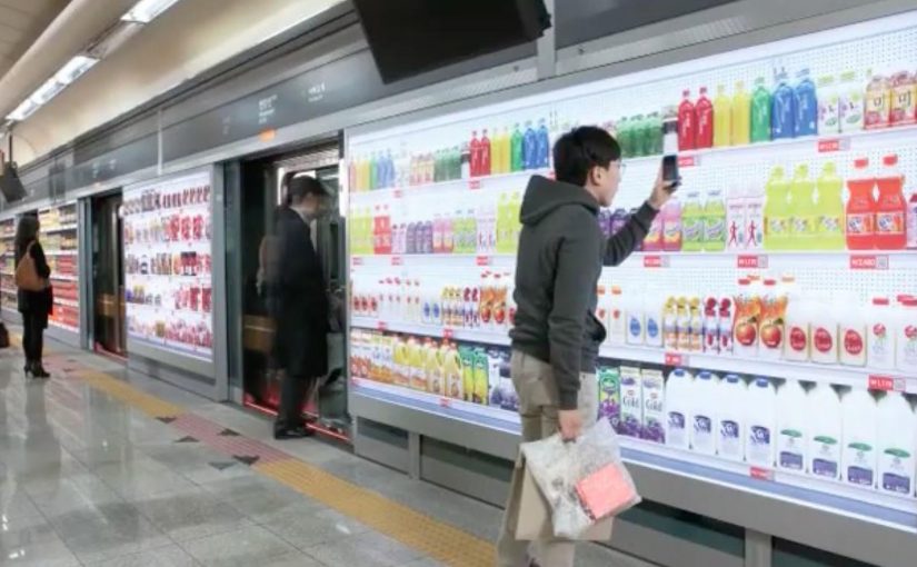
The virtual store appears as a life-size shelf display on station walls. Products are shown like a real aisle, complete with packaging visuals and clear selection cues.

The value is not novelty. It is time leverage. Shopping happens in minutes that normally get wasted.

How it works

The experience is deliberately simple.

A commuter scans product codes with a smartphone, adds items to a basket, and completes the order digitally. Delivery then happens to the home address.

Because the scan-to-basket flow is short, the order can be finished within a single wait for the next train.

That flow changes the meaning of convenience. The store is no longer a destination. It becomes an interface layer that can be placed anywhere footfall exists.

In high-density urban retail, the strongest convenience plays capture existing dwell time instead of trying to create new store visits.

Why this idea matters more than the technology

It is tempting to frame this as a QR-code story. That misses the point. This is the kind of retail innovation worth copying, because it turns context into conversion rather than chasing novelty.

Extractable takeaway: Treat customer dwell time as inventory. Put the simplest possible scan, pay, deliver flow inside a routine people already repeat.

The strategic innovation is contextual retail design. That means placing a purchase interface inside an existing routine, so the context provides the motivation.

Homeplus places the catalog where time is available, reduces friction to scan, pay, and deliver, and treats the physical environment as media and distribution at once.

The subway becomes a high-intent moment. People have time, they are idle, and they are already in a routine. Retail becomes a habit stitched into commuting.

What this signals for retail experience design

This concept highlights a shift that becomes increasingly important.

The real question is where your customers already have predictable micro-windows of time, and whether you can make buying fit cleanly inside them.

Retail experiences are not confined to stores or screens. They can be embedded into everyday environments where attention is naturally available.

For leaders, the question becomes where the best micro-windows of time exist in customers’ lives, and what a purchase flow looks like when it fits perfectly into those windows.

The real lesson. The aisle is a format, not a place

Homeplus shows that an aisle is a navigational model. It does not have to live inside a store.

Once that is accepted, the design space expands. Aisles can be printed. Aisles can be projected. Aisles can appear in transit, at events, or in high-dwell environments.

The pattern is consistent. Retail becomes more modular. Distribution becomes more creative. Convenience becomes a design discipline.

  • Design for dwell time. Choose environments where waiting is predictable and attention is naturally available.
  • Keep the interaction atomic. Scan, confirm, pay. Let fulfillment do the heavy lifting after the scan.
  • Make fulfillment boringly reliable. If delivery fails, the experience collapses because the shopper has no store fallback.

A few fast answers before you act

What is the Homeplus subway virtual store?

It is a life-size “aisle” display in a transit environment where commuters scan products with a phone and order delivery to home.

What is the core mechanic that makes it work?

A fast scan-to-basket flow that turns waiting time into a purchase moment, with fulfillment doing the heavy lifting after the scan.

What is the main prerequisite for repeating this model?

Operational reliability in fulfillment. If delivery fails, the experience collapses because the shopper has no store fallback.

Why is this more than a QR-code story?

The strategic innovation is placing a commerce interface inside a high-dwell routine, using the physical environment as both media and distribution.

What is the simplest way to judge if the concept is working?

If people can complete an order during a normal wait, and fulfillment consistently arrives as promised, the model earns repeat behavior.

Burger King: The Whopper Lust Challenge

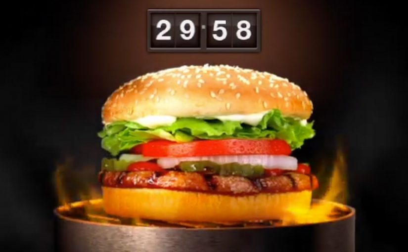
Stare at a picture of a Whopper long enough and you win one. That’s the premise of an interactive TV campaign from Burger King. What looks like a never-ending ad is actually a dedicated TV channel on DirecTV channel 111, built around a spinning flame-grilled burger and a timer.

To win, you tune in and activate the Whopper Lust challenge. A five-minute countdown starts, and you have to keep watching the rotating Whopper for the full duration. Make it to five minutes and you earn one free burger. Keep going for another ten and you earn two. Keep going and the rewards scale. The longer you last, the more you unlock.

The catch is that the channel occasionally prompts you to hit buttons on your remote. Miss one and the clock resets, so you lose the reward you were building toward. Complete the challenge and you can claim the free burger directly on the TV.

How the mechanic turns attention into currency

This is “watch time” treated like a loyalty program. Here, “watch time” means the viewer’s sustained, verified attention, not just a channel left on in the background. The spinning Whopper is deliberately hypnotic, the timer makes the commitment explicit, and the remote prompts prevent passive cheating. It is simple, but it forces real engagement rather than background viewing.

That works because the timer defines the commitment, the remote prompts verify attention, and the visible progress makes the reward feel earned rather than handed out.

In US quick-service marketing, converting a passive channel into a participation loop can buy disproportionate attention without buying proportional media.

Why this lands

It works because it is a dare, not a discount. The reward feels earned, and the friction is oddly satisfying because it creates tension. Will you slip and reset. The interaction also turns a solitary act. Watching TV. Into a game you can talk about immediately.

Extractable takeaway: If you want people to stay with a message, make the “cost” a clear, timed commitment and add periodic interaction checks, so attention becomes an active choice rather than a passive exposure.

What Burger King is really optimizing

This is not just a giveaway. It is a retention play. The real question is how to turn passive media time into a branded challenge people willingly stay with. The channel trains repeat viewing, creates a habit loop, and attaches the brand to a measurable “I lasted” story. Reported campaign figures describe large volumes of burgers given away and large volumes of watch minutes generated over the week.

What to steal from attention-for-reward mechanics

  • Make the rule instantly legible. “Watch X minutes. Win Y.” is frictionless to understand.
  • Prevent passive participation. Add simple interaction prompts to keep it honest.
  • Let rewards compound. Escalation keeps people in the loop longer than a single prize.
  • Turn viewing into a game. A timer and resets create stakes without complex tech.

A few fast answers before you act

What is the Whopper Lust Challenge?

It’s an interactive TV activation where viewers watch a dedicated Burger King channel and earn free Whoppers based on how long they stay engaged.

How do you win a free Whopper?

You activate the challenge, watch the spinning Whopper for five minutes, and respond correctly to occasional remote-control prompts so the timer does not reset.

Why add remote button prompts?

To ensure people are actually watching and interacting, not leaving the channel on in the background.

What makes this different from a normal TV ad?

The ad is the channel, and the viewer is part of the mechanic. Time and interaction directly determine the reward.

What’s the main risk with this format?

If the interaction prompts feel unfair, too frequent, or glitchy, frustration overwhelms the fun and people drop out.