
Carlsberg: Probably the Best Ad in the World

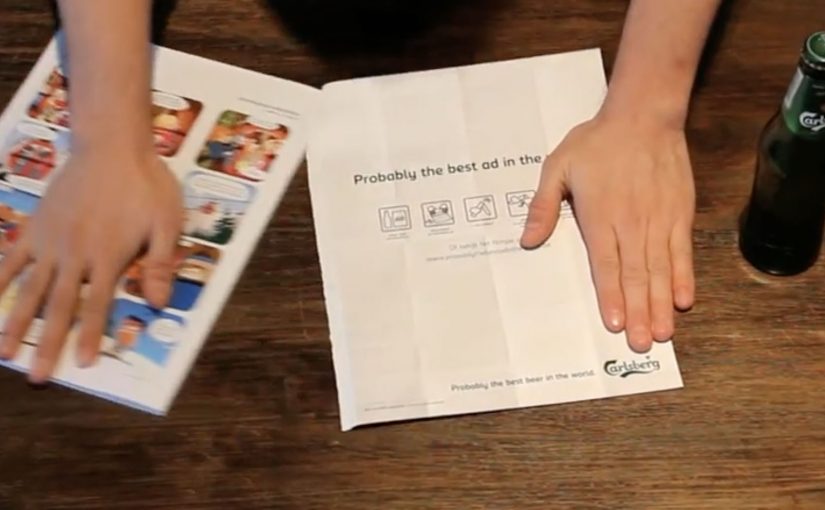
You can debate the effectiveness of magazine advertising all day long, but this Carlsberg ad from Belgian agency Duval Guillaume is undeniably useful. The advertisement reportedly appeared in Men’s magazine Menzo. Follow its instructions and you can use the flimsy piece of paper to open a bottle of Carlsberg.

How the idea is built

The mechanic is the message: the page is not just media. It is a tool. The ad teaches you how to tear and fold it into a working opener, which turns “try the product” into a physical action inside the magazine.

In print-led FMCG marketing, the fastest way to earn attention is to make the medium do something the viewer can immediately test.

The real question is whether your medium can deliver proof, not promises.

Why it lands

It turns a claim into proof. There is no argument to win and no feature list to remember. You either open the bottle, or you do not.

Extractable takeaway: Interactive print works when the action is the demonstration. Here, “interactive print” means the paper itself triggers a physical action, not just reading or looking. If the audience can do the product benefit with their hands in under a minute, the ad becomes memorable because it turns attention into a small personal “win”.

It forces participation. The reader cannot stay passive. The ad only completes itself when someone follows the instructions.

It earns a second look. Utility creates curiosity. People keep it, show it, and try it, which is the opposite of how most print gets treated.

Try it out yourself by downloading the advertisement from: www.probablythebestadintheworld.be.

But does it make this “probably the best ad in the world”? Not if you consider the likely inspiration below. The video shows someone using a piece of paper to open a bottle of Carlsberg.

Steal this: make the page a tool

  • Make the medium carry the benefit. If the product is about a moment. Build an execution that creates that moment.
  • Keep the instruction set frictionless. Fewer steps. Clear folds. Obvious success condition.
  • Design for sharing in the real world. The best print innovations get passed around physically before they get shared digitally.

A few fast answers before you act

What makes this print ad “interactive”?

It is not just read. It is folded into a functional bottle opener, so the reader completes the ad by doing something.

Why is a bottle-opener mechanic effective for beer?

It links the ad directly to the consumption moment. The ad becomes part of opening the product, not just talking about it.

Does utility automatically make a print ad effective?

It improves attention and memorability, but effectiveness still depends on distribution and whether people actually try it.

What is the biggest risk with “useful” print ideas?

If the build is fiddly or fails, the novelty collapses. The interaction must work reliably with minimal effort.

What is the most transferable lesson for advertisers?

When possible, replace messaging with demonstration. If the audience can experience the benefit through a simple action, persuasion gets easier.
The Schweppes Facebook Profile App

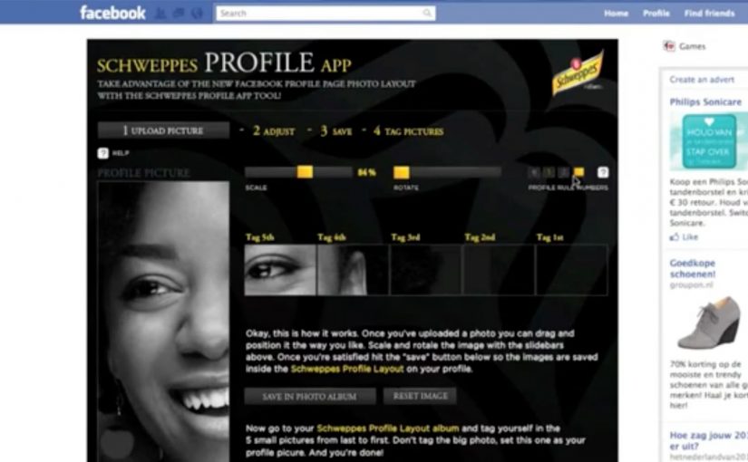
You want a standout Facebook profile, but you do not have Photoshop skills. Schweppes solves it with a Profile App that helps you build a polished new profile design in minutes, using simple templates instead of design tools.

What changed on Facebook that triggered this

Facebook rolled out improvements to the profile experience that made it easier to tell your story and learn about your friends. Creative people quickly started experimenting with the new profile design, turning profiles into personal canvases.

What did Schweppes build

That wave inspired Schweppes to develop the Schweppes Profile App on Facebook. It gave anyone who did not have Photoshop skills, and does not have much time, a way to create a great new profile.

On social platforms where the profile itself is part of how people present themselves publicly, the strongest brand utility is the one that makes visible self-expression easier.

The real question is whether the brand can make a rising social behaviour easier to join without making the experience feel like advertising.

Why this is a smart brand move

This is a smart brand move because it provides a service that becomes increasingly popular as the trend catches on. Templates matter here because they turn a design behaviour into something ordinary users can complete quickly, which is why Schweppes gets used inside the trend instead of interrupting it from the outside.

Extractable takeaway: When a platform change creates a new expression trend, the most effective branded response is often a simple utility that removes skill and time barriers so more people can participate.

What Schweppes is really buying

The business intent is not just profile creations. It is to link Schweppes to an emerging Facebook behaviour at the moment people are actively shaping how they appear to others, which gives the brand relevance through participation rather than message repetition.

What to steal if you build branded social tools

  • Ship a tool that helps people express themselves. Identity improvements get repeated use because the user cares about the output.
  • Ride an emerging behaviour with utility, not messaging. When a platform change sparks a trend, a simple enabler scales faster than a campaign claim.
  • Make quality accessible for non-experts. Templates turn “I need skills” into “I can do this in minutes”.
  • Measure what stays live, not just what gets tried. Adoption is about how many people keep the output active and visible to others over time.

A few fast answers before you act

What is the Schweppes Facebook Profile App?

It is a branded Facebook app that helps people create a customised profile look without needing Photoshop or design skills.

Why does this work as content people actually use?

Because the output is identity-based. People are motivated to improve how they present themselves, so a tool that makes it easy gets adoption.

What is the core pattern to copy?

Spot an emerging behaviour, then ship a simple tool that helps people do it better. The brand earns attention by enabling, not interrupting.

Why does accessibility matter more than creative polish here?

Because the idea scales only if ordinary people can complete it quickly. Templates beat complexity when the goal is broad participation, not elite design output.

What should you measure if you run something similar?

Creations completed, share and usage rate, how many people keep it live, referral loops from friends viewing profiles, and repeat usage over time.

Claro: Ringtowns

Turning coverage into something people can carry

Claro is one of the leading telecommunications companies in Guatemala and it faces a constant struggle to combat negative perceptions of their network coverage. So Ogilvy Guatemala created a campaign to counter these perceptions and communicate the wide coverage of Claro by involving consumers through their cellphones.

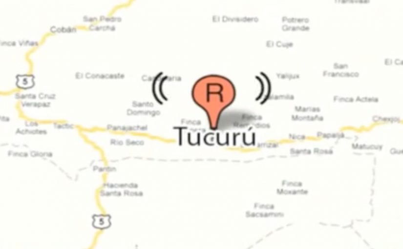
Imitating the sound of the traditional ringtones they communicated the names of towns and remote communities in the country. The campaign “Ringtowns” was based on local realities in Guatemala to create a strong sense of identity and pride, while communicating the wide coverage of Claro in an innovative manner. In the campaign, each “Ringtown” is a downloadable ringtone that encodes a town or community name into the audio, so the place name itself becomes the message.

The mechanic: make a town name sound like a ringtone

The product here is not a poster or a banner. It is a piece of audio people choose to install. Each ringtone is designed to sound like a familiar phone ring while “saying” a place name, so the coverage claim becomes something you hear repeatedly in daily life.

A “Ringtown” is a downloadable ringtone that encodes a specific town or community name into the audio, so the location itself becomes the message.

In telecom categories where coverage is questioned, making the proof travel through personal devices can outperform traditional persuasion because it shows up in real social moments.

In emerging-market telecom markets, coverage trust is shaped as much by social stories as by technical maps.

Why it lands: social proof disguised as personalization

The real question is whether you can make a skeptical coverage claim feel like a personal identity choice, not corporate reassurance. This works because it turns a skeptical claim, “We cover remote places,” into a personalized choice. If I download a ringtone that represents my town, then every time my phone rings in public, it signals both identity and reach. That shift turns the coverage narrative from a corporate statement into a consumer-owned artifact that other people hear.

Extractable takeaway: When an attribute is distrusted, package the proof as a personalized utility people choose, keep, and replay in public.

What Claro is really buying with this format

This is an awareness campaign that behaves like distribution. Downloads create repeat exposures. Call events create additional impressions. Sharing extends reach without extra media spend. An opt-in utility is a stronger lever than another coverage-map ad because repetition is user-chosen and public.

Most importantly, it reframes “coverage” from a technical map into a cultural map. Names and pride replace bars and statistics.

Design moves that make proof portable

  • Make the message a utility. If people can use it daily, frequency is built in.
  • Use identity as the opt-in. People adopt things that say something about where they are from.
  • Design for public replay. Ringtones happen around other people, which makes the message audible and social.
  • Keep distribution simple. Website download and text message fulfillment reduce barriers.

A few fast answers before you act

What is Claro’s Ringtowns campaign?

It is a mobile campaign that turns town and community names into ringtone-style audio. People download the ringtones, and every incoming call becomes a small, repeated reminder of Claro’s coverage.

How does it communicate network coverage without showing a map?

It uses place names as the proof. By turning remote locations into ringtones, the campaign suggests breadth of coverage through cultural recognition rather than technical claims.

Why is the ringtone format powerful for marketing?

A ringtone is repeated, public, and chosen by the user. That combination creates high frequency exposure with built-in social visibility.

What is the key participation mechanic?

Users download one of the “Ringtowns” from the Claro website or request it by text message. Installation is the commitment step that creates ongoing exposure.

What is the biggest risk if you copy this idea?

If the audio is annoying or the payoff feels unclear, people will not keep it installed. The artifact has to be genuinely usable, not just clever once.