Share Happy Ice Cream Machine

Share Happy Ice Cream Machine

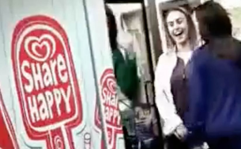
You approach an ice cream machine that refuses to work for a solo person. It only dispenses when two people participate together. The reward is simple. Free ice cream. The behaviour it creates is even simpler. Ask someone nearby to join you.

The idea. Turn a freebie into a shared ritual

Most giveaway machines are built for speed. Press, receive, leave. Share flips the script. The machine makes cooperation the trigger, so the brand message is performed in public rather than stated on a poster.

Why this mechanic works

It removes awkwardness. People have a reason to talk to strangers, and the machine becomes the icebreaker. The shared reward also creates a shared story, which is why these activations often travel well on social. Here, the mechanic is simply the rule people must follow to unlock the reward.

Extractable takeaway: When the reward depends on two people, the brand turns participation itself into proof of the idea.

Buy interaction, not just sampling

In crowded retail and event environments, the hard part is not handing out samples, but giving strangers a reason to interact in public.

The real question is not whether a free ice cream can attract attention. It is whether the brand can turn that attention into a memorable social behaviour.

Share gets that right, because the interaction is the media, not just the reward.

Steal this from the teamwork mechanic

  • Make the rule obvious before people arrive. People should understand from a distance that this only works together.
  • Keep the action physical and quick. The longer the interaction takes, the more the social energy drops.
  • Make the reward immediate. Fast payoff is what turns a small interaction into a satisfying public moment.
  • Judge success by interactions, not just giveaways. The stronger metric is how many micro-connections the brand creates between people.

A few fast answers before you act

What is the Happy Ice Cream Machine?

It is a vending-machine-style activation that dispenses free ice cream only when people participate together, so the reward is tied to cooperation.

Why require two people?

Because it forces a social moment. The brand message becomes a behaviour. Sharing is not a slogan. It is the unlock mechanism.

What makes this kind of activation spread?

It is easy to understand on video. Two strangers team up, the machine responds, and the payoff is instant. That simplicity travels.

Where does this work best?

It works best in places with natural foot traffic and a low barrier to joining in, such as retail zones, festivals, campuses, and public events.

What should you measure?

Participation pairs per hour, average dwell time, repeat attempts, and the share rate of user-generated clips during the activation window.

Pilot Pen: Handwritten Emails

Pilot Pen: Handwritten Emails

Pilot Pens Spain has made emails more personal by letting you handwrite your emails on the computer.

A pen brand that turns “your writing” into a usable tool

The mechanic is simple. You create a digital font from your own handwriting, then use that font to write emails that look like you wrote them by hand.

All you need to do is go to www.pilothandwriting.com and turn your handwriting into a digital font. After that you can start sending handwritten emails to your friends.

In everyday one-to-one communication, the feeling of personal effort often matters more than perfect typography.

Why it lands: it restores “human signal” without slowing you down

Email is fast but visually uniform. Handwriting is personal but slow. This concept bridges the gap by keeping the speed of email while reintroducing the quirks and warmth that make a message feel meant for one person. By “human signal,” this means the visible personal quirks that make a message feel authored by a specific person rather than produced by a system. It works because the digital font preserves those quirks while removing the time cost of writing by hand.

Extractable takeaway: If your brand owns a physical ritual, translate the ritual into a digital utility that keeps the emotional benefit. People do not want “more features”. They want the feeling the ritual used to create.

The business intent: make the brand present at the moment of meaning

The real question is whether a pen brand can make its core ritual useful inside digital behavior instead of just advertising around it.

This is a strong brand utility move because it turns product truth into something people can actually use. Pilot is useful when you have something worth saying, and the campaign makes the brand present at the exact moment that sentiment is expressed.

The work is commonly credited to Grey Barcelona for Pilot Pen in Spain.

How to apply this brand utility pattern

  • Turn a brand asset into a tool: if you own a distinctive behavior (writing, drawing, annotating), make it usable in digital life.
  • Keep the first win fast: the user should get a “wow, that’s me” moment within minutes.
  • Design for sharing by default: the output should be easy to send, post, or reuse without extra steps.
  • Respect authenticity: slight imperfections are a feature here. Over-smoothing kills the point.
  • Measure the right signal: repeats and reuse matter more than one-time visits.

A few fast answers before you act

What is Pilot Handwriting?

It is a web experience that converts your handwriting into a digital font, so you can write emails that look handwritten.

Why does “handwritten email” feel more personal?

Because handwriting carries individual variation. That visual uniqueness signals effort and intention in a way standard typed text does not.

Is this a gimmick or a useful tool?

It can be a real utility if it reduces friction and produces an output people reuse. The best test is whether users come back and keep writing with it.

What makes a brand utility campaign work?

A clear problem, a fast first payoff, and an output that naturally travels to other people, turning use into distribution.

What’s the biggest risk in copying this idea?

Onboarding friction. If setup is slow or error-prone, the personal magic disappears before the user gets a satisfying result.

AT&T: ZugMO webcam heading banner game

AT&T: ZugMO webcam heading banner game

The AT&T banner brings you right into the game, using Zugara’s augmented reality motion capture technology called ZugMO. Here, “augmented reality” means webcam-based motion capture with game graphics layered over live camera input. ZugMO translates head movement into game input. You use your webcam to “head” crosses toward goal, with five shots to score as many as possible. There isn’t much more to it than that. But it is a very cool concept, especially because it is described as having run as a banner placement on ESPN.com with BBDO and Zoic Studios involved.

Why this banner feels different to click on

Most banners ask for a click and then try to convince you after the fact. This one flips the sequence. It gives you a tiny game first, then lets AT&T benefit from the time, focus, and small dopamine hit that comes from trying to score.

Extractable takeaway: A playable banner works when the mechanic is instantly legible, the interaction is frictionless, and the reward arrives fast enough that people try “just one more shot.”

What “augmented reality” means here

In this execution, “augmented reality” is less about 3D worlds and more about webcam-based motion capture layered with game graphics. Your movement is the controller. The screen overlays the ball path and goal feedback on top of live camera input, so the interaction feels physical even though you are still inside a standard banner unit.

The mechanic is the message

There are only a few moving parts. A webcam feed. Face and head tracking. A corner-kick animation. A simple scoring loop with five attempts. That minimalism matters because banners do not have time for onboarding. If the player cannot understand it in one glance, the banner has already lost.

In performance-driven digital advertising, the fastest way to earn attention is to let people experience the message with their own body in seconds.

The real question is whether your ad can earn five seconds of voluntary play without explaining itself.

Playable banners are worth doing when the first interaction is immediate, legible, and ends quickly enough to invite a replay.

The business intent behind the “cool concept”

Positioned around football attention, the deeper message is speed and responsiveness. Not by claiming it, but by making the ad itself respond to you. It is a small but smart translation of “fast network” into an experience you can feel.

Steal this pattern for playable banners

  • Design for zero instructions. If the mechanic cannot be understood instantly, simplify it.
  • Use the body as the controller. Webcam motion beats mouse clicks when you want memorability, not just reach.
  • Keep loops short. Five shots is a clear session boundary. It invites replay without feeling endless.
  • Make the feedback loud. Clear “goal” and “miss” cues turn confusion into compulsion.
  • Let the format prove the claim. If your message is speed, make the interaction snappy and responsive.

A few fast answers before you act

What is a “playable banner”?

A playable banner is a display ad that includes a lightweight interactive experience, usually a mini game, inside the ad unit itself. The goal is to trade passive impressions for active participation.

Why does webcam motion capture increase engagement?

Because it turns the user from a viewer into the controller. When your body movement drives the outcome, attention becomes harder to drop and easier to remember.

What makes this AT&T banner easy to understand?

The interaction maps to a real-world action. You head the ball. The scoring loop is obvious. The session is short. That combination removes the need for instructions.

What is ZugMO in simple terms?

ZugMO is Zugara’s webcam-based motion capture layer that detects user movement and converts it into game input. In this case, it translates head movement into a “header” action.

What is the biggest failure mode for interactive banner ads?

Too much friction. If the ad requires setup, permissions confusion, slow loading, or unclear controls, most people leave before the first reward moment arrives.