
KLM: Economy Comfort

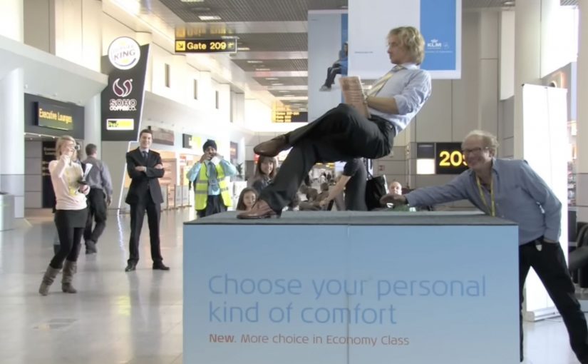
Dutch ad agency Rapp Amstelveen has magician Ramana appear in a European airport, performing his levitation trick to advertise KLM’s comfortable Economy Comfort seats.

A comfort claim made physical

The execution picks a familiar magic trope. Levitation. And places it in a high-friction environment where comfort actually matters. Airports. Waiting. Stress. The stunt is easy to understand even without copy, and the metaphor does the selling: this seat makes the journey feel lighter.

How the mechanism earns attention

Mechanically, it works because it is a live interruption, meaning a real-world moment people witness in person, that behaves like entertainment first and advertising second. People stop because something unusual is happening, then the brand message arrives as the explanation for the spectacle.

In travel and airline marketing, making an abstract benefit feel tangible is often more persuasive than repeating feature lists.

In European travel brands, context-led demonstrations often outperform abstract comfort claims.

Why it lands in an airport context

The location is the multiplier. In an airport, audiences are already thinking about space, fatigue, and the next few hours of their life. A “comfort” message is not a concept. It is an immediate desire. That makes the metaphor feel relevant rather than random.

Extractable takeaway: When the promise is comfort, place the proof where discomfort is already top of mind, so the message lands as a relief, not a claim.

What KLM is really buying with a stunt like this

Beyond awareness, the intent is memorability for a paid upgrade. Economy Comfort is the kind of product that can disappear into pricing tables. A public demonstration gives it a story. The real question is whether your upgrade has a story people will repeat after they leave the airport. And stories travel further than seat specs.

Steal this move for paid upgrades

  • Use a single, legible metaphor. If the audience can “get it” in one second, you win the next ten.
  • Stage it where the benefit is felt. Context turns a claim into a reminder of a real pain point.
  • Let entertainment open the door. Make the first moment about curiosity. Make the second moment about the brand.
  • Turn a feature into a story. Especially for upgrades and add-ons that otherwise live in fine print.

A few fast answers before you act

What is the core idea behind KLM Economy Comfort?

A live levitation stunt in an airport used as a physical metaphor for a more comfortable flight experience.

Why use a magician for a seat upgrade?

Because comfort is hard to “prove” in an ad. A simple spectacle makes the promise feel immediate and memorable.

What role does the airport setting play?

It is where people are already primed to care about comfort, waiting, and travel fatigue. The message meets them at peak relevance.

What is the transferable lesson?

When your benefit is abstract, demonstrate it with a single visual metaphor, in the environment where the benefit matters most.

How can you adapt this if you cannot do a live stunt?

Use a single visual metaphor you can demonstrate in the place where the benefit is felt, then let the brand message arrive as the explanation.
Google Goggles: Translate Text in Photos

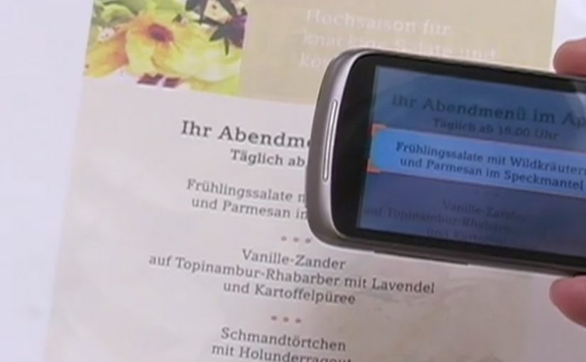
A user takes a photo of text with an Android device, and Google Goggles translates the text in the photo in a fraction of a second.

It uses Google’s machine translation plus image recognition to add a useful layer of context on top of what the camera sees.

Right now, it supports German-to-English translations.

What Google Goggles is really doing here

This is not “just translation.” It is camera-based understanding. The app recognises text inside an image, then runs it through machine translation so the result appears immediately as usable meaning.

In everyday travel and commerce, camera-first translation removes friction at the exact moment that text blocks action. By camera-first translation, I mean pointing a phone at printed text and getting a translated overlay instantly in the same view. Because the result appears in place, people do not have to retype or switch apps, which is why it feels immediate.

In European travel and retail settings, camera-first translation turns printed text into immediate, actionable guidance.

The real question is whether your interface can turn raw capture into meaning without making users switch contexts.

This is the kind of feature worth shipping because it removes friction exactly where action stalls.

Why this matters in everyday moments

If the camera becomes a translator, a lot of friction disappears in situations where text blocks action. Think menus, signs, instructions, tickets, posters, and product labels. The moment you can translate what you see, the environment becomes more navigable.

Extractable takeaway: When you translate what people see in the same view they are already using, you turn blocked moments into forward motion.

The constraint that limits the experience today

Language coverage determines usefulness. At the moment the feature only supports German-to-English, which is a strong proof point but still a narrow slice of what people want in real life.

The obvious next step

I can’t wait to see the day when Google comes up with a real-time voice translation device. At that point, we will never need to learn another language.

What to copy from camera-first translation

  • Remove friction at the moment of intent. Translate or explain text exactly when it blocks action, not after users detour into search.
  • Keep meaning in the same view. Overlay the translation in-place so people stay oriented and do not have to retype or switch contexts.
  • Expand coverage before polishing edges. Language breadth determines usefulness more than UI refinements.

A few fast answers before you act

What does Google Goggles do in this example?

It translates text inside a photo taken from an Android device, using machine translation and image recognition.

How fast is the translation described to be?

It translates the text in a fraction of a second.

Which language pair is supported right now?

German-to-English.

What is the bigger idea behind this feature?

An additional layer of useful context on top of what the camera sees.

What next-step capability is called out?

Real-time voice translation.

Nokia: Mixed Reality interaction vision

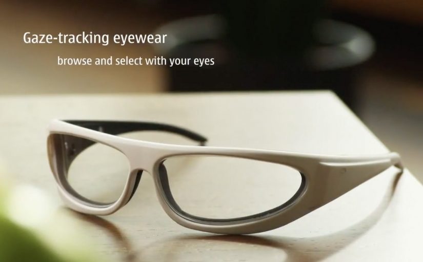
A glimpse into Nokia’s crystal ball comes in the form of its “Mixed Reality” concept video. It strings together a set of interaction ideas: near-to-eye displays (glasses-style screens close to the eye), gaze direction tracking (sensing where you look), 3D audio (spatial sound), 3D video, gesture, and touch.

The film plays like a day-in-the-life demo. Interfaces float in view. Sound behaves spatially. Attention (where you look) becomes an input. Hands and touch add another control layer, shifting “navigation” from menus to movement.

Future-vision films bundle emerging interaction modalities into a single, easy-to-grasp story.

What this video is really doing

It is less a product announcement and more a “stack sketch”, meaning a quick story that layers several interaction technologies into one routine. Concept films are useful for alignment, but they are not validation until the interaction is prototyped and tested.

The mechanism: attention as input, environment as output

The core mechanic is gaze-led discovery. If your eyes are already pointing at something, the system treats that as intent. Gesture and touch then refine or confirm. 3D audio becomes a navigation cue, guiding you to people, objects, or information without forcing you to stare at a map-like UI. This works because it turns existing attention into a low-effort selection signal, then uses deliberate actions to reduce accidental activation.

In product and experience teams building hands-free, glanceable interfaces, this shift from menu navigation to attention-led cues is the core design trade-off.

Why it lands: it reduces “interface effort”

By “interface effort” I mean the mental and physical work of hunting through apps and menus. Even as a concept, the appeal is obvious. It tries to remove that friction by bringing information to where you are looking, and actions feel closer to how you already move in the world. The real question is whether you can make attention-led interfaces feel stable and trustworthy in everyday use.

Extractable takeaway: The fastest way to communicate a complex interaction future is to show one human routine and let multiple inputs, gaze, gesture, touch, and audio, naturally layer into it without heavy explanation.

That is also the risk. If a system reacts too eagerly to gaze or motion, it can feel jumpy or intrusive. The design challenge is making the interface feel calm while still being responsive.

What Nokia is positioning

This vision implicitly reframes the phone from “a screen you hold” into “a personal perception layer”, meaning a persistent interface that sits closer to your senses than a handset UI. It suggests a brand future built on research-led interaction design rather than only on industrial design or hardware specs.

What to steal for your own product and experience work

  • Design around one primary input. If gaze is the lead, make gesture and touch supporting, not competing.
  • Use spatial audio as a UI primitive. Direction and distance can be an interface, not just a soundtrack.
  • Show intent, then ask for confirmation. Let the system suggest based on attention, but require an explicit action to commit.
  • Keep overlays purposeful. Persistent HUD clutter kills trust. Reveal only what helps in the moment.
  • Prototype the “feel,” not just the screens. Latency, comfort, and social acceptability decide whether this works in real life.

A few fast answers before you act

What is Nokia “Mixed Reality” in this context?

It is a concept vision of future interaction that combines near-to-eye displays with gaze tracking, spatial audio, gesture, and touch to make navigation feel more ambient and less menu-driven.

What does “near-to-eye display” mean?

A near-to-eye display sits close to the eye, often in glasses-style hardware, so digital information can appear in your field of view without holding up a phone screen.

How does gaze tracking change interface design?

It lets the system infer what you are attending to, so selection and navigation can start from where you look. Good designs still require a secondary action to confirm, to avoid accidental triggers.

Why include 3D audio in a mixed reality interface?

Because sound can guide attention without demanding visual focus. Directional cues can help you locate people, alerts, or content while keeping your eyes on the real environment.

What is the biggest UX risk with gaze and gesture interfaces?

Unwanted activation. If the interface reacts to normal eye movement or casual gestures, it feels unstable. The cure is clear feedback plus deliberate “confirm” actions.