
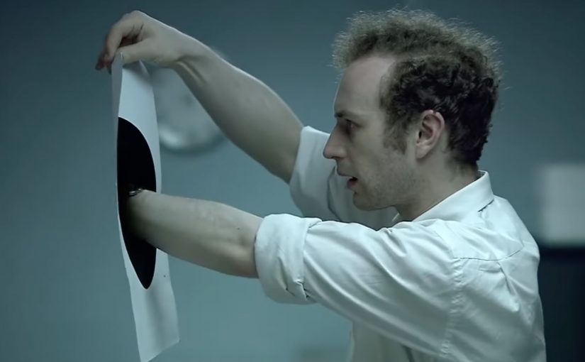
The Black Hole: Greed Meets Gravity

A photocopied black hole in a tired office

A sleep-deprived office worker accidentally discovers a black hole. And then greed gets the better of him.

The temptation ladder that drives the story

The mechanism is minimal and ruthless. An impossible object appears in a painfully ordinary environment, and the plot becomes a sequence of decisions. That escalation is a temptation ladder. Each rung is a slightly bolder choice that still feels justifiable. First curiosity. Then small opportunism. Then the one step too far, when he is unobserved and convinced he can get away with more.

In digital-first marketing teams, shorts like this are often used as reference for how to compress a human truth into under three minutes without losing clarity.

Why it lands: humour, surprise, and a very human loss of control

It works because the character is recognisable. The film does not need backstory. Sleep deprivation, dull repetition, and the sudden possibility of an easy win are enough. The humour comes from how quickly the “reasonable test” becomes a greedy plan. Because the escalation is choice-led, the ending feels inevitable rather than arbitrary. The real question is how fast a “harmless” shortcut turns into a choice you cannot undo. The office worker’s attempt to take the money leaves him imprisoned in the safe, which snaps the whole story shut with a clean, memorable payoff. For short-form work, this is a stronger reference than most brand films because it earns its payoff through decisions, not exposition.

Extractable takeaway: If you want a twist to travel, build it as a ladder of justifiable choices so the audience can feel themselves taking each step.

Craft choices that make the twist hit harder

The look supports the emotional state. Desaturated colour and a flat office environment underline the dull, repetitive job, then the discovery injects energy into both the performance and the pacing. Visual rhythm is handled through fast cutting and movement within the frame, and it intensifies when he enters the room with the safe.

Sound does a lot of work too. It helps sell the supernatural element while keeping everything grounded in familiar office items, which makes the concept feel closer and more unsettling.

Steal the escalation pattern for your own shorts

  • Start with a one-sentence premise. The audience should understand the setup immediately.
  • Escalate through choices, not explanation. Each decision should feel like the next “tempting” step.
  • Let craft mirror psychology. Colour, cutting, and sound can track the character’s shift from boredom to adrenaline.
  • Deliver an inevitable ending. A twist lands best when viewers can replay the steps and realise it was always heading there.

A few fast answers before you act

Who made “The Black Hole”?

The short film “The Black Hole” is directed by Philip Sansom and Olly Williams and features Napoleon Ryan as the office worker.

What is the core mechanism of the film?

The film puts an ordinary office setting next to an impossible “black hole” object, then escalates through a chain of increasingly greedy decisions.

Why does the short work so well?

The short works because the character is instantly recognisable, the premise is one sentence, and each choice feels like a believable next step until the inevitable consequence lands.

What makes this a useful reference for marketers and storytellers?

The film is a useful reference because it compresses a human truth into a tight arc with minimal setup, clear escalation, and a payoff that recontextualises every prior step.

What is the most transferable takeaway?

The most transferable takeaway is to start with one impossible object, escalate via choices rather than exposition, and land a twist that feels inevitable in hindsight.
Nokia: The World’s Biggest Signpost

When navigation stops being private

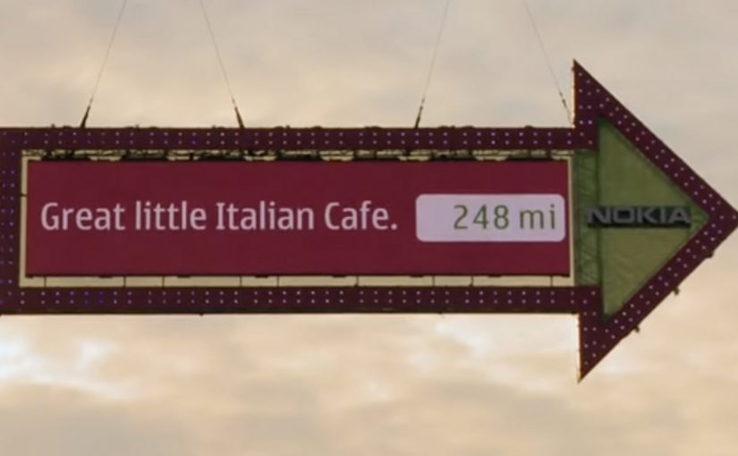
Making navigation social is the new big idea by Swedish agency FarFar for Nokia.

What the “big signpost” actually does

The idea is simple at street level. Put a colossal digital signpost in a place with constant foot traffic, then let the public control it. People submit a location from their phone or via the web, and the sign turns to point toward that place while displaying the direction and distance.

Instead of selling navigation as a spec on a phone, the campaign turns it into a shared public utility and a social recommendation engine. Your place becomes part of the experience, and everyone nearby gets a live demonstration of what the service can do.

In global consumer tech marketing, “useful features” often stay invisible until you give them a public stage and a participatory hook.

Why it lands

It takes something normally solitary, finding your way, and makes it performative. Watching the sign react in real time creates instant credibility, and seeing other people’s “good things” transforms navigation from point-to-point directions into discovery. The spectacle draws a crowd, but the viewer control keeps the crowd engaged because the output is never the same twice.

Extractable takeaway: If you are marketing a capability people underestimate, externalize it in a physical demonstration, then let the audience drive the input so the proof feels self-generated.

What Nokia is really buying with this stunt

The visible job is attention. The deeper job is adoption.

The real question is whether a public demonstration can turn navigation from a private utility into a behavior people want to repeat and share.

This is a stronger way to sell navigation than listing features in isolation because the product benefit becomes visible, social, and easy to try.

Done well, the “map of good things” becomes more than a campaign artifact. Here, “map of good things” means a navigation layer shaped by public recommendations, not just static directions. It becomes a product behavior.

What brands can steal from the signpost

  • Turn an invisible feature into a visible ritual. Make the value legible in under five seconds, even with no sound.
  • Design for participation, not just impressions. Let people submit inputs, then reward them with a public output.
  • Make the crowd the content engine. Recommendations from real people do the persuasion work for you.
  • Build a clean bridge to “try it now.” If the demo is the billboard, the next step must be immediate on the device in someone’s pocket.

A few fast answers before you act

What is “The World’s Biggest Signpost” for Nokia?

It is a large interactive signpost installation that lets the public submit locations and then shows the direction and distance to those places, used to promote Nokia’s navigation services as social and shareable.

How does the experience make navigation “social”?

It shifts navigation from personal utility to public discovery by letting anyone contribute places and letting everyone nearby see the recommendations and results live.

What is the core mechanic that makes it work?

Real-time viewer control. People submit a destination and immediately see the sign respond with a physical, public proof of the service.

Why use a large physical installation instead of a regular ad?

A physical demo creates instant trust. It shows the capability in the real world, not as a claim, and it attracts attention through spectacle while keeping engagement through interaction.

What’s the key transferable lesson for brands?

If you want people to value a capability, stage it as a shared experience where the audience supplies the inputs and the product supplies undeniable outputs.

Logorama: 2,500 Logos

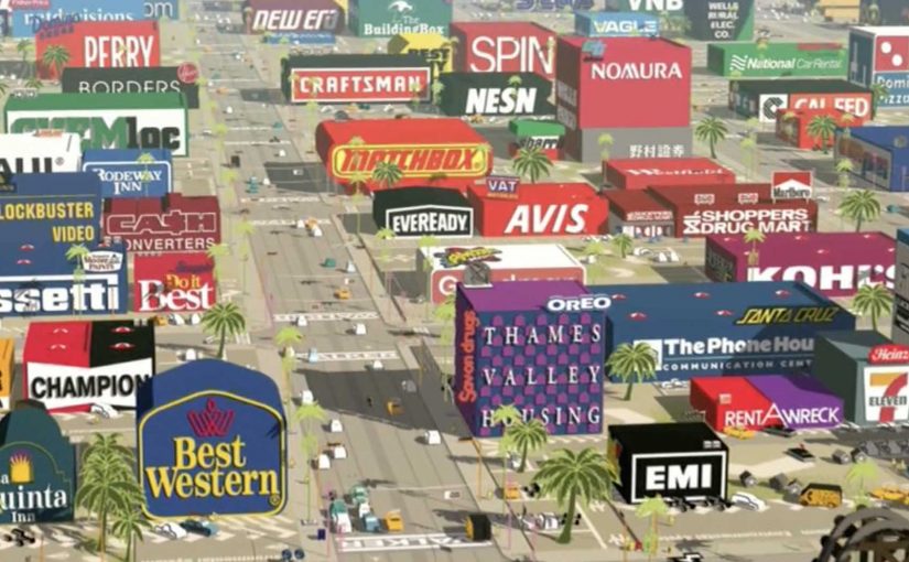
A seventeen-minute Hollywood-style tale where the city, the props, and even the characters are built from brand marks. The film is described as using more than 2,500 logos.

Logorama turns a familiar crime-thriller structure into something stranger. A world that looks like Los Angeles, but everything is signage. Every surface is a trademark. Every background detail is a corporate symbol you already know.

A thriller built out of trademarks

The mechanism is extreme constraint. Here, that means one hard rule: the filmmakers construct the entire environment out of existing brand identities, then animate it with blockbuster pacing, chase energy, and escalating chaos. That constraint works because instant logo recognition lets the film establish character, tone, and hierarchy without slowing down for explanation.

In brand-saturated consumer cultures, the fastest way to make people feel the weight of logos is to stop treating them as background and make them the physical world.

Why it lands, even if it feels wrong

The film works because it makes recognition do the work. You do not need exposition to understand who is powerful, who is ridiculous, and what kind of world you are in. Your brain fills in associations at speed, and the pace keeps you laughing before you have time to get comfortable. The satire lands not through speeches, but through accumulation. If everything is a logo, nothing is neutral.

Extractable takeaway: If your message is about cultural saturation, build a system where the audience cannot escape the stimulus, and let their own pattern-matching create the critique.

What the film is really demonstrating

Logorama is both craft flex and commentary. It shows how deeply brand codes have entered shared visual language, and it proves that you can tell a coherent, high-tempo story while replacing conventional production design with a library of corporate symbols.

This is not a logo stunt. It is a disciplined storytelling system that turns brand recognition into narrative force. The real question is how far a single visual rule can carry both entertainment and critique without collapsing into gimmick.

What to borrow from Logorama

  • Use constraint as a headline. One clear rule can make a piece feel instantly different.
  • Let recognition drive meaning. Familiar symbols carry narrative shortcuts, use them deliberately.
  • Keep the story engine simple. High concept needs a readable spine, chase, pursuit, escalation.
  • Make the critique experiential. People remember what they felt while watching, not what they were told.

A few fast answers before you act

What is Logorama?

An animated short that builds a Hollywood-style thriller world entirely out of brand logos and mascots, using recognition as both storytelling fuel and satire.

Why does the “all logos” rule matter?

It turns branding from decoration into environment. That shift makes consumer culture feel unavoidable, which is the point the film is pressing on.

How many logos are in the film?

The film is commonly described as featuring more than 2,500 logos.

What is the main creative risk of this approach?

If the narrative spine is weak, the piece becomes a spot-the-logo gimmick. The story has to keep moving, so the constraint serves meaning rather than replacing it.

What can marketers learn from it?

High constraint plus simple story structure can produce work that is both memorable and interpretable. The audience does the decoding, which increases engagement.