Yahoo! JAPAN: Hands On Search

Yahoo! JAPAN: Hands On Search

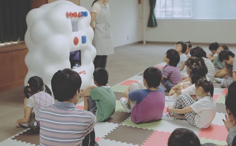
Yahoo! JAPAN introduces what it calls “Hands On Search”. A hands-on search experience that lets visually impaired children explore online concepts through touch, not screens.

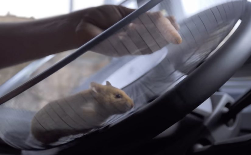
A voice-activated kiosk is set up so children can speak what they want to “search” for. The system recognises the verbal request, pulls a corresponding 3D model, and prints a small physical object. For the first time, children can hold what they usually only hear described. From animals to landmarks and buildings.

Search becomes a physical output

The mechanism is voice input plus 3D printing output. Instead of returning text, images, or audio, the search result is manufactured into a tactile model the child can feel in their hands. Because the output is tactile, the child can verify shape and scale directly, which is why the interaction shifts from description to discovery.

In accessible technology design, the strongest innovation is often a translation layer that converts a dominant medium into the sense that an excluded audience can reliably use. That is the pattern worth copying. Change the output medium, not just the narration layer.

In accessible-learning contexts, the constraint is rarely intent but whether the output can be inspected without sight.

Why it lands

It reframes “search” as something more than browsing. It becomes discovery you can share in a classroom. The real question is whether your product can render its core value into the senses your excluded users actually rely on. The moment the object prints is also the moment learning becomes concrete. It is not an abstract promise about inclusion. It is a visible, touchable outcome.

Extractable takeaway: If your experience is inherently visual, do not just add narration. Add an equivalent output that preserves shape and scale in a form people can physically inspect, so learning moves from description to direct exploration.

Tactile-search patterns for product teams

  • Design for the missing sense, not the average user. Start with the constraint, then build the interface around it.
  • Make the interaction one-step. Voice request in. Physical result out. No menus, no setup rituals.
  • Curate the object library. Accessibility fails when content quality is inconsistent. The “catalogue” is part of the product.
  • Prototype in real learning environments. Schools and educators reveal whether the tool supports teaching, not just demos.

A few fast answers before you act

What is Hands On Search in one sentence?

It is a concept machine that turns spoken searches into small 3D-printed models, so visually impaired children can “touch” search results.

Why does 3D printing matter here?

Because it converts information into form. For someone who cannot see images, a physical model can communicate shape, proportion, and structure directly.

Is this a campaign or a product direction?

It plays like a campaign film, but the underlying idea is a product direction. Search as an output system that can render to different senses depending on user needs.

What is the biggest risk in copying this idea?

Building a beautiful prototype without a sustainable content pipeline. If the object library is thin, slow to expand, or low fidelity, usefulness drops quickly.

Where should you prototype first?

Prototype where learning happens. Schools and educators will quickly show whether the tool supports teaching, not just demos.

Volvo Trucks: The Hamster Stunt

Volvo Trucks: The Hamster Stunt

Brands everywhere are chasing branded content. Volvo Trucks picks a sharper route: it turns a technical feature into a spectacle by letting a hamster “steer” a Volvo FMX out of a quarry using Volvo Dynamic Steering.

The gag is simple to explain and hard to ignore. A hamster wheel is mounted to the steering wheel, and a precision driver handles pedals and safety while guiding the hamster with a carrot. The result feels like a ridiculous idea that somehow still proves something real.

When the product proof is the entertainment

Volvo Dynamic Steering is not an easy feature to dramatize in a way non-truck buyers want to watch. This film solves that by making “light steering” visually absurd, then grounding it with a credible live-test frame. A live-test frame is a visibly real setup that keeps the demonstration believable even when the idea is silly.

In global B2B and industrial marketing, this is a clean blueprint for turning an engineering benefit into mass-reach content without losing the proof.

The real question is whether your product proof can be watched by people who will never buy the thing.

B2B brands should bias toward demos that carry the claim in the image, not explanations that require patience.

Why the hamster works as a device

The hamster is not just cuteness. It is a proxy for “minimum force.” If a tiny animal can move the wheel, the viewer instantly understands the claim before any explanation arrives.

Extractable takeaway: If you can embody your benefit in a single visual proxy, the claim lands before the explanation.

That is the key branded-content trick: build an image that carries the message on its own, then let the technical story catch up afterwards.

Reported reach, and the deeper lesson

Volvo Trucks reports the film drew millions of views quickly, and industry press echoes that early momentum. The bigger point is not the number, it is the audience expansion. A feature aimed at fleet operators becomes something broadly watchable because the demonstration is designed like a story, not a spec.

What to copy from the hamster stunt

  • Turn the benefit into a visual impossibility that still stays true.
  • Keep the proof readable without narration, the image should carry the claim.
  • Use a live-test frame so entertainment does not undermine credibility.
  • Design a one-sentence retell, “a hamster steers a truck” is instant recall.

A few fast answers before you act

What feature is Volvo proving here?

Volvo Dynamic Steering, positioned as making the steering feel unusually light and precise even in demanding conditions.

Is the stunt “real” or purely visual effects?

It is presented as a controlled live test executed in a managed environment, with safety handled by a precision driver while the hamster influences the steering wheel.

Why does this count as strong branded content?

The product truth is inseparable from the story. The plot only works because the feature exists, which makes the content feel earned rather than bolted on.

What makes this approach effective for B2B brands?

It recruits non-buyers as viewers. When the demo is entertaining on its own, reach grows beyond the immediate purchase audience, while still reinforcing the proof.

What is the biggest risk when copying this pattern?

If the spectacle overwhelms the claim, people remember the stunt but not the feature. The visual must map cleanly to the benefit.

Klik Chocolate: WhatsApp campaign

Klik Chocolate: WhatsApp campaign

A teen adds “Klik Says” to a WhatsApp group chat. The group receives playful instructions in a Simon Says-style format, and the game turns the chat into a shared, social challenge.

The move. Using WhatsApp without buying media

Klik is a chocolate snack in Israel that wants to increase brand engagement amongst its teen audience. It goes to WhatsApp, the #1 teen platform in Israel. Since WhatsApp does not offer any media inventory, Klik and its agency Great Interactive build a format that works inside the product. A WhatsApp version of Simon Says. Here, “media inventory” means paid ad placements you can buy inside the app.

The real question is how to earn repeat participation on a platform where you cannot buy attention. Treat WhatsApp as a product surface, not a media channel, and design a mechanic people can play together.

How it works. One phone number, many groups

  • Klik publishes a dedicated phone number on its Facebook page.
  • Fans add Klik to their WhatsApp groups.
  • Once added, Klik runs the “Klik Says” game by sending tasks and prompts designed for teens to complete and share in the group.

In consumer brands trying to reach teens in messaging-first markets, the unit of design is the group chat, not the feed.

Results. Participation and completion

Over 2000 teens participate in the Klik Says game, and 91% of them complete the provided tasks.

Why this pattern travels

This is a clean example of engagement design when the platform offers no traditional inventory. The brand does not “advertise” inside WhatsApp. It behaves like a participant with a repeatable game mechanic, shaped around the social unit that matters. The group chat. Because the mechanic arrives as a chat participant and plays in the same thread as everyone else, it fits the social rules of the group.

Extractable takeaway: When you cannot buy placements, build a repeatable mechanic that shows up as a native participant in the user’s existing social unit, then let the group do the distribution for you.

Moves to borrow for messaging-first platforms

  • Design for the group. Make the mechanic playable in a shared thread, not as a one-to-one brand broadcast.
  • Enter as a participant. Use a bot or number that behaves like a member of the chat, with a consistent role and loop.
  • Keep the loop simple. Prompts, responses, and completion should be obvious without onboarding.
  • Make sharing the default. Structure tasks so completion naturally creates something the group wants to react to.

A few fast answers before you act

What is the Klik WhatsApp campaign?

A teen engagement campaign in Israel that turns WhatsApp group chats into a Simon Says-style game called “Klik Says”.

Why does WhatsApp matter here?

It is positioned here as the #1 teen platform in Israel, and it is where teen group behavior already happens.

How does Klik enter the experience?

Via a dedicated phone number shared on Facebook, which teens add to their WhatsApp groups.

What is the core mechanic?

A task-and-prompt loop, structured like Simon Says, that groups can complete together.

What are the reported results?

Over 2000 participants, with 91% completing the tasks.