
Back to Vinyl: The Office Turntable

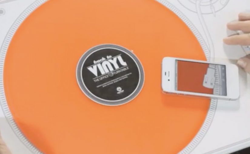
Demo CDs created by music labels are often treated like spam. So to promote a new track from DJ Boris Dlugosch, Kontor Records decided to send out a bright orange vinyl along with a 2D turntable as part of a direct mailing.

The people who received the mailing activated the turntable by scanning the QR code on it. That simple action enabled the missing piece of the turntable on the user’s smartphone, which then allowed them to play the music by placing the phone over the “deck”.

Making the mailer do the work

The mechanism is a tight little trick. The envelope becomes the turntable. The QR code becomes the start button. The smartphone becomes the “needle”. It is analogue theatre powered by a digital unlock, meaning the physical format itself becomes a short performance the recipient has to complete, and it forces the recipient to complete the experience instead of ignoring it.

In B2B marketing where your audience is drowning in promos, the fastest way to earn attention is to turn the first interaction into a short, satisfying action that cannot be skipped.

Why it lands

This works because it turns listening into participation. You do not just receive a track. You assemble the moment, and the novelty is directly tied to the product. The design also flatters the target. It treats creative directors like DJs. People with taste and a fondness for well-made objects. Because the recipient has to scan, place, and play, the mechanic turns passive exposure into participation, which makes the track harder to ignore and easier to remember.

Extractable takeaway: If your content is easy to ignore, do not beg for attention with more messaging. Engineer a simple physical or digital action that unlocks the content, and make that action feel like a reward rather than a chore.

The real question is how you make the format itself impossible to ignore before the message even starts. This is a stronger approach than sending another promo that asks for attention without earning it.

The numbers are the proof

According to campaign case-study reporting, 71% of 900 mailings were activated via the QR code. The same reporting notes that 42% of recipients also visited the Kontor site. For a target group known for deleting promos on sight, that is the clearest signal that the mechanic did its job.

How to make direct mail behave like a product

  • Build a “first step” that is irresistible. If the first step is fun, the rest of the funnel happens almost accidentally.
  • Fuse the medium and the message. Here, the packaging is the product experience, not just a container.
  • Use phones as functional components. Not as a second-screen gimmick, but as a literal missing part.
  • Target the ego carefully. Positioning recipients as tastemakers, not “buyers”, increases the odds they will engage.

A few fast answers before you act

What is “The Office Turntable”?

It is a direct mail piece for Kontor Records where the envelope folds into a paper turntable, and a smartphone activated via QR code completes the player so the recipient can listen to a vinyl release.

Why use vinyl instead of a promo CD?

Because vinyl is a status object and a curiosity trigger. It signals “this is different” before any copy is read.

What role does the QR code play?

It is the activation switch. Scanning it unlocks the mobile component that makes the paper turntable usable.

What results were reported?

Case-study reporting cites 71% activation across 900 mailings, and 42% of recipients visiting the Kontor site.

How do you apply this pattern without copying it?

Turn your distribution format into a usable object, then make one simple action unlock the content. The best versions feel like a clever tool, not a stunt.
Hemoba and Vitória FC: My Blood Is Red and Black

The state of Bahia was experiencing a shortage of blood. To raise awareness of this problem and increase the blood reserves, Hemoba Foundation (Blood Foundation) in Brazil partnered with Bahia football club Esporte Clube Vitória to run a unique blood donation drive.

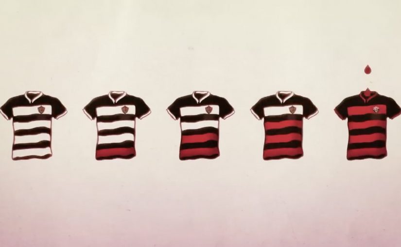
For the campaign, the football club changed the stripes of their iconic jersey from red to white. Then over the course of the season as the blood reserves rose, the team slowly changed the white stripes back to the original red.

As a result, the promotion is reported to have helped raise blood donation by 46%.

A club kit that doubles as a public scoreboard

This is a blood drive that refuses to stay in the background. Instead of asking people to donate “because it is important”, it turns the most visible symbol of the club into a live indicator of how the state is doing. This is a stronger behavior-change design than a standard awareness appeal, because the public scoreboard sits inside club identity.

How the stripe mechanic works

The mechanism is one clean promise. Remove the red from Vitória’s shirt, then bring it back only as blood reserves recover. Every step of progress becomes legible in the one place fans naturally look, the team’s colors.

In sports-led community campaigns, changing a core identity asset works because it creates a shared metric that everyone can track without explanation.

Why this lands beyond typical charity messaging

Most donation drives rely on abstract need. This one makes need visible and slightly uncomfortable, because fans are confronted with “missing red” every match week until they act. It also flips motivation from guilt to pride, because the act of donating becomes a way to restore the club’s full identity.

Extractable takeaway: If you need sustained participation, attach the cause to a symbol your audience already protects. Then turn progress into a public, binary signal that updates over time.

What the partnership is really doing

The campaign aligns incentives. The real question is how to turn a one-time act of goodwill into a shared public ritual that people keep joining. Hemoba gets reach and urgency without buying attention in the usual media sense. The club earns meaning and publicity by making its platform materially costly, because it “gives up” part of its kit until the community responds.

What to steal for your next behavior-change campaign

  • Make the metric visible. People act more when they can see progress, not just hear appeals.
  • Use a symbol with real emotional ownership. Identity assets beat posters, because people notice when they change.
  • Turn donation into restoration. “Bring something back” is often more motivating than “add something new”.
  • Design for weeks, not a day. A season-long mechanic sustains attention and creates multiple decision moments.

A few fast answers before you act

What is “My Blood Is Red and Black”?

It is a blood donation campaign in Bahia, Brazil, where Hemoba partnered with Esporte Clube Vitória and used the team jersey’s red stripes as a visible indicator tied to blood reserves.

How did changing the jersey drive donations?

By removing the red stripes and gradually restoring them as reserves improved, the campaign turned blood supply into a public signal that fans could track across the season.

Why does sports identity work for public health?

Because club colors, rituals, and match-week attention are already shared and emotionally charged. The campaign borrows that energy and redirects it into a concrete action.

Why is this stronger than a standard awareness appeal?

Because it does not ask people to care in the abstract. It makes the shortage visible through a symbol fans already watch, defend, and want restored.

What is the transferable principle here?

Make progress tangible. Link participation to restoring a valued symbol, and keep the feedback loop running long enough for people to join when they are ready.

smart fortwo: parKING

Parking in the city is rarely fun, so BBDO Germany turns a regular test drive for the smart fortwo into an interactive parking game inspired by musical chairs.

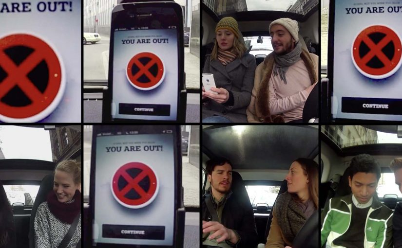
An iPhone app plays music and directs teams around central Berlin. When the music stops, teams have to find a parking spot immediately. The last team to park and verify their location with a photo upload is eliminated. The competition runs out of the smart Center Berlin, where eight teams battle to become Berlin’s first “parKING”. In this activation, “parKING” names the elimination-style parking race where the last team to park when the music stops is out.

How the game works as a test drive

The mechanism is simple. A timed audio cue creates urgency. GPS-style direction turns the city into the board. Photo proof keeps it honest. Underneath the playfulness, every round forces the product truth the brand wants to dramatize. In a dense city, a small car that can slip into tight spots changes the outcome. Because the win condition is parking fast in tight spots, the fortwo’s city-fit advantage shows up as a competitive edge.

In urban European mobility marketing, turning a functional advantage into a public game is a reliable way to make a test drive feel like entertainment rather than evaluation.

The real question is whether the rules make the product truth decide the winner, without narration.

For city-mobility brands, this rule-first approach beats a standard test drive because it turns a claim into observable proof.

Why it lands

It converts a daily friction into a competitive moment, then makes the proof visible. People do not need to be told that parking is painful. They already feel it. The activation reframes that pain as a challenge where speed, composure, and the vehicle’s city fit are the deciding factors.

Extractable takeaway: If your product benefit only matters in a real context, stage a rule-based experience that forces the context to happen. Then let the rules make the benefit obvious without narration or feature lists.

Steal the parKING activation pattern

  • Build the experience around one constraint. Here it is time pressure when the music stops. One constraint keeps the story legible.
  • Use verification that audiences trust. Photo proof is simple and public. It prevents the “this is fake” reaction.
  • Turn the environment into the media. The streets of Berlin are not a backdrop. They are the gameplay.
  • Make the rules do the branding. When the win condition is aligned with the product truth, the brand message arrives naturally.

A few fast answers before you act

What is parKING in one sentence?

It is a city-wide parking game that turns a smart fortwo test drive into musical chairs, guided by an iPhone app and enforced with photo verification.

Why does a game work better than a normal test drive here?

Because it creates stakes and a clear outcome. A standard test drive is private and subjective. A game produces winners, losers, and shareable proof.

What makes this feel “made for Berlin” instead of generic?

The rules depend on dense city parking reality. The city’s constraints are the point, so the activation feels native to the environment.

What is the main risk when brands copy this pattern?

Misaligned rules. If the game’s win condition does not directly demonstrate the product truth, you end up with a fun event that does not build the intended belief.

What is the minimum viable version of this mechanic?

A single timed cue, simple navigation to keep teams moving, and one proof step such as a photo upload. Strip everything else.