
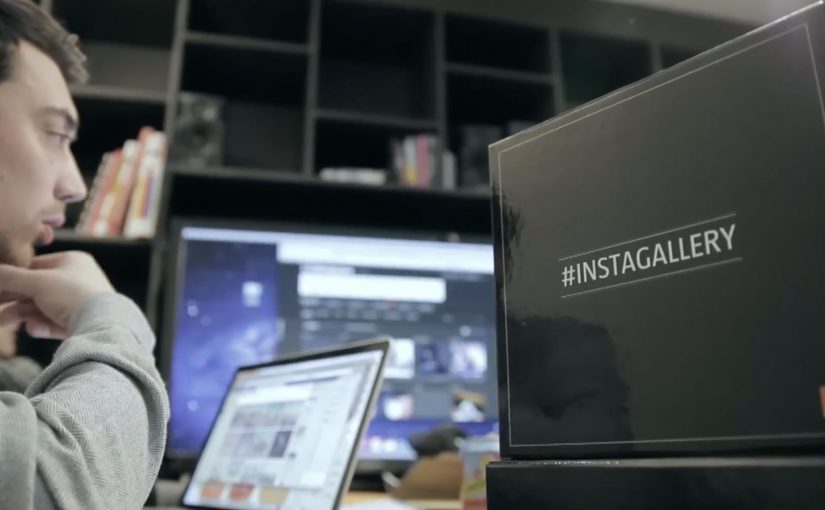
Orange: Instagallery

An Instagrammer posts a photo and suddenly sees it displayed as “art” in a gallery setting, complete with strangers commenting on it in real time. That is the hook behind Orange France’s Instagallery. A campaign built to make network speed feel like instant cultural presence.

A gallery built from other people’s feeds

To promote a new high-speed network, Orange works with Cake Paris to target influential Instagram users by pulling their photos into a staged photo exhibition in Los Angeles. The exhibition becomes a physical set for a second move. Capturing the reactions.

The mechanism: personal proof sent back to the source

Orange films people walking through the gallery and making awkward, unfiltered comments on the displayed photos. Those short films are then sent directly to the original Instagrammers, who share the clips with followers. The sharing loop creates buzz for Orange France without buying classic reach in the same way a traditional launch campaign would.

In European telecom marketing, speed messaging becomes more believable when it is demonstrated as immediacy inside a social platform people already use daily.

Why this lands

It works because it is personal before it is promotional. The influencer is not asked to “post an ad”. They receive a surprising artifact starring their own content, with a built-in narrative their audience wants to watch. The physical gallery in Los Angeles adds a scale cue, and the awkward commentary makes the clip feel real rather than polished brand content.

Extractable takeaway: If you need influencers to spread the message, give them a shareable object that is already about them, and let the brand benefit ride inside the story instead of sitting on top of it.

What Orange is really buying

The real question is how to make a technical speed claim travel through social sharing without feeling like a telecom ad.

This is less an Instagram stunt and more a distribution design. By distribution design, this means structuring the idea so the creator’s reason to share also becomes the brand’s route to reach. Orange turns “network speed” into a reason for participation, then uses personalization to lower friction. The brand benefit is present, but it is not the main character. The creator is.

What to borrow from Instagallery

  • Start with the creator’s ego, not your slogan. Make the shareable asset feel like a reward for them.
  • Move digital into a physical set. A real-world installation creates legitimacy and better footage.
  • Build a loop, not a one-off post. Content goes from user, to brand, back to user, then out to audience.
  • Make the reveal fast. The audience should understand “why this exists” in the first seconds.

A few fast answers before you act

What is Orange’s Instagallery?

It’s a campaign that turns selected Instagram photos into a staged gallery exhibition, then sends creators short reaction films they can share to drive buzz for Orange France.

Why build a gallery in Los Angeles for a French telecom brand?

A distant, recognisable cultural setting amplifies perceived scale and surprise. It makes the creator’s photo feel like it “travels” instantly and matters beyond their feed.

How does the influencer loop work here?

Creators post normally, the brand repackages their content into an event and a film, and the creator then shares the film because it features them, not because they were handed a script.

What are the main risks with this pattern?

Rights and permissions for using user photos, avoiding a “creepy” feeling, and ensuring the brand role stays clear enough that the message does not get lost behind the stunt.

How can a non-telecom brand adapt this?

Create a “real-world upgrade” of customer-created content, capture authentic reactions, and return a ready-to-share edit to the creator so distribution feels like self-expression.
TAC: How to Plan a Funeral

In September 2012, the Transport Accident Commission (TAC) in Australia runs a Pinterest campaign with a line that lands like a punch: How to plan a funeral.

The idea is aimed at girlfriends and mothers of young men. The case frames the problem bluntly. Young men are far more likely to die in a crash than young women, and speeding is positioned as a primary contributor to those fatalities.

How Pinterest becomes a road-safety channel

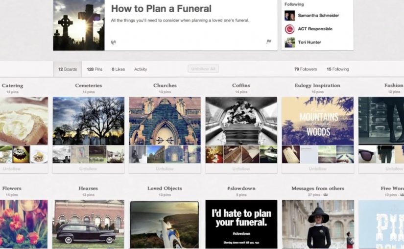
The mechanism uses Pinterest boards that look like practical inspiration for funerals. Images and pins map to real funeral-planning themes, then steer toward the campaign’s message: “I’d hate to plan your funeral. Slowing down won’t kill you.” That works because the planning format lowers resistance before the safety message lands.

In road-safety behavior change, the most effective interventions often come from trusted relationships rather than institutional authority.

Why it lands

It shifts the emotional weight. Instead of telling a driver what TAC wants, it lets a partner or parent express what they fear. Pinterest is a deliberate platform choice because the boards feel like a real place someone would browse for “ideas”, which makes the moment of recognition more personal and more unsettling.

Extractable takeaway: If you need behavior change, route the message through the person with social permission to say it, meaning someone whose concern will be heard as care rather than control. Then build the media experience so it feels like everyday browsing, not an “ad break”.

What the campaign is really optimizing for

This is not trying to win an argument about enforcement. It is trying to trigger a conversation at home. The work uses a shareable, repeatable line that people can copy in their own words, because a close person saying it carries more force than a government body broadcasting it.

The real question is how to make the warning come from someone the driver will actually hear before the risky behavior happens.

The stronger strategic move here is to design for the relationship, not for the institution.

What to steal for your own safety or health campaign

  • Design for the messenger. Decide who the audience will actually listen to, then craft the creative for that relationship.
  • Choose a platform that matches the behavior. If the message is “planning” and “ideas”, a board format can feel native.
  • Use one line people can borrow. If supporters cannot repeat it verbatim or paraphrase it easily, it will not travel.
  • Make the consequence concrete. “Funeral planning” is an action. It forces imagination to do the work.

A few fast answers before you act

What is the core idea of How to Plan a Funeral?

A TAC Pinterest presence that looks like funeral-planning inspiration, designed to help girlfriends and mothers deliver a more impactful “slow down” message to young men.

Why use Pinterest instead of a typical road-safety ad format?

Because the browsing context feels personal and practical. That makes the emotional message land as something a loved one would stumble into and share, not something an authority announces.

What is the key insight behind the campaign line?

A close relationship can say what an institution cannot. “I’d hate to plan your funeral” is a social message first, and a safety message second.

Who is the message really meant to activate?

Girlfriends and mothers of young men. The campaign is built for the people whose concern is more likely to be heard as care than control.

What is the biggest risk in copying this approach?

If the platform context feels forced or exploitative, people disengage. The creative must feel native to the behavior on that platform, and the tone must stay respectful.

Friskis&Svettis Stockholm: #friskissthlm

January in Sweden is when gyms and health clubs go loud, chasing everyone who made the classic New Year’s resolution to start exercising. Stockholm-based health club Friskis&Svettis is no exception.

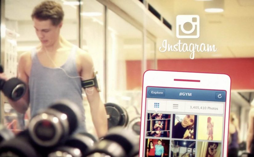
Because Friskis&Svettis is a non-profit association owned by its members, they and their agency Volt build a campaign where members inspire the wider community. A hashtag, #friskissthlm, invites people to work out, photograph the moment, and tag their pictures, so the members themselves become the creative running “around Stockholm”.

How the member-driven mechanic scales

The mechanism is participation as media: member actions create the content and also help distribute it. Instead of producing a single hero ad, the brand defines one simple behavior: train, post, tag. The hashtag becomes the aggregation layer, a single place where the posts collect and stay discoverable, and every new image becomes both proof and invitation. The campaign’s distribution is powered by the same thing gyms want more of in January: visible momentum.

In member-owned fitness communities, letting real members supply the proof tends to land harder than brand-led messaging, because the social permission comes from peers rather than from advertising.

The real question is not how to make a louder January gym ad, but how to make visible member momentum easier to join. The stronger move here is to make member behavior the campaign, not to outshout every other club in January.

Why it lands

It turns the most fragile moment in fitness, starting, into something public and shareable without making it complicated. The posts do two jobs at once. They show variety (different workouts, different people, different branches) and they reduce intimidation, because the “campaign face” is not a model, it is your neighbor.

Extractable takeaway: If you want community growth, choose one repeatable participation unit and one clear tag, then let volume and variety do the persuasion. Your members become the credibility layer.

What to borrow for your own January push

  • Make the ask behavioral. “Work out, post, tag” is easier to follow than “join our movement”.
  • Let variety do the selling. Many small proofs beat one polished claim, especially in fitness.
  • Turn members into the creative. It is cheaper, more credible, and naturally localized.
  • Design for aggregation. One hashtag, one place to browse, one loop that keeps filling itself.

A few fast answers before you act

What is #friskissthlm in one sentence?

A member-powered Instagram hashtag campaign where workouts posted and tagged by members become the campaign content for Friskis&Svettis Stockholm.

Why is this stronger than a typical January gym ad?

Because the proof is peer-generated. People trust “someone like me did this” more than they trust a brand saying “you should”.

What is the key design decision?

Keeping the participation unit tiny and repeatable, so the barrier to contributing stays low while the content volume stays high.

What is the main risk with hashtag-led campaigns?

If the tag is not actively adopted, the feed looks empty and the idea collapses. You need early seeding from members and staff so momentum is visible from day one.

How would you adapt this outside fitness?

Keep the pattern, not the category. Pick one repeatable action people are already willing to do, give it one clear tag or container, and make the resulting proof easy for others to browse and copy.