dotHIV: .hiv Domain

dotHIV: .hiv Domain

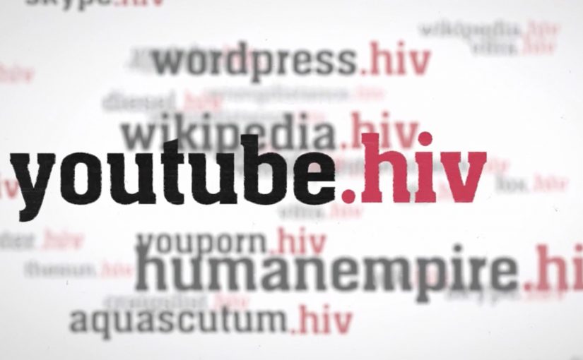
A familiar website address. One small change at the end. And suddenly the act of browsing is framed as a contribution.

.hiv is a global idea positioned to fight HIV and AIDS. Campaign materials claimed that by the end of 2010, the number of people diagnosed with HIV would have reached 150 million.

AIDS continued to be a deadly diagnosis, so nonprofit organization dotHIV and Hamburg-based agency KemperTrautmann launched a Facebook-led campaign with a specific ambition. Establish a new top-level domain, .hiv, alongside endings such as .com or .org.

The proposed mechanism is straightforward. Any website could soon have a .hiv version. The content stays the same, but using the .hiv version is framed as “doing some good”. Every visit would trigger a small donation to dotHIV, or the website owner would pay a monthly rate for using the .hiv ending, with proceeds routed toward the cause.

Why the domain idea is the message

This works because it turns a familiar object, the URL, into a symbol. A domain ending is tiny, but it is also persistent. It appears everywhere the link appears, and it travels without needing a new explanation each time. The “digital red ribbon” effect is built into the mechanics, not added on top. Here, “digital red ribbon” means a visible, repeatable sign of support that appears wherever the link appears. That matters because persistent, low-effort visibility lowers the cognitive cost of participation and helps the cause travel with the behavior.

Extractable takeaway: If you want scale for a social cause, design participation so it sits inside a behavior people already repeat daily, and make the proof of participation visible every time the behavior happens.

In global cause-led digital initiatives, the scalable advantage comes from attaching support to a habit people already repeat without thinking.

What the campaign is really trying to unlock

The real question is whether the cause can become part of a daily digital behavior instead of remaining a separate appeal.

The visible pitch is fundraising. The deeper play is normalization. If .hiv becomes a usable, recognizable address ending, it makes the cause present in everyday digital life, which can reduce stigma through repetition and visibility rather than messaging alone.

The more strategic value here is normalization, not just fundraising.

What cause-led marketers can borrow

  • Attach impact to habit. Make the “good” happen when people do something they already do.
  • Make participation visible. A marker people can see and share helps the idea spread without extra media.
  • Keep the mechanism explainable in one sentence. If it needs a diagram, adoption collapses.
  • Design for opt-in trust. Cause mechanics live or die on clarity about where money flows and why.

A few fast answers before you act

What is the .hiv idea in one line?

A proposed top-level domain intended to turn everyday browsing into support for HIV and AIDS work by routing fees or visit-linked donations through dotHIV.

How is it supposed to work for normal websites?

A site could have a .hiv version that mirrors the existing content, while usage or registration is framed as generating funds for dotHIV.

Why use a domain ending instead of a normal donation page?

Because a domain ending is persistent and repeatable. It can travel with links and become a visible marker of participation everywhere it appears.

What makes this idea credible or not credible to audiences?

Transparency about governance, pricing, and where proceeds go. The mechanism needs to be as clear as the promise.

What is the biggest risk with “donation-by-browsing” concepts?

If the value exchange is unclear, or the impact feels too small or too opaque, people disengage or suspect cause-washing.

EOS Magazine: Talking Tree

EOS Magazine: Talking Tree

Everybody has an opinion on Nature. But what about Nature’s opinion. EOS Magazine decides to give Nature the means to talk, by turning a single tree into a live publisher of its own conditions.

A 100-year-old tree on the edge of Brussels is hooked up to a fine dust meter, ozone meter, light meter, weather station, webcam, and microphone. This equipment constantly measures the tree’s living circumstances and translates the signals into human language. Then the tree lets the world know how it feels.

From sensors to sentences

The mechanic is a simple chain that stays readable. Capture the environment in real time. Translate measurements into plain-language statements. Publish those statements where people already spend time, so “air quality” and “noise” stop being abstract and start sounding like mood.

In European environmental communication, translating invisible conditions into a relatable voice is a practical way to turn passive concern into everyday awareness.

Why giving Nature a voice changes the reaction

It reframes data as empathy. People do not debate particulate matter in casual conversation, but they do respond to a living thing saying it feels dizzy, stressed, or relieved. The tree becomes a social character, which makes the topic shareable without needing a lecture.

Extractable takeaway: If your message is driven by measurements, do not lead with the measurements. Lead with a human-readable translation that carries emotion, then let the data sit underneath as credibility.

What EOS is really building here

This is not just a one-off film. It is a living channel. The tree becomes a continuous stream of micro-updates that can be followed, quoted, and revisited, which gives the idea longevity beyond a single media burst. The real question is not whether the sensors are impressive, but whether the translated voice is strong enough to make environmental data socially relevant every day.

What to steal for your own sustainability storytelling

  • Pick one “spokes-object”. A single, specific entity makes a broad topic easier to care about.
  • Translate, do not dump. Make the system output statements people can repeat in their own words.
  • Make it continuous. A live feed builds habit and credibility faster than a single campaign headline.
  • Keep the voice consistent. The tone should feel stable, or the project reads like a gimmick.

A few fast answers before you act

What is the core idea of Talking Tree?

A sensor-equipped tree that translates environmental conditions into human language and publishes how Nature “feels” through social media-style updates.

Why does anthropomorphizing data work here?

Because it creates an emotional entry point. People respond to a character and a voice faster than they respond to metrics.

What is the key design decision behind the experience?

The translation layer. The project succeeds or fails on whether the outputs feel meaningful and readable, not on how many sensors are installed.

How do you measure success for a concept like this?

Ongoing engagement and repeat visits, plus evidence that the phrasing spreads into conversations, shares, and press pickup beyond the campaign’s owned channels.

Why does the idea need to stay live, not static?

Because continuity is part of the persuasion. Repeated updates turn the project from a one-time awareness stunt into a channel people can return to and reference over time.

POWA: Waking Up the Neighbourhood

POWA: Waking Up the Neighbourhood

This social experiment was carried out using hidden cameras in a townhouse complex in Johannesburg. The message is pretty clear: “Don’t condone violence by doing nothing”.

It is structured as a test of what people will react to. When something is merely annoying, neighbors complain quickly. When something is genuinely harmful, the same neighbors often hesitate, rationalize, or stay silent.

How the experiment is engineered

The mechanism is simple and uncomfortable: place residents in a situation where intervention feels “socially costly”, then reveal how easily people default to inaction even when the signals are obvious. Here, “socially costly” means risking awkwardness, conflict, or reputational blowback with the people you live next to. That engineered discomfort is why the film persuades. It forces the viewer to notice the exact moment hesitation becomes a decision.

In close-quarter urban living, social friction often gets managed faster than serious harm because “not getting involved” is treated as the safest norm.

Why it lands

It attacks the real barrier. Many people do not support violence, but they also do not act. The work focuses on that gap between belief and behavior.

Extractable takeaway: Anti-violence communication changes behavior when it targets the bystander decision point. Make inaction feel like a choice with consequences, and intervention feel like the socially supported default.

It reframes intervention as normal. By showing how readily people mobilize for minor disturbances, it implies that speaking up about violence should be even more expected.

It removes the viewer’s excuses. The hidden-camera format makes “I wasn’t sure” feel less credible, because the audience sees the same signals and the same hesitation play out.

The real question is whether you want to be the neighbor who notices and still stays silent. Campaigns should be judged on whether they move bystanders into safe action, not on whether they earn agreement.

Design cues that wake bystanders

  • Design for the moment people freeze. Identify the exact instant where hesitation happens, then build the story around breaking it.
  • Use contrast to make the point undeniable. A “small problem” people act on is a sharp mirror for the “big problem” they avoid.
  • Keep the message actionable. A clear instruction beats a general plea, especially for behavior people are scared to perform.

A few fast answers before you act

What is the core message of this experiment?

That doing nothing enables violence. If you suspect abuse, silence is not neutral. It is permission.

Why use hidden cameras for a topic like this?

Because it captures real hesitation, not rehearsed opinions. The credibility comes from watching ordinary behavior under social pressure.

What behavior is the campaign trying to change?

It aims to reduce bystander inaction. The target is the moment someone hears or suspects violence and chooses not to intervene.

What makes this approach effective compared to statistics?

It is experiential. Viewers can imagine themselves in the same setting, which makes the moral choice feel immediate rather than abstract.

What is the most transferable lesson for brands or NGOs?

If you want action, dramatize the decision point, show the cost of inaction, and make the desired intervention feel socially acceptable and doable.