Superette: Short Shorts

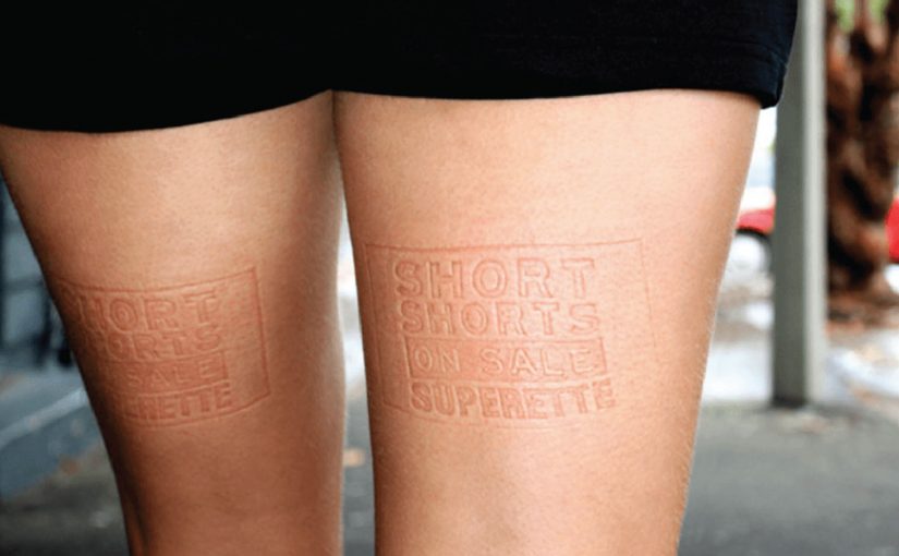
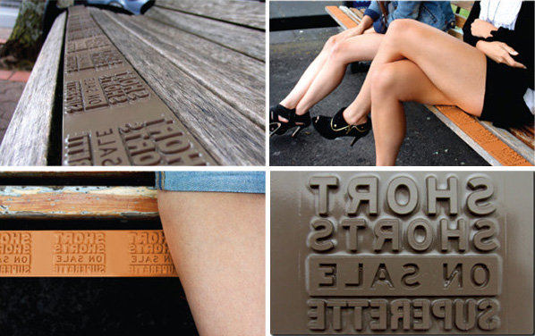
In the inner city, someone stands up from a bus-stop bench and notices a message pressed into their thigh. It reads like a sale reminder, and it travels with them for the next hour.

That is the execution DDB Auckland creates for Superette’s short shorts sale. Indented plates are fitted across bus stops, mall seats, and park benches in the fashion district, so when people sit down, the message is imprinted on the bare skin exposed by the trend. The result, as described, is branded seating plus a moving wave of free media: thousands of temporary imprints that last up to an hour, and show up most visibly on exactly the style-setters the retailer wants.

Superette’s short shorts sale campaign.

How the imprint works

This is body imprint advertising: a physical surface transfers a readable message onto skin through pressure, like a temporary stamp without ink. The media buy is the furniture people already use. The “placement” is the moment the audience sits down.

In fashion retail, the fastest way to make a promotion feel native is to attach it to the lived behavior and the exposed product context, not a separate media channel.

Why it lands in the street

The idea carries its own proof. The imprint is not a claim you read; it is a thing that happens to you, and that makes it unusually hard to ignore or forget. It also creates a social moment. People compare marks, laugh, take photos, and inadvertently become distribution. The targeting is embedded in the location strategy: benches in inner-city and fashion-district zones bias the audience toward the “hippest young cats” already dressed for visibility.

Extractable takeaway: When your offer is simple and time-bound, design a mechanic where the audience physically carries the message for a short period, then place that mechanic where the right crowd naturally gathers.

What Superette is really buying

Not just awareness. The campaign buys cultural permission. It signals that the sale belongs to a specific scene and that the brand understands how that scene moves, sits, and shows skin. The imprint is a cheap, repeatable proof-point of “this is for you” without ever saying it directly.

The real question is whether the sale message can travel through the scene as social proof instead of behaving like an ad bolted onto it.

What retail teams can steal from this

  • Turn existing infrastructure into media. Find the surfaces your audience already uses, then engineer the message into the touchpoint.
  • Make the ad portable. If people carry the message with them, your reach compounds without extra placements.
  • Target by behavior, not demographics. Location and context can do the filtering when the creative is inseparable from the setting.
  • Keep the message legible and short. Physical imprint media rewards minimal copy and a single, clear action.

A few fast answers before you act

What is “body imprint advertising” in this campaign?

A message is created as a temporary impression on skin by sitting on seats fitted with indented plates. No ink is needed. Pressure creates the readable mark.

Why does putting the ad on benches make sense for a shorts sale?

The trend exposes bare thighs, so the sale message can live on the same body area the product is designed to reveal. The medium and the product context reinforce each other.

What makes this feel like “free media” after the placement?

Once a person stands up, the imprint travels with them for a while. Every subsequent encounter becomes an additional impression without buying another seat or poster.

What is the main risk with this approach?

If the imprint feels intrusive or uncomfortable, the novelty can flip into backlash. The mechanic depends on perceived playfulness, not coercion.

When should a brand use a tactic like this?

When the message is ultra-short, the audience is location-clustered, and the idea can be experienced instantly in a way that people will talk about and show others.

Tele2: Giant Phone

Tele2 is launching a new offer that sounds technical on paper. Fixed telephony delivered through the mobile network. In plain terms, that means a home-phone style service carried over the mobile network instead of a traditional fixed line. The fastest way to make that believable is to let people use it like a normal landline.

So Forsman & Bodenfors builds giant, working phones in Sweden’s three biggest cities. Passersby can pick up the handset and call whoever they want for free, whether that is a friend, a taxi, or the first number that comes to mind.

To keep the street theatre alive, Tele2 occasionally calls the giant phones. Whoever answers at that moment wins a prize.

The giant-phone mechanic

The mechanic is a physical demo of a simple promise. A “home phone” style service that rides the mobile network behaves exactly like the thing people already understand: pick up, dial, talk. The oversized installation does two jobs at once. It acts as out-of-home media you cannot ignore, and it removes friction by turning product education into a one-step trial.

In technical product launches, the most reliable shortcut to trust is an immediate, public, hands-on trial that converts jargon into a familiar behavior.

Why the simplicity message sticks

This works because the audience does not have to believe a claim. They verify it themselves in seconds. The scale makes it socially safe to participate, because the act of “trying it” is also the entertainment. The prize-call twist adds intermittent reward, which keeps attention and creates a reason to stay nearby a little longer.

Extractable takeaway: When your value proposition is hard to explain, design a live interaction where the user completes the core promise in one obvious action, then let the environment do the storytelling.

What Tele2 is really selling

The obvious message is “it’s easy.” The real question is whether the new delivery model feels familiar enough to trust. The deeper message is “it’s close enough to the old thing that switching feels low-risk.” The activation reframes a potentially abstract network feature as continuity: you still have a phone experience, just delivered differently.

Launch lessons from the giant-phone demo

  • Prototype the promise. Build a demo that behaves like the old habit, even if the technology underneath is new.
  • Make the demo the media. If the unit cannot be ignored, you buy awareness and comprehension with the same spend.
  • Keep participation effortless. “Pick up and call” beats any explanation panel.
  • Add a timed trigger. A random callback, reward, or live moment gives people a reason to linger and talk about it.

A few fast answers before you act

What was Tele2 trying to prove with the giant phones?

That its fixed-telephony offer delivered over the mobile network feels as straightforward as a traditional landline. You pick up a handset, dial, and it works.

Why use giant phones instead of a standard street team?

The scale creates instant attention and makes the demo impossible to miss. It also turns the product trial into a public spectacle that others notice and join.

What makes this an effective “technical product” launch pattern?

It replaces explanations with verification. A user experiences the core benefit directly, which reduces skepticism and increases recall.

How does the prize-call element help the concept?

It creates anticipation and a reason to stay engaged, while adding a simple narrative hook people can repeat to others.

Where does this approach work best today?

Any launch where the promise is “this new infrastructure behaves like the old familiar thing,” such as networks, payments, or connected services that need trust before adoption.

Bar Aurora & Boteco Ferraz: $73,000 Bar Tab

At Bar Aurora and Boteco Ferraz, the bar tab can land like a punch. A normal night out suddenly totals $73,000.

The number is deliberately absurd. Instead of “just” charging for drinks, the receipt is designed to confront patrons with the kinds of costs that a drunk-driving crash can trigger, described as an itemized ledger of consequences rather than a generic warning.

Ogilvy Brasil (São Paulo) ties the message to the moment that matters most. Right after the drinking. Right before the decision to drive.

A receipt that speaks at the exact decision point

The mechanism is simple and brutal. Take a familiar ritual, the bar tab, and turn it into a personalized “cost statement” that patrons cannot ignore because it arrives inside a context they trust and understand. It works because the receipt arrives as a trusted artifact at the exact moment the choice is being made.

That timing does most of the work. The message is not competing with the rest of the day’s noise. It shows up when someone is already weighing options like “I’m fine” versus “I should take a taxi.”

In public-interest and brand-led behavior-change work, point-of-decision interventions outperform broad awareness because they collide with behavior, not intentions.

Here, a point-of-decision intervention is a prompt delivered at the moment someone is deciding what to do next.

The real question is whether you can make the consequence feel immediate enough to change the drive-or-taxi decision.

Why the anger matters more than the poster

People get annoyed because the interruption feels personal. That emotion spike is useful. It snaps the brain out of autopilot, forces a re-check, and reframes the “big deal” as a concrete, financial, immediate-looking problem.

Extractable takeaway: If the risky behavior feels like a small, private choice, make the consequence feel like a concrete, personal ledger entry that appears at the decision point. Reduce abstract harm into a format the audience already treats as “real.”

Done well, this does not need moralizing language. The receipt format does the persuasion quietly. It turns “don’t do this” into “here is what this can cost you, in a language you already understand.”

What the bar gets out of it

This is cause work that also behaves like brand building. It positions the venue as the place that looks after customers beyond the last drink, and it gives staff a socially acceptable reason to start a safer-ride conversation without sounding preachy.

It also travels. The idea is easy to retell, easy to film, and built for word-of-mouth because the “$73,000” moment is inherently shareable.

Patterns to reuse from the $73,000 tab

  • Move the consequence into the present tense. Don’t explain risk. Render it.
  • Use a trusted artifact. Receipts, tickets, confirmations, packaging, dashboards. Anything the audience already believes.
  • Interrupt without humiliating. Aim for friction and reflection, not public shaming.
  • Design for the handoff. The moment should naturally lead to a safer alternative (taxi, ride-share, designated driver) without needing a speech.

A few fast answers before you act

What is the “$73,000 Bar Tab” idea?

It is an anti drink-driving activation where patrons receive a dramatically inflated bar tab that reframes a “small” choice as a high-cost outcome, using the receipt format to make the warning feel concrete.

Why use a bar tab instead of a standard awareness ad?

A bar tab arrives at the point of decision, when a person is actively choosing what to do next. That timing creates immediate relevance and forces the brain out of autopilot in a way a poster rarely can.

What is the key mechanism that makes it persuasive?

Format plus timing. The message is delivered inside a familiar, trusted artifact, at the exact moment the audience is weighing whether they are “okay to drive.”

How can brands adapt this pattern without backlash?

Keep the intervention private, keep the tone factual, and pair it with an obvious safer alternative. The goal is reflection and route change, not punishment.

What should the moment lead to immediately?

Build in an easy handoff to the safer choice, so the “pause” turns into action, like taking a taxi, using ride-share, or calling a designated driver.