
Fanta: Lift & Laugh

A school elevator that refuses to stay boring

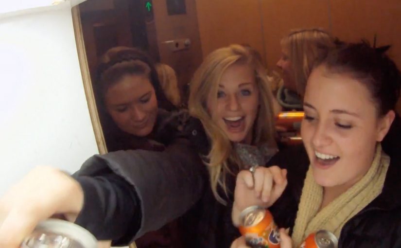
Ogilvy Brazil sought to reinforce Fanta’s brand image of “joy” in the USA. So they came up with an elevator prank called “Lift & Laugh”.

An elevator in a school in Atlanta was chosen to arouse students curiosity and laughter. In the elevator they installed a device that responded to the movements and comments from the students.

The mechanic: a responsive space that reacts back

This works by turning a routine moment. waiting for an elevator ride. into an interaction loop. The environment listens, then answers in real time, so the people inside start experimenting to see what triggers the next reaction.

An ambient ad is a brand experience placed in an everyday setting, where the setting itself becomes the medium and the message is delivered through participation.

In youth and soft drink marketing, “joy” only sticks when it is felt in-the-moment, not just claimed in a tagline.

The real question is whether your experience design can make play discoverable without instructions.

Why the prank lands with students

It creates instant permission to play. The elevator is a confined stage, the reactions are immediate, and the group dynamic amplifies everything. If one person laughs, everyone joins, and the experience escalates without needing instruction.

Extractable takeaway: When the audience’s own movement or words trigger an immediate response, the fun feels earned and becomes more likely to be retold.

The business intent: make joy a repeatable brand behavior

This is not just a one-off gag. It is a proof point for a positioning idea. Fanta turns dull places into fun places. If the experience is good enough, the brand gets earned attention plus social retell value without needing to push product features.

In the end many students did not want to get off the elevator and asked for a repeat trip.

What to steal if you want an experience people replay

  • Make the interaction discoverable. People should learn the rules by trying, not by reading.
  • Reward experimentation fast. Short feedback loops create momentum.
  • Design for groups, not individuals. Laughter spreads socially. Build for that amplification.
  • Anchor the behavior to your brand. The “why” should map cleanly to what you stand for.

A few fast answers before you act

What is Fanta’s Lift & Laugh?

It is an elevator prank experience where the elevator reacts to students’ movements and comments, turning a normal ride into a playful, responsive brand moment for Fanta.

Where did the activation take place?

It was staged in a school in Atlanta, using a real elevator as the experience space.

How does the elevator prank create engagement?

It uses immediate cause and effect. People try something, the elevator responds, and the group starts experimenting together to trigger more reactions.

Why does this work especially well with students?

The elevator becomes a contained stage and laughter spreads socially. One reaction gives others permission to play, which escalates the experience quickly.

What makes this “ambient advertising” rather than a standard ad?

The everyday environment becomes the medium. The message is delivered through participation in a real situation, not through a screen or a slogan.

What should brands learn from this format?

If you want “fun” as a brand attribute, build it into a situation people already live. Then make participation the delivery mechanism, not a message about participation.
Coca-Cola: Santa’s Forgotten Letters

When childhood letters get answered years later

The city of Santa Claus is situated in the state of Indiana, USA. The museum in the city brings together different objects related to Santa Claus and has long received letters from people around the world, described as doing so for more than 70 years.

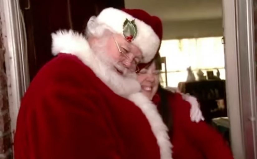
Coca-Cola with its ad agency Ogilvy Brazil selected 75 forgotten letters, meaning letters written to Santa as children that sat unanswered for years, and set out on an impossible task to find the writers and give them exactly what they asked for. The result was a touching movie that reinforces the magic of Christmas.

The impossible brief behind the film

The mechanism is straightforward and brutal in effort. Find a place where old letters to Santa were kept. Read through decades of messages that never got a reply. Select a small set of letters. Then track down the original writers and recreate the exact gifts they once requested.

In global FMCG holiday marketing, the fastest route to belief is to make generosity observable in the real world, not just promised in a tagline.

Santa’s Forgotten Letters is a Coca-Cola Christmas campaign by Ogilvy Brazil that turns archival letters into real deliveries, using the act of fulfilment as the proof of the story.

Why it lands: belief becomes physical

This works because it reverses the usual Christmas-ad formula. Instead of asking the audience to feel something while watching a film, it shows a real-world action first. The emotion is earned by the logistics.

Extractable takeaway: If you want “magic” to read as real, put the proof in the world first, then let the film simply document the effort.

The letters also do the writing for the brand. Each request is specific, personal, and time-stamped by childhood. That specificity makes the surprise feel less like marketing and more like closure.

The business intent hiding inside the sentiment

Coca-Cola is reinforcing a familiar role in the season. It wants to be the brand that protects the “magic” adults quietly miss, and it does that by staging a story people retell without needing to mention product features.

The real question is whether you can prove the sentiment with a concrete act, not just narrate it.

Done well, this is the right kind of sentiment-led brand work because it earns emotion through effort the audience can verify.

This is brand meaning built through a single, high-signal act that generates a long tail of earned conversation.

Steal this structure for earned emotion

  • Start with an artifact, not an insight. Real letters, real handwriting, real specificity.
  • Make the work visible. Show the searching, the tracking, the making, the delivery.
  • Let the recipients carry the truth. The reactions are the credibility layer.
  • Limit the scope to protect authenticity. A small number of deliveries can feel more believable than a mass stunt.

A few fast answers before you act

What is Coca-Cola’s Santa’s Forgotten Letters campaign?

It is a Christmas film built around a real-world fulfilment stunt. Coca-Cola and Ogilvy Brazil selected 75 old letters to Santa from Santa Claus, Indiana, tracked down the writers, and delivered the gifts they once asked for.

Where did the letters come from?

The letters were kept in Santa Claus, Indiana, where a local Santa-related museum had reportedly received letters for decades.

What is the mechanism, step by step?

Locate an archive of unanswered letters. Select a small set. Identify the original writers years later. Recreate the exact requested gifts. Deliver them, and film the search and the moment of fulfilment.

Why does the “old letters” device work so well?

Because it carries built-in specificity and credibility. A handwritten childhood request feels personal and time-stamped, so the fulfilment reads as earned rather than manufactured.

What should brands learn from this execution?

If you want belief, let the action do the persuading. Make the work visible. Keep the claim simple. Let real reactions carry the credibility.

What is the main risk with this kind of sentiment-led work?

If the fulfilment feels staged, scaled too broadly, or too polished, it can lose authenticity. Limiting scope and showing real effort helps protect trust.

Bar Aurora & Boteco Ferraz: $73,000 Bar Tab

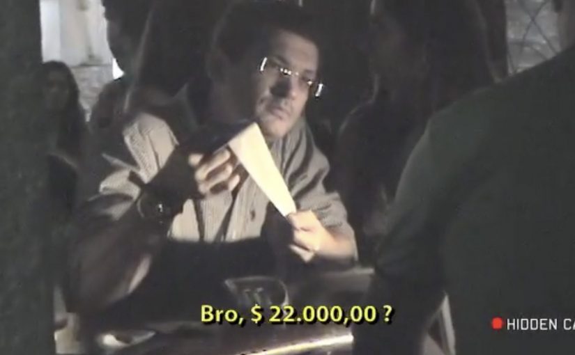
At Bar Aurora and Boteco Ferraz, the bar tab can land like a punch. A normal night out suddenly totals $73,000.

The number is deliberately absurd. Instead of “just” charging for drinks, the receipt is designed to confront patrons with the kinds of costs that a drunk-driving crash can trigger, described as an itemized ledger of consequences rather than a generic warning.

Ogilvy Brasil (São Paulo) ties the message to the moment that matters most. Right after the drinking. Right before the decision to drive.

A receipt that speaks at the exact decision point

The mechanism is simple and brutal. Take a familiar ritual, the bar tab, and turn it into a personalized “cost statement” that patrons cannot ignore because it arrives inside a context they trust and understand. It works because the receipt arrives as a trusted artifact at the exact moment the choice is being made.

That timing does most of the work. The message is not competing with the rest of the day’s noise. It shows up when someone is already weighing options like “I’m fine” versus “I should take a taxi.”

In public-interest and brand-led behavior-change work, point-of-decision interventions outperform broad awareness because they collide with behavior, not intentions.

Here, a point-of-decision intervention is a prompt delivered at the moment someone is deciding what to do next.

The real question is whether you can make the consequence feel immediate enough to change the drive-or-taxi decision.

Why the anger matters more than the poster

People get annoyed because the interruption feels personal. That emotion spike is useful. It snaps the brain out of autopilot, forces a re-check, and reframes the “big deal” as a concrete, financial, immediate-looking problem.

Extractable takeaway: If the risky behavior feels like a small, private choice, make the consequence feel like a concrete, personal ledger entry that appears at the decision point. Reduce abstract harm into a format the audience already treats as “real.”

Done well, this does not need moralizing language. The receipt format does the persuasion quietly. It turns “don’t do this” into “here is what this can cost you, in a language you already understand.”

What the bar gets out of it

This is cause work that also behaves like brand building. It positions the venue as the place that looks after customers beyond the last drink, and it gives staff a socially acceptable reason to start a safer-ride conversation without sounding preachy.

It also travels. The idea is easy to retell, easy to film, and built for word-of-mouth because the “$73,000” moment is inherently shareable.

Patterns to reuse from the $73,000 tab

  • Move the consequence into the present tense. Don’t explain risk. Render it.
  • Use a trusted artifact. Receipts, tickets, confirmations, packaging, dashboards. Anything the audience already believes.
  • Interrupt without humiliating. Aim for friction and reflection, not public shaming.
  • Design for the handoff. The moment should naturally lead to a safer alternative (taxi, ride-share, designated driver) without needing a speech.

A few fast answers before you act

What is the “$73,000 Bar Tab” idea?

It is an anti drink-driving activation where patrons receive a dramatically inflated bar tab that reframes a “small” choice as a high-cost outcome, using the receipt format to make the warning feel concrete.

Why use a bar tab instead of a standard awareness ad?

A bar tab arrives at the point of decision, when a person is actively choosing what to do next. That timing creates immediate relevance and forces the brain out of autopilot in a way a poster rarely can.

What is the key mechanism that makes it persuasive?

Format plus timing. The message is delivered inside a familiar, trusted artifact, at the exact moment the audience is weighing whether they are “okay to drive.”

How can brands adapt this pattern without backlash?

Keep the intervention private, keep the tone factual, and pair it with an obvious safer alternative. The goal is reflection and route change, not punishment.

What should the moment lead to immediately?

Build in an easy handoff to the safer choice, so the “pause” turns into action, like taking a taxi, using ride-share, or calling a designated driver.