
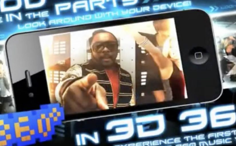
Black Eyed Peas: BEP360 AR music video

The smartest artists in 2011 are starting to behave like brands. Not only by releasing content, but by building experiences around it that fans can actually play with.

BEP360 is a strong example of that thinking. It packages a 360-degree, motion-controlled music video experience around The Black Eyed Peas, designed for iPhone, iPad, and iPod touch.

The core mechanic is simple. You move your device, and the camera view moves with you, giving you viewer control inside the scene. Viewer control here means you choose the camera angle in real time by moving the device. On top of that, BEP360 includes an augmented reality layer triggered by pointing the iPhone camera at the album cover for The Beginning, plus a virtual photo session feature that lets fans stage shots with the band and share them.

In global entertainment marketing, app-based experiences are becoming a practical way to deepen fandom between releases and justify paid content with participation.

The real question is whether you are building a replayable interaction fans control, or just dressing up a single-view clip with novelty features.

It is also an early signal of where “music video” can go when it is treated as a product experience rather than a clip you watch once. The app is billed as a first-of-its-kind 360-degree mobile music video, built under will.i.am’s will.i.apps banner, with augmented reality support via Metaio and 3D360 video technology referenced in early coverage.

Why this is more than a promo gimmick

The best part is the shift from passive viewing to participation. A 360-degree experience creates a reason to replay, because you cannot see everything at once. That replay value is what standard video launches rarely earn.

Extractable takeaway: If the experience gives people control over what they see, replay becomes the point, and that repeat engagement is what turns a launch into something that feels like a product.

What the AR layer adds, and what it does not

The AR trigger is not the main event. It is a novelty layer that extends the universe into the physical world, using the album cover as the marker. The real value is the combination of interactive video plus social output. Fans can create something and share it, which keeps the campaign alive without requiring more media spend.

Fan-first interactive video playbook

  • Give people viewer control. Control creates replay value.
  • Bundle features around one hero action. Here the hero action is “step inside the video”. Everything else supports that.
  • Use AR as an on-ramp, not the whole product. A quick wow moment is fine, but the experience must hold attention afterwards.
  • Design for sharing outputs. Photo sessions and remixable moments extend reach organically.

A few fast answers before you act

What is BEP360?

BEP360 is a Black Eyed Peas iOS app that turns a music video into an interactive 360-degree experience controlled by moving your device, with an added augmented reality layer triggered by the album cover.

What makes the music video “360-degree” in this case?

The camera perspective changes as you rotate or swing the phone, giving you control over where you look inside the scene while the track continues.

How does the augmented reality part work?

You point your iPhone camera at the The Beginning album cover, and the app overlays animated BEP characters and related content on screen.

Why does an app make sense for music marketing?

Because it can bundle interaction, social sharing, and ongoing fan content into one place. It gives people a reason to pay for the experience, not only consume a free clip.

What is the main risk with app-based fan experiences?

Friction. If downloads, device compatibility, or onboarding are annoying, the idea collapses. The experience has to deliver value within seconds.

The One Ronnie: My BlackBerry Isn’t Working

Ronnie Corbett turns 80 in December 2010, and the BBC marks it with an all-star sketch show built around a simple idea: take the old “shop misunderstanding” format and swap the props for modern tech brands.

A classic shop sketch, updated for the BlackBerry era

The setup is instantly familiar if you grew up on British sketch comedy. A customer walks into a shop with a straightforward complaint. The assistant tries to help. Language gets in the way, and the conversation collapses into escalating misunderstanding.

Here, the misunderstanding is brand vocabulary. “BlackBerry” sounds like fruit. “Apple” could be a device or something you eat. “Orange” lands as both a fruit and a UK telecom brand. The sketch plays the confusion straight, like a modern homage to the kind of wordplay that made The Two Ronnies famous.

The mechanic: support jargon collides with everyday language

What makes it work is how the dialogue keeps switching frames. Corbett speaks in tech-support phrases. The shopkeeper responds as if it’s a greengrocer problem. Each “helpful” instruction becomes more absurd because both sides believe they are being perfectly clear.

In mass-market consumer technology, product naming and support language often drift away from how normal people naturally describe problems.

The laugh: watching certainty unravel

The comedy is not “tech is hard”. It is “tech words are slippery”. The sketch lands because it reflects a real feeling from the BlackBerry moment, the phase when a device is mainstream but the language around it still feels specialist. Lots of people own the device, but few feel fluent in the language around it.

Extractable takeaway: If your product lives in mainstream culture, treat naming, onboarding, and help content as part of the product. When everyday meanings collide with brand meanings, users do not just get confused. They get confidently confused, which is harder to recover from.

The intent: a birthday special that doubles as cultural commentary

This is not an ad. But it is a sharp snapshot of the era. BlackBerry is big enough to be a shared reference point. Apple is mainstream enough to be the punchline without explanation. That is exactly when a technology brand crosses from “product” into “culture”. Words are part of the product experience, not just the support layer around it. The real question is whether your product still makes sense once it is explained in ordinary language.

What to steal if you build digital products

  • Audit your vocabulary: if your support scripts sound like a different language than your users speak, you are creating avoidable friction.
  • Name things the way people describe them: features, settings, and errors should map to user intent, not internal architecture.
  • Test for double meanings: brand names and feature names should survive casual conversation without constant clarification.
  • Design for “first explanation wins”: early misunderstandings set the mental model. Fixing them later costs more.

A few fast answers before you act

What is this sketch actually parodying?

It’s a modern take on the British “shop misunderstanding” sketch format, using tech brand names and support language as the source of confusion.

Why does BlackBerry work as a joke prop here?

Because the name has an everyday meaning (fruit) and a product meaning (phone). The sketch exploits how quickly conversations derail when people assume different meanings.

What’s the product lesson behind the comedy?

Words are part of UX. Naming, labels, and help content shape whether users can describe problems accurately and follow instructions confidently.

How do you reduce this kind of confusion in real products?

Use plain-language labels, test terminology with non-experts, and rewrite help steps to match how users describe issues, not how engineers describe systems.

Is this still relevant once the device changes?

Yes. The device is a period reference. The underlying problem, jargon colliding with everyday language, repeats with every new platform and feature wave.

Durex: Baby App

Making the consequence tangible, not the lecture louder

In consumer health marketing, the hardest problems are rarely about information. They are about motivation in the moment. This Durex idea is a clean example of turning a behavior barrier into an experience.

Condoms can feel like a downer. So how do you convince guys to put one on, and make Durex the favored choice?

This is the right move when information is not the problem. Make the consequence tangible, not the lecture louder.

Using the iPhone, Nicolai Villads, Peter Ammentorp and Raul Montenegro created what is called the Durex Baby application for the iPhone.

How the Durex Baby app worked as a behavioral nudge

The mechanism was simple. If the barrier is that protection feels like a mood killer, shift attention to what happens without it.

The app simulated the realities of having a baby, using the phone as a constant companion device. It turned an abstract risk into a persistent, personal experience that could be felt rather than explained. Because the phone stays close, the simulation can interrupt everyday moments, which is why it lands as a nudge instead of a lecture.

In consumer health marketing, consequence simulation works best when the audience already knows the facts but needs a visceral prompt.

The real question is how you make “responsible” feel like the easiest choice in the moment.

Why simulation can change decisions faster than persuasion

Most messaging about safe sex competes with optimism bias, the tendency to assume consequences happen to someone else. A simulation reduces that distance by making “later” feel like “now,” reframing the trade-off from short-term inconvenience to long-term responsibility.

Extractable takeaway: When persuasion stalls, build a simulation that collapses time and personal distance so the audience feels the outcome and re-evaluates the trade-off on their own.

The intent behind building it for Future Lions

The app was created for the Future Lions 2010 competition organized by digital agency AKQA and the Cannes Lions Advertising festival.

The business intent is clear. Use mobile to translate a sensitive topic into a playful but pointed interaction that can travel socially and be discussed without heavy moralizing, while keeping the brand associated with the responsible choice.

What to borrow from Durex Baby

  • Turn abstract risk into felt experience. Simulation can outperform warnings when the audience tunes out lectures.
  • Use the device people always carry. Mobile is effective when the behavior change depends on everyday moments.
  • Reframe the trade-off. Move attention from short-term friction to long-term consequence in a way people can grasp instantly.
  • Make it discussable. Playful interaction can open conversation on topics people avoid in direct language.

A few fast answers before you act

What is the Durex Baby app?

An iPhone app concept that simulates the realities of having a baby to encourage safer choices and reduce resistance to using condoms.

What was the core mechanism?

Behavioral reframing through simulation. The phone delivers an ongoing experience that makes the consequence of not using protection feel immediate.

Why does this approach work better than a warning for some audiences?

Because it reduces optimism bias. People are more likely to change behavior when the consequence feels personal and present, not distant and theoretical.

What business goal does it serve for Durex?

Positioning the brand as the responsible default choice by shifting the decision from mood-based resistance to consequence-based clarity.

What is the main takeaway for marketers?

If persuasion is failing, design an experience that makes the outcome feel real, then let the audience reach the conclusion themselves.