
VGT: Fur iAd that bleeds when you swipe

VGT (an association combating animal factories), working with Austrian agency Demner, Merlicek & Bergmann, created an iAd, an interactive tablet ad unit, for the iPad edition of DATUM magazine.

The iAd shows a young woman wearing a fur coat. When the iPad user tries to continue browsing with the familiar finger-wipe movement, each swipe leaves a blood stain on the fur. The more you try, the more blood appears, turning a simple “next page” gesture into the message.

A navigation gesture that becomes the accusation

The clever part is that nothing “extra” is required from the user. No quiz. No mini game. No new behaviour. The iAd hijacks the most natural behaviour on the device. Swiping to move on. That is why it feels so sticky. The ad does not ask for attention. It punishes avoidance.

The mechanism: friction by design

Most advertising tries to reduce friction. This does the opposite. It introduces deliberate friction at the exact moment the audience normally exits. That choice forces a small pause, and that pause is where the ethical point lands. For tablet units, this kind of purposeful friction beats bolt-on interactivity that can be ignored.

In tablet-first media environments, gesture-based interactivity can turn a standard placement into a moral confrontation.

The real question is whether your interaction makes the viewer complicit, or merely entertained.

Why it lands even if you dislike shock tactics

This is not shock for spectacle. It is shock attached to an action the viewer chooses. You create the stains. That’s what makes the experience uncomfortable in a more personal way than a static image could. It also matches the medium. The iPad is intimate. It’s held close.

Extractable takeaway: When touch is the medium, tie consequence to a habitual gesture so the argument is felt in the hand, not just read on the screen.

How to borrow this for tablet units

  • Exploit a native gesture. Swipe, pinch, tap, drag. If the gesture is already habitual, the learning curve disappears.
  • Make the interaction mean something. The response should be the argument, not just a visual flourish.
  • Use friction sparingly and intentionally. Only add resistance when the resistance is the point.
  • Design for instant comprehension. The first swipe should explain the whole idea.
  • Earn the discomfort. If you push people emotionally, the payoff must be clarity, not confusion.

A few fast answers before you act

What is the VGT iAd concept in one sentence?

An iPad iAd that prevents an easy page swipe by leaving blood stains on a fur coat every time you try to move on.

Why use the swipe gesture instead of a video or a static image?

Because swiping is an action the user performs. When the consequence appears immediately, the viewer feels involved rather than merely informed.

Is this an example of “interactive storytelling” or “interactive persuasion”?

Both. The story is minimal, but the persuasion is embodied. The interaction itself carries the moral logic.

When does this kind of tactic backfire?

When the shock feels disconnected from the cause, when the friction blocks people without a clear point, or when the execution reads as manipulation rather than meaning.

What is the simplest way to apply this pattern ethically?

Use a familiar gesture, create an immediate consequence tied to the message, and ensure the user can still exit once the point is delivered.
Nutricia: Baby Connection

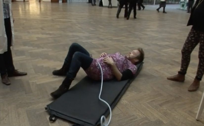
Young parents all over Belgium rely on Nutricia babyfoods every day. To support mums even before their baby is born, Duval Guillaume helped Nutricia create Baby Connection, an iPhone app designed to get dads more involved in the pregnancy.

Baby Connection works best when you use it as a couple. There is a mum version and a dad version, and everything each parent adds is automatically synced with their partner’s phone. The app can even transform two iPhones into one big screen.

A couples app that turns involvement into habit

The mechanism is simple and deliberate. Split the experience into two roles, then keep both roles in lockstep through syncing. Add a playful physical trick, two phones acting like one screen, to make “doing this together” feel tangible, not just promised.

In Belgian consumer brand building, support tools land best when they reduce friction for both parents and make the dad’s role practical, not symbolic.

Why it lands

This works because it shifts the conversation from “be more involved” to “here is exactly how”. Shared inputs, shared visibility, shared moments. The app design quietly nudges the couple into repeated check-ins, which is where involvement stops being intention and becomes routine.

Extractable takeaway: If you want two people to share responsibility, design the product so both can contribute in small ways, see each other’s contributions instantly, and feel like a team without extra coordination effort.

Launching an app with an experience, not a banner

The real question is how to make shared participation feel real before the baby arrives, not how to advertise another pregnancy app.

To launch Baby Connection, Duval Guillaume backed the app with a campaign designed to be as distinctive as the product itself, and to pull the idea into public conversation beyond the app store listing.

The stronger move is to market the shared behaviour the product enables, not just the app itself.

What pregnancy-support brands can borrow

  • Design for the couple, not the individual. Two roles, one shared narrative.
  • Make syncing the default. Shared visibility is the involvement mechanic.
  • Add one physical “together” moment. A simple device interaction can signal partnership better than copy.
  • Launch the product idea, not only the product. If the behaviour change is the point, market the behaviour.

A few fast answers before you act

What is Nutricia Baby Connection?

A paired iPhone app for expectant couples, with separate mum and dad versions that sync pregnancy updates and activities between both phones.

What is the core mechanism?

Two-role design plus automatic syncing, so both parents can add and see information without manual coordination.

Why does the “two iPhones as one screen” idea matter?

It turns a digital feature into a physical couple moment, reinforcing that pregnancy planning is shared, not solo.

What is the business intent behind this kind of app?

To support and deepen trust with parents before birth, by providing a practical tool that keeps the brand present in daily routines.

What is the most reusable lesson here?

If you want involvement from a second person, make contribution easy, feedback immediate, and shared progress visible.

Toyota: A Glass of Water

A Glass of Water is a challenge created by Saatchi & Saatchi Stockholm for Toyota in Sweden. Its mission is to help drivers cut down their fuel consumption by 10% and reduce CO2 emissions, aligned with Toyota’s stated zero-emission vision.

When drivers register on the program website, they accept the challenge to place a glass of water on their dashboard or cup holder, then drive in a smooth manner that avoids spillage.

According to Toyota, the less you spill, the gentler you drive. Therefore the less fuel you consume.

A rule you can test on your next drive

The brilliance is the simplicity. No special car, no expert coaching, no complicated scorecard. Just a physical feedback loop that makes every harsh brake and every aggressive turn visible in the most basic way possible.

How the mechanism teaches eco-driving

Spilling is the metric. If you keep the water steady, you are accelerating, braking, and cornering more smoothly. That smoother style tends to reduce wasteful energy spikes, which is the same principle behind most eco-driving advice, translated into something you can feel immediately.

In European automotive marketing, behavior-change challenges work best when the rule is simple enough to try on the next drive.

Why it lands

It turns an abstract goal. “reduce fuel consumption”. into a personal game with instant feedback. The glass makes you self-correct without being told what to do, and it makes eco-driving feel like mastery rather than sacrifice. It also travels well as a story because anyone can explain it in one sentence.

Extractable takeaway: If you want people to change a daily behavior, give them a physical, low-effort indicator that converts “doing better” into a visible result they can improve on.

What Toyota is really buying

This is not just awareness. It is repeatable participation. Each drive becomes a new attempt, and each attempt reinforces the brand’s association with smarter, calmer driving rather than with lecturing about emissions.

The real question is how to make smoother driving feel self-evident and repeatable, not how to explain eco-driving more forcefully.

What to steal from the water-glass challenge

  • Use a single, legible metric. Spills are binary and instantly understood.
  • Make the feedback loop physical. Physical cues outperform abstract dashboards for habit shifts.
  • Lower the start barrier to almost zero. If people can start today, they will.
  • Turn restraint into skill. People adopt habits faster when it feels like competence.

A few fast answers before you act

What is A Glass of Water?

A driving challenge where you place a glass of water on the dashboard or cup holder and try to drive smoothly enough not to spill, as a proxy for reducing fuel consumption.

Why does “not spilling” relate to fuel savings?

Because avoiding spills requires gentler acceleration, braking, and cornering. That smoother driving style tends to reduce inefficient energy spikes.

What makes this different from typical eco-driving advice?

It replaces instructions with immediate feedback. The glass shows you how you are driving without needing an expert or a complex display.

What is the biggest risk with this kind of challenge?

If people treat it as a stunt rather than a habit tool, the effect fades quickly. The challenge needs repetition to translate into lasting driving style change.

How should a brand measure success for a behavior challenge like this?

Participation volume, repeat participation, and any measured or self-reported fuel consumption improvement among participants, not only views or clicks.