Foxtel: The Alert Shirt

In September 2012, London fashion house CuteCircuit launched a wearable, sharable, programmable tshirt. Then in 2013, Durex Australia unveiled their wearable electronic underwear that allowed touch to be transferred over the internet. Now joining this growing trend of wearable electronic clothing is the Alert Shirt from Australian telecommunications company Foxtel.

Loyal Foxtel customers can use this special shirt to experience in real time some of the physical sensations their favorite players have on the field, including:

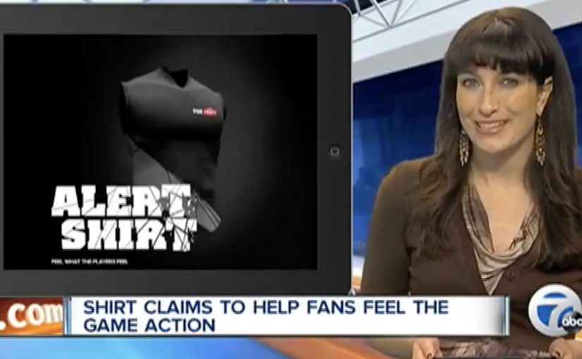
  • Pressure: A thumping heartbeat
  • Impact: The shock of a big hit
  • Adrenalin: An intense rush of blood
  • Exhaustion: Lungs burning with effort
  • Despair: A sudden sinking feeling

The data is transmitted via Bluetooth from smartphone app, and the shirt is powered by a lithium polymer cell battery.

From second-screen to second-skin

The mechanism is a clean translation layer. Live game moments are captured as data, the app receives them, and the shirt turns those signals into physical feedback. The experience is not about watching harder. It is about feeling the sport in parallel with the broadcast.

In subscription sports media, the strategic job is retention. The best fan experiences make the service feel like access to something you cannot get anywhere else.

Why it lands

This idea works because it turns fandom into a bodily cue, not just a viewing habit. It also frames “technology” as something you wear once, then forget. When it is working, the interface disappears and the sensation becomes the message.

Extractable takeaway: If you want to deepen engagement, do not add more features to the screen. Translate key moments into a new sensory channel that runs alongside the core experience, and make activation as close to effortless as possible.

What Foxtel is really testing

Beyond the spectacle, this is a trial of emotional stickiness. By emotional stickiness, the point is simple: give fans a stronger felt reason to come back for the live broadcast. The real question is whether that added intensity is strong enough to make Foxtel feel like the only place to experience the match properly. If the shirt can make a live match feel more intense at home, it creates a reason to watch live, to watch longer, and to choose the broadcast that supports the experience.

What sports broadcasters can steal from this

  • Design the sensation vocabulary. Map data to feelings in a way users can understand instantly.
  • Make the phone a bridge, not the destination. Use the app to pair and translate, then let the wearable carry the moment.
  • Keep the promise specific. Heartbeat, hit, exhaustion. Concrete signals beat vague “immersive” claims.
  • Build for live viewing. The value rises when timing is tight and the feedback feels synchronous.

A few fast answers before you act

What is the Foxtel Alert Shirt?

It is a connected shirt that receives live match signals via a Bluetooth smartphone app and converts them into physical sensations so fans can feel key moments in real time.

What problem does it solve for a broadcaster?

It makes the broadcast feel exclusive and more emotionally intense, which can support loyalty and repeat live viewing.

Why use physical sensations instead of more on-screen stats?

Because sensations do not compete with the main viewing experience. They add a parallel layer without asking the fan to look away.

What makes this kind of wearable feel credible?

Clear mappings between events and sensations, low setup friction, and tight timing so feedback feels connected to the moment.

How can another brand apply the pattern?

Choose a live experience with high emotion, capture a small set of meaningful signals, then translate them into a simple, repeatable sensory vocabulary.

Happy Holiday Videos 2013: Agency Stunts

Welcome back. Hope everyone had a great holiday season. Now for a great start to 2014.

Taking off from my last post, here are a series of holiday action videos created by agencies around the world in their lead up to Christmas 2013. By “holiday action videos” I mean greetings built around a single visible action or interaction, not a passive message.

Holiday greetings that behave like products

The mechanism across this set is simple. Use the “holiday card” moment as permission to ship a stunt, an installation, or an interactive video that people can experience rather than merely watch.

In global agency culture, holiday cards are a low-stakes sandbox for experimentation that teams can ship fast and share widely.

The real question is whether your greeting can demonstrate something people can experience, not just a sentiment you can post.

This format is worth copying because it turns a seasonal hello into proof of craft.

Why this format keeps working

These pieces earn attention because they trade greeting-card sentiment for an observable action. Put in a coin. Click a button. Gather people in front of a webcam. One clear trigger, one visible result.

Extractable takeaway: If you want something to travel during peak-season noise, design a one-step interaction that produces a visible payoff, and make the payoff easy for someone else to describe in a sentence.

Christmas Chocolate Coin Factory by W+K London

Wieden+Kennedy London turned their Hanbury Street office window into a Christmas installation. Passers-by who inserted a 1 pound coin into Dan & Dave’s Chocolate Coin Factory activated the machine on display which then dispensed a special gold Belgian chocolate coin at the other end. All the money collected from this coin factory was donated towards building a new playground for Millfields Community School in Hackney, East London.

Disrupted Christmas by Holler

Holler, an agency from Sydney, created a live interactive installation that gave the general public a chance to disrupt the agency as it worked throughout the day. Electric Muscle Stimulation (EMS) units were hacked and hooked up to the Internet via IP cameras. Then key members of the agency were connected to the EMS units, and the Internet via a live stream. The public could then watch the agency staff online and instantaneously zap them at will with the click of a button.

For each disruption the agency donated $1 to The Factory, a local community centre with a long history of supporting socially and economically disadvantaged local residents.

The More the Merrier by Publicis Groupe

The Publicis Groupe was back again with another Maurice Lévy holiday video. This time they worked with DigitasLBi to create a video that uses your webcam to detect how many faces are watching together, and then adapts the video based on the number of viewers.

The Epic Christmas Split by Delov Digital

Delov Digital from Hungary used Chuck Norris to top Jean-Claude Van Damme’s epic Volvo split with the help of some serious digital enhancement.

A repeatable structure for next year’s greeting

  • Give the audience one trigger. A single action that anyone can explain and repeat.
  • Make the payoff visible. Something that changes on-screen or in the real world, immediately.
  • Design for retellability. If the idea cannot be summarized in one sentence, it will not spread.
  • Let craft do the selling. Use the holiday excuse to demonstrate what you can build, not just what you can say.

A few fast answers before you act

What makes “holiday action videos” different from normal holiday ads?

They are built around a visible action or interaction. The greeting is the excuse. The experience is the asset that people talk about and share.

Why do agencies use holiday cards as a playground for experimentation?

The stakes are lower and the audience is receptive. That creates room to try unusual formats, technical tricks, and interactive mechanics that would be harder to justify in a client campaign.

What is the common mechanism across the best ones?

One clear trigger and one clear payoff. Insert a coin and get a coin back. Click a button and something happens. Add more people and the video changes.

How do you choose a mechanic that people will actually try?

Pick a one-step trigger that feels effortless, then make the payoff obvious within seconds. If someone cannot explain both in one sentence, the interaction will not travel.

How do you keep it from feeling like a gimmick?

Anchor the interaction in a simple human reward. Delight, togetherness, surprise, or a small act of good. Then keep the mechanic effortless so the idea does not collapse under friction.

Australia Post: Video Stamps

Unpacking a parcel can feel a bit like unpacking a gift. Australia Post builds on that instinct with a “video stamp” that lets senders add a personal message to a package.

The mechanic is straightforward. A QR code stamp is linked to a custom video message, so the recipient scans the stamp and watches a personal clip as part of the unboxing moment.

How the video stamp works

The value sits in the linkage between physical and digital. The parcel carries a QR stamp, the QR routes to a hosted video message, and the message becomes part of the delivery experience without changing the logistics underneath.

In holiday postal services and gifting moments, a simple personalization layer can increase perceived value without changing the core delivery product.

Why this lands

This works because it upgrades a utilitarian service into an emotional ritual. The postal service delivers the object, but the sender delivers the moment. The QR stamp is also a clean trigger because it is familiar, fast, and naturally placed where attention already goes during unboxing.

Extractable takeaway: If your product is operational by nature, add a lightweight digital layer that attaches to a physical touchpoint, so the experience gains meaning without adding friction to the core process.

The idea in context

Linking codes to personal messages is a proven pattern. J.C. Penney linked QR codes to voice messages in their Santa Tags sticker campaign in 2011. There was also a concept video circulating about a similar DHL-style Christmas video packet service. The notable part here is the step from concept and retail experiments into a postal service implementation.

The real question is not whether a QR code can play a video, but whether a postal service can make a routine delivery feel personal without complicating the service.

This is a smart service-layer idea because it adds emotion without asking the postal operation to become something else.

What postal and gifting teams can reuse

  • Attach meaning to a routine moment. Unboxing is already emotional. Add a trigger there.
  • Use a familiar bridge. QR is low-explaining and low-friction.
  • Let the sender create the content. Personalization scales when users do the work willingly.
  • Keep it additive. The digital layer should not interfere with delivery, tracking, or operations.

A few fast answers before you act

What is an Australia Post video stamp?

It is a QR code stamp on a parcel that links to a custom video message, so the recipient can scan and watch a personal clip.

Why does this work especially well at Christmas?

Because parcels are already treated like gifts. A video message makes the delivery feel more personal and intentional.

Is this a new idea or a new implementation?

The underlying concept has existed in other forms, but the notable move is a postal service implementing it as a practical consumer feature.

What’s the main UX requirement for this to succeed?

Instant playback with minimal steps. If scanning leads to friction, the emotional moment disappears.

What’s the easiest way to copy the pattern?

Identify a physical touchpoint people already look at, then attach a scannable trigger that opens a personal message or content layer immediately.