Ikea RGB Billboard

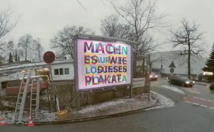
German ad agency Thjnk and production studio I Made This teamed up to create a unique RGB Billboard that revealed different messages depending on the colored lights.

The billboard featured three different messages in three different colors. Cyan, magenta and yellow. At night, the billboard was lit up by red, green and blue (RGB) light bulbs, which made the different messages visible depending on the shining light bulb.

The red showed the cyan text. The green made the magenta text visible. And the blue light revealed the yellow text. With this simple visual trick, the billboard made the most of its limited space and embodied IKEA’s space-saving message.

How the RGB trick works

The idea leans on a simple perception hack, meaning the light color determines which printed layer stands out to the eye. You print multiple messages in different ink colors, then you control which one becomes dominant by changing the light color that hits the surface.

By switching between red, green, and blue lighting, the billboard effectively “filters” what you see. One physical surface. Multiple readable layers. No moving parts required. That works because each light color makes one printed layer readable while pushing the others back.

In crowded retail and FMCG environments, that kind of space efficiency matters because one surface often has to carry more than one job.

Why this is a very IKEA way to communicate

IKEA’s promise often comes down to doing more with less space. This billboard does the same thing. It demonstrates the benefit while delivering the message. The medium becomes the proof.

Extractable takeaway: When the medium visibly demonstrates the product promise, the ad explains itself faster and sticks longer.

What the idea is trying to do for the brand

The real question is not whether people notice the trick, but whether the trick makes IKEA’s value proposition easier to remember.

That is exactly the right move for out-of-home. The business intent is to turn a space-saving claim into a live demonstration, so one billboard works as both message and proof.

What to borrow for your next OOH idea

  • Make the constraint the concept. Limited space becomes the creative engine.
  • Use a mechanism people can explain. “Different lights reveal different messages” travels fast.
  • Build a repeatable reveal. The change over time, or over conditions like day and night, creates a reason to look twice.

A few fast answers before you act

What is the IKEA RGB Billboard?

It is a billboard designed to reveal different messages depending on whether it is lit by red, green, or blue light.

Who created it?

German ad agency Thjnk and production studio I Made This.

How many messages did it contain?

Three messages, printed in cyan, magenta, and yellow.

What lighting was used at night?

Red, green, and blue (RGB) light bulbs.

Why was it a good fit for IKEA?

It demonstrated a space-saving principle by making one billboard placement do the work of multiple messages.

Corona Extra: Luna Corona

Corona Extra and their ad agency Cramer-Krasselt worked with astronomers, planetariums, and universities in the USA to calculate the positioning of the moon, aiming to capture a moment where it would align perfectly with an image of a Corona Extra beer.

The moment was timed so the billboard’s “missing lime” is completed by the moon’s crescent alignment on the nights of June 14 and 15.

When the sky completes the creative

The mechanism is engineered perspective plus a fixed window in time. The billboard artwork is designed so that from a specific viewing position, the crescent moon appears exactly where a lime wedge would normally sit on a Corona bottle. The media placement then turns into a scheduled viewing, because the “full ad” only exists when the moon cooperates.

In out-of-home advertising, aligning a message with a real-world phenomenon can turn a static placement into a time-limited event people actively seek out.

Why it lands

This works because it makes a familiar brand ritual feel discovered rather than advertised. The payoff is not a new claim. It is a real-world moment that feels improbably perfect, which gives people a reason to stop, watch, and tell someone else where and when it happened. The real question is how far a brand can make the physical world do the storytelling for it. The stronger move here is using the moon to deliver the brand cue instead of adding more message.

Extractable takeaway: If you can make the environment complete your creative, you turn passive exposure into participation. That participation becomes the distribution.

What to steal from Luna Corona

  • Design for one unmistakable illusion: one clean visual trick beats multiple clever details.
  • Use time as a feature: a narrow viewing window creates urgency without discounts or gimmicks.
  • Make the “rule” explainable: people should be able to describe it in one sentence.
  • Choose a ritual people already associate with you: the lime wedge is an instantly legible brand cue.
  • Capture proof: the video is not decoration. It is how the idea travels beyond the street corner.

A few fast answers before you act

What is “Luna Corona”?

It is an out-of-home idea where a Corona billboard is positioned and designed so the crescent moon visually becomes the lime wedge on the bottle during a specific time window.

Why involve astronomers and universities?

Because the illusion depends on precise timing and angle. You need accurate lunar position predictions to know when the crescent will “land” in the right spot from the viewer’s perspective.

Is this interactive?

Not in the device sense. The interaction is physical. People move into position, wait for the right moment, and witness the alignment as it happens.

What makes it more than a clever billboard?

The scarcity. It only “works” at certain times, so it behaves like an event, not just media inventory.

What’s the biggest risk with ideas like this?

Fragility. If weather, timing, sightlines, or location details are off, the reveal fails. The planning and production tolerance must be treated like a live event.

Coca-Cola: Personal Road

Coca-Cola has an ongoing global campaign that allows consumers to personalise bottles and cans…

The real question is how you extend a personalization promise beyond the package without turning it into a gimmick.

Enjoy a Coke with Sunil

Building on the success of this campaign Coca-Cola Israel decided to take the idea further with personalised billboards.

A mobile app was developed where consumers could enter their name. Then using geo-fence technology, the Coca-Cola billboard displayed the name when it was approached. Geofencing here means the app detects when you enter a defined area around the billboard. The same trigger also sends a phone message, which is what makes the public moment feel personal and easy to share.

In global consumer brands running mass-personalization campaigns, this kind of simple, location-triggered reveal is a clean way to turn a name into a real-world moment.

Since its launch the app has reached 100,000 downloads and is currently ranked #1 in Israel’s app store.

Why this extension makes sense

It keeps the original “Share a Coke” promise intact, then amplifies it with one visible surprise that is immediately confirmed on the device you are already holding.

Extractable takeaway: If you want personalization to stick, pair one unmistakably personal output people can see with one immediate confirmation they can keep.

  • It keeps the personalization promise. The name is not only on the package. It shows up in the world around you.
  • Location makes it feel “for me”. The moment you approach the billboard, the experience becomes uniquely yours.
  • Mobile closes the loop. The phone notification confirms the moment and turns it into something you can share.

The reusable pattern

Start with a personalization mechanic people already understand. Then add a single “surprise and confirm” moment in the real world, powered by location and a simple mobile action.

  • Keep the input tiny. Ask for one thing, like a name, and make it obvious what happens next.
  • Make the output public and specific. Put the person’s name somewhere they cannot miss in the real world.
  • Confirm on mobile. Send a message at the same moment so the experience is memorable and shareable.

A few fast answers before you act

What is Coca-Cola “Personal Road”?

It is a Coca-Cola Israel extension of the personalised-name campaign that uses a mobile app and geofencing so a billboard displays your name as you approach, and your phone notifies you.

How does the billboard know when to show a name?

The app uses geo-fence technology to detect proximity, then triggers the personalised billboard moment when the user approaches.

Why pair the billboard moment with a smartphone message?

The message confirms what just happened and makes it easy for the consumer to capture and share the experience.

What is the key takeaway for location-based campaigns?

Make the rule simple and the payoff instant: one input from the consumer, one visible personalised output, and one mobile confirmation that seals the memory.