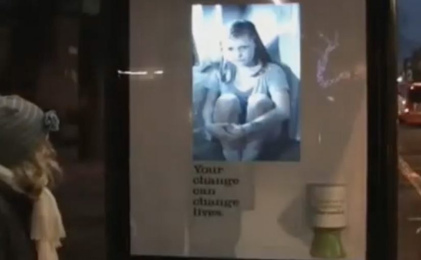
BBH London has created an interactive donation poster for Barnardo’s. Placed as an outdoor unit, it turns a normal “walk past” fundraising ask into a moment that responds to you. Here, an “interactive donation poster” means out-of-home media that visibly responds to an on-the-spot donation.
A poster that reacts when you give
As reported in trade coverage at the time, the execution combines a traditional collecting tin with a responsive screen element. When someone donates, the poster acknowledges it in real time, shifting the dynamic from silent guilt to immediate gratitude.
Public charity fundraising in busy public spaces lives or dies on a small, human feedback loop that makes giving feel seen and valued.
The real question is whether your ask creates a visible emotional payoff at the exact moment someone chooses to give.
What “interactive donation poster” means here
An interactive donation poster is out-of-home media that responds to real-world behaviour. In this case, the behaviour is donating on the spot, and the response is a visible, immediate acknowledgement that makes the exchange feel personal rather than transactional.
Why the interaction matters more than the technology
The technology is not the headline. The headline is the social contract it creates. If you give, the poster “gives back” with recognition. That reciprocity is a powerful motivator because it makes the donor feel like a participant, not a passer-by. Cause-led teams should treat that reciprocity as the product, and keep the tech invisible.
Extractable takeaway: This works because it takes the most fragile part of street fundraising, the awkwardness of being asked, and replaces it with a clear emotional payoff that arrives the second you act.
It also increases dwell time. People pause to see what happens. Others notice the pause and become curious. Curiosity becomes participation. Participation becomes donations.
Steal this: gratitude on cue
- Reward the act immediately. The first second after a donation is the moment to reinforce behaviour.
- Keep the interaction binary. A clear “gave” versus “didn’t” moment is easier to understand in public space.
- Design for bystanders. Make the reaction readable from a distance so the crowd becomes your amplification layer.
- Make the thank-you feel human. Avoid gimmicks. Aim for warmth and clarity.
- Protect trust. Be explicit that the interaction is tied to giving, not to identifying or tracking people.
A few fast answers before you act
What is the Barnardo’s interactive donation poster?
It is an outdoor fundraising poster designed to respond when someone donates, so the act of giving triggers an immediate acknowledgement rather than staying a one-way ask.
Why does this kind of poster increase the chance of donation?
It replaces the awkwardness of being asked with a quick emotional reward. When donors see a direct response, giving feels more meaningful and less like dropping money into a void.
What is the simplest version of this idea?
A single visible reaction to a confirmed donation. A thank-you line, a change of expression, or a short message that appears only after giving. The key is timing, not complexity.
What are the main risks with interactive fundraising in public space?
Friction, reliability, and perceived surveillance. If it fails to respond, people feel tricked. If it feels like it is “watching” them, people feel uncomfortable and avoid it.
How do you keep it ethical and respectful?
Make the interaction about the donation, not the donor. Keep any sensing minimal, avoid collecting personal data, and ensure the message focuses on impact and gratitude.