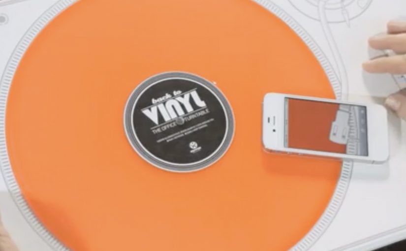
Demo CDs created by music labels are often treated like spam. So to promote a new track from DJ Boris Dlugosch, Kontor Records decided to send out a bright orange vinyl along with a 2D turntable as part of a direct mailing.
The people who received the mailing activated the turntable by scanning the QR code on it. That simple action enabled the missing piece of the turntable on the user’s smartphone, which then allowed them to play the music by placing the phone over the “deck”.
Making the mailer do the work
The mechanism is a tight little trick. The envelope becomes the turntable. The QR code becomes the start button. The smartphone becomes the “needle”. It is analogue theatre powered by a digital unlock, meaning the physical format itself becomes a short performance the recipient has to complete, and it forces the recipient to complete the experience instead of ignoring it.
In B2B marketing where your audience is drowning in promos, the fastest way to earn attention is to turn the first interaction into a short, satisfying action that cannot be skipped.
Why it lands
This works because it turns listening into participation. You do not just receive a track. You assemble the moment, and the novelty is directly tied to the product. The design also flatters the target. It treats creative directors like DJs. People with taste and a fondness for well-made objects. Because the recipient has to scan, place, and play, the mechanic turns passive exposure into participation, which makes the track harder to ignore and easier to remember.
Extractable takeaway: If your content is easy to ignore, do not beg for attention with more messaging. Engineer a simple physical or digital action that unlocks the content, and make that action feel like a reward rather than a chore.
The real question is how you make the format itself impossible to ignore before the message even starts. This is a stronger approach than sending another promo that asks for attention without earning it.
The numbers are the proof
According to campaign case-study reporting, 71% of 900 mailings were activated via the QR code. The same reporting notes that 42% of recipients also visited the Kontor site. For a target group known for deleting promos on sight, that is the clearest signal that the mechanic did its job.
How to make direct mail behave like a product
- Build a “first step” that is irresistible. If the first step is fun, the rest of the funnel happens almost accidentally.
- Fuse the medium and the message. Here, the packaging is the product experience, not just a container.
- Use phones as functional components. Not as a second-screen gimmick, but as a literal missing part.
- Target the ego carefully. Positioning recipients as tastemakers, not “buyers”, increases the odds they will engage.
A few fast answers before you act
What is “The Office Turntable”?
It is a direct mail piece for Kontor Records where the envelope folds into a paper turntable, and a smartphone activated via QR code completes the player so the recipient can listen to a vinyl release.
Why use vinyl instead of a promo CD?
Because vinyl is a status object and a curiosity trigger. It signals “this is different” before any copy is read.
What role does the QR code play?
It is the activation switch. Scanning it unlocks the mobile component that makes the paper turntable usable.
What results were reported?
Case-study reporting cites 71% activation across 900 mailings, and 42% of recipients visiting the Kontor site.
How do you apply this pattern without copying it?
Turn your distribution format into a usable object, then make one simple action unlock the content. The best versions feel like a clever tool, not a stunt.