
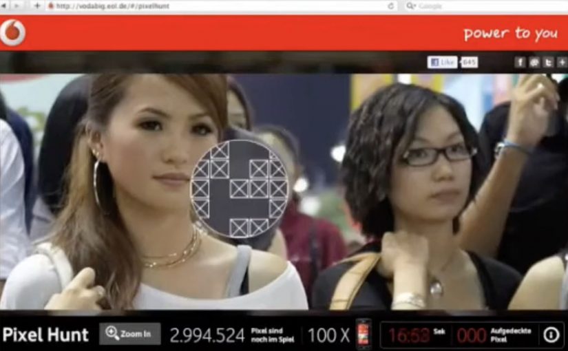
Vodafone: 5 Million Pixel Hunt

To promote the Vodafone LG Optimus Windows 7 phone with a 5-megapixel camera, Jung von Matt/Alster built a deceptively simple challenge: find the “winning” pixels inside a picture made of five million clickable pixels.

The premise is literal. One giant image is broken into a massive pixel field. A small set of those pixels are winners, and each winning pixel unlocks a prize, a new LG Optimus Windows 7 phone.

In handset launches, interactive “single mechanic” experiences can outperform heavier builds because the payoff is immediate and the learning curve is close to zero. By “single mechanic,” I mean one repeatable action loop that anyone can understand instantly.

A camera spec turned into a game mechanic

Most 5MP messaging ends up as lifestyle photography claims. This flips it into a rule: five million pixels. Go hunt them. That move makes the spec tangible, even if you never take a photo. Because the spec becomes a rule you can act on, the message lands without explanation and invites immediate participation.

It also reframes the product story from “better camera” to “better challenge.” The camera claim becomes the architecture of the experience.

In mass-market handset launches, the simplest interactive loops win because they reward attention in seconds, not minutes.

Why the pixel hunt pulls people in

A “pixel hunt” is a giant clickable image where only a small set of pixels are winners, and three forces do the work:

Extractable takeaway: When a spec can be turned into a single, repeatable micro-action with an obvious reward, participation scales faster than feature-heavy experiences.

  • Micro-actions: every click feels like progress, even when nothing happens.
  • Lottery logic: anyone can win, which keeps effort rational in small bursts.
  • Social proof: the more people play, the more the hunt feels “worth trying.”

The real question is whether your mechanic is so obvious that people can start without instructions and still feel progress within the first few clicks.

This is the kind of engagement design that scales without extra features. It is not a platform. It is a loop you can explain in one sentence.

Reported outcomes, and the real takeaway

The campaign is reported to have driven hundreds of thousands of visitors and to have had the full pixel field “clicked out” within weeks. Whether or not you track the exact numbers, the lesson holds: a single, repeatable micro-action can create massive aggregate participation when the reward is clear and the friction is low.

For spec-led launches, I would rather ship one obvious loop like this than a sprawling feature set that needs onboarding.

What to borrow from the pixel-hunt mechanic

  • Translate a spec into an experience rule, not a headline.
  • Use one action that is impossible to misunderstand, here it is “click to search.”
  • Make progress feel constant, even when outcomes are rare.
  • Keep the story retellable, “there were prizes hidden in five million pixels.”

A few fast answers before you act

What is a “pixel hunt” campaign?

An interactive image where users click through a dense pixel field to uncover hidden winning spots that unlock prizes.

Why does tying the hunt to “five million pixels” matter?

It turns a product attribute into the core mechanic. The spec becomes something you do, not something you are told.

What makes this kind of engagement scale?

Low friction plus high repeatability. People can participate in seconds, stop, and return without needing to relearn anything.

What is the biggest risk with this mechanic?

Fatigue. If the reward feels too remote, people churn. The prize framing and perceived odds must stay motivating.

How do you measure success beyond page views?

Unique participants, average clicks per session, return rate, and the conversion from participation into newsletter opt-ins, store visits, or qualified leads, depending on your objective.
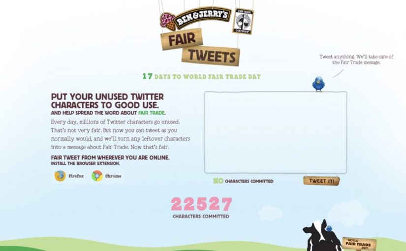
Ben & Jerry’s: Fair Tweets

How can an ice cream maker use social media to help provide farmers a fair income across the globe. Ben & Jerry’s positions itself as a Fairtrade-first mover in ice cream, then takes on the challenge with a deceptively simple Twitter utility called Fair Tweets.

The idea is to let followers donate their unused tweet space to the cause. “Unused social media space” here means the leftover characters inside a tweet that does not hit the then-standard 140 character limit. Fair Tweets fills those remaining characters with an advocacy message that promotes World Fair Trade Day (May 14) and Fair Trade issues more broadly.

Turning leftover characters into a donation mechanic

The mechanism is a lightweight interface that behaves like a plug-in for your behavior. You tweet as normal. The system automatically appends a Fair Trade message into the empty character space you did not use. It is a small “opt-in constraint” that converts millions of tiny, personal broadcasts into consistent campaign impressions. By “opt-in constraint,” I mean a voluntary limit the user accepts, so the campaign can add a message without hijacking their voice.

In global consumer brands with always-on social channels, this pattern scales because it turns everyday posting into distributed, opt-in media inventory.

The real question is whether you can piggyback on an existing habit without hijacking what people meant to say.

In brand-led cause marketing, the fastest way to earn participation is to reduce effort to one familiar action inside a channel people already use daily.

Why it lands

It does not ask people to change who they are on Twitter. It asks them to keep tweeting, while quietly upgrading the payload. This pattern is worth copying only when the appended message stays clearly secondary to the user’s own voice. The constraint is the hook. It makes the act feel clever rather than preachy, and it turns participation into a visible badge that friends can copy in seconds.

Extractable takeaway: If you want a cause message to spread without feeling like an ad, attach it to a behavior users already repeat, then “tax” only the slack in that behavior. The slack is where adoption hides.

What to steal for your next social utility

  • Exploit a real constraint. The character limit is not a creative brief. It is a platform rule that makes the idea instantly understandable.
  • Make the value exchange obvious. Users give you what they were going to waste anyway, then they get an identity signal for supporting the cause.
  • Keep the activation single-step. One click, one tweet, done. Every additional step kills the multiplier.
  • Design for imitation. The best proof is not a campaign site. It is seeing friends do it in-feed.

A few fast answers before you act

What is the Fair Tweets idea in one line?

It automatically fills the unused characters in a tweet with a Fair Trade message, so normal tweeting becomes lightweight cause promotion.

Why does “unused characters” work as a donation model?

Because it feels free. Users are not giving money or time. They are donating spare capacity inside something they were already doing.

What makes this approach different from a hashtag campaign?

A hashtag asks users to change their message. Fair Tweets rides along with any message, which increases participation without forcing people into campaign language.

What is the biggest risk when brands copy this pattern?

Over-automation. If the appended message feels spammy, repetitive, or hijacks the user’s voice, people will stop using it and may resent the brand.

How do you write the appended message so it feels shareable?

Keep it short, clearly optional, and visibly additive to the user’s tweet. If it reads like a branded footer or repeats too aggressively, it stops feeling like a badge and starts feeling like spam.

GOL Airlines: Mobile Check-in banner you fly

Here is a pretty innovative banner ad from AlmapBBDO in Brazil for GOL Airlines. The banner challenges you to imagine what it would be like to “fly” on your mobile phone.

You submit your mobile number into the banner. Seconds later you get a live call with flight instructions. At the same time the page transforms into a flying game controlled directly from your phone keypad.

You then fly a virtual plane across a major Brazilian travel site while destination deals appear underneath the route you choose. Flying is simple. Touch numbers to change direction and trigger special manoeuvres. The ad finishes by reminding you that flying is easier when you check in via your mobile phone.

In travel categories where products feel interchangeable, interactive creative wins when it turns a service benefit into a felt experience in seconds.

A banner that calls you back

The key move is not the game. It is the phone call. The call instantly makes the experience feel “live” and personal, and it bridges the banner and the handset into one connected moment. Once the call happens, the user is no longer passively viewing an ad. They are inside a two-device interaction.

The real question is whether your creative can make the service benefit happen inside the unit, rather than only claiming it.

This is a classic example of making the handset part of the unit. The mobile phone becomes the interface, which proves the check-in promise instead of describing it.

The mechanic: second-screen control without an app

Most second-screen ideas fail because they ask people to download something or switch contexts. This one uses what every phone already has. The keypad. In other words, the phone becomes a simple remote control for what happens on the page. That choice removes onboarding friction and makes the interaction feel surprisingly accessible for a banner unit.

It also creates a clean narrative arc. Number entered. Call received. Instructions delivered. Game begins. Deals appear. The brand claim lands as the closing line rather than the opening pitch.

In consumer travel marketing, where attention is scarce and booking friction is high, this kind of second-screen viewer control turns “convenience” into something you can feel.

Why the “flying game” format fits the job

The game is not meant to be deep. It is meant to create one sensation. Control. When you steer the plane with your own phone while destination deals appear under your route, the ad links that felt control to the check-in promise.

Extractable takeaway: If your benefit is “ease,” build a small interaction that gives the viewer control and a useful reward in the same moment. In a “message as mechanism” execution, the claim is delivered through the interaction itself, not a line of copy.

Steal this from GOL’s mobile check-in banner

  • Use a real-world channel as the trigger. A live call is stronger than a visual prompt because it changes the user’s state immediately.
  • Make the phone the interface. If you are selling a mobile service, let the mobile device do the work inside the experience.
  • Keep controls primitive and universal. Keypad inputs beat complex gestures when you need instant comprehension.
  • Reward the interaction with utility. Deals, destinations, availability, or next steps should appear as part of play, not after it.
  • End with the service tie-back. Let the experience earn the claim, then state it plainly.

A few fast answers before you act

What is the core idea of the GOL mobile-controlled banner?

You enter your phone number into a banner, receive a live call with “flight” instructions, and then control an on-page flying game using your phone keypad while travel deals appear as you fly.

Why does a phone call change the effectiveness of a banner ad?

It makes the experience feel immediate and real, and it creates a bridge from passive viewing to active participation without asking the user to install anything.

What category situations benefit most from this pattern?

Categories where the product is hard to differentiate visually and the benefit is “convenience” or “ease.” Airlines, ticketing, banking, utilities, and service platforms.

What is the biggest execution risk?

Operational friction. If the call is delayed, fails, or feels spammy, the experience collapses. Timing, consent clarity, and reliability are everything.

How would you modernise the mechanic without changing the concept?

Keep the phone as controller, but use a consent-forward trigger and fast connection method. For example, a one-tap call prompt or a verified in-browser handoff that still preserves the “live instructions” feeling.