CuteCircuit x Ballantine’s: tshirtOS

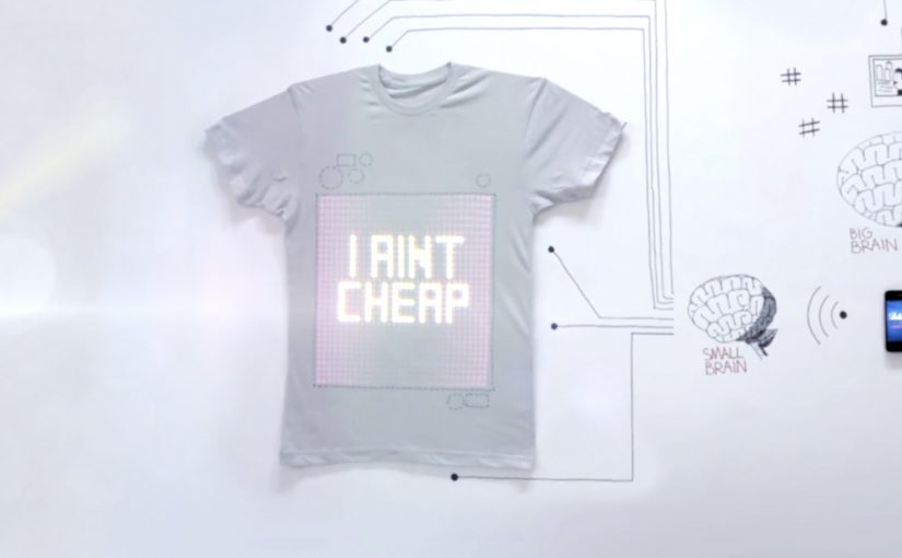
A grey T-shirt looks ordinary until it lights up and starts broadcasting whatever you choose. Text. Images. A status. A moving graphic. Your chest becomes a screen.

London fashion house CuteCircuit, in collaboration with whisky brand Ballantine’s, introduces tshirtOS, described as a wearable, shareable, programmable T-shirt built for digital creativity.

Here is a short making-of film, described as having received over 500,000 views.

What tshirtOS actually is

At the center is a 32 by 32 grid of 1,024 LEDs on the front of the shirt, controlled via an app on your phone. The concept is expanded with built-in components including a micro-camera, a microphone, an accelerometer, and speakers. The result is a garment that can display and capture content, then push it outward as a wearable broadcast. Here, that means the shirt itself becomes the display surface and the phone becomes the control layer.

In global consumer culture, where mobile is the primary tool for self-expression, programmable wearables turn identity signals into a personal channel that travels with the wearer.

Why it lands

Most “future of fashion” ideas die because they look like tech demos instead of culture. tshirtOS works as a story because it keeps a familiar object, the plain tee, then adds one new superpower that everyone understands immediately. You can show something. Right now. In public. Because the output appears on a familiar object people already understand, the technology reads as communication before it reads as hardware. That instant legibility makes the idea feel less like a gadget and more like a new medium.

Extractable takeaway: If you are launching a new interface, anchor it in a familiar form factor, then make the first benefit obvious in one glance so the audience explains it for you.

What the brands are really betting on

The ambition is bigger than a one-off prototype. It is a new creative canvas that sits between fashion, social content, and live communication. Ballantine’s gets cultural adjacency to creativity and experimentation, while CuteCircuit extends its interactive fashion narrative into something that looks commercially repeatable.

The real question is whether a programmable garment can move from prototype theater into a repeatable medium people instantly understand and want to use.

The second film, “T-shirt of the future,” puts tshirtOS into a night-out storyline. It is described as having already generated over 1.3 million views.

What to steal from tshirtOS

  • Prototype the medium, not the message. When the platform is new, the product itself is the headline.
  • Design for instant comprehension. If it cannot be understood in a second, it will not spread.
  • Show it in culture, not a lab. A night out beats a spec sheet for explaining why it matters.
  • Make it programmable. Viewer control creates infinite variations without infinite production.

A few fast answers before you act

What is tshirtOS in one line?

A programmable T-shirt concept that uses a 32 by 32 LED grid and a mobile app to display and share digital content in real time.

What hardware is described as being inside the shirt?

A 1,024 LED grid plus components including a micro-camera, microphone, accelerometer, and speakers.

Why does a programmable shirt matter for brands?

It turns the wearer into a moving, controllable surface for expression, which can connect live moments to digital content without relying on external screens.

What is the main adoption barrier?

Practicality and cost. Washability, comfort, battery life, and price all determine whether it becomes a product or stays a prototype.

What is the strongest creative use case?

Live, personal expression in social settings, where instant visual output is part of the experience and the wearer wants to change what is displayed on the fly.

Berghs: Don’t Tell Ashton

Berghs School of Communication students want the advertising industry to notice their Interactive Communication class, and they decide to prove it instead of claiming it. They build a Twitter-driven artwork where participation is “paid” with a tweet.

The rule is easy to understand and easy to repeat. Tweet to join the frame. The more followers you have, the bigger your photo appears in the final piece. One person has enough followers to dominate the entire artwork by himself, Ashton Kutcher, so the campaign dares the internet with a simple prompt: Don’t tell Ashton.

How the social currency mechanic earns attention

The mechanism turns a social signal into a visible design system. Followers become “value”. Value becomes size. Size becomes status inside the artwork. Because the output is a single shared object, every participant has a reason to bring in more participants, and every new tweet is both payment and distribution.

In global creative education and talent recruiting, showing capability in a format that naturally spreads can outperform any brochure-style message about what you teach.

Why it lands

It uses a clean, game-like inequality that people instinctively understand. Bigger accounts get bigger presence. Smaller accounts still get in. The Ashton constraint makes the whole thing feel fragile and urgent, because one “wrong” tweet could ruin the artifact. Because the rule turns status into a visible outcome, people instantly understand why participation matters and why the object keeps spreading. That tension becomes the hook that keeps the story moving.

Extractable takeaway: If you want participation to scale, turn one simple social metric into a visible stake inside a shared outcome. Then add a single constraint that makes the outcome feel at risk.

What this is really doing for the program

This is a recruitment campaign disguised as an internet object. The artwork is the portfolio piece, and the spread is the proof that the makers understand how digital behavior works in the wild. The more people talk about the object, the more the school’s program name travels with it.

The real question is whether the program can turn its digital thinking into an object the industry wants to notice, share, and remember.

What to steal from the participation mechanic

  • Build one object people want to join. Collages, maps, frames, and leaderboards make participation legible.
  • Convert a metric into meaning. Followers, contributions, referrals, and time can become “materials” in the output.
  • Make the story retellable. If the rule cannot fit in one sentence, distribution collapses.
  • Add one constraint that creates urgency. A single “if X happens, we lose” condition can be enough.

A few fast answers before you act

What is the core idea of Don’t Tell Ashton?

A Twitter-built artwork where a tweet buys you a spot, and your follower count determines how large your portrait appears in the final piece.

Why tie portrait size to follower count?

It turns a social metric into a visible stake. That makes participation competitive, shareable, and instantly understandable without explanation.

What role does Ashton Kutcher play in the story?

He is the “edge case”. As the most-followed account in the story, one tweet from him could overwhelm the entire artwork, which gives the campaign its tension.

What makes this more than a clever stunt?

It demonstrates a transferable skill. Designing a mechanic where participation and distribution are the same action.

Why does this work better than a normal student showcase?

It makes the audience prove interest through participation. That produces evidence of relevance, not just a claim that the class understands interactive communication.

Nissan Micra: Savvy With Space Banner

From an under-the-seat shoe drawer to an extra-large glovebox, the 2011 Nissan Micra makes the most out of what it has. Here, “space-savvy” means fitting more useful function into a small footprint without making the car feel cramped. To reach drivers who value space-savvy functionality, TBWA\RAAD Dubai takes the same idea into media and builds a banner ad that “packs in” more utility than you would expect.

The punchline is simple. The banner is so clever with space that you can even use the ad itself to help sell your car.

When the format becomes the message

Instead of talking about storage compartments and smart design in a conventional way, the campaign uses the banner’s own layout as the demonstration. The ad behaves like the Micra. Compact, efficient, and surprisingly capable inside a tight footprint.

In automotive marketing, proving practical value often works best when the proof is baked into the experience format, not layered on as copy.

Why this lands

This works because it turns “space-savvy” from a feature claim into something you can feel. The audience is not asked to believe a list of compartments. They experience a compact unit that still does more than expected, which mirrors the product promise in a way that reads instantly.

Extractable takeaway: If your product advantage is “smart use of limited resources,” make the media unit demonstrate that constraint directly, so the format itself becomes the proof.

What the campaign is really optimizing for

The real question is whether the media can make clever functionality feel obvious before the audience has to read a feature list.

This is a strong fit for the Micra because the format does the selling work before the copy has to. The target is not everyone who wants a car. It is drivers who prioritise clever functionality and everyday usefulness. The banner’s “utility-first” design signals that the Micra is designed for people who like practical wins, not flashy theatre.

What functional brands can borrow

  • Let the container prove the claim. Build the story into the experience mechanics.
  • Design for instant comprehension. The idea should land before someone reads supporting text.
  • Match the medium to the benefit. Functional products benefit from functional media behaviors.
  • Keep it user-relevant. If the execution helps someone do something, attention comes easier.

A few fast answers before you act

What is “Savvy With Space” in this Nissan Micra campaign?

It’s a banner-led idea that uses the ad unit’s compact, space-efficient design to mirror the 2011 Nissan Micra’s “smart storage and functionality” positioning.

What makes this different from a normal feature ad?

The format demonstrates the benefit. Instead of only describing clever storage, the banner’s behavior and layout are designed to feel space-smart.

Who is the campaign aimed at?

Drivers who value practical, space-savvy functionality and small design decisions that make daily use easier.

What’s the reusable pattern here?

Make the medium behave like the product benefit, so the audience experiences the claim rather than just reading it.

What could go wrong if you copy this approach?

If the “cleverness” is not immediately obvious, it can look like gimmickry. The functional proof has to be legible fast.