Secret Diary of a Call Girl: The Window Opposite Radio

Secret Diary of a Call Girl: The Window Opposite Radio

A window performance built for radio

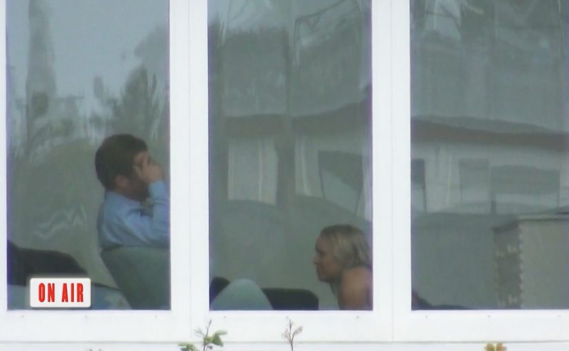
To launch the British TV drama Secret Diary of a Call Girl in New Zealand, DraftFCB staged a simple provocation. An “actress” displayed call girl-like behavior in a house window directly opposite a top radio station for three successive nights.

As expected, the scene caught the attention of the local DJ, who began broadcasting his observations on air. Other DJs around the country reportedly picked up the story, keeping it in circulation for roughly 72 hours. On the final night, with public interest at its peak, the actress closed the blinds to reveal the show message and the reason for the spectacle.

The mechanic: hijacking live commentary as distribution

The campaign is engineered to be “irresistible to narrate.” Put a curiosity trigger within line-of-sight of people whose job is filling airtime with observations, then let their real-time commentary do the heavy lifting. The multi-night schedule matters because it turns a one-off sighting into an unfolding story that listeners can return to, and that other shows can reference without needing new material.

In entertainment launches, live conversation often outperforms polished promos because the audience feels like they are overhearing something that is happening, not being sold something.

In broadcast-led markets, earned attention compounds fastest when the story is physically proximate to a microphone and structured to renew itself across multiple days.

Why it lands

It uses a classic public curiosity loop. People see something ambiguous, hear someone validate it on air, then share it socially to compare interpretations. Because the DJs are reacting in the moment, the “is this real?” tension stays alive long enough to travel, and the final-night reveal provides closure that feels like a payoff rather than a disclosure.

Extractable takeaway: If you want sustained buzz, design a repeatable public trigger that creates daily new angles for commentators, then hold the brand reveal until attention has clearly peaked.

What the launch is really optimizing for

The goal is not just reach. It is talk time, repetition, and social spillover. A premiere wins when it becomes the thing people reference without being prompted, and when the message arrives as the resolution of a story people have already been following.

The real question is whether the setup can turn observation into repeated on-air narration before the reveal arrives.

What to steal from this radio-first stunt

  • Choose a “natural broadcaster.” Put the trigger near people whose incentive is to describe what they see.
  • Make it episodic. Multi-night structure creates freshness and gives people a reason to check back.
  • Design ambiguity, then control the release. Let curiosity build, but ensure the reveal is clean and unmistakable.
  • Plan the social overflow. Seed a format that is easy to retell in one line, so listeners can amplify it without context.

A few fast answers before you act

What did DraftFCB do to promote Secret Diary of a Call Girl in New Zealand?

They staged an actress behaving like a call girl in a bedroom window opposite a radio station for three nights, prompting DJs to discuss it on air until a final-night reveal connected it to the TV premiere.

Why does placing the stunt opposite a radio studio matter?

Because DJs are paid to narrate interesting observations. Physical proximity to the studio turns the environment into live content.

What is the core distribution mechanic?

Earned media through live commentary. The stunt creates something discussable, and the on-air conversation becomes the ad.

Why run it across multiple nights?

Repeat nights transform a sighting into a story arc, increase the chance of pickup across stations, and create a natural moment for a final reveal.

What is the biggest risk with this kind of tactic?

If the reveal is unclear or the tone feels exploitative, the conversation can flip. The payoff must land cleanly and fast.

Sodimac: The 5-Second Skip Behavior Ad

Sodimac: The 5-Second Skip Behavior Ad

Viewers usually spend five seconds counting down to the “Skip Ad” button. Homecenter Sodimac from Chile uses that exact moment to ask a better question: do you want to skip the ad, or skip the behavior?

Working with agency MayoDraftfcb, Sodimac created a set of environmental messages that turn the skippable format into a moral choice. The button becomes the idea. Either you opt out, or you commit to changing a small wasteful habit.

A tiny mechanic that flips the meaning of “skip”

The creative move is to hijack an interface behavior people already know. That matters because it removes learning friction. The audience understands what to do instantly, and the campaign only has to change what that action means.

In brand communication, this is a neat example of interface-led storytelling. By that I mean the story is carried by a native UI element, not just the film around it.

The platform UI is not just a container for the message. It is the message.

In skippable video media, the first five seconds are the only attention you can reliably design for.

Why this works better than a standard awareness film

It uses the countdown moment as the content, so the viewer understands the choice instantly and the message lands before the skip reflex kicks in.

Extractable takeaway: If the platform gives people a default behavior, design your idea so that default action becomes the point, not the obstacle.

  • It is time-native. The idea fits the five-second window instead of fighting it.
  • It creates viewer control. The viewer makes an explicit choice, not a passive nod.
  • It is measurable. The “change” action is a click, not a vague sentiment.
  • It is consistent with the topic. Environmental habits are about small repeated actions. The format mirrors that.

Reported impact, and the real lesson

The campaign is reported to have driven over 80,000 people to choose the “change” option within a week. This is a smarter use of pre-roll than most awareness films because it makes the click mean something. The real question is whether your first five seconds invite a meaningful choice or just a reflexive skip. The bigger takeaway is structural: if you can turn a default skip behavior into a meaningful action, you get engagement that feels earned rather than bought.

Design rules for your next skippable campaign

  • Build for the first five seconds, and make the idea readable without audio.
  • Use the interface as a prop, buttons, timers, overlays, or any native UI element that viewers already trust.
  • Offer a single clean choice, so the click means something unambiguous.
  • Make the action lead somewhere useful, tips, tools, pledges, or a next step that matches the promise.

A few fast answers before you act

What is the core idea in one line?

It reframes the skippable pre-roll moment. Skip the ad, or skip the bad habit.

Why does this mechanic fit environmental messaging?

Because sustainability is built on small decisions repeated often. A skippable ad is also a small decision, repeated often.

What makes this different from a normal call-to-action?

The CTA is embedded inside a familiar platform behavior. The campaign is not asking for extra attention. It is redirecting an existing action.

What is the biggest risk with “interface hijack” ideas?

Here, “interface hijack” means repurposing a familiar UI element like the Skip button without hiding what is happening. If the viewer feels tricked, trust collapses. The choice has to feel fair, clear, and reversible.

What should you measure to prove it worked?

Click choice rate, completion rate, and downstream behavior on the landing destination, plus any lift in eco-tip engagement over the campaign window.

Eterna Cadencia: The Book That Cannot Wait

Eterna Cadencia: The Book That Cannot Wait

Last month I wrote about Austria Solar’s annual report, whose pages became visible only when exposed to sunlight.

Now Buenos Aires based bookshop and publisher Eterna Cadencia has released “El libro que no puede esperar”, “The book that cannot wait”. It is an anthology of new fiction printed in ink that disappears after two months of opening the book.

The mechanic: ink that fades once you open the seal

How is that possible. Here, the mechanic is a built-in physical rule: the books are described as being silk-screened using a special ink, then sealed in air-tight packaging. Once opened, the printed material reacts with the atmosphere and starts to fade. The result is that, after roughly two months, the text vanishes.

In global publishing markets where e-books change reading habits, physical formats regain attention when they add a constraint that digital cannot replicate.

Why it lands: urgency turns reading into an action, not an intention

The idea does not compete with e-readers on convenience. It competes on psychology. A normal book is patient. This one is not. It creates a deadline, and deadlines change behavior. Because the fading is irreversible, the deadline feels real rather than promotional.

Extractable takeaway: If you want people to stop postponing a behavior, make the cost of waiting tangible and irreversible. Scarcity works best when it is built into the product, not added as a marketing slogan.

What it is really doing for new authors

The real question is whether a physical constraint can turn passive interest into immediate reading.

This is smart publishing design, not a gimmick for its own sake.

At face value, this is a publishing gimmick. Underneath, it is an argument for momentum. New fiction struggles when it sits unread on a shelf, because “I’ll get to it” often becomes “never”. A time-limited book reframes the purchase as a commitment to read now, which is exactly what emerging authors need.

The project is also widely described as being developed with DraftFCB, which helps explain why the execution feels like an idea engineered for cultural pickup, not just for bookstore shelves.

What to steal if you are marketing anything physical

  • Build the message into the object: the product itself should carry the story, even without a campaign.
  • Make the constraint legible: people should understand the rule in one sentence.
  • Turn delay into loss: urgency works when waiting has a real consequence.
  • Use packaging as a trigger: opening the seal is a clear “start” moment, and that matters for behavior.
  • Design for retellability: “a book that disappears if you do not read it” spreads on its own.

A few fast answers before you act

What is “The Book That Cannot Wait”?

It is a print book sealed in packaging where the text is printed with ink that starts fading once the seal is opened, so the content disappears after around two months.

Why would a publisher want ink that disappears?

To create urgency. The mechanic nudges readers to start and finish the book quickly, which can help emerging authors get read instead of getting postponed.

Is this a product innovation or a marketing campaign?

It is both. The object is the media. The disappearing ink turns the product into the message, which then earns coverage and conversation.

What is the biggest risk of copying this idea?

Trust. If people feel tricked or if the fade behavior is inconsistent, the stunt becomes resentment. The rules need to be clearly communicated and reliably delivered.

Where else does “built-in urgency” work?

It can work in limited editions, time-bound access, perishability, or experiences that change after first use. It is strongest when the constraint feels meaningful, not arbitrary.