UNICEF Tap Project: Dirty Water Machine

UNICEF Tap Project: Dirty Water Machine

What if someone bottled the water that millions in developing countries drink every day and offered it on the streets of New York?

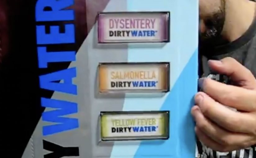
For just a buck, during World Water Week (March 22-29), New Yorkers in the Union Square Park area are invited to “enjoy” the benefits of Dirty Water. It comes in a range of choices like Malaria, Cholera, or Typhoid Dirty Water, and is described as having 900 million consumers.

Dirty Water is not an actual product, but a real problem for millions of children around the world.

A vending machine that sells disgust

The mechanism is a classic reversal: a familiar vending machine is repurposed to dispense bottles labeled with water-borne diseases. The point is not to get anyone to drink it. The point is to make the problem visceral and immediate for people who normally never have to think about it. By keeping the interaction familiar, the reversal lands because it turns moral distance into a physical reaction in seconds.

In global cause marketing, turning an abstract statistic into a physical choice can move more people from awareness to action than another informational poster ever will.

The real question is whether you can turn a distant, abstract problem into a personal encounter that makes action feel unavoidable.

Why “nobody drinks it” is the message

New Yorkers are startled to see options like Yellow Fever or Hepatitis Dirty Water. They look at the machine in disgust. And that disgust is the creative payload, meaning the emotional reaction the campaign is designed to deliver, because it mirrors the reality that millions of families do not have the option to refuse unsafe water.

Extractable takeaway: When the barrier is “I cannot feel this problem,” engineer a harmless encounter that triggers the right emotion on contact, then attach one immediate action that turns that emotion into help.

The donation promise that makes the $1 meaningful

The idea of “selling” dirty water is framed as being inspired by UNICEF’s promise that every dollar donated provides safe drinking water to 40 children for a day. Even if the bottle is never purchased as a “product”, the transaction becomes a small, concrete unit of impact.

How the campaign stays active beyond the street

This Dirty Water initiative is positioned as ongoing, with continued donation options online at tapproject.org or via text message. Text TAP or AGUA to UNICEF (864233) to make a $5 donation.

Steal the Dirty Water pattern

  • Use reversal with familiar UX. Put the message inside an everyday interaction so the emotional hit lands before the rational debate starts.
  • Make the abstract a physical choice. Let people “choose” the problem in front of them, then offer one simple action to refuse it for someone else.
  • Price the action as a unit. Frame the donation as a small, concrete purchase so the person feels immediate impact, not vague virtue.

A few fast answers before you act

What is the “Dirty Water” vending machine in one line?

A public vending machine that dispenses “dirty water” bottles labeled with diseases to shock passers-by into donating for clean water.

Why price it at $1?

Because $1 is a friction-light ask that feels like a purchase, not a pledge, and it maps to a clear “unit” of impact in the campaign story.

What is the main creative trick that makes it work?

Reversal: it sells something no one wants, so the emotional response is disgust, and that response reframes clean water as a privilege rather than a given.

What should brands learn from this without copying the cause?

If the problem is invisible, make it physically encounterable, and tie the encounter to one simple action that feels immediately meaningful.

What is the lowest-risk way to adapt this pattern?

Keep the reversal honest and harmless, avoid sensational claims, and make the action as clear as the emotion: one step, one outcome, no hidden complexity.

Chang Soda: Fizzy Billboard

Chang Soda: Fizzy Billboard

A giant Chang Soda bottle towers over a busy Bangkok shopping area. At the right moment, the cap “pops” and a burst of white balloons shoots out like carbonation escaping from a freshly opened drink.

Seeking new ways to create an impact in today’s sea of daily ad bombardment while taking into account shrinking budgets is quite a challenge. Chang’s Fizzy Billboard did just that, described as a reminder of how effective a great billboard idea can be when it turns a product truth, a single attribute the product can credibly own, into a public spectacle.

This is an outdoor activation that uses a physical effect, balloons released from the bottle, to dramatize “fizz” in a way that can be understood in a single glance.

The mechanism that makes it memorable

The creative leap is not the billboard. It is the “fizz”. Balloons are cheap, visible from far away, and they behave like bubbles in motion. Because of that, the claim becomes tangible even for people who only catch the moment in passing.

In FMCG categories where products are hard to differentiate at shelf, a single unmistakable physical metaphor in public space can outperform a week of polite messaging.

Why it lands as a shareable street moment

The payoff is time-based. People hear that “something happens” and they wait. When the burst comes, it reads instantly and creates a crowd reaction that becomes part of the communication. The effect also photographs well, which helps the idea travel beyond the street.

Extractable takeaway: If you want OOH to earn sharing, build a visible cause-and-effect that people can describe in one sentence, then make the payoff repeatable enough to be worth waiting for.

What the brand is really buying

This is a salience play. The goal is to make “Chang equals fizzy” stick through a short, repeatable spectacle, and to borrow the credibility of a real-world stunt rather than relying on a purely filmed illusion. The real question is whether you can turn one attribute into a repeatable moment people will stop for and retell. If you have to choose, back one literal, repeatable effect instead of spreading budget across polite static placements.

Steal-worthy rules for spectacle OOH

  • Make one product truth physical. Choose the one attribute you want remembered and build the effect around it.
  • Design for distance. If it does not read from across the street, it will not earn attention.
  • Use a predictable moment. A scheduled payoff creates anticipation and word of mouth.
  • Keep the metaphor literal. People should get it before they think about it.

A few fast answers before you act

What is Chang’s “Fizzy Billboard”?

An outdoor activation for Chang Soda where a giant bottle billboard appears to “pop” and release balloons like fizz, turning carbonation into a public spectacle.

Why use balloons for a soda message?

Balloons are inexpensive, highly visible, and they move like bubbles. That makes “fizzy” readable in one second from a distance.

What makes this kind of billboard more effective than a standard print-only OOH?

It creates a moment, not just an image. A time-based spectacle earns attention, crowd reaction, and secondary sharing that static posters rarely trigger.

What business outcome is this designed to influence?

Brand salience and attribute ownership. It aims to make the brand strongly associated with “fizz” versus competitors.

What is the biggest execution risk with spectacle billboards?

If the payoff is unclear or inconsistent, people feel tricked. The effect must be obvious, repeatable, and easy to explain in one sentence.

The North Face: Red Flags in China

The North Face: Red Flags in China

The North Face in China turns a simple outdoor ritual into a phone-powered race. You “plant” a virtual red flag to claim a location. You get the bragging rights of being first. Then you try to out-plant everyone else.

A modern take on the oldest explorer move in the book

Planting a flag is a universally understood symbol. It’s the shorthand for “I was here first.” This campaign borrows that instinct and digitizes it, so the only equipment you need is a mobile phone.

The mechanic: claim a place, then defend your status

At the heart of the idea is a competitive map. Participants place virtual red flags on locations they discover, and the campaign keeps score so “firsts” become collectible. It’s a light-touch way to make exploration feel like a game you can win, not just a virtue you should aspire to.

In fast-growing outdoor markets where many people are still taking their first steps into hiking culture, this kind of social competition is an effective on-ramp.

Why it lands: it converts curiosity into a scoreboard

Outdoor positioning often sounds lofty. “Explore more.” “Get outside.” The problem is that those ideas are hard to act on today, especially in cities where “nature” is not a default habit.

Extractable takeaway: If you want behavior change, give people a visible “progress signal” they can earn quickly. A simple status marker (first, top 10, streak, champion) turns vague aspiration into a repeatable loop.

Red flags work because they’re instantly legible. You don’t need instructions to understand what it means to claim something, and you don’t need a long explanation to feel the urge to beat someone else to the next spot.

The real question is how do you turn exploration from a brand line into a repeatable action people want to perform?

The business intent: make “Never Stop Exploring” measurable

This is a smart brand move because it makes “Never Stop Exploring” visible as behavior instead of leaving it as a slogan.

Case-study write-ups describe this as an integrated push that blends mobile participation with on-ground visibility and retail activation. The core goal is to move the brand from “admired” to “acted on”, by making exploration something people can start immediately, then repeat.

What brand teams can steal from Red Flags

  • Use a symbol people already understand: flags, stamps, passports, badges. Familiar metaphors reduce friction.
  • Turn progress into a public artifact: a claimed location or visible marker is more motivating than a private point total.
  • Design for repeat loops: one action should naturally suggest the next one.
  • Make competition optional but obvious: the scoreboard should be there for people who want it, without blocking casual participation.
  • Reward “first steps”: the earliest wins matter most when you’re trying to create a new habit.

A few fast answers before you act

What is the Red Flags idea in one sentence?

The Red Flags idea is a mobile competition where people plant virtual red flags to claim places and earn status for being first, encouraging more exploration through a simple scoreboard.

Why does “claiming a location” work so well?

Claiming a location works because it makes exploration feel personal and scarce. Once a place is “yours”, you feel ownership, and ownership increases repeat behavior.

Is this gamification or location-based marketing?

Red Flags is both gamification and location-based marketing. The location is the proof of action, and the game layer, claims, status, and competition, supplies motivation and repeatability.

What’s the main risk in copying this mechanic?

The main risk in copying this mechanic is overcomplicating it. If placing the first marker takes too long or requires too many steps, you lose the impulse that makes the idea work.

What’s a modern equivalent if you don’t want maps?

A modern equivalent without maps is any “claimable” unit: completing a route, checking in at partner venues, finishing a micro-challenge, or earning a time-bound “first” in a shared feed.