Draftfcb: In Your Face Recruitment Hack

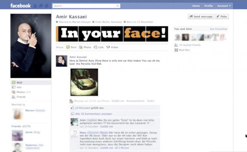
Draftfcb Germany is the latest ad agency to join the trend of tactically using social media for recruitment. In this case, they use Facebook’s redesigned profile layout to spread their hiring needs to a highly targeted advertising audience.

Recruitment message, delivered as a profile takeover

The mechanism is a simple interface hijack. Instead of posting a job ad and hoping people click, the recruitment message is built into the profile itself, so anyone landing on it experiences the “In Your Face” moment immediately. It is native to the platform, and it travels through the same social graph pathways as any other profile view.

In competitive hiring markets, social recruiting works best when the message shows up inside the places people already browse, rather than asking them to switch into “job search mode.”

Why it lands

This is not a deep story. It is a sharp pattern interrupt. That means the familiar Facebook profile suddenly behaves like a recruitment billboard, which makes the message easy to recognize and easy to forward to the right peers. The profile becomes the ad unit, the ad unit becomes a talking point, and the talking point becomes a referral engine as people share it with the exact peers who might fit.

Extractable takeaway: If you want a recruitment message to spread inside a community, put it where the community already looks, and make the first two seconds instantly legible without requiring a click.

The real question is whether the profile itself can carry the hiring message strongly enough to spread through the right creative network without needing a click. This is a smart recruitment move because it converts ordinary profile views into immediate message delivery and referral fuel.

Recruitment moves worth borrowing

  • Use the platform’s default surfaces. If the profile is the most-viewed asset, make that the canvas.
  • Design for “seen in passing.” The message should register at scroll speed.
  • Make it referable. The best recruitment creative gives insiders something easy to forward to insiders.
  • Keep it role-specific. If you want a “select advertising audience,” avoid generic “we’re hiring” language.
  • Respect the line. If the takeover feels spammy or deceptive, it damages employer brand more than it helps.

A few fast answers before you act

What is “In Your Face” in one sentence?

It is a Draftfcb Germany recruitment idea that turns Facebook’s profile layout into a visual hiring message that spreads through normal profile views and shares.

Why use a profile takeover instead of a standard job post?

Because it removes friction and increases certainty. The viewer immediately understands the intent without leaving the platform or clicking through.

What makes this tactic “targeted”?

It travels through an industry social graph. The people most likely to see it are connected to the agency, its staff, or the wider creative community.

What is the biggest risk with this approach?

Novelty decay. Once the trick is familiar, it stops being a conversation piece, so the idea needs either a short run or variations.

What should you measure if you do something similar?

Qualified inbound candidates, referral volume from employees and peers, share rate inside relevant networks, and sentiment about the employer brand.
Lacta Chocolate Facebook App

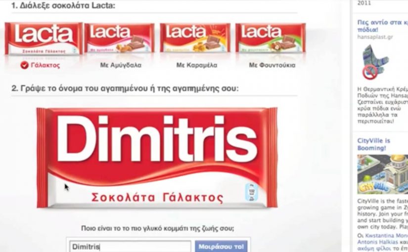
You open the Lacta Chocolate Facebook app, type your loved one’s name, and customise a Lacta wrapper around them. The app matches them to a Lacta flavour, then you push it out as a wall-to-wall post, meaning a highly visible Facebook share that others can see, react to, and copy. In seconds, your “love message” becomes something your friends can respond to and replicate.

The app idea. Turn affection into something people want to publish

The app is built around a simple insight. People naturally compare their loved ones with chocolates. Lacta turns that behaviour into a lightweight creation tool, so the output is personal, visual, and instantly shareable. This works because the branded asset carries the user’s own relationship signal, so posting it feels expressive rather than promotional.

Why some Facebook apps explode while others flop

Plenty of Facebook apps chase scale and get nothing. The real question is why anyone would want to publish the result in the first place. The strongest social tools do not ask people to share a campaign. They give people something about themselves worth sharing.

Extractable takeaway: Social tools spread when the output helps people express identity or affection in public, because the brand travels inside a social signal the user already wants to send.

1) Simplicity

A couple of clicks to get to the app and to the point of action.

2) Shareability

All the standard sharing features that make it easy to spread.

3) Insight

Something a fan might actually use, comment on, and share.

Who builds it, and what the traction looks like

Once again OgilvyOne Athens gets into action and creates an app that lets people customise a Lacta chocolate wrapper in their loved one’s name and compare them to a particular Lacta flavour, before using the wall-to-wall post feature to get the message across.

For Lacta, the business intent is clear. Turn private affection into branded public visibility that fans distribute for free.

In consumer brands using social platforms as lightweight participation channels, this matters because the strongest ideas convert self-expression into distribution without adding friction.

In just over a month the app generates over 150,000+ fans, with thousands using personalised chocolate wrappers as profile pics.

What to steal if you build shareable social tools

  • Make the output the share. The personalised wrapper is the thing people want to publish, not a link to the app.
  • Keep the creation flow brutally short. Name input plus one decision is enough to get to a finished artefact.
  • Use a familiar emotional trigger. Affection and gifting makes the action feel socially safe, not promotional.
  • Design for copying behaviour. Seeing someone else’s personalised wrapper naturally prompts “make mine”.

A few fast answers before you act

What is the Lacta Chocolate Facebook app in one sentence?

It is a simple Facebook app that lets you personalise a Lacta wrapper with a loved one’s name, match them to a flavour, and share it as a wall-to-wall post.

Why does this app spread?

Because the output is personal and visual, the creation flow is fast, and the sharing mechanic is built into the final step.

What are the three success factors highlighted here?

Simplicity, shareability, and a real insight that people actually want to express publicly.

What is the business value behind the interaction?

It turns a private affection signal into branded public visibility, so distribution happens through what users already want to share.

What is the key execution lesson to copy?

Make the “thing people share” the natural end product of the interaction, not an optional add-on after the fact.

dotHIV: .hiv Domain

A familiar website address. One small change at the end. And suddenly the act of browsing is framed as a contribution.

.hiv is a global idea positioned to fight HIV and AIDS. Campaign materials claimed that by the end of 2010, the number of people diagnosed with HIV would have reached 150 million.

AIDS continued to be a deadly diagnosis, so nonprofit organization dotHIV and Hamburg-based agency KemperTrautmann launched a Facebook-led campaign with a specific ambition. Establish a new top-level domain, .hiv, alongside endings such as .com or .org.

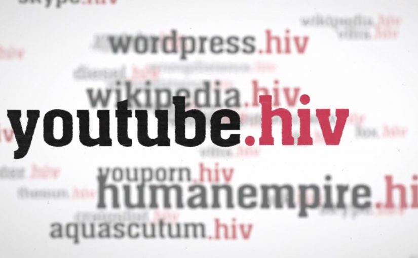
The proposed mechanism is straightforward. Any website could soon have a .hiv version. The content stays the same, but using the .hiv version is framed as “doing some good”. Every visit would trigger a small donation to dotHIV, or the website owner would pay a monthly rate for using the .hiv ending, with proceeds routed toward the cause.

Why the domain idea is the message

This works because it turns a familiar object, the URL, into a symbol. A domain ending is tiny, but it is also persistent. It appears everywhere the link appears, and it travels without needing a new explanation each time. The “digital red ribbon” effect is built into the mechanics, not added on top. Here, “digital red ribbon” means a visible, repeatable sign of support that appears wherever the link appears. That matters because persistent, low-effort visibility lowers the cognitive cost of participation and helps the cause travel with the behavior.

Extractable takeaway: If you want scale for a social cause, design participation so it sits inside a behavior people already repeat daily, and make the proof of participation visible every time the behavior happens.

In global cause-led digital initiatives, the scalable advantage comes from attaching support to a habit people already repeat without thinking.

What the campaign is really trying to unlock

The real question is whether the cause can become part of a daily digital behavior instead of remaining a separate appeal.

The visible pitch is fundraising. The deeper play is normalization. If .hiv becomes a usable, recognizable address ending, it makes the cause present in everyday digital life, which can reduce stigma through repetition and visibility rather than messaging alone.

The more strategic value here is normalization, not just fundraising.

What cause-led marketers can borrow

  • Attach impact to habit. Make the “good” happen when people do something they already do.
  • Make participation visible. A marker people can see and share helps the idea spread without extra media.
  • Keep the mechanism explainable in one sentence. If it needs a diagram, adoption collapses.
  • Design for opt-in trust. Cause mechanics live or die on clarity about where money flows and why.

A few fast answers before you act

What is the .hiv idea in one line?

A proposed top-level domain intended to turn everyday browsing into support for HIV and AIDS work by routing fees or visit-linked donations through dotHIV.

How is it supposed to work for normal websites?

A site could have a .hiv version that mirrors the existing content, while usage or registration is framed as generating funds for dotHIV.

Why use a domain ending instead of a normal donation page?

Because a domain ending is persistent and repeatable. It can travel with links and become a visible marker of participation everywhere it appears.

What makes this idea credible or not credible to audiences?

Transparency about governance, pricing, and where proceeds go. The mechanism needs to be as clear as the promise.

What is the biggest risk with “donation-by-browsing” concepts?

If the value exchange is unclear, or the impact feels too small or too opaque, people disengage or suspect cause-washing.