Reporters Without Borders: QR Codes That Speak

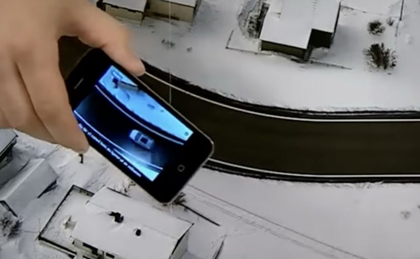
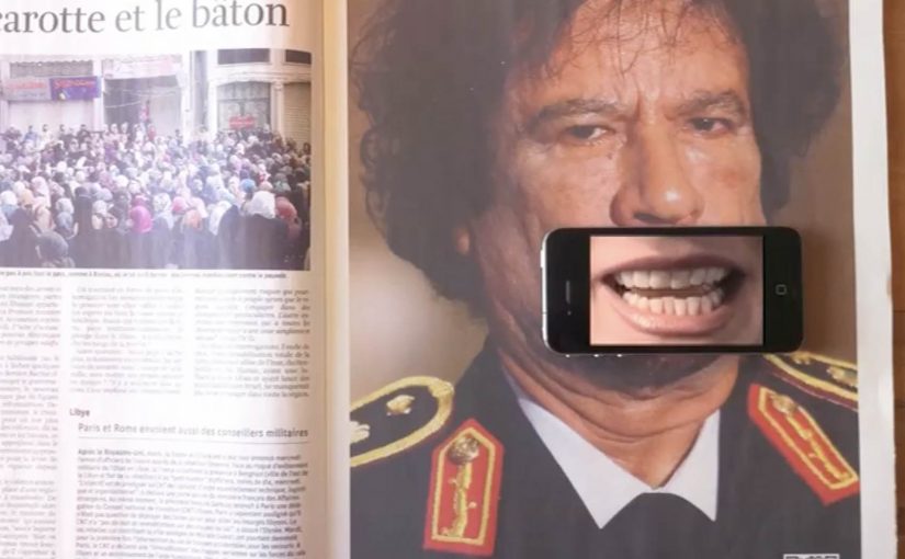
You scan a QR code in a magazine ad, then hold your iPhone over a leader’s mouth. A QR code, short for Quick Response code, is a printed shortcut that opens a mobile destination. The mouth starts talking. But it is not the leader’s voice. It is a journalist explaining what censorship looks like in that country.

Print ads are hitting above their weight lately. Recently, you could test-drive a Volkswagen right inside a print ad, thanks to a special app. Now, QR codes are used to get dictators talking in a set of print ads created by Publicis Brussels for the free-press advocacy group Reporters Without Borders (RWB).

In the ads for RWB you scan the QR code with your iPhone and then place the phone over the leader’s mouth. The mouth starts talking, but it turns out to be the voice of a journalist discussing media censorship in that particular country.

Currently there are Gaddafi, Ahmadinejad and Putin versions.

In public-interest and advocacy communication, this kind of print-to-phone interaction works because it turns a static message into a lived moment of contradiction. The “authoritarian voice” is visually present, but the truth comes from someone who is usually silenced.

How the ad “speaks”

The mechanism is a simple overlay. The printed QR code launches a mobile experience, and the phone screen becomes the animated mouth layer when you align it with the face in the ad.

QR codes act as a bridge from paper to a mobile destination. The ad uses that bridge to deliver audio and motion, without needing the page itself to be electronic.

In advocacy and public-interest communication, print-to-phone interactivity works best when it creates a moment of moral contrast, not a tech demo.

The real question is whether the interaction changes what the message means, or just adds motion.

Why this lands harder than a normal poster

The interaction forces you to participate in the message. You physically place your device over the mouth, so you are complicit in “giving a voice”. Then the reveal flips expectations and reframes the act as a statement about censorship. Because the phone screen becomes the moving mouth layer, the reveal is immediate and hard to dismiss. This is a strong pattern for interactive print: make the overlay carry meaning, not novelty.

Extractable takeaway: If the mobile layer can be removed without changing the message, the interaction is optional. Design the overlay so the meaning only exists when the viewer lines it up and activates it.

What to steal for interactive print

  • Make the overlay do meaning work. The phone is not a gimmick. It is the message delivery device.
  • Engineer a single, clear reveal. The twist needs to land in seconds.
  • Design for alignment and clarity. If the user cannot line it up easily, they quit.
  • Keep the outcome unmistakable. Audio plus a visible mouth movement makes the payoff obvious.

A few fast answers before you act

What is the core idea of these Reporters Without Borders print ads?

They use a QR code and a phone overlay to make a leader’s mouth appear to speak, then reveal a journalist’s voice explaining censorship in that country.

Why use QR codes in a print campaign like this?

QR codes create a fast bridge from paper to mobile audio and motion, which lets print deliver a message that feels alive rather than static.

What makes this more than a tech trick?

The interaction supports the meaning. You “activate” speech, then hear the voice of journalism instead of power, which reinforces the theme of suppressed information.

What are the main execution risks?

Poor alignment, slow loading, or unclear instructions. Any friction can break the moment before the reveal lands.

How can brands apply the pattern without copying the politics?

Use print as the stage and mobile as the moving layer. Make the overlay essential to the message, and build toward one clean, immediate reveal.

Volkswagen Norway: Test drive in a print ad

You open a magazine and see a long, empty road. Then you hover an iPhone over the printed page and a Volkswagen appears to “drive” along that road on your screen. It is a test drive that happens inside a print ad, with summer and winter road versions depending on the magazine insert.

Volkswagen Norway builds this as a hybrid print and mobile experience. Readers are prompted to download an app, developed by Mobiento, that turns the printed road into a track. The phone becomes the controller and the page becomes the environment. The payoff is simple viewer control. You move the phone. The car moves with you.

An augmented reality print ad is a piece of print that a camera can recognize as a trigger. Once recognized, an app overlays a digital layer onto the page, anchored to the printed design so the interaction feels connected to the physical medium.

In European automotive marketing, the hardest part is making driver-assist feel concrete without getting people behind the wheel.

The experience is designed to demo three features in a way print usually cannot. Lane assist, adaptive lights, and cruise control. It is not a real test drive, but it is a clear and surprisingly tactile explanation of systems that are otherwise hard to “feel” from a magazine spread.

Why this works as an explanation engine

By “explanation engine” I mean a format that lets someone experience a feature benefit in seconds, not just read about it. Driver-assist features are abstract until you see them respond to a road situation, and this setup works because the printed road plus the phone’s motion becomes a simple input loop the viewer can control. This kind of demo is worth doing when the feature’s value is easier to show than to describe.

Extractable takeaway: When the benefit is behavioural, make the user’s motion the control and the physical asset the scenario.

What the campaign is really doing for the brand

This is a positioning move as much as a product demo. It says Volkswagen brings technology into everyday life and it does it with familiar media, not only with future-facing formats. Print becomes the doorway into a mobile experience, and that contrast makes both feel more interesting.

The real question is whether your media choice can carry the product story without needing a live demo.

What to steal for your own print-to-mobile idea

  • Make the printed asset the interface. The road is not decoration. It is the input surface.
  • Choose features that benefit from simulation. Assist systems and “smart” behaviours are ideal for quick demos.
  • Keep the interaction one-step. Download, point, move. Anything more kills curiosity.
  • Provide two contexts. Summer and winter versions make the concept feel robust and replayable.

A few fast answers before you act

What is “test drive in a print ad” in simple terms?

It is a magazine ad that works with an iPhone app. When you hover the phone over the printed road, the app overlays a car on screen and lets you simulate driving along the page.

What features does the VW print-ad test drive demonstrate?

The experience is built around lane assist, adaptive lights, and cruise control, using the printed road as the scenario that triggers the system behaviours.

Why is this better than a normal print ad for tech features?

Because it shows behaviour, not descriptions. The viewer sees the system respond in a road context, which is more memorable than reading about it.

Is it accurate to call it the world’s first?

Volkswagen Norway bills it that way, and the work is widely described as an early example of augmented reality applied to print as a functional “test road”.

What is the main risk with print-to-app activations?

Friction. If install or recognition is slow, people stop. The first payoff has to arrive quickly so the novelty turns into understanding.